Menus that shift when the evening does
A bar menu has a different rhythm to a lunch board. Cocktails change, draught lines move, bottle stock tightens and a short special can last only one service. That is where snap frames and insert boards earn their place, because the sheet lifts out and the new print slides in without a fuss. In a packed room, nobody wants to pry open a frame with a screwdriver while patrons are waiting at the counter.
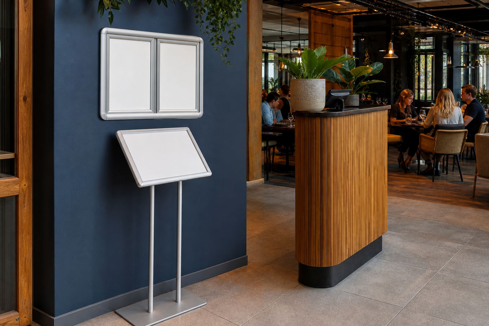
For bars, the usual setup is a wall mounted A4 or A3 snap frame near the till, a larger specials board close to the entrance, and one or two A-frame stands for pavement or patio use. In venues with a darker interior, anti-glare covers and strong contrast in the artwork matter just as much as the frame itself. A glossy print under warm lighting can vanish at the wrong angle, while a matte finish keeps the wording readable from across the room.
What usually sits on the bar side of the counter
The working mix is usually practical rather than decorative. A drinks list may sit in a slim wall frame, while an A-frame stand carries the daily special, tasting tray or late-night food line-up. Where the venue has a street-facing window, a face-out frame can carry trading hours, a short promo or a festival drink list. Aluminium profiles are a common choice because they hold their shape and cope well with regular insert changes.
- A4 frames for compact drinks lists and reserve notices
- A3 frames for signature cocktails, beer lists or food pairings
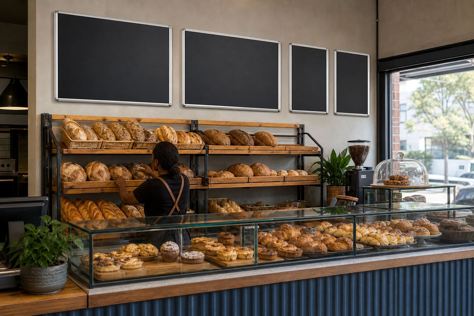
- Chalkboards for hand-written specials that change through the week
- A-frame stands for pavements, entrances and covered courtyards
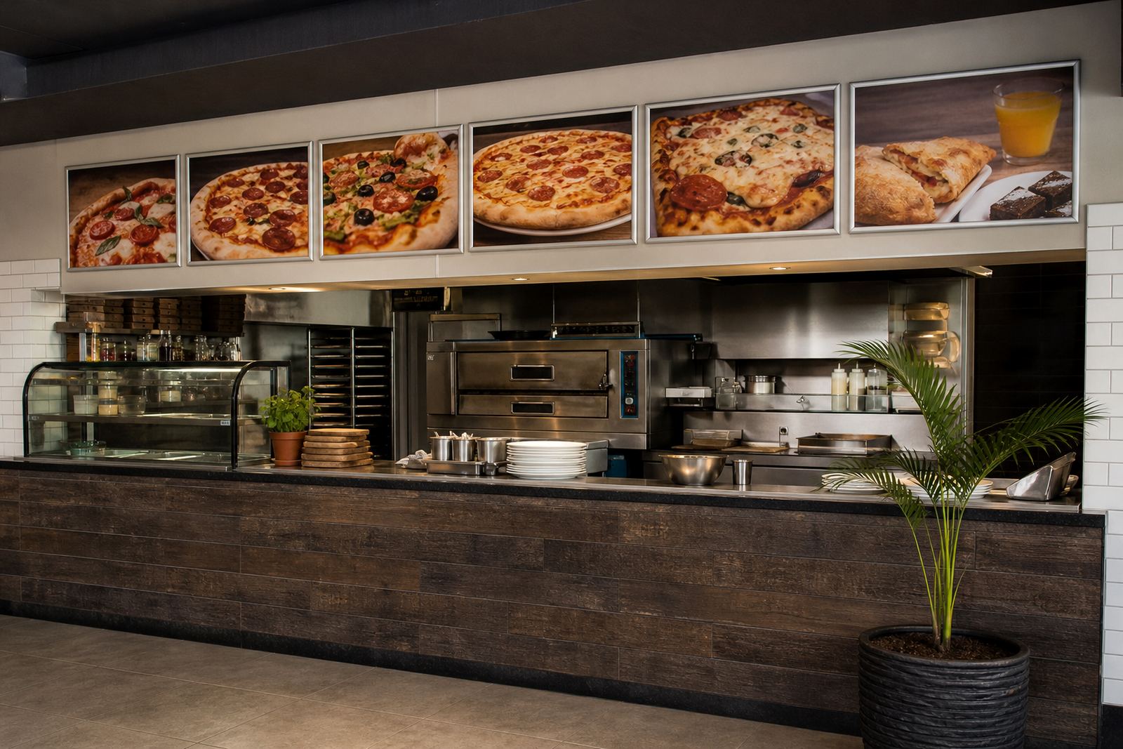
- Poster insert boards for larger menu sheets and window displays
- Anti-glare covers for rooms with low light or reflective fittings
Bars that serve across several zones often use a mix of sizes so the same menu language appears at the counter, the wall and the street edge. That keeps the house list clear, while still leaving room for a rotating specials sheet or a weekend feature board.
Sizing the artwork before the first print
Menu sizing is where many bar jobs go sideways. A beautifully written list can end up cramped if the text block was built for the wrong frame size, or the margins were ignored. A4 works well for shorter lists and house rules. A3 gives more breathing room for cocktail names, ingredients and prices. If the venue wants a strong board above eye level, larger poster inserts can work, but the font sizes need to be checked from a few metres away, not only from the laptop screen.
Our team handles A4 menu templates, A3 menu templates, resizing, typesetting, proofing and print finishing so the insert fits the frame first time. Where a bar changes the list often, it helps to build the layout in a way that can absorb small shifts in wording, especially when a long gin name or a cocktail ingredient line runs on. That is also where colour matching matters, because a dark background with pale text can look excellent in daylight and disappear under warm indoor lamps if the contrast is too soft.
For venues in coastal areas like Cape Town or Gqeberha, the hardware itself should be checked for corrosion resistance and a good seal on the cover. Salt air and humidity can leave cheaper fittings looking tired sooner than expected, especially on window-facing boards and patio stands.
Window fronts, pavement spots and low-light rooms
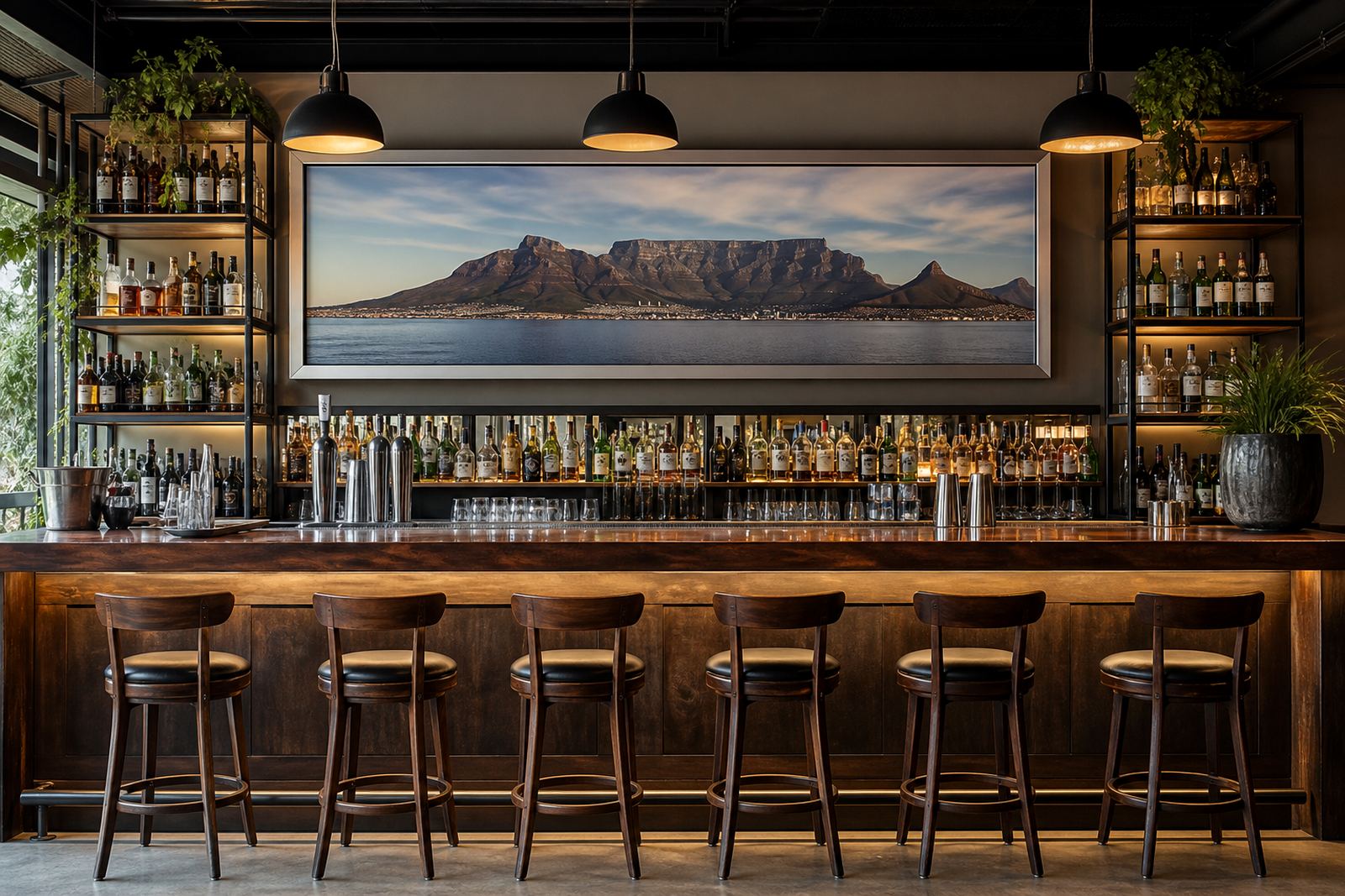
Bars often need more than one display point. A window frame can pull in walk-ins from the street, while a pavement A-frame catches people passing by after work. Inside, the board at the till needs to be readable from the queue, not only from the bartender’s side. If the room is dark by design, use anti-glare covers and avoid thin typefaces that disappear under spotlights or reflective glass. A matte poster insert usually reads better than a shiny sheet in those conditions.
- Place the main list where guests first pause, not hidden behind décor
- Keep specials separate from the full drinks list so updates stay quick
- Leave enough white space around prices and item names
- Use consistent wording for sizes, pour options and add-ons
- Keep window boards simple so street readers catch the message fast
Courier packaging is part of the job when boards travel nationwide. Frames and inserts need to arrive flat, clean and ready for mounting, whether they are going to Stellenbosch, Johannesburg, Durban or Milnerton. A damaged corner on a frame can throw off the fit and leave the board looking untidy at the edge.
Common slip-ups that make bar boards harder to use
The most common mistake is trying to squeeze too much onto one sheet. A drinks menu that includes every pour size, every garnish and every note can become hard to read from standing distance. The next issue is using the same layout for every board, even when one frame sits in a dim corner and another hangs near a bright window. Font choice, spacing and background colour should suit the actual placement, not only the artwork on screen.
Another frequent problem is ordering the wrong mix of frames. A bar may need one A3 for the main list, but several A4 inserts for wine, cocktails and kitchen snacks. If the venue changes specials often, a chalkboard may be useful for short handwritten lines, while the main drink list stays printed and consistent. Poor finishing can also shorten the life of the board. If a print is not trimmed cleanly or laminated properly, edges fray and inserts start to look rough after a few swaps.
Budget wise, bar menu work can move in layers. Small A4 insert jobs with basic finishing may sit in the lower hundreds of Rand per item, while larger framed boards, laminated prints and A-frame stands usually move into the higher hundreds to low thousands, depending on size, count and finishing. Short runs for a new cocktail list cost less than a full set of window boards plus pavement stands, so it helps to plan the menu package around the actual service pattern.
A few checks before the order is final
Before the artwork goes to print, the venue should settle the frame sizes, the number of inserts and where each board will live. A bar with a narrow counter edge may prefer wall mounts, while a venue with passing foot traffic might need a sturdier A-frame for the entrance. If the menu changes every week, keep the core layout stable and swap only the sections that move. That saves time and keeps the room looking organised.
- Confirm the final text for drinks, specials and sizes
- Match the frame size to the space on the wall or window
- Check whether anti-glare covers are needed for low-light areas
- Decide which boards should be printed and which can be handwritten
- Plan courier packaging for the route to the venue
SnapperFrame Menus works from Paarden Eiland in Cape Town and handles menu updates, short run printing, laminated menu prints, poster insert printing and finishing for bars across South Africa. Our contact form is the cleanest way to send the details, whether the job is for Cape Town, Paarl, Bellville or further afield.