The bar counter needed to move faster than the print
The brief came from a busy bar in Woodstock, Cape Town, where the menu changes did not sit still for long. Drinks lists shifted for seasonal stock, happy hour notes changed through the week, and the team wanted a display that could be updated without tools or a full reprint every time a line moved.
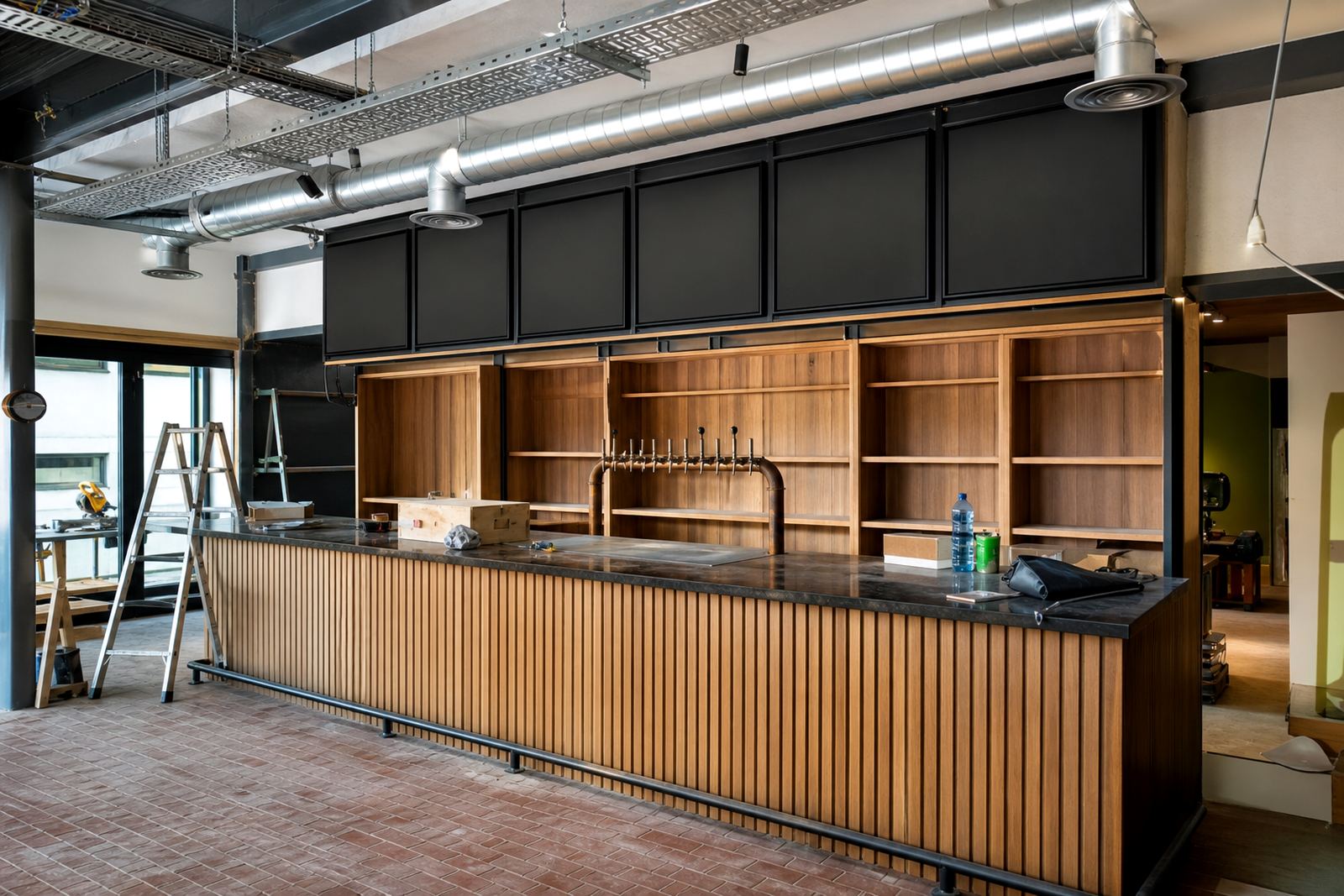
The space itself had a tight mix of wall area, bottle shelving and a service counter that stayed active through trade. That meant the display had to stay slim, read clearly at a distance and keep fingerprints, scuffs and condensation in mind. In a room like that, even a good-looking menu can feel clumsy if it takes up too much space or slows the staff down.
- Client type: inner-city bar and evening trade venue
- Town: Woodstock, Cape Town
- Display goal: easy swaps for drinks and specials
- Working style: wall display with one chalkboard for daily use
Frame sizes, board layout and the print path
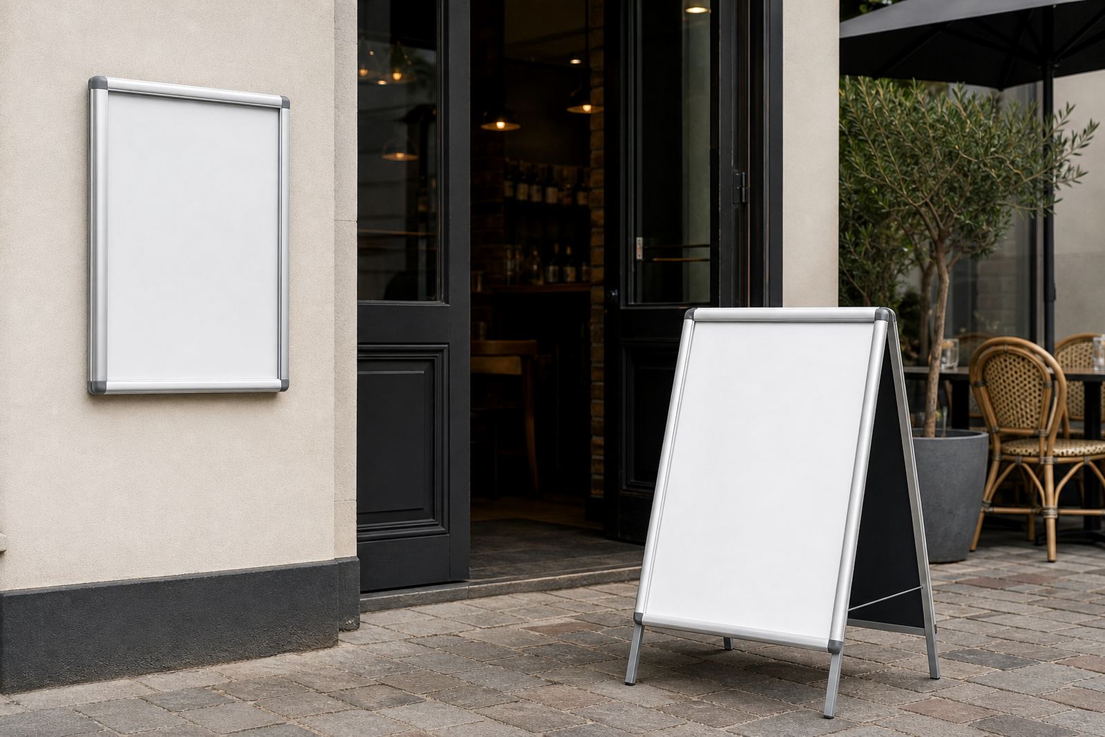
We set the package around landscape snap frames in A3 and A4, with aluminium profiles that suit a bar interior better than bulky display hardware. The larger frame handled the main drinks list, while the smaller frame was reserved for offers and callout items that changed often. Both sizes allowed print inserts to lift out and drop back in without damage to the print face.
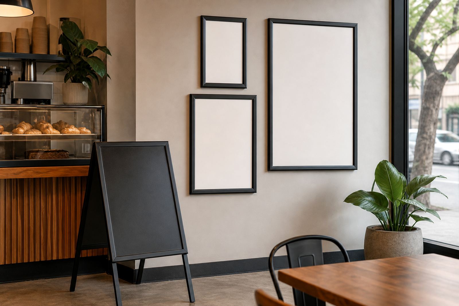
For the daily specials area, we supplied a chalkboard surface that could take hand lettering and quick pricing changes during service. The mix worked well because the bar did not need every message treated the same way. The structured parts stayed printed, while the daily board stayed loose and practical.
To keep the printed inserts sharp behind the cover, we prepared the artwork for the right viewing direction and clear line breaks. The anti-glare covers helped under mixed lighting, especially where glass behind the bar catches reflected light from overhead fittings. That matters more than people expect when the room fills up and the board has to be read from a few metres away.
- A3 landscape snap frame for the main drinks board
- A4 snap frame for a secondary notice or offer panel
- Anti-glare cover sheets to reduce reflection
- Chalkboard surface for daily specials and hand updates
What had to fit the room, not fight it
The site needed something neat enough for a bar wall, but still practical for everyday use. We avoided oversized panels that would crowd the seating area, and we kept the frame depth modest so the display did not jut out awkwardly near the service path. That mattered because staff move quickly behind the counter, and any edge that catches a sleeve becomes a nuisance very quickly.
There was also a visual balance to get right. Drinks menus can look heavy if every block of text is treated the same, so we spaced the layout with clearer grouping for beers, wines, cocktails and soft drinks. The bar could then update one section without disturbing the rest, which kept the board tidy on busy nights and during quieter lunch trade as well.
- Profile depth chosen to stay close to the wall
- Landscape orientation for long drinks lists
- Clear section spacing for easier reading
- Writable area kept separate from printed inserts
How the package was prepared in the shop
In our Paarden Eiland shop and production area, the team handled the menu resizing, typesetting and proofing so the final boards matched the space rather than forcing the space to adapt to the artwork. The print coordinator checked the insert sizes, the production manager signed off the finish, and the installations lead arranged the mounting set-up for the wall positions.
We used short run printing for the inserts that needed a cleaner finish and laminated menu prints where extra handling was expected. The laminated pieces were a good fit for the bar setting because hands, splash marks and day-to-day wear are part of the job. Courier packaging was prepared for the framed items and the loose print inserts so they could travel safely to site without corner damage.
The project ran across three weeks from layout checks to final supply. That included measuring the menu fields, preparing print-ready templates, confirming the exact text breaks and making sure the chalkboard section sat in the right place on the wall plan. It was a straightforward build, but not a rushed one, because a bar menu shows every small error once it is mounted.
Daily trade is where the display proved itself
Once the frames and boards were in place, the bar had a cleaner rhythm for updates. Staff could change specials without disturbing the main drinks list, and the printed frames kept the permanent information looking sharper than loose paper ever could. The anti-glare covers helped the wording stay readable when lights caught the glass, which is often the point where a good menu becomes hard to live with.
The result was not about showiness. It was about clearer ordering, less handling of paper inserts and a more settled look behind the counter. For a venue that relies on quick decisions and small price shifts, that practical difference matters more than a flashy finish. The room looked calmer, and the menu system was easier to keep in line with the pace of trade.
- Cleaner wall presentation for drinks and specials
- Less time spent swapping whole printed sheets
- Better legibility under bar lighting
- A tidier counter area during service
What we would keep for a similar bar fit-out
For another bar with a similar layout, we would keep the same split between fixed printed menus and a writable daily board. It gives the team enough structure to hold the important items in place, while still leaving room for the lines that move through the week. That mix is often more useful than trying to make every item sit inside one rigid format.
We would also keep the landscape framing for long drinks lists, especially where the wall space is wider than it is tall. It makes better use of the available area and gives the eye an easier path across the page. If the venue has a chalkboard section near the counter, that should stay large enough for quick pricing and special notes without crowding the printed pieces beside it.
The main lesson from Woodstock was simple enough: the board has to work through service, not only before opening. When menus are built for that reality, they stay useful for longer and are easier for staff to maintain. That is the sort of job where the right size, finish and layout do the heavy lifting in the background.
Key facts
| Project | Woodstock Bar |
|---|---|
| Town | Woodstock, Cape Town |
| Main format | Landscape snap frames in A3 and A4 |
| Secondary format | Daily specials chalkboard |
| Finish | Aluminium profiles with anti-glare covers |
| Turnaround | 3 weeks from layout to supply |