A till counter that had to stay readable
The brief came from a coffee-focused venue in Milnerton that needed a cleaner way to show drinks, pastries and daily specials near the till. The counter was busy, the floor area was tight and the display had to sit neatly without crowding the service point. Staff wanted something that could be changed often, because specials shifted with stock and the menu board had to keep pace.
We worked around the narrow counter depth and the need for easy viewing at customer height. The venue did not want loose paper sheets, taped corners or a board that looked busy by midday. We kept the layout compact, with one main menu frame and a smaller board for specials, so the information stayed clear and the service area stayed orderly.
- Client type: coffee shop
- Town: Milnerton, Cape Town
- Display mix: wall frame, counter specials board, printed inserts
- Priority: fast menu changes without tools
Frames sized for daily service
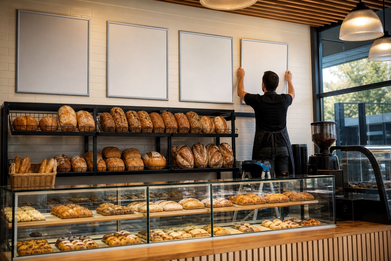
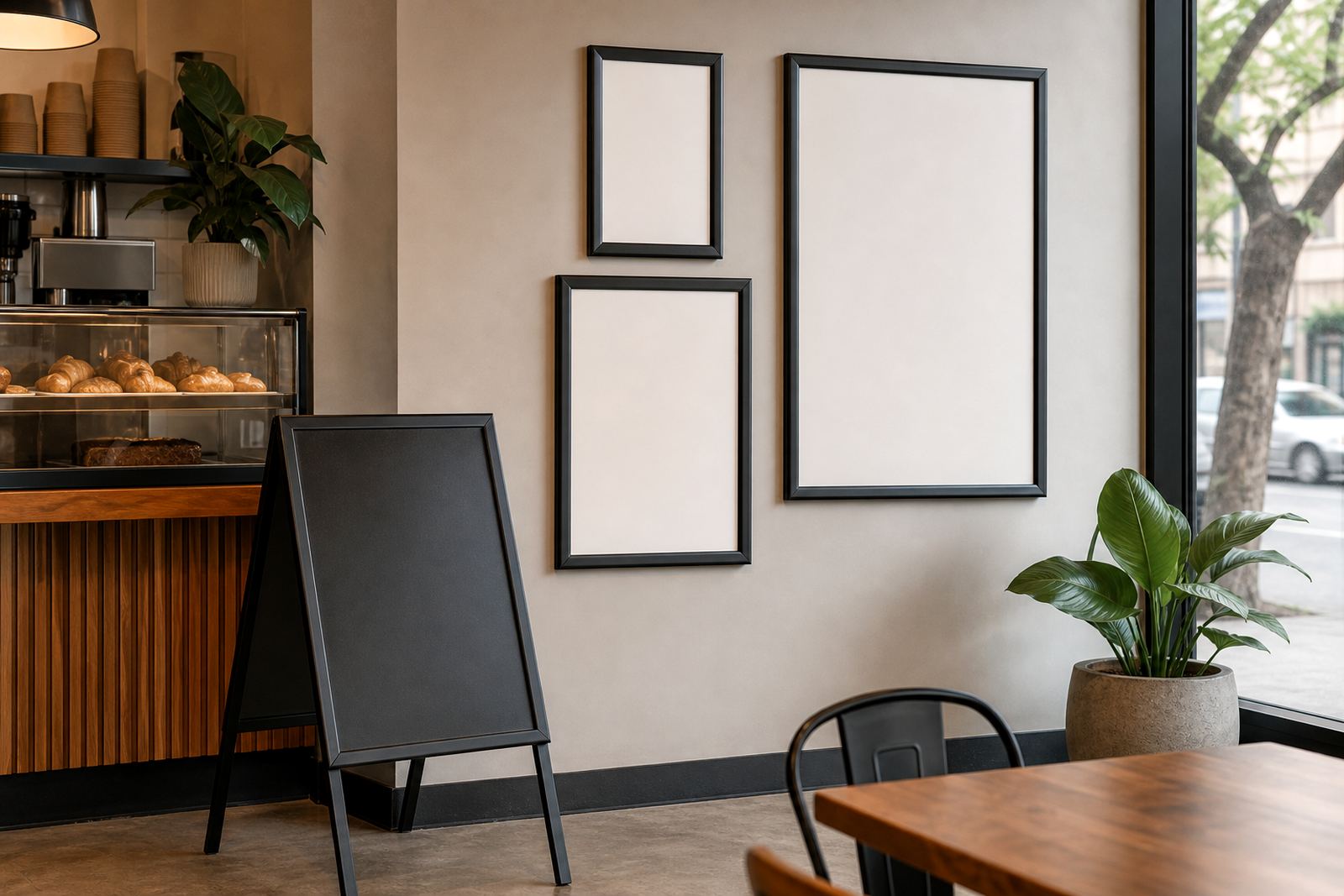
The main menu piece used an A4 snap frame for compact pricing and drink listings, while the specials board took a slightly larger format so the daily offers did not feel cramped. Aluminium profiles kept the frame neat and light enough for easy wall mounting. Anti-glare covers helped with light from the front windows, which mattered during bright Cape Town mornings.
For the specials area, we supplied a board that could take short runs of printed inserts and sit close to the till. The arrangement made it easier for staff to point customers to the right section, and the menu content was not fighting with the rest of the front counter. We also kept the print sizes practical, so the coffee names, add-ons and pastry notes stayed legible at a glance.
- A4 snap frame for the core menu
- Secondary specials board near the till
- Anti-glare front covers for daylight visibility
- Aluminium snap profiles for regular insert changes
Layout work that kept the board easy to read
The menu copy needed careful spacing because there were several coffee variations, milk choices and a short list of bakery items. We reworked the content into clearer blocks, then set line breaks so the eye could move through the board without hesitation. Price points were aligned in a way that looked tidy from the queue, even when a few items changed during the week.
We also matched the print finish to the room. Gloss can catch too much light, while a flat finish can go dull in a bright space, so the final balance had to suit the windows and the lighting above the till. The result was a cleaner read for customers and less clutter for the staff working behind the counter, which made the service point feel calmer.
- Menu typesetting for coffee drinks and food add-ons
- Menu resizing to suit the selected frames
- Proofing before print to catch spacing issues
- Colour matching to keep headings and brand tones consistent
What we supplied for the Milnerton counter
The package included a snap frame set for the main menu, a specials board for short notice updates and printed inserts ready for fitting. We also packaged the frames for local handling and courier movement, so the corners and covers stayed protected. Because the venue wanted a simple swap system, we kept the insert format direct and practical, with no extra fixings needed at service level.
Where the coffee shop needed outdoor visibility, an A-frame option was available for footpath specials or takeaway offers, though the main use here stayed inside by the till. That gave the site some flexibility for weekends and busier periods without making the counter display complicated. The same board family can also work with chalkboard panels when handwritten specials are useful, but this site used printed inserts for a cleaner look.
- Snap menu frames in compact sizes
- Short run printing for menu inserts
- Laminated menu prints for frequent handling
- Courier packaging for local and national delivery
A three week rollout from brief to fitting
The project moved through brief, layout and production in three weeks. The first stage was sorting the content into a format that worked for a coffee menu rather than a long restaurant list. After proofing, we moved into printing and finishing, then prepared the inserts for fitting into the frames. The last step was packaging the order so the frames and covers arrived ready for use.
Milnerton has plenty of daylight and a fair amount of customer movement at the counter, so the board had to stay readable from a short distance. The final set met that need without taking over the wall space. Staff could change the inserts quickly, and the specials board could be updated when stock changed, which kept the front area more organised through the week.
- Week 1: brief and content layout
- Week 2: proofing and print preparation
- Week 3: printing, finishing and packaging
- Final placement: till counter and nearby wall area
The result at the till and on the wall
The finished display gave the coffee shop a tidier front counter and a clearer way to present daily specials. Customers could read the core menu without asking for repeated explanations, and staff had a quicker way to change inserts when items moved in or out of stock. The frames also suited the compact setting better than loose posters, which often look untidy after a busy morning rush.
What stood out most was the control the team gained over updates. A new sandwich or seasonal drink could be added without tools, and the board still looked consistent after each change. That mattered in a small coffee space where the display sits close to the till and every bit of visual clutter shows. The setup now works as a proper part of service rather than something bolted on at the end.
- Cleaner presentation near the till
- Faster menu swaps during trading hours
- Better readability in bright window light
- Less clutter from taped notices and loose sheets
The same setup we would repeat for another coffee counter
For a similar coffee shop brief, we would keep the frame count modest and build around the counter layout first. A4 and A3 snap frames work well where the menu needs to stay compact, while a separate specials board gives staff room to update short notices without changing the full menu. Where the wall space is tight, a window-mounted frame can also help with visibility from outside, provided the layout stays plain and readable.
We would also keep the print sizes tied to the viewing distance rather than the page size alone. That avoids cramped text and keeps the headings strong enough for the queue. In a Milnerton setting or anywhere along the Cape coast, that approach works well because daylight, reflections and daily menu changes all affect how the board performs. The final result needs to be practical first, with enough room for a clean menu and a specials area that staff can manage without fuss.
- A4 and A3 frame sizing based on viewing distance
- Wall or window mounting depending on counter space
- Printed inserts matched to frequent menu changes
- Optional A-frame stand for takeaway offers and entrance specials