A lounge menu that had to read quietly
The brief from Newlands was for a lounge service menu that could sit comfortably beside deeper wall colours, softer lighting and a more reserved room finish. The client needed menu changes to stay quick and tidy, but the display itself had to avoid shine and visual noise.
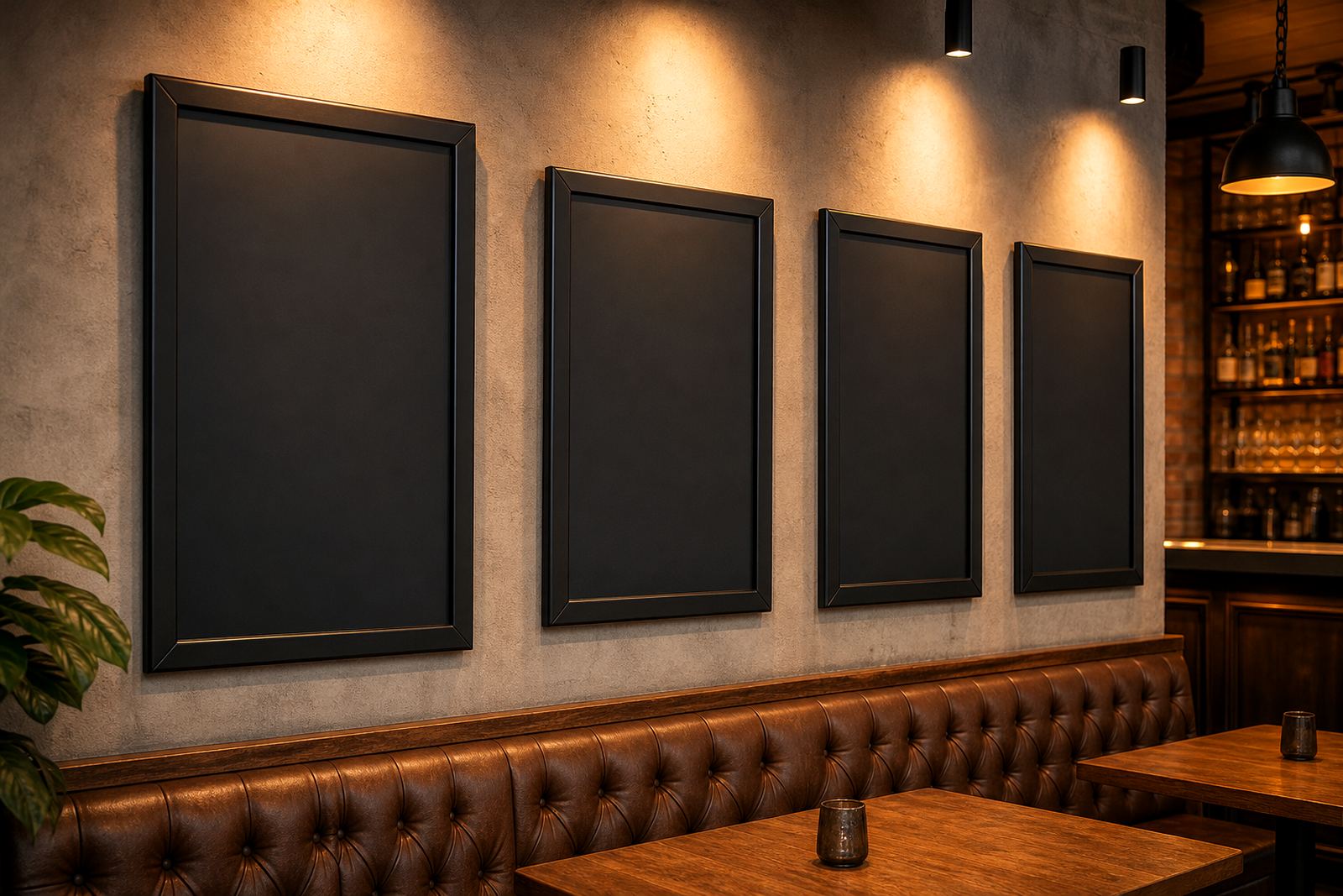
We worked around that with black powder coated aluminium snap frames, low-glare cover sheets and a restrained layout. The result was a set of menu holders that kept the information easy to read without fighting the room. It was a practical fit for a lounge where the menu changes through the week and the display has to stay neat.
- Display style: wall mounted snap menu frames
- Frame sizes: A4 and A3
- Cover type: low-glare protective sheets
- Finish: darker frame profile for evening interiors
Sizing the inserts for service shifts
The menu set needed to handle starters, drinks, lighter meals and late service items without crowding the page. That meant careful resizing, line breaks and spacing so each board stayed readable from a standing position. We typeset the inserts to suit the frame sizes rather than forcing a single layout across every board.
Because the lounge ran a mixed menu, we also kept the print versions flexible. Some pages were better as A4 inserts inside A4 frames, while others needed the extra presence of A3. Short run printing helped the team work with the exact quantities needed for the room, with no unnecessary extras sitting in storage.
- A4 menu inserts for tighter sections
- A3 menu inserts for featured items
- Typesetting adjusted for mixed menu lengths
- Short run print batches for controlled stock
Wall points, window faces and floor stands
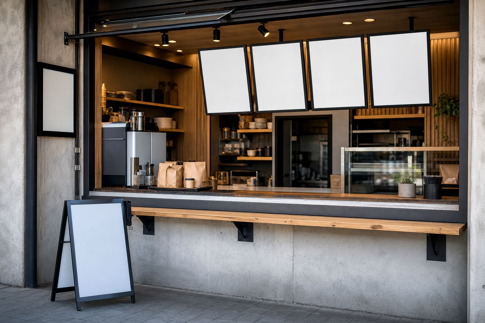
The room needed more than one display format. We supplied wall mounted frames for the main service points and an A-frame menu stand for the entry side where passing guests could see the offer before sitting down. That mix gave the lounge a flexible layout without adding clutter to the counter or walls.
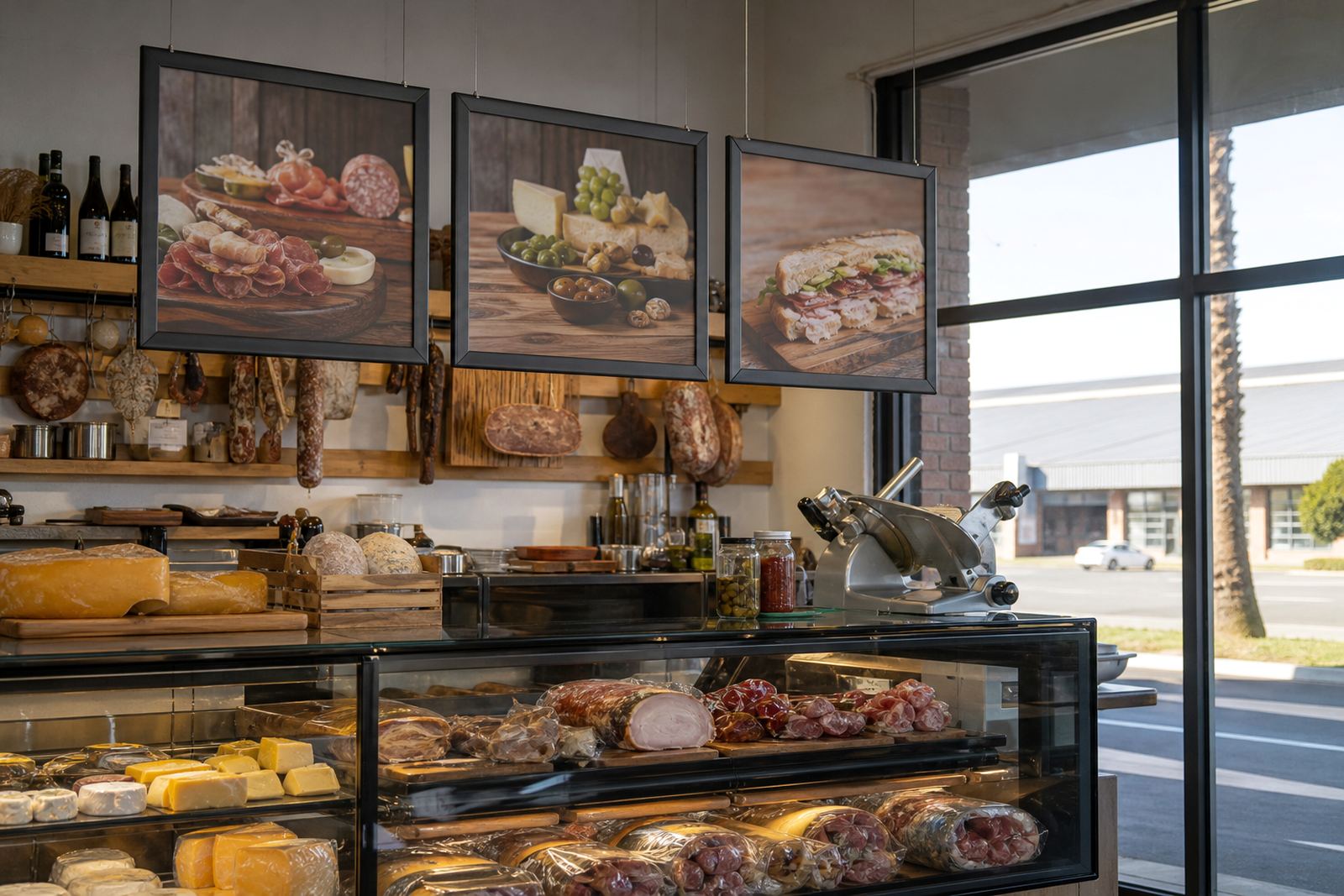
Where the glass and polished surfaces caught too much light, the low-glare covers made a clear difference. They cut reflections from the brighter parts of the room and kept the menu visible from normal viewing angles. For a lounge with moody lighting, that small change mattered more than a glossy finish would have.
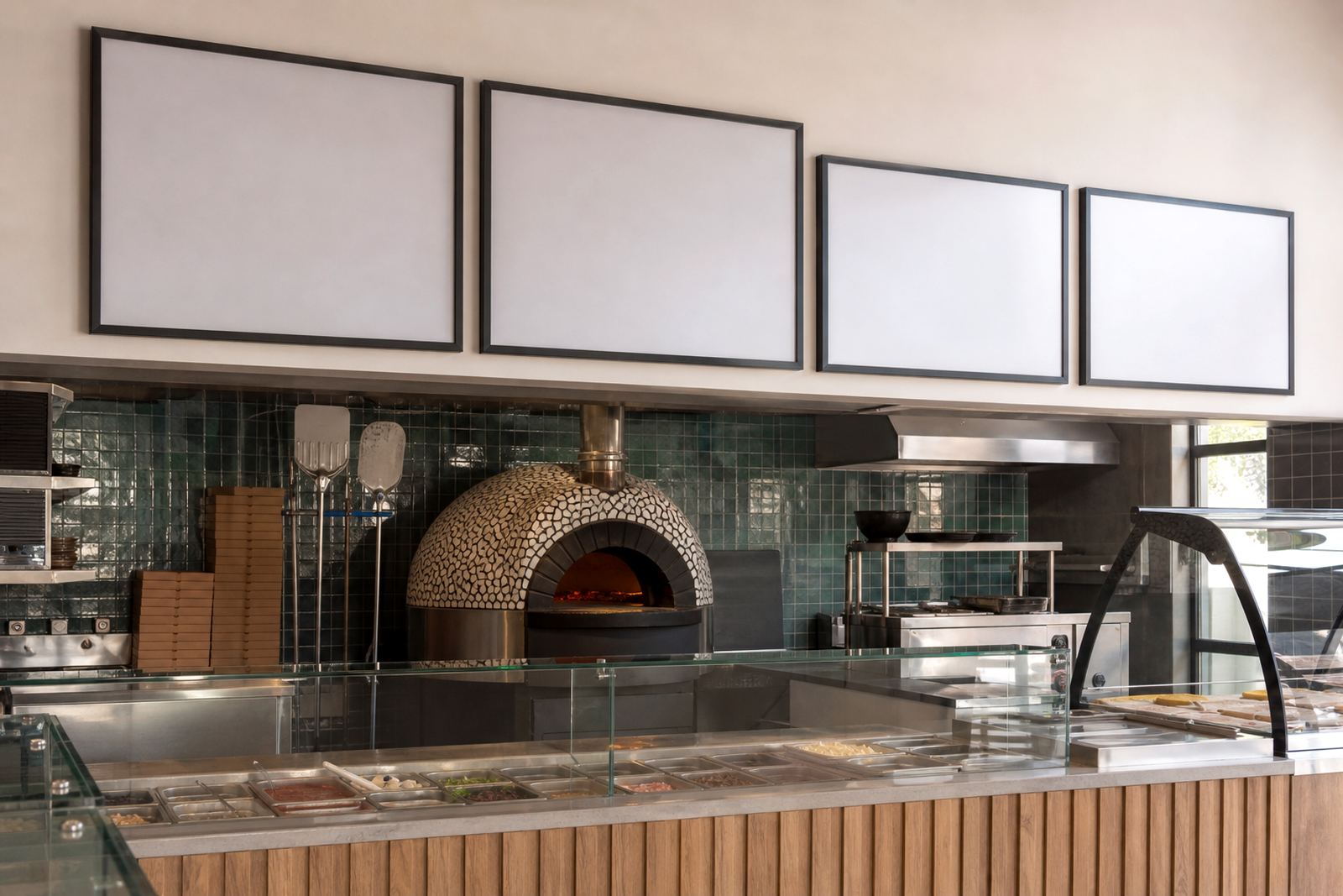
- Wall mounting for fixed menu points
- A-frame stand for entry placement
- Low-glare covers for brighter corners
- Suitable for wall and window facing positions
Printing, proofing and finish control
The print file set went through proofing before production so the spacing, spelling and menu order could be checked against the final insert sizes. Once approved, we moved into printing, trimming and finishing with care around edges and corners. The lounge wanted a cleaner presentation than a basic laminated sheet, so the final handling had to stay sharp.
Colour matching was kept practical rather than decorative. The blacks stayed deep, the text held its contrast and the menu headings remained easy to scan in a dim room. That mattered because a lounge menu is often read in short glances, not studied at length. The finished boards needed to work in that rhythm.
- Proofing before print release
- Laminated menu prints for extra handling strength
- Clean trimming for frame insertion
- Colour matching across repeated menu pages
Courier packing from Paarden Eiland
The job was run from our Paarden Eiland team in Cape Town, with packing set up for safe courier movement to the Newlands site. Frames were wrapped to protect the corners, inserts were stacked flat and the finished set was marked so the client could place each menu in the right position without confusion.
The order moved through the workshop over about three weeks from layout to dispatch, with the work split across planning, print, finishing and courier packaging. That kind of schedule suits fit-outs where the room is ready but the final display still needs to be ordered properly. It also keeps the printed pieces from arriving bent, marked or mixed up.
- Courier packaging prepared for national delivery
- Corner protection for snap frames
- Flat packing for inserts and boards
- Dispatch arranged for Cape Town and beyond
What held together on the finished wall
Once installed, the lounge had a menu system that looked quieter and worked faster for staff. Inserts could be changed in seconds, and the darker frame finish sat naturally against the room's interior palette. The low-glare covers meant the boards stayed legible under mixed lighting, which was the part that mattered most in the space.
For a venue like this, the biggest gain was not flash, it was control. The menu displays looked finished, the information stayed readable and the service team could update items without tools. The client left with a cleaner front-of-house presentation and a set-up that could keep pace with menu changes through the week.
- Cleaner front-of-house presentation
- Tool-free menu changes
- Better visibility in low light
- Layout suited to a lounge service menu