A small front counter with a busy rhythm
The brief came from a takeaway counter in Gardens, Cape Town where the front of house space had to do a lot of work in a very small area. Staff needed a clear queue line, a visible collection point and menu panels that could be updated when items sold out or new specials moved in for the day.
The counter faced steady pedestrian traffic and the client wanted the menu message to stay legible from a short distance, especially when people were waiting to order. We worked with standard insert sizes so the team could keep artwork practical, print on ordinary sheet sizes and avoid custom cutting for every change.
- Queue-line boards for ordering flow
- Collection-point frame for takeaway handover
- A4 and A3 snap frame formats for fast insert changes
- Anti-glare covers for brighter front windows
What the setup had to handle in Gardens
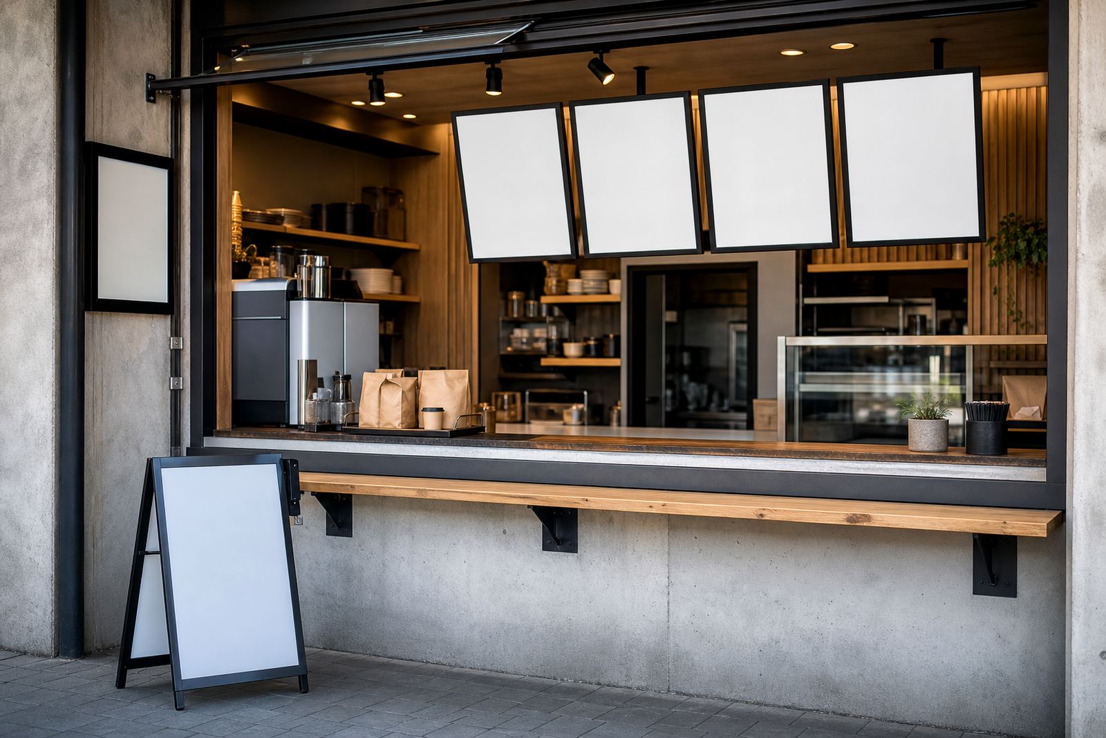
The site had a narrow service edge, so the display range needed to stay neat and not crowd the counter. Wall mounting was preferred for the main menu points, while one freestanding piece was used near the collection area where customers naturally paused. The layout had to read well at eye level and hold up to regular wiping, fingerprints and the humidity that rolls in from the coast.
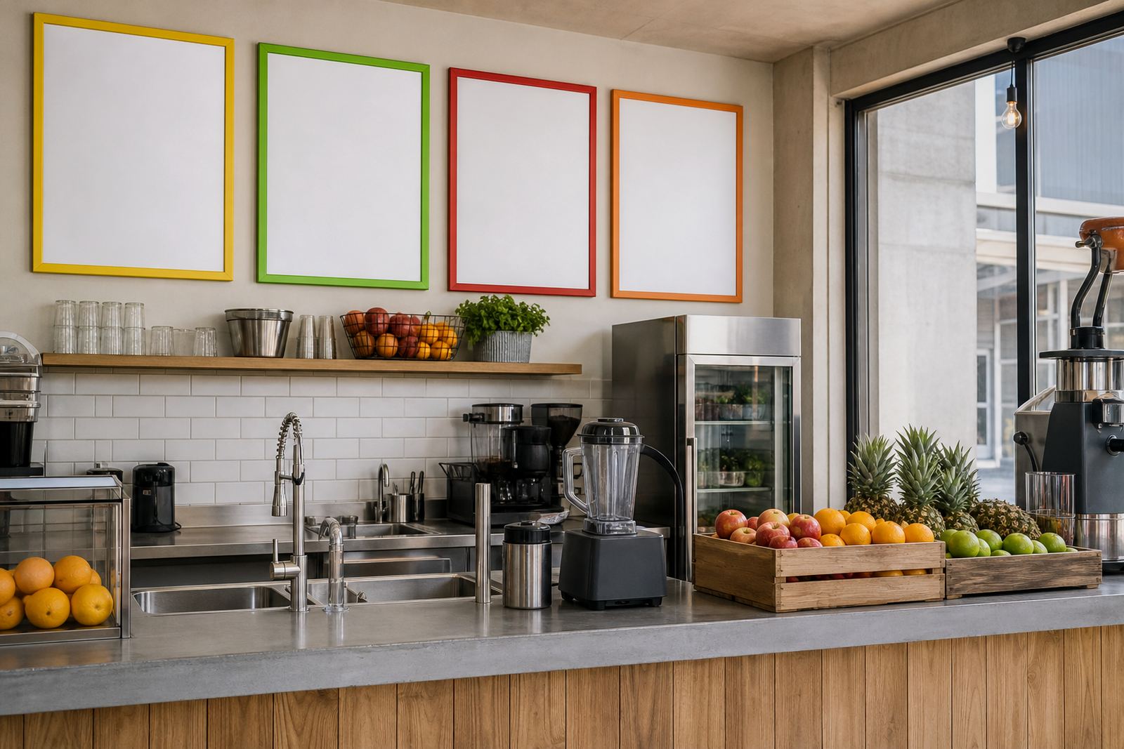
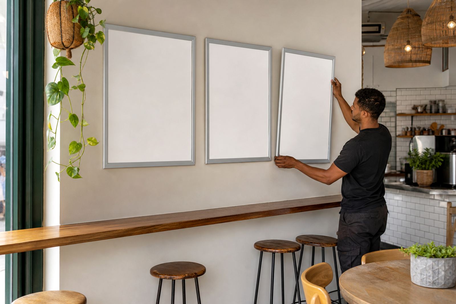
There was also a practical print issue. The kitchen wanted room for price changes, item swaps and small notes without redoing the whole menu board. That pushed the job toward snap frames with aluminium profiles, because the inserts can be changed without tools and the outer frame keeps the line tidy against tiles, painted walls or glass.
- Aluminium snap profiles for quick insert changes
- Wall and window mounting options where needed
- Clear covers chosen for better legibility under mixed light
- Sizes kept to common print formats for easy reprints
Frames, inserts and board sizes supplied
We supplied a mix of A4 and A3 menu frames, plus a collection-point display sized to stand out without taking over the counter. The board set included a combination of snap frames and a simple A-frame stand for floor placement where a queue line needed a stronger visual cue. For the menu art, we set up print-ready templates and resized existing content into standard ratios so the final sheets would sit straight inside the frames.
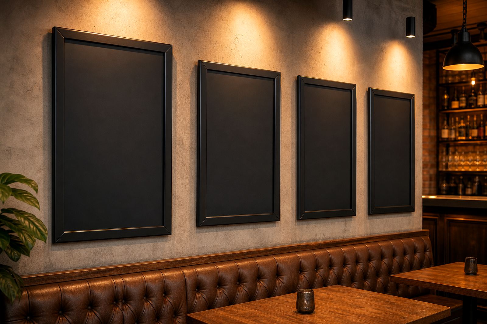
Short run printing was used for the first batch of inserts, with laminated menu prints for areas that would be handled more often. Where the client wanted a softer handwritten look for specials, chalkboard-style panels were used alongside the printed inserts. That gave the counter a practical blend of fixed information and changeable notices.
- A4 snap frames for specials and shorter notices
- A3 snap frames for fuller menu groups
- A-frame stand for queue guidance and collection calls
- Chalkboard panels for daily items and quick pricing changes
Keeping the menu easy to change
The main ask was speed at the counter, not a fancy display. Staff needed to open the frame, slide in a fresh insert and close it again without hunting for tools or loose clips. We set the menu artwork to standard sizes and checked the margins so no vital wording would sit too close to the frame lip. The result was a cleaner presentation, with less wasted paper and fewer awkward trims.
We also matched the finish to the indoor light in the store. Anti-glare covers helped cut reflections from the front glass and overhead fittings, which mattered where people stand at different angles while ordering. The collection-point frame was kept bold and direct, so customers could see where to wait or collect without asking twice.
- Menu resizing for existing artwork and new specials
- Typesetting for clear prices and item descriptions
- Proofing before print to catch spacing issues
- Colour matching to keep branding consistent across inserts
Timeline, delivery and fitting on site
The job moved in a short production window over two weeks. In the first week we finalised sizes, templates and print layout. In the second week we completed printing, finishing and courier packaging for delivery to the Cape Town site. The frames were prepared for straightforward mounting, with the layout planned so the queue-line boards and collection frame would not block the service hatch or the payment point.
Because the setup was going into a takeaway counter rather than a restaurant dining room, every panel had to earn its place. We kept the footprint tight and made sure the signs did not fight with the menu board. The finished arrangement gave the counter a more ordered feel and made the menu changes easier to manage during a normal trading day.
What worked on the counter, and what we would keep
The strongest part of this project was the balance between fixed structure and flexible content. The snap frames handled the main menu areas, the A-frame stand guided the queue, and the collection-point frame helped the front counter read clearly from the entrance. The client could swap inserts without changing hardware, which keeps the setup practical when specials move or prices shift.
If we were repeating a similar job in another takeaway space, we would keep the same approach: standard sizes first, then a small number of special-format boards where the customer flow needs extra direction. In a compact space, that mix usually gives better order than trying to use too many different signs at once.
- Clearer queue direction near the counter
- Faster insert changes for specials and sold-out items
- Cleaner presentation around the collection point
- Less visual clutter across the service area