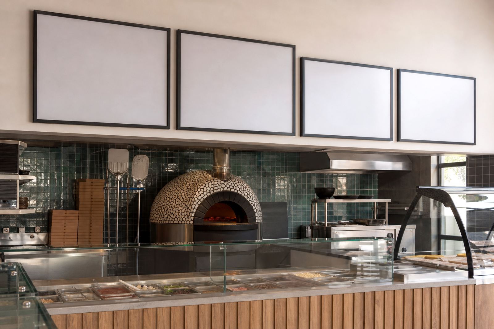
A tight counter needed a cleaner menu rhythm
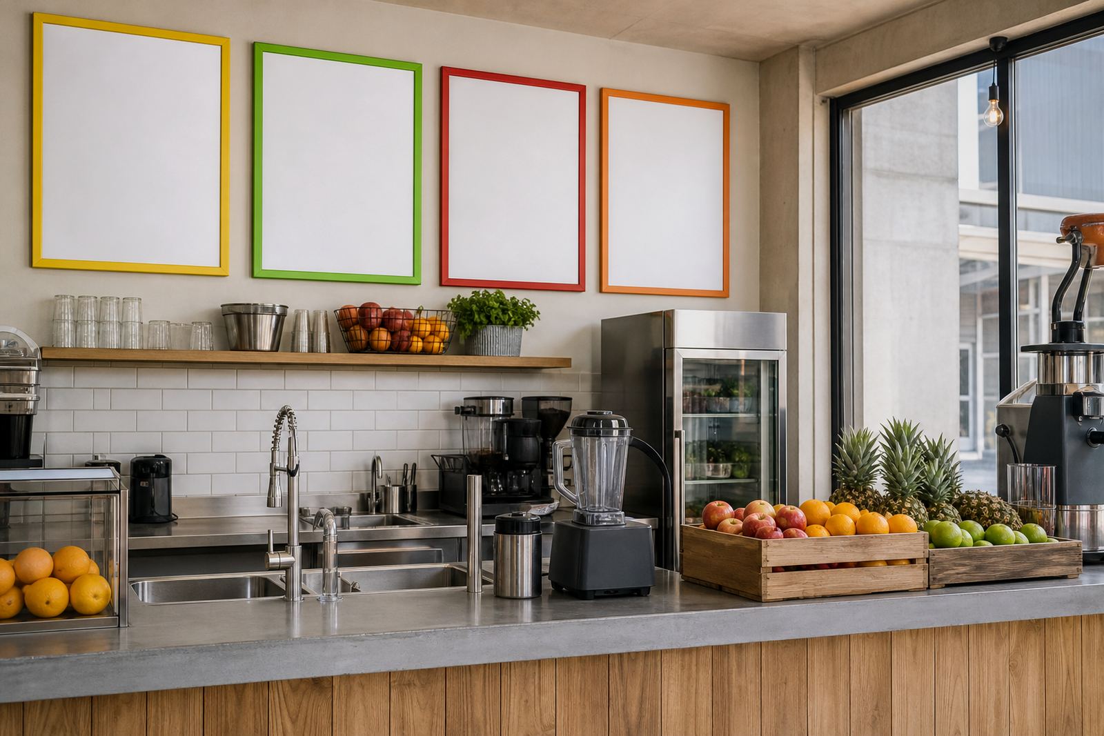
The brief came from a small hospitality counter in Observatory where the team sells smoothies, boosters and add-ons all day. The menu had to work at eye level, keep the counter free for blending and payment, and still carry enough colour to match the shop’s lively service style.
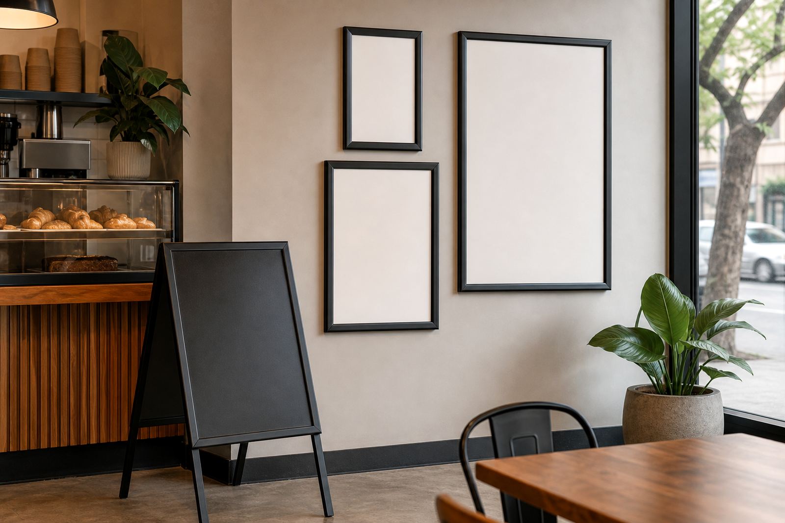
The old setup asked staff to point, explain and repeat prices through a busy shift. That is rarely a good fit in a narrow service area. We proposed snap menu frames for the wall, a board for window-facing visibility and a compact A-frame for the pavement edge when the weather allowed it.
- Site: Observatory, Cape Town
- Use case: smoothies, bowls, add-ons and short specials
- Space constraint: small front counter with limited wall depth
Menu parts that could be changed without tools
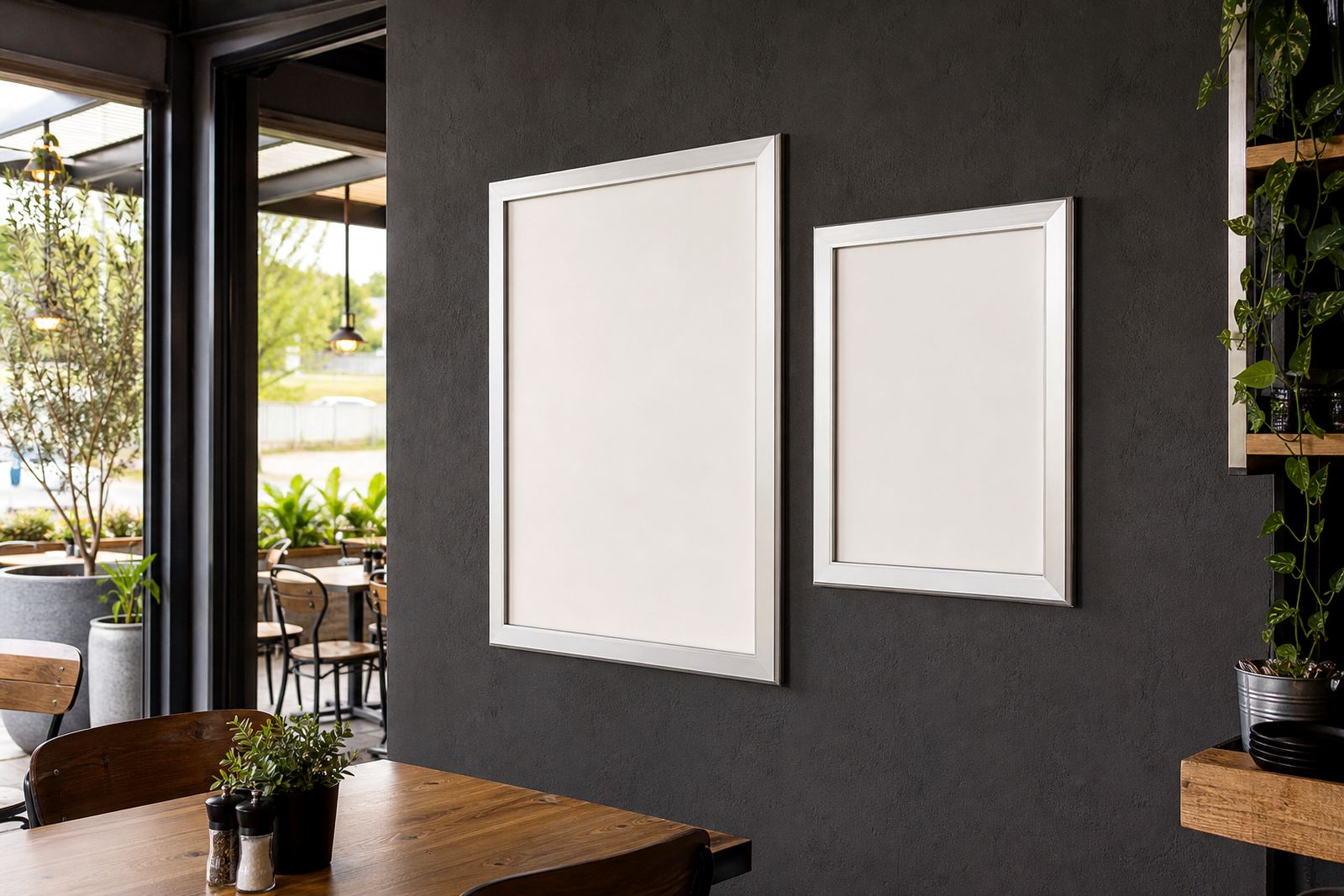
The menu system used aluminium snap frames with spring edges, so printed inserts could be swapped without removing the frame from the wall. That suited a list with seasonal fruit, price changes and rotating extras. We supplied A4 and A3 insert options, then matched each board size to the viewing distance inside the shop.
For the window side, we used anti-glare covers so afternoon light would not wash out the text. The frame faces stayed clean and the printed blocks remained easy to read even with reflections from glass and tiled walls. Where the team wanted a softer look, we paired the frames with a chalkboard section for a short specials line and a handwritten feel.
- A4 and A3 snap frame formats
- Anti-glare front covers for brighter interiors
- Wall mounting for the main menu line
- Window-facing placement for passers-by
Print files built for quick menu changes
The layout work focused on clarity first. Smoothie names, sizes and add-ons were grouped so the eye could move across the board without stopping at every line. We prepared print-ready templates, then adjusted the type size so smaller items still held up at a normal standing distance. The menu also needed room for short seasonal notes, but not so much text that the design felt crowded.
We handled menu typesetting, menu resizing and proofing in one flow, then prepared laminated menu prints for the inserts that would be handled most often. The finish was chosen for wipe-down use in a busy drinks environment where spills are part of the day. Colour matching mattered too, because the bar wanted the board to feel fresh and bright rather than flat or overly dark.
- Menu templates set for A4 and A3 output
- Short run printing for test batches and updates
- Laminated menu prints for handling and wipe-down use
- Colour matched artwork for consistent tones across the set
A-frame placement for foot traffic outside
The front edge of the shop needed a sign that could greet walkers without blocking the doorway. We supplied an A-frame menu stand sized for short daily messages and takeaway specials. It gave the team a place for a simple offer, while the main wall board carried the full menu. That split matters in a small premises, because one board does not have to do every job at once.
The A-frame also needed packaging that would hold up in courier transport. We prepared the stand and inserts for nationwide delivery, with protective packing around the print faces and frame corners. For a site in Cape Town that may need menus sent to another branch or replaced after a season change, that matters more than people think.
- A-frame stand for pavement use
- Courier packaging prepared for national delivery
- Menus packed for Cape Town, Stellenbosch, Johannesburg, Durban and Gqeberha
- Useful for temporary specials and takeaway offers
What the team carried from brief to install
The job moved through design, proofing, print finishing and final handover in a short two week span. The production side handled the inserts, while installations prepared the frames for clean placement on the wall and in the window zone. The result was a set of boards that made the counter feel calmer and gave staff fewer points of explanation during a rush.
Observatory has plenty of foot traffic and plenty of passing opinions too, so the menu had to read well from a quick glance. After the install, the client had a clearer route for daily specials, smoother menu swaps and a cleaner front-of-house look. The big gain was not just the colour, it was the order that came with it.
- Turnaround: 2 weeks from layout to install-ready set
- Main outcome: clearer product grouping and faster menu swaps
- Layout focus: small footprint, readable text, stronger colour blocks
What we would use again on a similar juice counter
We would keep the structure of a wall frame, a window-visible panel and a small A-frame, because that mix gives a busy counter room to breathe. The board system lets the team update one insert without rebuilding the whole menu, and that keeps day-to-day changes practical. For drinks bars, cafes and takeaway counters, the best menu plan is often the one that reduces the amount of talking needed at the till.
We would also keep the print split between main menu content and short promotion lines. The main board can stay steady, while the smaller board handles specials, price changes and seasonal fruit. That balance suited this Observatory site and would suit many other compact service counters across South Africa.
- Keep a stable main menu and separate specials board
- Use snap frames for simple future insert changes
- Reserve chalkboard space for short rotating offers
Key facts
| Project | Observatory Juice Bar |
|---|---|
| Town | Observatory, Cape Town |
| Products | Snap menu frames, wall menu boards, A-frame menu stand |
| Sizes | A4 and A3 insert formats |
| Finishes | Anti-glare covers, laminated prints, print finishing |
| Delivery | Nationwide courier packaging across South Africa |