Counter-side board for a fast pizza line
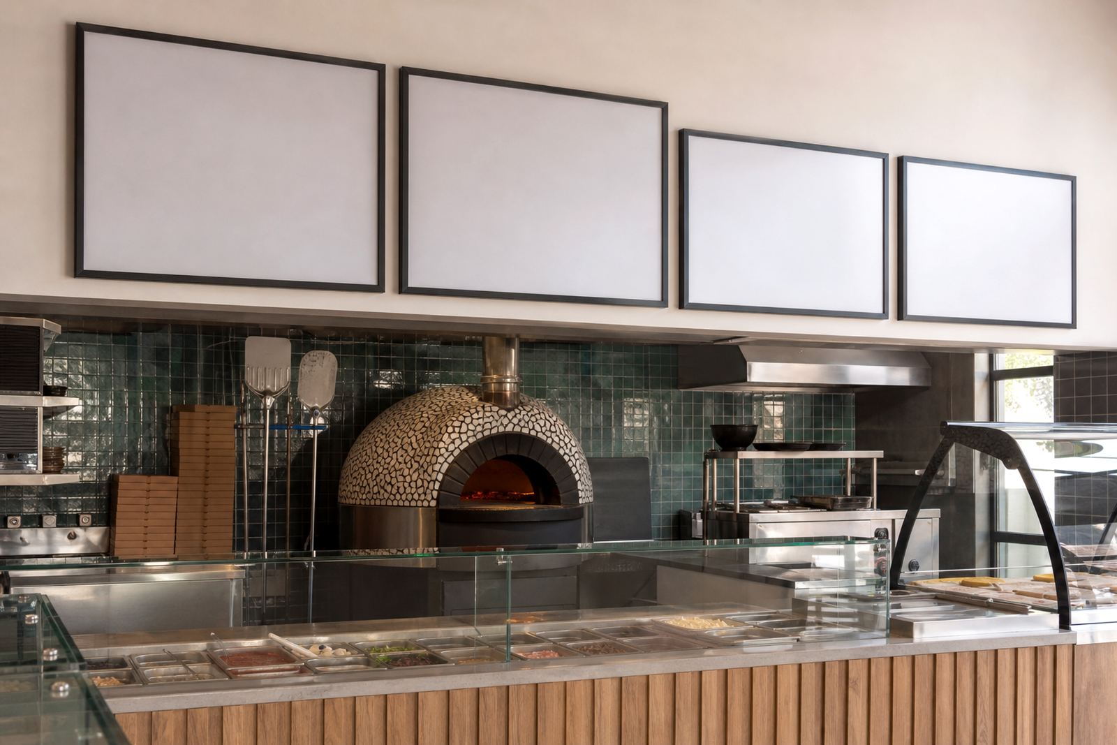
The brief came from a pizzeria in Claremont, Cape Town, where the order point is tight and the menu sits above the till line. The team wanted one board for core pizzas, another strip for specials, and a layout that kept the eye moving from top to bottom without crowding the most ordered items.
We kept the structure plain and practical. The main price panel was set for quick reading at a short distance, while the specials section used a lighter split so new toppings could move in and out without resetting the full board each time. That matters in a busy service area where the counter shifts from quiet to packed in a few minutes.
- Wall-mounted snap frames in A3 and A4 sizes
- Aluminium frame profile for repeated insert changes
- Anti-glare cover sheets for direct indoor light
- Artwork arranged around pizzas, sides and specials
The space asked for clear edges and no clutter
The counter wall had limited depth and needed a clean face, not a heavy sign with loose corners or extra fittings showing. We worked with a board layout that sat flat against the wall and kept the outer edges tidy, which helped the menu feel part of the room instead of bolted on as an afterthought.
Because the shop serves both dine-in and takeaway trade, the design had to read well from standing height and from the queue line. We used larger headings for pizza categories, tighter copy for add-ons and a bolder price line where the eye naturally lands first. That kept the menu useful when the room was full and people were deciding quickly.
- Face-size planned for standing customers at the counter
- Window and wall mounting options were kept in the build plan
- Menu type was set to hold short descriptions and pricing neatly
- Colour matching kept the printed inserts consistent across sections
What we supplied for the wall menu
We produced a snap-frame menu board set with printed inserts sized for easy swaps. The frame profile allowed the front section to open, so the shop team could replace specials without removing the whole unit. For a pizzeria, that means topping changes, lunch deals and seasonal offers can move in and out cleanly, without tools or loose clips on the counter.
The insert set included menu printing at A3 for the main board and A4 for smaller notice areas. We also prepared a proof stage so the client could check spelling, spacing and price alignment before print finishing. The final pack was wrapped for courier transport with corner protection so the frame and printed sheets stayed flat on the way out of Cape Town.
- A3 menu insert for core pizzas and mains
- A4 inserts for specials and add-on notices
- Laminated menu prints for better handling at the counter
- Courier packaging for national delivery from Paarden Eiland
Production timing and the working rhythm
The job moved through layout, proofing, print and pack over three working weeks. The first week was spent shaping the board structure and setting the text so the long item names did not fight the price lines. In the second week we prepared the artwork for print and checked the inserts against the frame sizes. The final stretch covered finishing, packing and delivery handover.
That rhythm suited the shop because the menu needed to stay live during trading hours. A pizza counter cannot wait around for a loose layout or a frame that makes the staff wrestle with each insert. The board had to feel familiar from day one, with enough margin around the text to keep it legible under ordinary indoor light.
- Week 1: layout planning and menu structure
- Week 2: proofing, type setting and print preparation
- Week 3: finishing, packing and dispatch
How the board changed the counter flow
The finished board gave the team a cleaner way to present pizzas, sides and specials above the till. Customers could scan the key items faster and staff had fewer interruptions from people asking for the same prices twice. The board also helped keep the menu language consistent, which matters when specials change but the base offering stays the same.
Because the inserts can be swapped without stripping the frame, the shop is better set up for weekday changes and weekend runs. A pizzeria in Claremont gets a steady mix of regulars and walk-ins, so the board has to stay readable, tidy and simple to update. The result was a menu wall that worked with the room rather than competing with it.
- Faster visual reading above the order point
- Cleaner updates for specials and new items
- Less clutter around the counter face
- Consistent presentation across all printed sections
What we would keep in a similar board build
We would keep the same split between strong headings and compact item lines, because that balance works well when service is busy. We would also keep the anti-glare cover and the snap-frame format, since both help in a bright counter area where people stand at different angles and do not always read straight on.
For another pizza counter or takeaway board, we would still plan the design around the distance between the customer and the menu. That distance shapes everything from font size to panel height. A board that looks neat on a screen can fail at the till if the text is too tight or the prices sit too low.
- Keep headings short and bold
- Use insert sizes that match the frame exactly
- Leave space for specials that change often
- Set the board for real counter height, not a flat mock-up
Key facts
| Project | Claremont Pizzeria |
|---|---|
| Location | Claremont, Cape Town |
| Product | Wall menu board with snap frames |
| Frame sizes | A3 and A4 |
| Materials | Aluminium profile with anti-glare cover sheets |
| Delivery | Courier packaging for nationwide delivery |
| Timeline | 3 working weeks |
| Use case | Pizzas, specials and takeaway pricing above a fast-moving order counter |