A bakery wall list that could change with the tray
The brief came from a bakery in Paarl with a busy front counter and a wall that already carried too much information. The owner wanted a cleaner way to show bread, pastry and coffee items, while keeping the price list readable from the queue and near the till. The menu also had to suit early-morning service, where staff move quickly and cannot spend time loosening screws or changing whole boards.
We worked around three practical points. The first was readability at a glance, because customers stand at different distances in the shop. The second was keeping the boards neat when items change during the day. The third was fitting the menu into the bakery's existing wall space without crowding shelves, lights or product displays.
The frame sizes and finishes that made sense
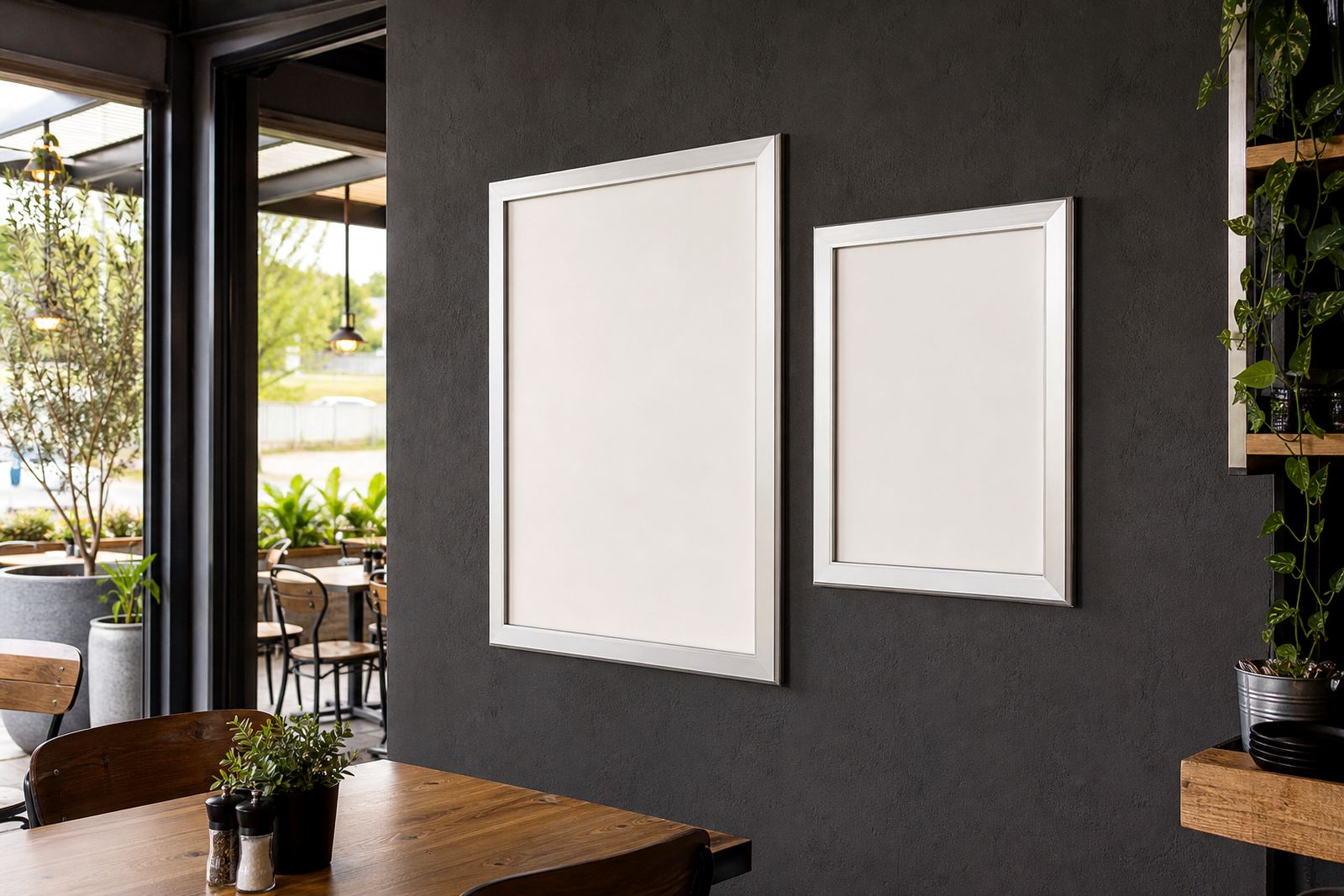
We supplied A4 and A3 snap frames with aluminium profiles and anti-glare covers, chosen for their clean edge and easy insert changes. The larger headings went into A3 frames so specials and section titles held their place, while the smaller item lists sat in A4 frames where detail mattered more than size. On the wall, the frames gave the bakery a straight line of pricing and product names that stayed tidy through a long service period.
- A4 frames for detailed lists, drinks and smaller section blocks
- A3 frames for main headings and broad price groupings
- Anti-glare covers to cut down reflection near the front windows
- Aluminium profiles for a light but firm finish on the wall
The menu print work was set up for easy swapping later on, so the bakery could move prices or items without redoing the whole wall. That mattered because the list changed often enough to make fixed boards awkward. The inserts were sized to suit the frames properly, with margins kept sensible and text spacing adjusted for a quick read.
How the coffee board and bread list were arranged
The bakery wanted the wall board to feel ordered, not packed. We split the menu into clear blocks for breads, pastries and coffee, then matched the layout to the way customers order. Bread names sat together in one part of the board, pastries in another, and coffee options were grouped so the eye could move naturally from food to drink. That kept the wall useful for both the counter team and the people in the queue.
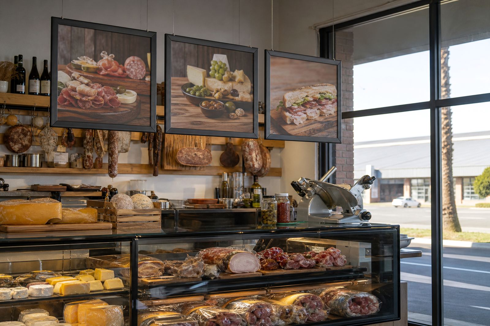
For the busiest section we used a combination of menu boards and poster insert printing, which gave the shop a cleaner surface than handwritten notices. A few chalkboard-style notes were kept for daily specials where the bakery needed a soft, informal look. Those areas were left easy to update, but the main pricing stayed in printed form so it did not shift from day to day.
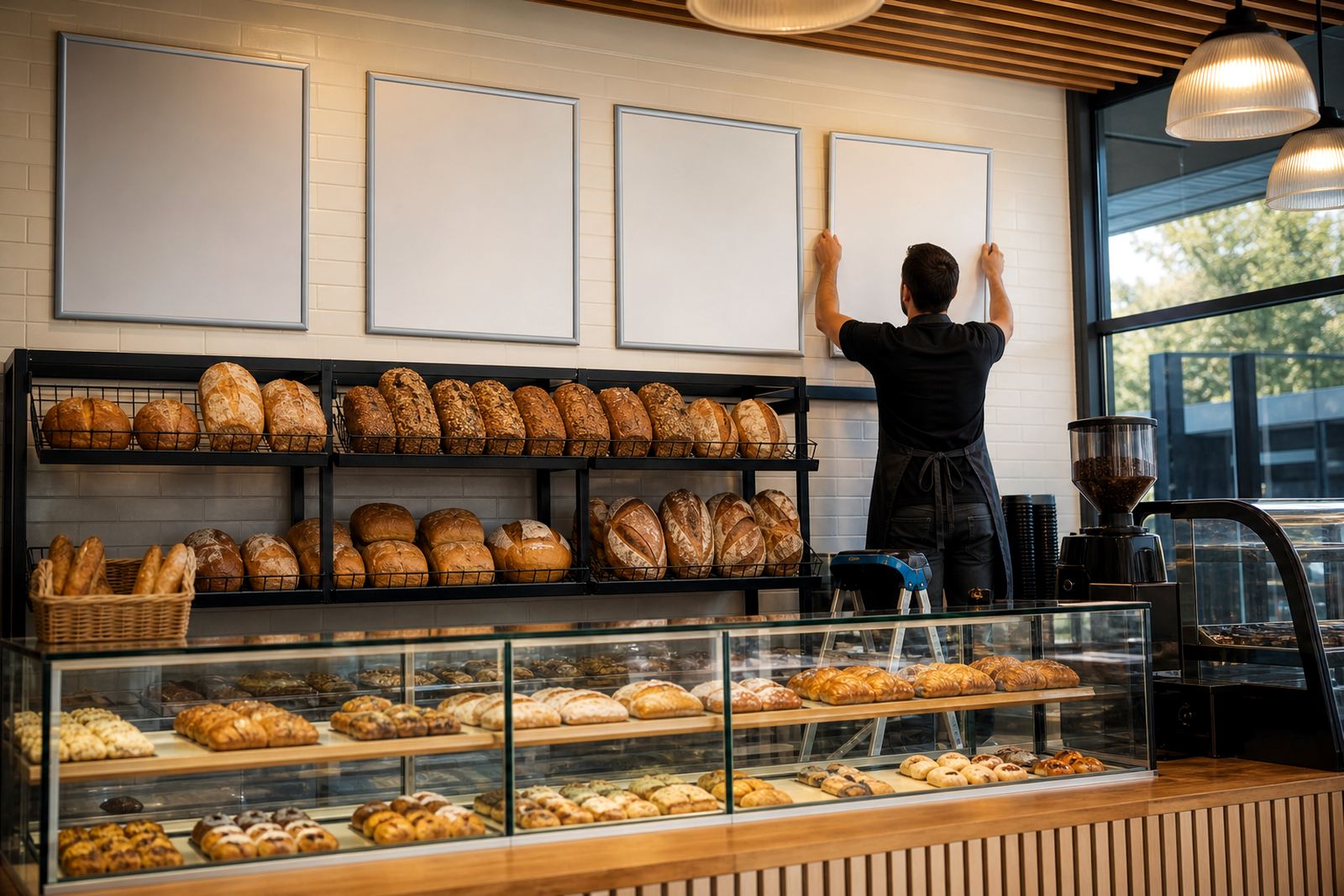
- Wall-mounted frames near the service counter
- Window-facing panels where the afternoon light was stronger
- Printed inserts for fixed price lists
- Writable boards for short daily notes and specials
Proofing, resizing and the small checks that saved time
The supplied artwork was checked, resized and proofed so the text held together across the different frame sizes. Menu resizing was important here because a bakery list can get cramped fast, especially when there are multiple loaf sizes, pastry names and coffee variants to fit. We adjusted line breaks, spacing and heading weight so the board stayed readable without feeling bare.
Colour matching was also handled with care. The bakery wanted a warm look that sat well beside timber shelving and neutral wall paint, but not a glossy finish that would fight the lighting. The laminated menu prints were finished to protect against everyday handling, which helps in a shop where staff are touching the same boards all morning and wiping down counters as they go.
A short run was enough for this job. The bakery did not need a large print batch, only the right mix of frames, inserts and board pieces to cover the main menu zones. That made the project practical for the space and easier to fine tune before everything went on the wall.
Courier packing from Paarden Eiland to Paarl
The job was produced in Paarden Eiland, Cape Town and packed for courier delivery to Paarl. The boards and frames were wrapped so the covers and corners stayed protected in transit, with insert sets kept together by section so the bakery team could unpack and place them in order. Courier packaging matters on this kind of work because a bent frame or scratched cover shows up straight away on a front-of-house wall.
For the bakery, the delivery had to arrive in a usable condition, with the menu sections separated clearly enough for the team to install without confusion. The work moved from print to packing in a sequence that kept the inserts matched to their frames. That saved time on site and reduced the chance of a bread list ending up in a coffee slot, which is exactly the sort of mix-up that slows a morning service.
- Courier packaging prepared for frame corners and covers
- Print sets kept in section order for quick unpacking
- Wall and window items packed together by location
- Insert packs marked for breads, pastries and coffee
What the menu wall changed for the counter team
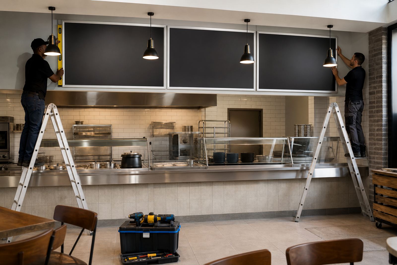
Once the boards were in place, the front counter felt more settled. Staff had a cleaner wall to point to, customers could read the main items without leaning forward, and the prices no longer depended on handwritten sheets that had to be adjusted through the day. The bakery also gained a more consistent look between the wall, the window and the counter area, which helped the shop feel organised during early trade.
The biggest practical gain was speed at the point of service. When a bread line or coffee option changed, the insert could be swapped without tools. That kept the menu current without making the wall look patched together. For a bakery with active mornings and a steady flow of customers, that kind of flexibility is worth a lot more than a decorative board that stays fixed but goes out of date too quickly.
If we handled a similar bakery wall project again, we would keep the same split between A3 headings, A4 detail frames and a few writable board points for specials. That balance gave the team enough structure for the busy items and enough freedom for the changing ones, which is usually where these counters work best.
Key facts
| Project | Paarl bakery wall menu boards and frame inserts |
|---|---|
| Town | Paarl |
| Products supplied | A4 snap frames, A3 snap frames, menu boards, A-frame stand elements |
| Print sizes | A4 and A3 menu inserts |
| Finish | Aluminium profiles, anti-glare covers, laminated prints |
| Delivery | Courier packaging and nationwide delivery from Paarden Eiland, Cape Town |