A lunch line that changed more than once a week
The client runs a staff canteen in Bellville with a steady lunch rush and a short counter line. Their printed menus were being replaced often, but the old boards were slow to update and looked tired after a few cycles. The brief was direct: keep the menu easy to read, keep the wall clear, and make the daily swap faster for the person working the counter.
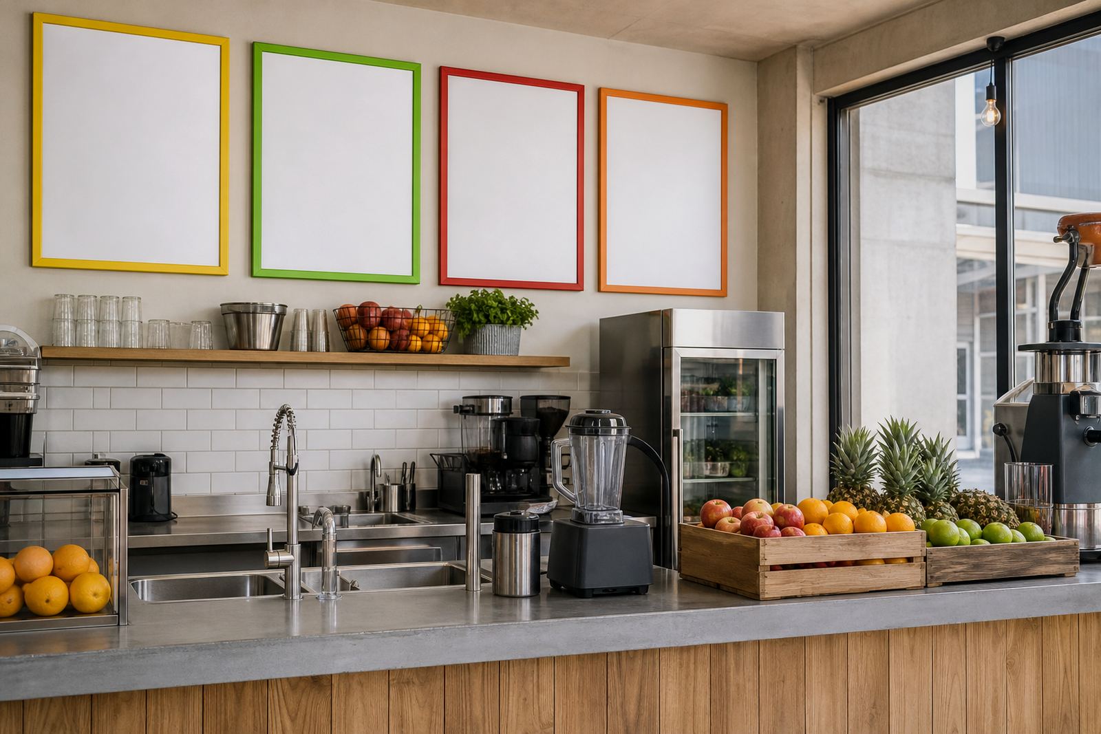
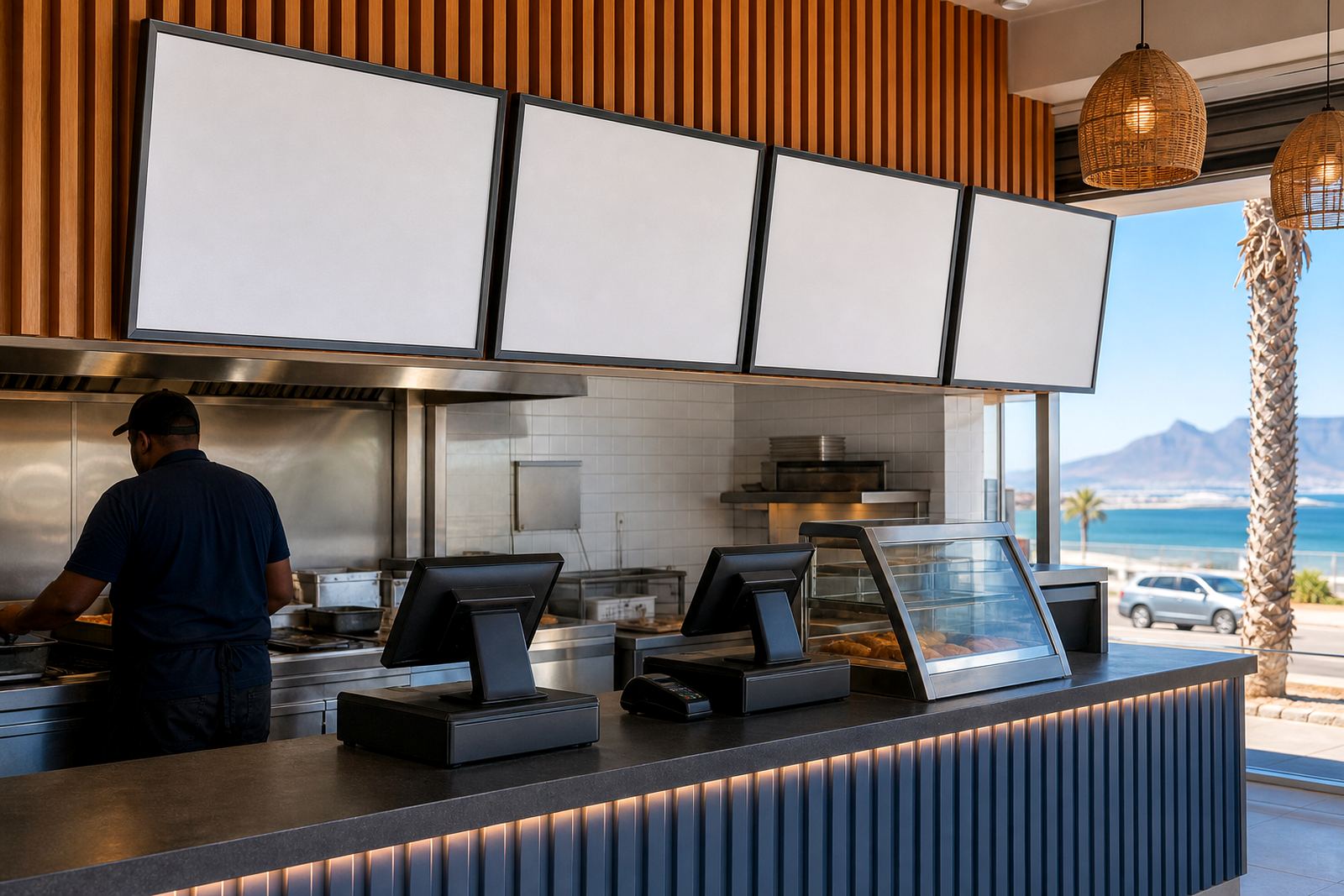
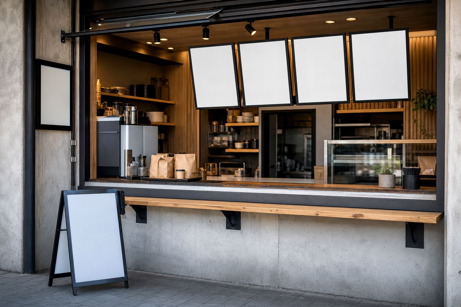
The room had limited wall space beside the service hatch, so the layout had to work in a narrow run rather than spread across one wide panel. We planned grouped menu boards in a neat row, with the larger meals at eye level and the smaller notice areas set lower down. That gave the staff a cleaner way to separate plated meals, add-ons, and drinks without cramming everything into one board.
Because the canteen serves a mixed staff crowd, the reading distance mattered. We kept the headings bold and the body copy spaced well apart, with enough white space to avoid a busy feel. The aim was plain enough: a board people can read while they queue, not after they have already moved past the hatch.
Frames, inserts and mounting that suited the wall
We supplied aluminium snap frames in A4 and A3 sizes, with anti-glare covers for indoor light and busy foot traffic. The wall boards were fixed in a grouped pattern so the menu could be split by section instead of pushed into one long list. That helped the staff keep specials, mains and sides in their own place.
For the daily inserts, we prepared print-ready layouts that matched the frame sizes and allowed for tidy crop lines. The menu boards were set up for quick opening and closing, so the printed sheet could be changed without removing the whole frame from the wall. In a canteen where meal options shift through the week, that matters more than people expect.
- A4 snap frames for smaller notices and price lines
- A3 snap frames for the main lunch board
- Anti-glare front covers for clearer indoor reading
- Wall mounting arranged to suit the hatch and queue flow
The finish was kept plain and practical, with no decorative clutter around the menu area. Stainless-looking trim would have drawn attention away from the food list, so we chose a clean aluminium profile that sits neatly against painted walls.
How the Bellville layout was set out
The canteen needed the menu to sit above a counter that already had handover traffic, drinks and serving trays in the same zone. We worked around those fixed points and measured the wall so the boards would not interfere with service or cleaning. The final layout used a central A3 section for the main meal options, with A4 frames placed to either side for notices, extras and price updates.
We also allowed space for easy future changes. The team can move a board section if the menu expands, and the system still keeps the same visual order. That flexibility is useful in a canteen where roast day, curry day and lighter meal choices all need different amounts of space.
- Grouped wall line that stays readable from the queue
- Balanced spacing for the main meal list and side notes
- Room left for future item changes without a full redesign
- Surfaces arranged so the wall could still be cleaned quickly
The wall itself had minor uneven points, nothing dramatic, but enough to matter when frames are lined up in a row. We made sure the set-out followed the real wall rather than forcing a perfect graphic grid onto an imperfect surface. That kept the install neat and avoided awkward gaps.
Print preparation and the meal list changes
The printed inserts were built for regular updates, with menu titles, price lines and item descriptions arranged for quick reading. We kept the text blocks short so staff could swap in a new lunch special without reworking the full page. The sizes were chosen to suit the wall frames and to avoid waste when only one item changed.
Where needed, we set out poster insert printing for larger notices and laminated menu prints for places where the sheet would be handled more often. The canteen did not need complicated graphics. It needed a menu that looked consistent from one week to the next, even when the food list changed by hand.
For the print sets, we used clear menu typesetting and checked the line breaks so longer dish names did not run into the margins. Small menu details can become messy fast, especially in a narrow board format. We adjusted spacing so the final sheets held their shape and stayed legible under the anti-glare cover.
Three weeks from measure-up to final handover
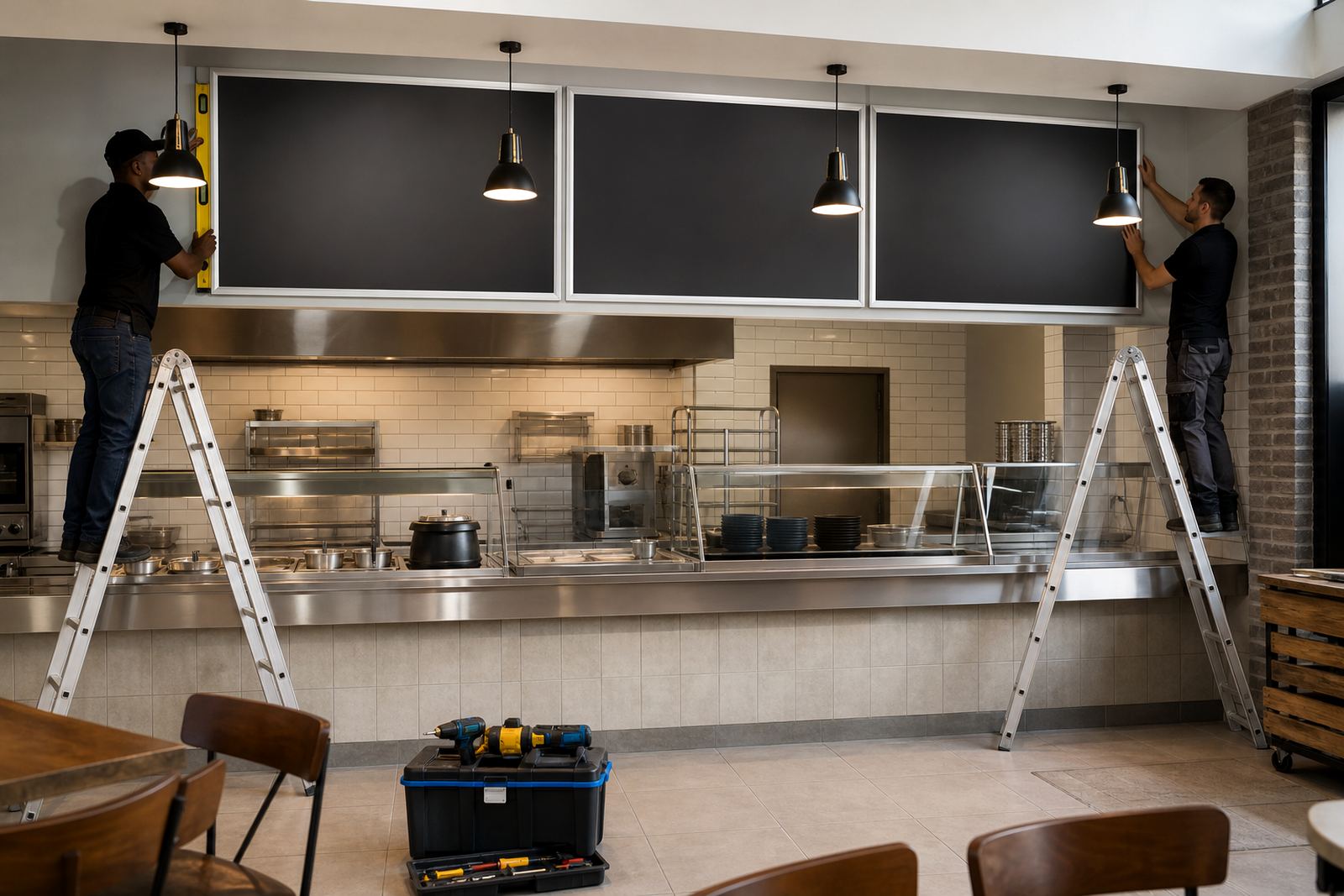
The project ran over three weeks from first measure-up to handover. The first week was spent on site checking the wall, counter position and board heights. In the second week we handled the menu resizing, proofing and print preparation. The third week covered production, packaging and the final wall fit-out in Bellville.
For a canteen that changes menu items regularly, the sequence mattered. A rushed fit would have left the board heights slightly off or the menu spacing too tight. Instead we took the time to line up the sections properly and keep the inserts consistent across the different frame sizes.
- Week 1: measure-up and wall set-out
- Week 2: resizing, proofing and print checks
- Week 3: production, install and final placement
The team on site worked around normal serving hours, so the board positions had to be practical for both staff and cleaners. Once the frames were mounted, the menu area read as one organised run rather than a patchwork of separate signs.
What changed for the canteen team
After the install, the counter area felt less cluttered and the daily menu swap became more straightforward. The staff could lift the frame, replace the insert and close it again without tools. That made short-run changes less awkward, especially when the special changed late in the week or a printed price needed to be corrected.
The grouped boards also helped the room look more settled. Instead of several loose notices pinned around the serving hatch, the canteen now had a fixed menu zone that held the eye. Customers could scan the options faster and the staff had a clear place for notices, meal lists and add-on items.
For a food service space, the result is not about decoration. It is about clarity, speed and keeping the wall useful. The Bellville job did that well, and the frame system still leaves room for fresh inserts, laminated sheets or poster changes as the canteen menu shifts through the seasons.
What we would keep on a similar canteen job
We would set out the same kind of grouped wall line again for a busy canteen with changing meal options. The mix of A3 and A4 frames gave the staff enough structure without overloading the wall. It also kept the menu area easier to read than a single crowded board.
On a similar job, we would keep the inserts short, use the same height for the main headings and allow a little spare space around price lines. That approach helps when the kitchen changes a dish or two and the menu needs a new sheet, not a full rebuild.
We would also keep the wall mounting simple and sturdy, because a service area takes daily handling. A good canteen board should sit square, stay legible and support quick changes without making the team work around it. That is the practical part that matters most.
Key facts
| Project type | Canteen menu board installation |
|---|---|
| Town | Bellville, Cape Town |
| Frame sizes | A4 and A3 snap frames |
| Board style | Grouped wall-mounted menu boards |
| Print finish | Anti-glare covers with insert-ready sheets |
| Timeline | 3 weeks from measure-up to handover |