A counter wall that had to read as one order line
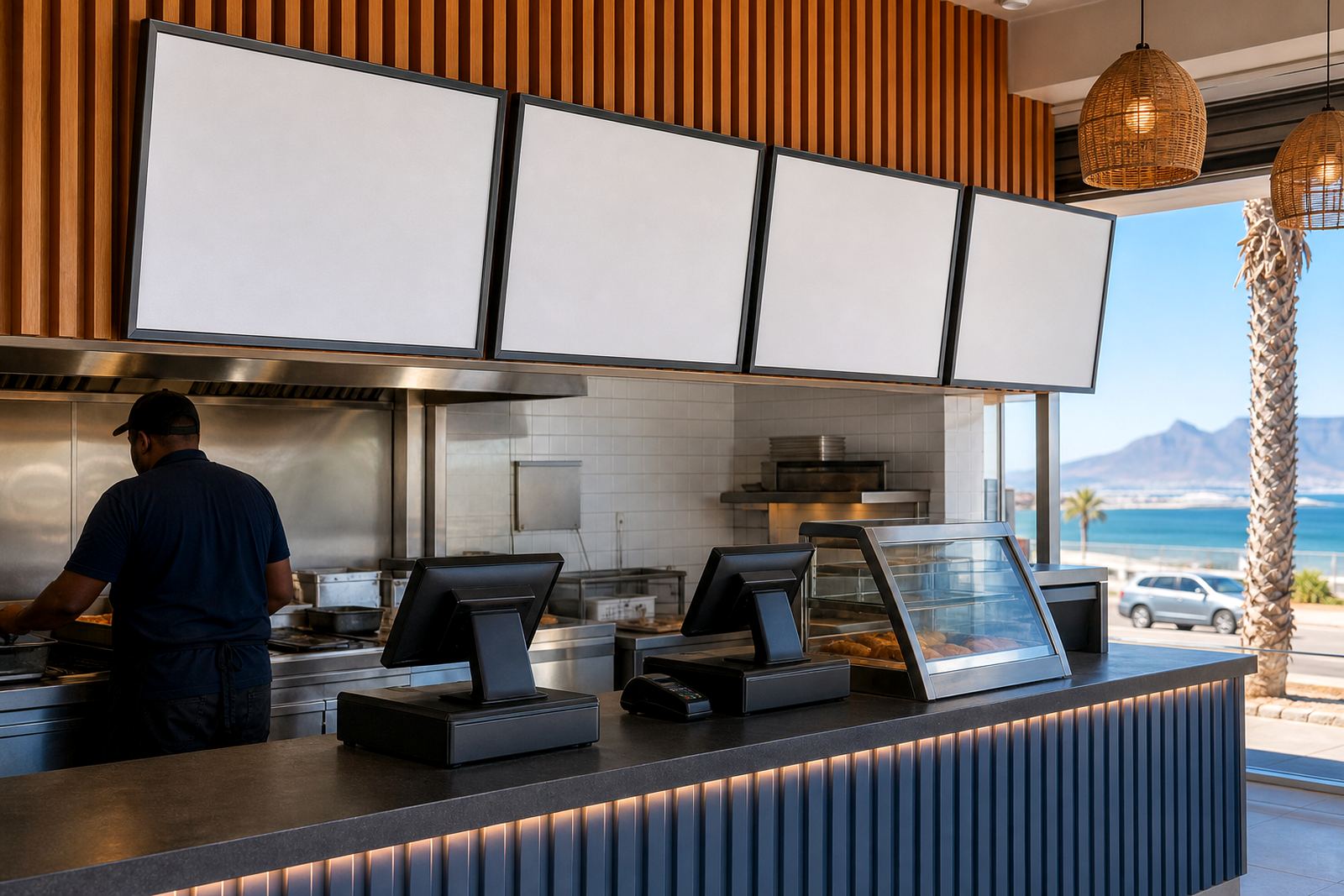
The brief came from a busy burger shop in Blouberg, close to the coast where salt air and damp evenings can leave cheap display fittings looking tired very quickly. The team wanted a set of menu boards that sat neatly above the counter, kept the busiest items close together and made the full order path easier for staff and customers.
The layout had to work as a single run, not a jumble of separate boards. That meant matching frame sizes, even spacing and menu copy that could be read from a normal standing distance at the counter. The shop also needed inserts that could be updated without tools, because specials and combo changes happen often in a food service setting.
- Client type: burger shop counter
- Town: Blouberg, Cape Town
- Display style: aligned menu boards in a counter run
- Change method: snap-open front frames for quick insert swaps
What had to fit the site, not just the wall
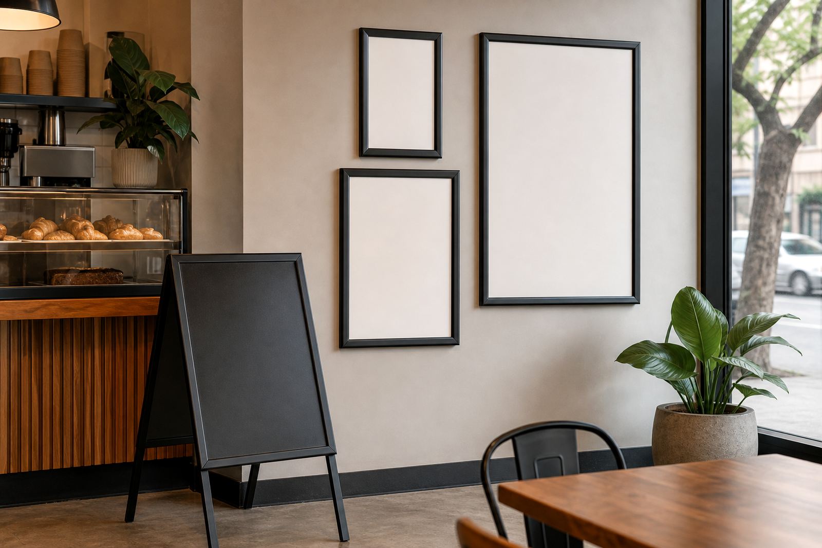
The wall space above the till area was limited, so the boards had to be planned around sightlines, shelving and the customer queue. A3 frames were used for the main items and combo sets, while A4 inserts carried support details and smaller price blocks. That split kept the display readable without crowding the wall.
We also had to allow for window glare and the strong daylight that comes through shopfront glass in the afternoon. Anti-glare covers were specified where the boards sat near the front glazing, and the print layout was prepared with dark text, clear margins and enough white space to keep the board calm at a glance.
- A3 snap frames for main menu sections
- A4 inserts for sides, add-ons and supporting items
- Anti-glare front covers for brighter positions
- Wall mounting planned around the counter height and window line
Frames, inserts and mounting details
The main hardware was a set of aluminium snap menu frames, chosen for a clean edge and a front-opening profile that makes menu changes straightforward. The profiles were finished to suit an indoor food counter, with backing boards cut for the insert sizes and tidy corners that sit neatly in a commercial interior. For the customer-facing run, the frames were aligned as a straight line so each section felt connected.
We supplied the printed inserts in the correct sizes, trimmed to match the frame opening and packed for the site fitment. Where the shop wanted a more relaxed specials area, we added a chalkboard section that could carry handwritten notes and price changes between print runs. The result was a mix of permanent structure and flexible content, which suits a takeaway counter that changes often.
- Aluminium snap frames in A4 and A3 sizes
- Printed inserts trimmed to fit the frame opening
- Wall and window mounting options included in the plan
- Chalkboard section for specials and rotating notes
Print setup and menu layout work
The menu copy was typeset so the burger range sat in a clear order from top to bottom. Combos were grouped with the main burgers, then sides, drinks and extras followed in a cleaner sequence. That helped the counter team guide customers without having to scan across unrelated items. Menu printing sizes were checked against the frame openings before final output, which kept borders even and text aligned.
We also handled menu proofing and colour matching so the printed inserts stayed consistent across the whole board set. A burger menu can look noisy fast if every block carries a different font weight or shade, so the final layout used one visual rhythm across the wall. The print finishing was kept neat, with laminated menu prints where the site wanted extra wipe-down protection.
- A3 menu templates for the main boards
- A4 menu templates for support sections
- Menu resizing and menu typesetting done to fit the counter run
- Short run printing with laminated finish on selected inserts
From approval to fitment in weeks, not a scramble
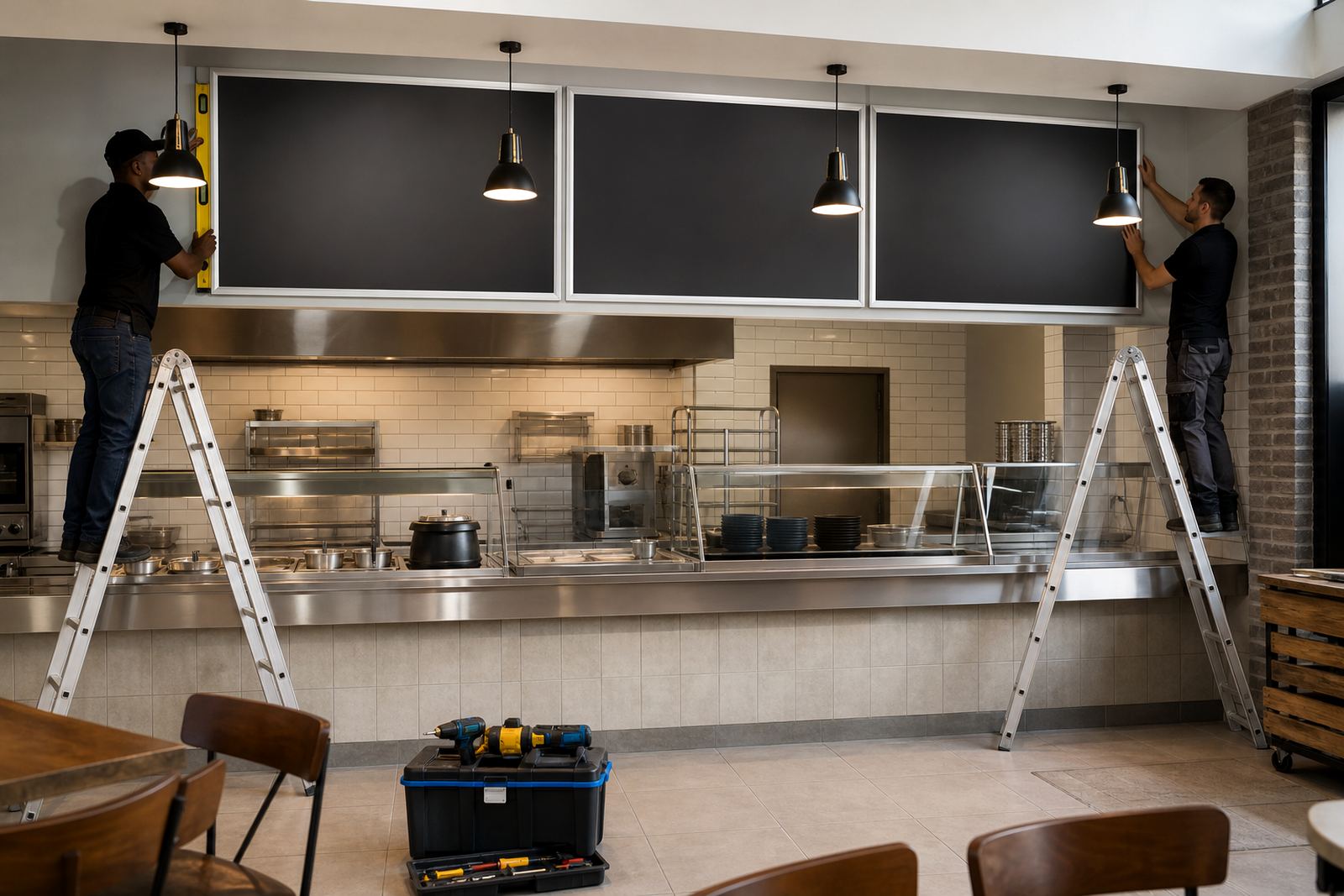
The project moved over a short build window of two weeks. The first stage covered layout checks, sizing and proofing. The second stage covered print production, courier packaging and the final fitment plan. Because the boards were designed as a matched set, the install ran without awkward gaps or last-minute trimming on site.
Our team in Paarden Eiland handled the production side and packed the finished boards for courier delivery to the Blouberg site. That meant the shop could receive the full order in one set, with the inserts grouped by frame size and marked for installation. A clean packaging plan matters with display work, especially when multiple frame sizes are travelling together to a coastal area.
- Planning and proofing: 1 week
- Printing, finishing and packing: 1 week
- Delivery method: courier delivery to the shop
- Fitment style: aligned counter run with clear board order
What the counter gained after the update
The biggest gain was clarity. The menu line now reads as one organised surface instead of a group of separate signs. That makes the ordering point easier to follow when the shop is busy, and it gives the counter a more settled look without adding clutter. The frame set also means future updates can be handled section by section, which saves time when prices move or a combo changes.
Because the inserts were built around standard A4 and A3 sizes, reprints stay practical. The shop can update one section or the full run, depending on what changes on the menu board. For a burger counter with a steady flow of customers, that flexibility is worth having, and the display still looks tidy after changes.
- Clearer order path at the counter
- Easy insert swaps for specials and price updates
- More consistent look across the full board line
- Standard sizes kept future print runs practical
The same build choices we would make again
We would keep the same combination of A3 frames for the main menu and A4 inserts for the supporting details. That mix gave the Blouberg shop enough room for the food range without forcing the copy into cramped blocks. The aligned layout was the other strong choice, because it let the boards read together from the queue and not as separate items.
If the site needed a later expansion, we would use the same frame family and extend the run rather than changing the display language halfway through. That keeps the wall neat and helps the menu stay legible as the offer grows. For food counters near the coast, that kind of consistency matters more than fancy extras.
- Keep the main items in A3 frames
- Use A4 inserts for add-ons and supporting lines
- Hold the boards to one spacing rhythm across the wall
- Carry a spare set of print-ready templates for future updates
Key facts
| Project | Blouberg Burger Shop menu board set |
|---|---|
| Location | Blouberg, Cape Town |
| Main formats | A3 and A4 snap frames |
| Frame material | Aluminium profile display frames |
| Print work | Menu resizing, typesetting, proofing and short run printing |
| Delivery | Courier packaging and nationwide delivery |