A café brief shaped by wind, glare and fast menu changes
The client was a surf-facing cafe in Muizenberg, serving breakfast, coffee and light meals in a spot where the window line matters as much as the counter. They wanted menu display that held up in coastal conditions and stayed easy to update when specials changed, with no loose clips or fiddly fixings at the till.
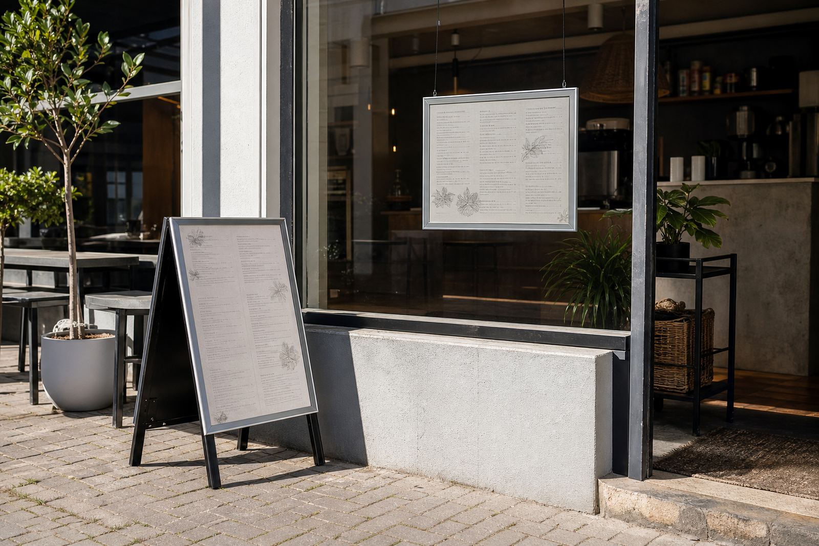
The brief called for clear reading from the sidewalk, a tidy fit on the front windows and a portable stand that could move where the foot traffic was strongest. We worked to common poster sizes so the printed menus stayed practical for regular updates, and the frame profile kept the edge clean without crowding the glass.
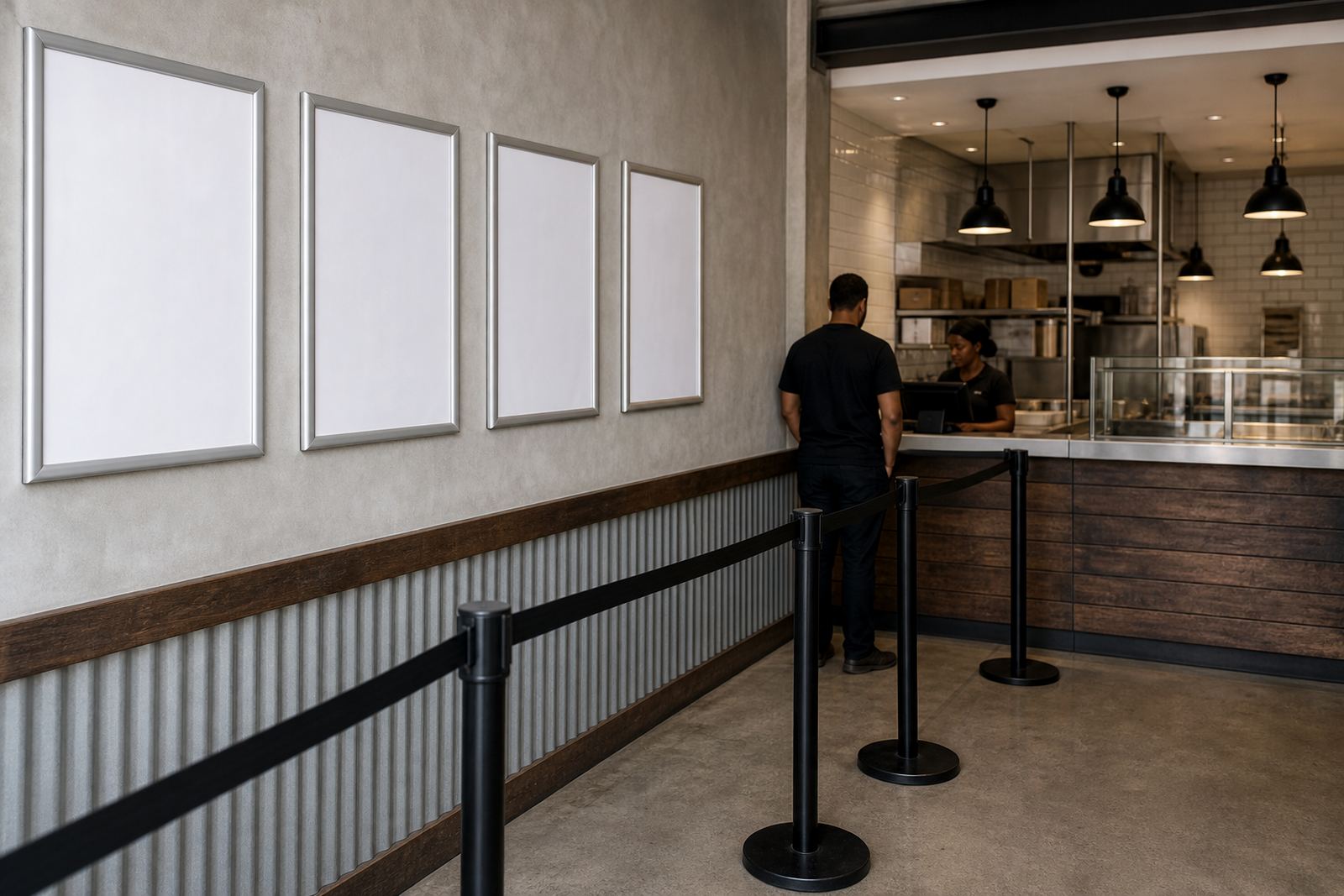
- Window-mounted snap frames for the main menu panels
- Exterior A-frame stand for pavement exposure
- Menus set up for A4 and A3 print sizes
- Anti-glare covers for easier daytime reading
What the site needed to cope with
Muizenberg brings damp mornings, salt in the air and stronger light off the water, so the display had to do more than look neat. We supplied aluminium snap frames with a firm front-opening profile, plus clear anti-glare covers to cut reflections when the sun sat low over the bay.
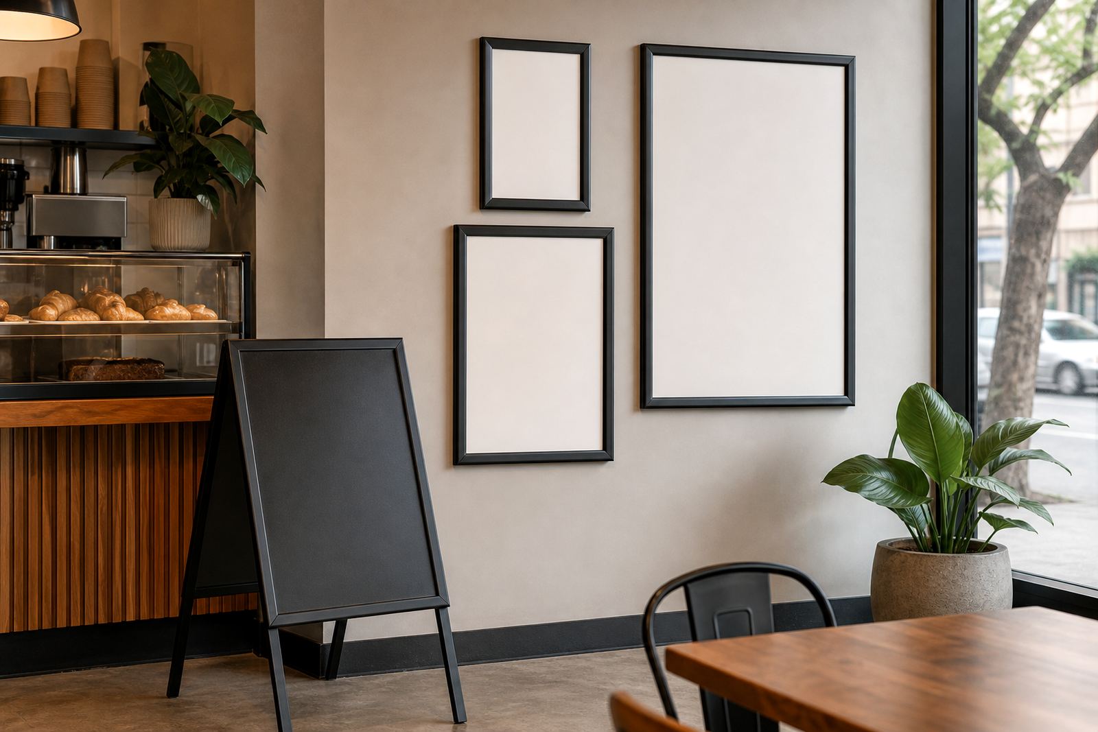
The cafe also needed a layout that would not block views through the windows. That meant keeping the wall and window mounted units slim, then using the A-frame outside for the call-out items, daily specials and takeaway notes. The stand sat well on level paving and could be brought in when the frontage was being cleaned or rearranged.
- Aluminium frames suited to repeated opening and closing
- Wall and window mounting options used together
- Front-opening profile for quick menu swaps
- Weather-aware setup for coastal frontage use
Boards, print sizes and finishing choices
We prepared the menu artwork around standard insert sizes so the cafe could keep reprinting without reworking the whole board. The main displays used A3 where longer lists needed space, while smaller inserts in A4 were used for specials, drinks and takeaway add-ons. That kept the visual hierarchy easy to manage, and the menu copy stayed balanced inside each frame.
For the printed inserts, we handled sizing, colour matching and finishing so the text stayed readable under mixed daylight. Lamination was used where handling was heavier, and poster insert printing gave the team a cleaner changeover when seasonal items came off the board. The final pack included template guidance for future updates, so the cafe team could work from the same layout each time.
- A4 menu templates for smaller insert panels
- A3 menu templates for fuller menu boards
- Menu typesetting and proofing before print
- Laminated menu prints for frequent handling
The work carried out over the production weeks
The project ran over three weeks from first brief through to packed delivery. In the first stage, we cleaned up the menu structure and mapped the items to the frame sizes. The second stage covered print proofing, finishing and packaging for the window frames, wall board and outside stand. The last stage was courier packing for delivery to Muizenberg, with every insert kept flat and separated for easier installation.
Because the frontage already had a clear customer flow, we did not overbuild the setup. The frames were sized to suit the available glass and the stand was proportioned for a sidewalk pitch without crowding the entrance. It kept the setup practical for a busy service window, and the result read cleanly from both close range and a few metres away.
- Week 1: layout review and size planning
- Week 2: proofing, print finishing and frame preparation
- Week 3: courier packaging and delivery to site
- Flat-packed inserts separated for easier fitment
What changed at the frontage after install
The finished setup gave the cafe a proper display rhythm. Window frames handled the main menu, the wall board held supporting information and the A-frame drew attention from people walking past the beachfront route. The team could open the frames, change the inserts and close them again without tools, which made daily menu movement less awkward at service time.
From the street, the boards looked more settled and the copy was easier to read in bright coastal light. The anti-glare covers reduced the washed-out look that glass can give near the sea, and the print finishing kept the edges tidy where staff handled the menus often. It was a small footprint, but it gave the front of house a sharper order.
- Clearer street-facing menu reading
- Faster insert changes during service
- Better handling of reflected light near the beach
- More organised frontage for passing trade
What we would keep on a similar Muizenberg site
We would keep the same mix of window frames and an exterior A-frame for a cafe with strong passing trade. That combination suits a beach strip where the menu has to be visible, durable and easy to change without slowing the counter. The cleanest result came from keeping the frame sizes standard and letting the print do the talking.
For a similar site, we would again plan the artwork around A4 and A3 inserts, use aluminium frames with anti-glare covers, and pack the prints so they travel well on the courier leg. It is a practical setup for a coastal frontage, and it leaves the team with a display that can handle regular menu shifts without turning the counter into a cluttered mess.
- Keep inserts on standard sizes for simpler reprints
- Use anti-glare covers where the frontage faces open light
- Mix window mounting with one movable pavement stand
- Pack spare prints flat for later menu changes
Key facts
| Client type | Beachside cafe |
|---|---|
| Town | Muizenberg, Cape Town |
| Display types | Window snap frames and exterior A-frame stand |
| Print sizes | A4 and A3 inserts |
| Finish | Aluminium profiles with anti-glare covers |
| Project timeline | 3 weeks from brief to delivery |