A counter that had to work while people were already ordering
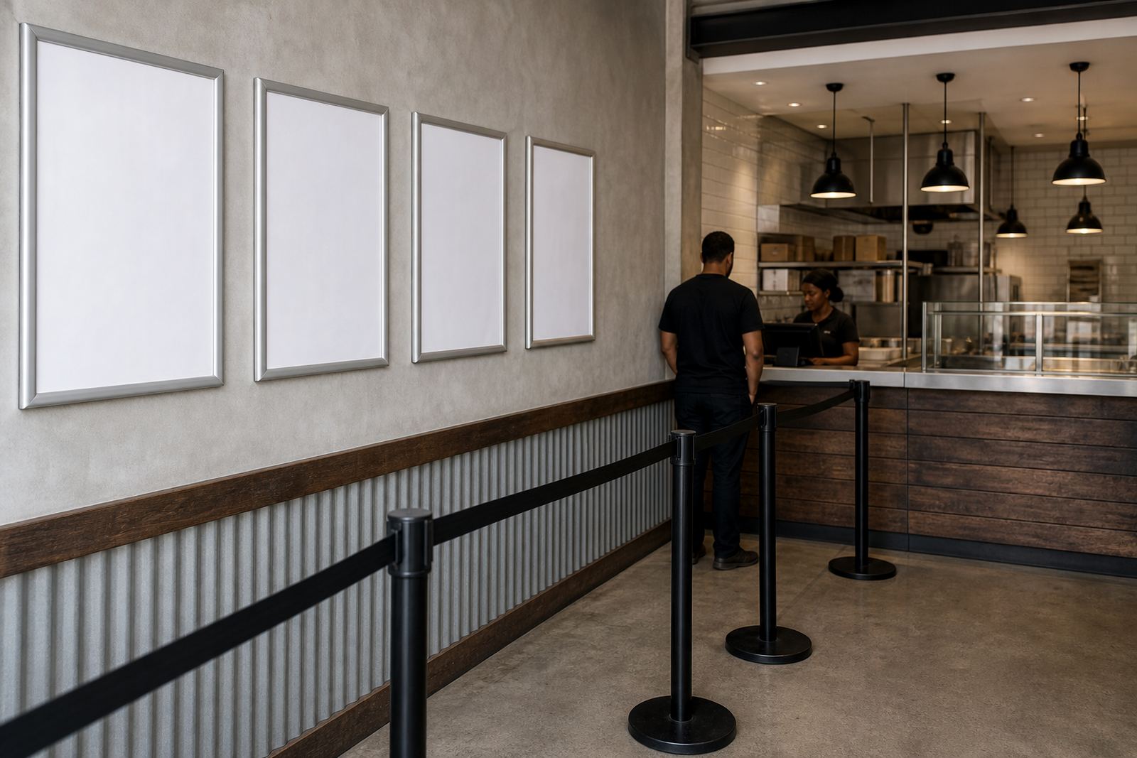
The brief came from a busy takeaway in Table View, close to passing traffic and a steady lunch queue. The team wanted menus that could be seen from the front of the shop, at the payment point and from the pavement without staff leaning over loose pages or taping up fresh sheets every time the price list changed.
The space also had a fair amount of glare from the front opening, plus fingerprints, steam and regular handling around the counter edge. That meant the menu system had to be easy to wipe down, firm enough for daily use and neat enough to sit beside the till without looking temporary.
- Fast menu swaps without tools
- Wall, window and counter facing display points
- Clear reading distance for passing customers
Choosing sizes that fitted the shop front and the queue
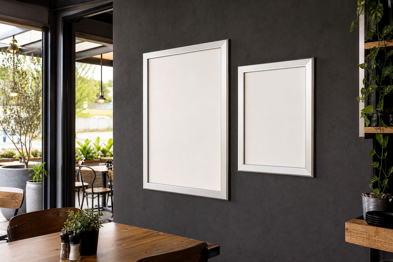
We worked around A4 and A3 snap frames, since those sizes suit most takeaway menu sets and keep the print shop side simple. The main menu needed a larger face for the wall behind the counter, while shorter item lists were better on smaller frames near the ordering point. The A-frame stand gave the shop a second display surface for the pavement side, which helped on busy periods when people were still deciding before they stepped inside.
We kept the layout practical, with enough room for meal names, sides and a few clear price breaks. The typography had to stay readable at a glance, so the type size and spacing were set for quick scanning rather than decorative styling.
- A4 frames for short category menus and add-ons
- A3 frames for the main board behind the counter
- A-frame stand for outside-facing daily specials
Materials that hold up in a coastal shopfront
Paarden Eiland work often sees salty air and a bit of grime from traffic, so we used aluminium profile snap frames with anti-glare covers. The covers soften reflection from windows and front lighting, which matters when customers are standing at an angle or reading past movement in the shopfront. The frame edge also gives the boards a cleaner finish than loose laminated sheets pinned to a wall.
For the takeaway, we used wall mounting where the staff wanted a fixed board and window-facing placement where the street view mattered. The A-frame stand was set up for quick movement when the queue shifted, and the inserts were printed to fit each frame size without trimming on site.
- Aluminium snap profile construction
- Anti-glare front covers
- Wall and window mounting options
- Portable A-frame stand for pavement use
Print, proofing and the small changes that save the shift
The print set included menu templates, menu typesetting and proofing before the final run. The takeaway needed prices aligned neatly, item names kept consistent and a few language adjustments for local ordering habits. We also prepared short run printing for items that changed more often, together with laminated menu prints where a tougher finish was needed around the counter.
Because the menu list had a few sections, we set up colour matching so the same tones carried across the wall board, window insert and A-frame sheet. That kept the shopfront looking orderly even when different menu sizes were used in different spots. Courier packaging was arranged for the fitted inserts and spare prints, so the store could store them flat and swap them as needed.
- A4 menu templates and A3 menu templates
- Menu resizing for different frame positions
- Menu proofing before print approval
- Laminated inserts for heavier handling areas
A two-week rollout from measurements to fitted boards
The project ran over two weeks from initial measuring to final fitment. In the first phase, we mapped the counter line, wall span and frontage sight lines so the display sizes matched the available space. The second phase focused on artwork prep, resizing and proofing, then print finishing and packaging for the wall boards, snap frames and the A-frame stand.
Once the finished pieces were in place, the takeaway had a cleaner ordering flow. Staff could change daily specials without pulling down taped pages, and the front window no longer carried a patchwork of printed sheets. The main result was clearer menu reading at the counter and less clutter around the ordering point, which made the service area feel more organised during rush periods.
- Measured for wall, window and counter use
- Printed inserts matched to frame sizes
- Finishing kept edges neat and protected
- Queue flow improved at the order point
What we would keep on a similar takeaway fitout
The same approach would suit other takeaway shops near main roads or foot traffic. Start with the reading distance, then work back to the size of the frame and the amount of information that must fit on each board. In this job, the combination of a fixed wall menu, a window-facing frame and a moveable A-frame covered the different ways customers viewed the menu across the day.
We would keep the print set simple, with a core price list that stays put and smaller inserts for specials or short-term changes. That mix reduces clutter, keeps the front of house clean and makes the menu easier for staff to manage when the counter is full and people are ordering fast.
- Keep the main price list on the largest board
- Use smaller inserts for specials and side items
- Match the frame size to the viewing distance
- Leave room for future menu updates
Key facts
| Project | Table View Takeaway |
|---|---|
| Town | Table View, Cape Town |
| Product set | A4 snap frames, A3 snap frames, wall menu boards, A-frame stand |
| Print work | Menu templates, typesetting, proofing, short run printing |
| Finishing | Laminated inserts, anti-glare covers, colour matching |
| Delivery | Courier delivery across South Africa |