Start with the wall, not the menu
Before you decide on portrait or landscape, stand where the customer will stand and look straight at the wall. A narrow pillar, a glass panel beside the till, or a long blank stretch above a counter will each point to a different frame shape. In Paarden Eiland we often see sites with tight walls near the prep area, while some Stellenbosch cafés have longer brick runs that suit wider menu boards. The frame should sit where eyes land first, not where there happens to be space left over.
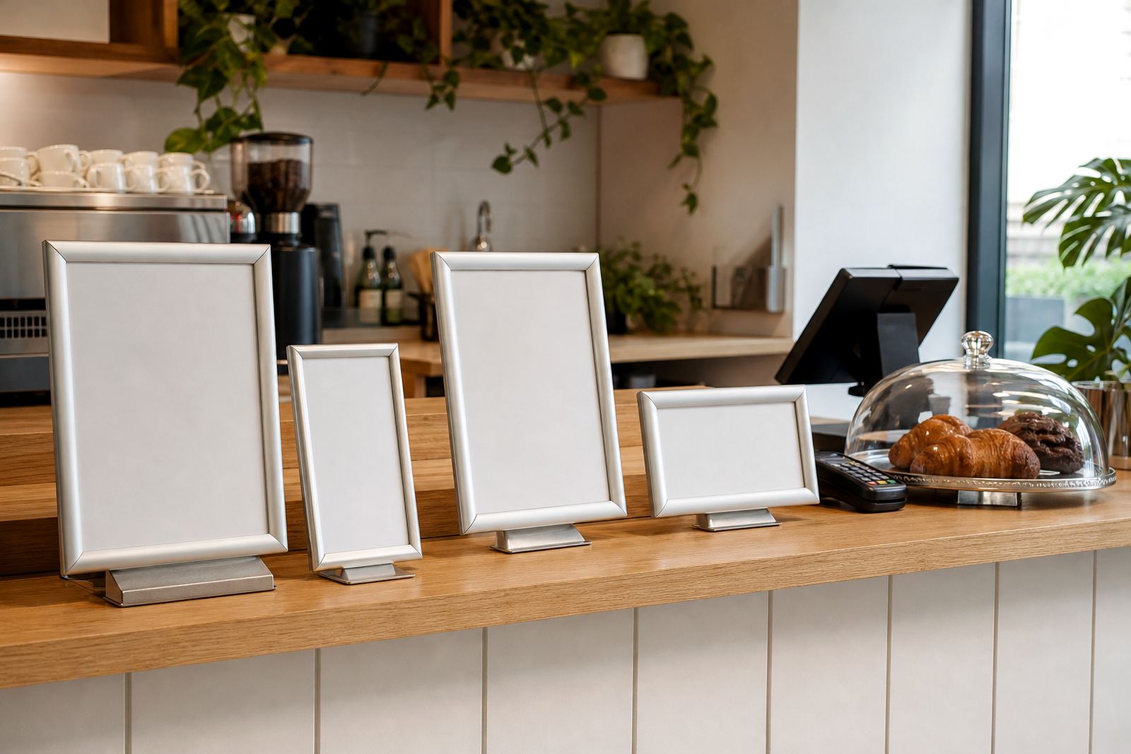
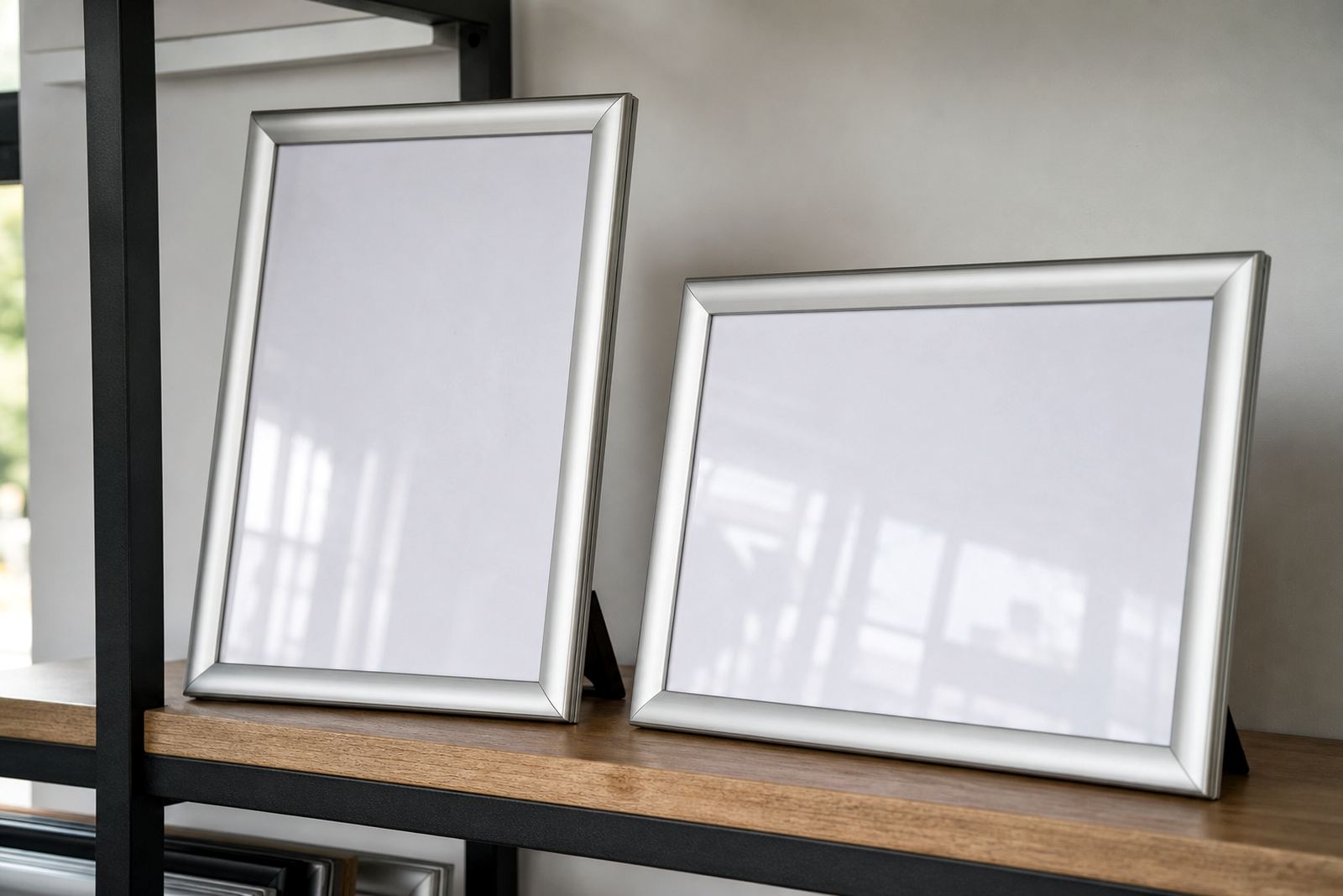
Portrait works well on slimmer sections because it draws the eye upward and keeps the menu tidy on a vertical line. Landscape suits wider walls and longer lists because it spreads items across the viewing field without making the board feel crowded. If the board will sit near a serving counter, check whether the top edge leaves enough room for staff movement and for customers to read without leaning too close.
When portrait makes the menu easier to read
Portrait is the better fit when you have short item groups, a tall wall section, or a single-column layout that needs strong focus. It is also useful where the eye line sits a little higher, such as above a counter or beside a service hatch. For many takeaway counters, a portrait A4 or A3 snap frame can hold a clean list of popular items, specials, or a daily board that changes often.
Because portrait gives more vertical depth, it helps when you want bigger type and clear spacing between sections. That can matter in bright front windows, where glare can make cramped lines harder to read. A portrait board with an anti-glare cover and proper colour contrast is easier on the eye than a packed layout that tries to squeeze in too much. Keep the wording short, or the board starts fighting itself.
- Use portrait for tighter wall spaces and slimmer pillars.
- Choose it when your list is split into short sections.
- It works well for specials, breakfasts and quick lunch boards.
- It suits window mounts where height matters more than width.
When landscape carries a longer list better
Landscape is usually the right call when the menu has several columns, meal groups or prices that need space to breathe. Cafes with breakfast, lunch and drinks on the same board often find that a wide layout gives each section more room without forcing tiny type. It also helps where customers glance across the board from left to right, such as when standing in a queue.
An A3 landscape snap frame can suit a bigger wall above a service area, while an A4 landscape board can work for a limited specials list at eye level. If the board must carry a logo, item names, prices and short notes, landscape gives the layout designer more room to line things up. That makes the board feel calmer and easier to scan, especially when the room is busy or the counter area is tight.
- Use landscape when the menu has several sections or columns.
- Choose it for wider walls and long viewing distances.
- It is handy for boards that include prices and notes.
- Landscape suits bar counters and longer takeaway menus.
How viewing angle changes the choice
A menu is not read from a neat textbook position. Customers glance at it from the side, from below, or while moving past the counter with a tray in hand. That is why the viewing angle matters as much as the wall shape. If the board sits high, portrait can feel more direct. If it sits long and low, landscape often reads more naturally across the space.
In Durban coastal humidity can affect printed inserts and laminated sheets, so the mounting and cover matter as much as the orientation. Anti-glare covers help where light hits the face of the frame at an angle, while strong aluminium profiles keep the board looking crisp against the wall. If a board will be viewed from a doorway or across a small dining room, test the line of sight before fixing the final size.
Sometimes the best answer is not a big frame at all, but two smaller boards placed with purpose. One board can hold food, another drinks, and the eye does not have to travel too far. That split can work better than forcing everything into one dense panel that asks too much of the customer.
A quick sizing check before you print
Before printing, check the size of the content against the frame size and the viewing distance. A4 suits short lists and daily specials. A3 suits fuller menus, larger type and spaces where people stand a little farther back. If the wording keeps shrinking to fit, the board has probably taken the wrong shape for the job.
Menu resizing and typesetting are not just technical tasks, they decide whether the board reads in a few seconds or becomes cluttered. A clean menu should leave breathing room around prices, line items and section headings. If you need to fit a long list into a portrait frame, use narrower wording or split the content into a second insert. If the design looks strained in the proof, it will look strained on the wall too.
- Check the number of items first, then the frame size.
- Keep font sizes readable from the service point.
- Use shorter item names where possible.
- Make sure prices line up neatly across the board.
- Leave margins for snap edges and insert handling.
Practical uses for wall, window and A-frame setups
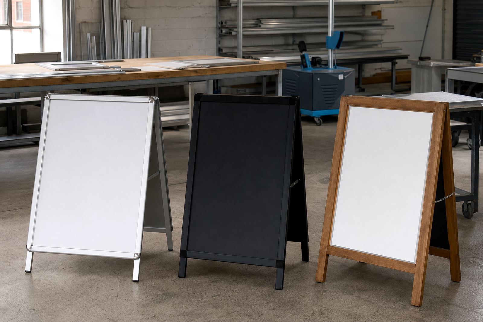
Wall-mounted snap frames are the most common choice when the menu needs to stay in one place and be changed often. Window mounting can work well for grab-and-go counters, especially when the board must face passers-by as well as seated customers. A-frame stands suit pavement-facing specials, pop-up trading and entrances where foot traffic flows past both sides.
Portrait A-frames are useful for single specials or opening hours, while landscape A-frames carry broader messages and more lines. Chalkboards can also sit beside snap frames when one section changes daily and the main menu stays fixed. In a busy café or bar, this mix gives staff a practical way to separate fixed content from rotating items without rebuilding the whole board every week.
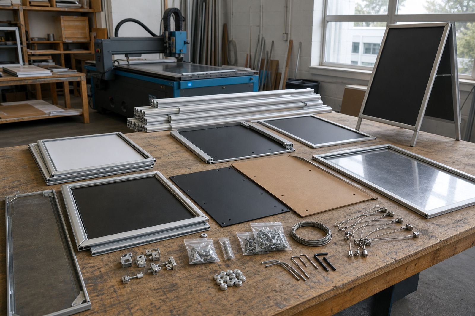
For branches in Cape Town, Johannesburg or Gqeberha, courier packaging needs to protect corners, inserts and covers properly so the frame arrives ready for mounting. A good pack also helps keep aluminium profiles square and the acrylic or polycarbonate cover free from marks. That matters when the frame has to go straight onto the wall or into a window fitting.
A simple decision path for your next board
If the menu is short, the wall is narrow and the customer stands close, portrait usually feels right. If the menu is longer, the wall is wider and the board needs to carry more structure, landscape is often the stronger choice. The board should match the room first, then the wording and print size can be adjusted around it.
Use this check before you lock in the format:
- Measure the wall or window space in millimetres.
- Count the menu lines and separate fixed items from specials.
- Stand where customers will queue and check the viewing angle.
- Decide whether the frame needs wall mounting, window mounting or an A-frame stand.
- Match the insert size to the amount of text, not the other way round.
When the orientation and the content work together, the menu feels easier to use. Staff swap inserts without fuss, customers find the right item faster, and the board sits properly in the room instead of fighting it.