Start with the counter, not the artwork
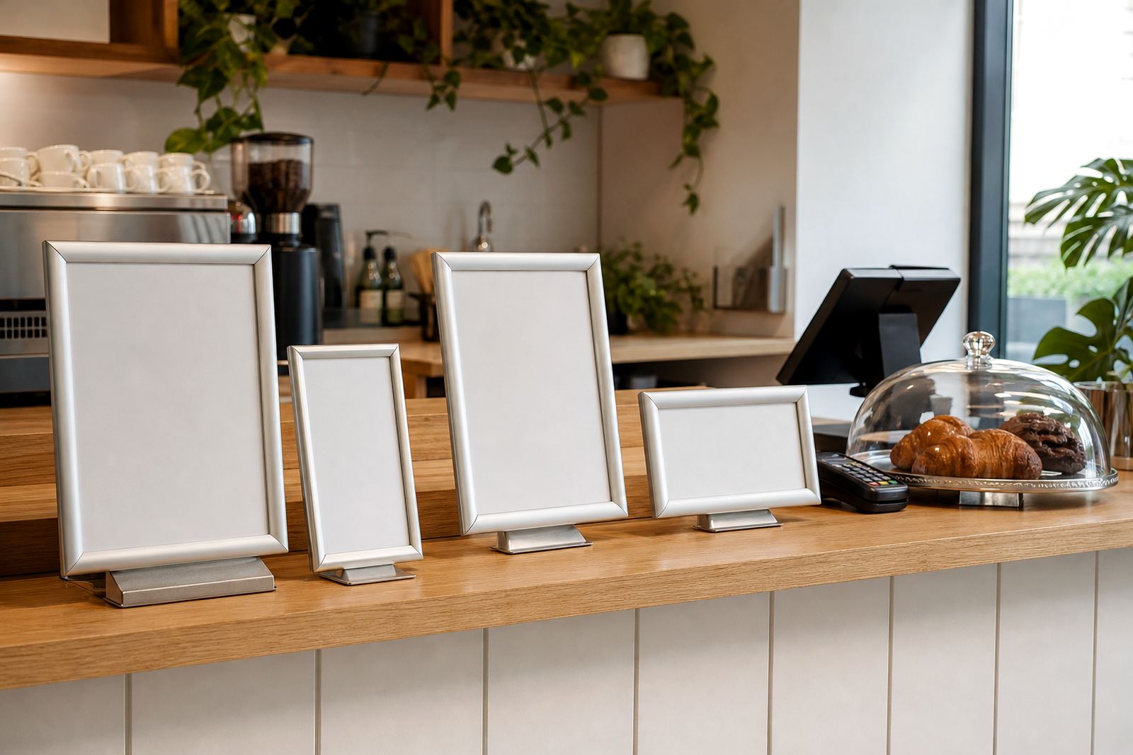
Measure the space where people read the menu first. A narrow till point usually suits an A4 snap frame or a slim A-frame stand, while a wider collection counter can carry A3 without crowding cups, card machines or condiment trays. Keep enough clearance for staff to move behind the counter and for customers to lean in without blocking the queue.
Think about viewing distance too. A menu read from arm length can stay compact, but a frame that needs to be seen from the doorway or queue should use larger type and stronger contrast. In busy Cape Town lunch queues, a board that is too small gets skipped over, and people ask questions that slow the line.
- A4 suits short lists, daily specials and add-ons.
- A3 works better for fuller menus and clearer pricing.
- Leave room for payment trays, receipts and condiments.
- Check the line of sight from standing height, not just sitting height.
Pick the frame style for the way orders move
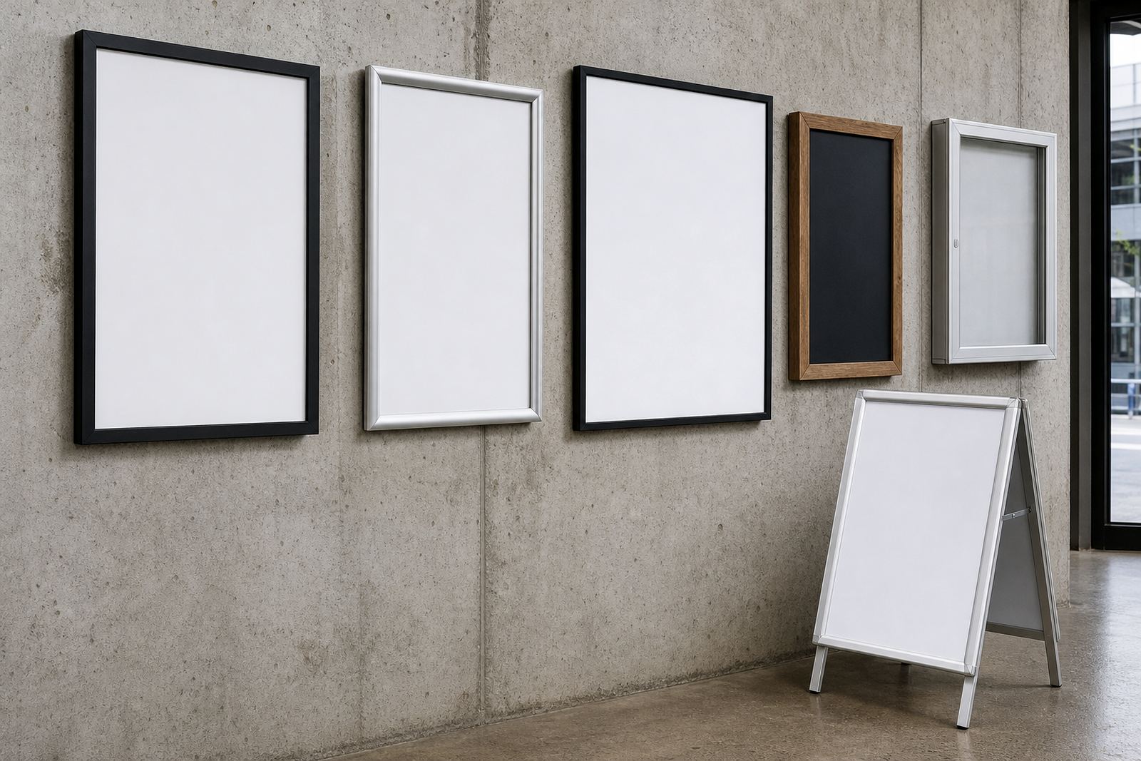
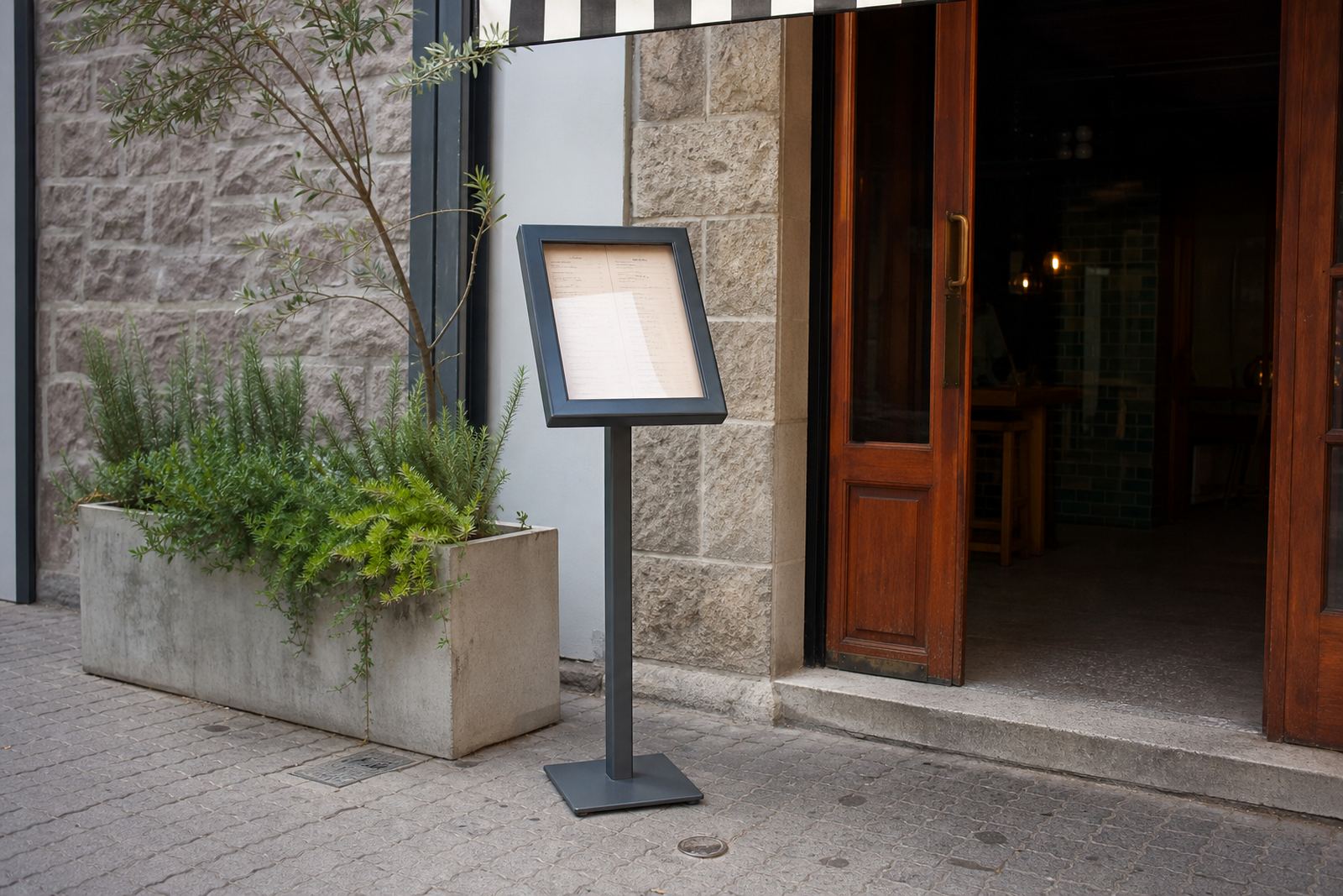
Snap menu frames suit frequent changes because the front opens and closes without tools. Aluminium profiles hold the print flat, and anti-glare covers help under bright café lights or window reflections. For counters that face the street, wall and window mounting can keep the menu visible without taking up serving space.
A-frame menu stands are useful where the same display needs to work on both sides, such as a queue side and a collection side. Chalkboards can help with rotating specials, but they work best when the writing stays neat and the text is large enough for passing foot traffic. A mixed setup can work well: one fixed menu board for core items, plus a smaller board for specials.
- Snap frames are best when pricing changes often.
- Wall mounting helps where the counter surface stays busy.
- Window mounting suits takeaway shops facing pedestrians.
- A-frame stands are handy for temporary specials or queue-side notices.
Keep the menu readable at service speed
Menu layout needs to match how staff call out items. Put the most ordered items near the top or centre, then group drinks, sides and extras so the eye does not jump around. Use a type size that stays legible when printed on laminated sheets or poster inserts, and avoid squeezing too much text into one panel.
Colour matching matters when the brand has a fixed look across different branches. A clean border, steady contrast and the same spacing on each update make the board feel settled, even when the prices shift. If the menu is printed in sections, make sure the panels line up cleanly inside the frame, otherwise the board starts to look untidy fast.
- Keep item names short where possible.
- Use clear price alignment on every line.
- Group like items together, not by font tricks.
- Leave enough white space for the eye to rest.
Use templates before the print goes in
Print-ready templates save trouble when several branches need the same menu in different sizes. A4 and A3 layouts should be prepared with the final trim in mind, so the text does not sit too close to the snap edge or clip behind a profile. Menu resizing is useful when the same content must fit a small counter frame and a larger wall board.
Typesetting should match the actual insert size, not a rough guess. That matters for posters, laminated sheets and short run printing where one small shift can spoil the finished look. If the menu is for a coastal area like Milnerton or Durban, laminated inserts can also help protect the print from humidity and handling marks.
- Check that the final size matches the frame opening.
- Allow for the cover sheet and border inside the profile.
- Keep repeated items aligned across every branch version.
- Use the same spacing for prices, headings and footnotes.
Plan the board around cleaning and daily handling
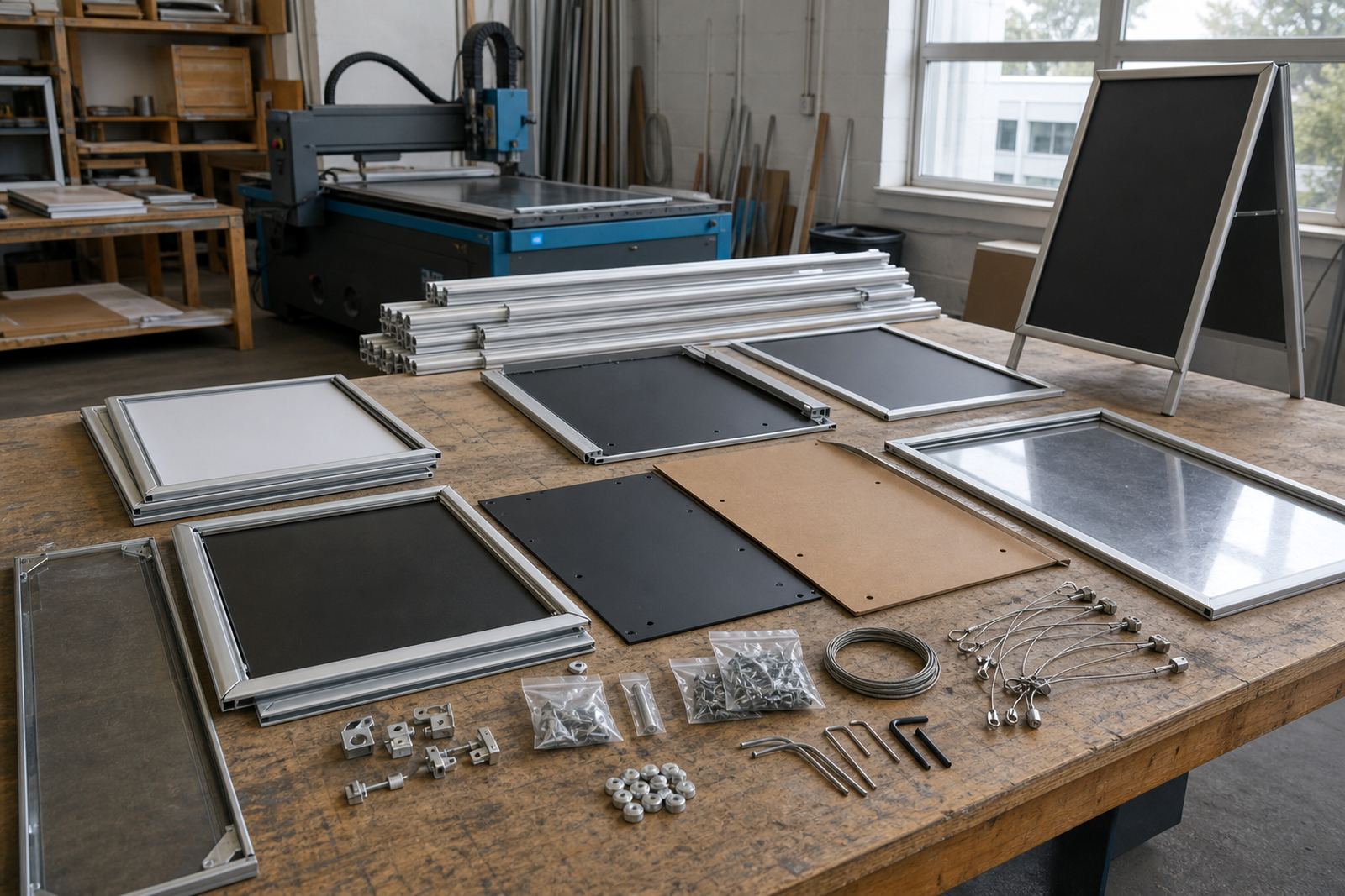
Counter displays get touched, wiped and moved more often than wall signs. A frame should open easily, stay shut properly and not leave sharp edges where staff pack away menus. For takeaway counters, the board should handle fast updates without forcing a full reprint every time a special changes.
Courier packaging matters when boards travel to Johannesburg, Stellenbosch or Gqeberha. The frame corners, covers and inserts need to stay flat in transit so the menu can go straight onto the counter. If a stand will move between branches, ask for the same layout across each location so ordering feels familiar.
- Choose materials that wipe clean without clouding the cover.
- Keep the frame easy to open for updates.
- Protect corners and covers during transport.
- Match the same layout across all branches where possible.
A quick checklist before you place the display
Before you decide, measure the counter, note the viewing angle and decide which items must stay fixed and which can change weekly. Then match the frame type to the job: wall board, window display, A-frame stand or a compact snap frame for the till point. The best setup usually mixes one main menu with one smaller board for specials or extras.
If the menu changes often, short run printing, laminated menu prints and poster insert printing can keep the display current without making the counter feel cluttered. For shops in Paarden Eiland, Cape Town or elsewhere in South Africa, the right combination depends on how much space you have and how quickly the list shifts.
- Measure the available wall, window or counter space.
- Decide whether A4 or A3 will read best.
- Confirm which menus need fast swapping.
- Choose the mounting style before the artwork is finalised.