Wall fixes that keep menus level and tidy
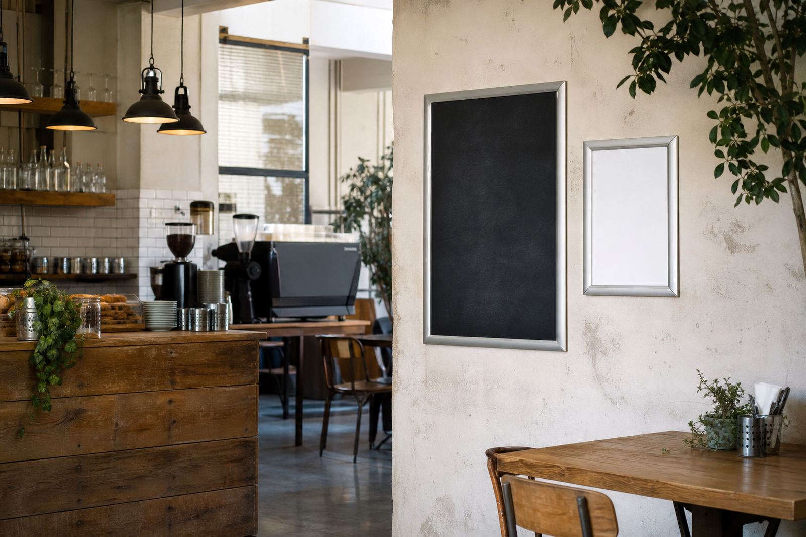
Wall mounting suits dining rooms, serving walls and queue areas where the menu needs a fixed position. A4 and A3 snap frames are the usual sizes for price lists, daily specials and counter menus, while larger boards work better when a whole menu must stay visible from a few paces away.
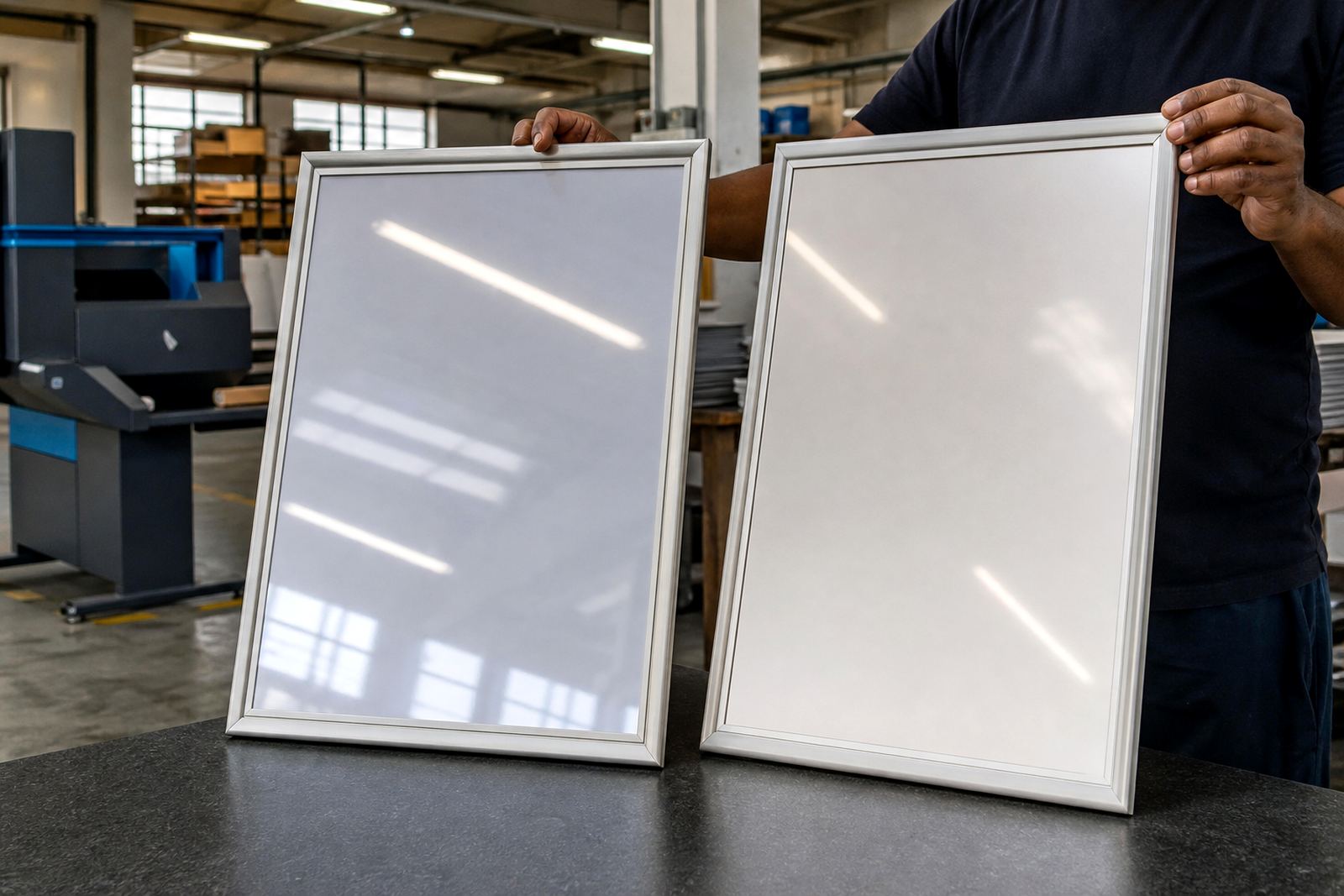
Aluminium snap profiles hold the print flat and let the front frame open for changes without tools. That matters in busy service areas where menu inserts change with breakfast, lunch or seasonal items. Anti-glare covers help when glass, polished tile or strong daylight would otherwise make reading harder.
- Measure the viewing height before drilling.
- Leave space for the frame to open fully.
- Check that the wall surface takes screws cleanly.
- Use the same size across a set of menus when possible.
Window mounting for street-facing menu boards
Window mounting works well for cafes, bakeries and takeaway counters that want passers-by to read the menu before they step inside. A snap frame fixed to the inside of the glass, or mounted just behind it, keeps the print protected while still giving a clean view from outside. This is useful for trading streets in Cape Town, Stellenbosch or Durban where daylight and reflections change through the day.
For window use, the print should suit the glass size and the frame should sit square so the text does not look skewed from the pavement. If a poster sits behind the menu board, the border should not hide the key items or prices. A clean layout with strong type and clear spacing helps more than crowded artwork.
- Check the exact glass opening and frame clear area.
- Allow for reflections from nearby buildings or cars.
- Use bolder type for menus read from outside.
- Keep the bottom line high enough to avoid clutter from the counter edge.
Suspended menus above counters and service points
Suspended mounting suits larger service areas, queue lines and open kitchens where a wall frame would sit too low or be blocked by people. A hanging frame or board can be fixed from a ceiling point, beam or upper structure, giving a clear view over heads and display cases. In centres with high foot traffic, this keeps the menu in sight without taking space off the counter.
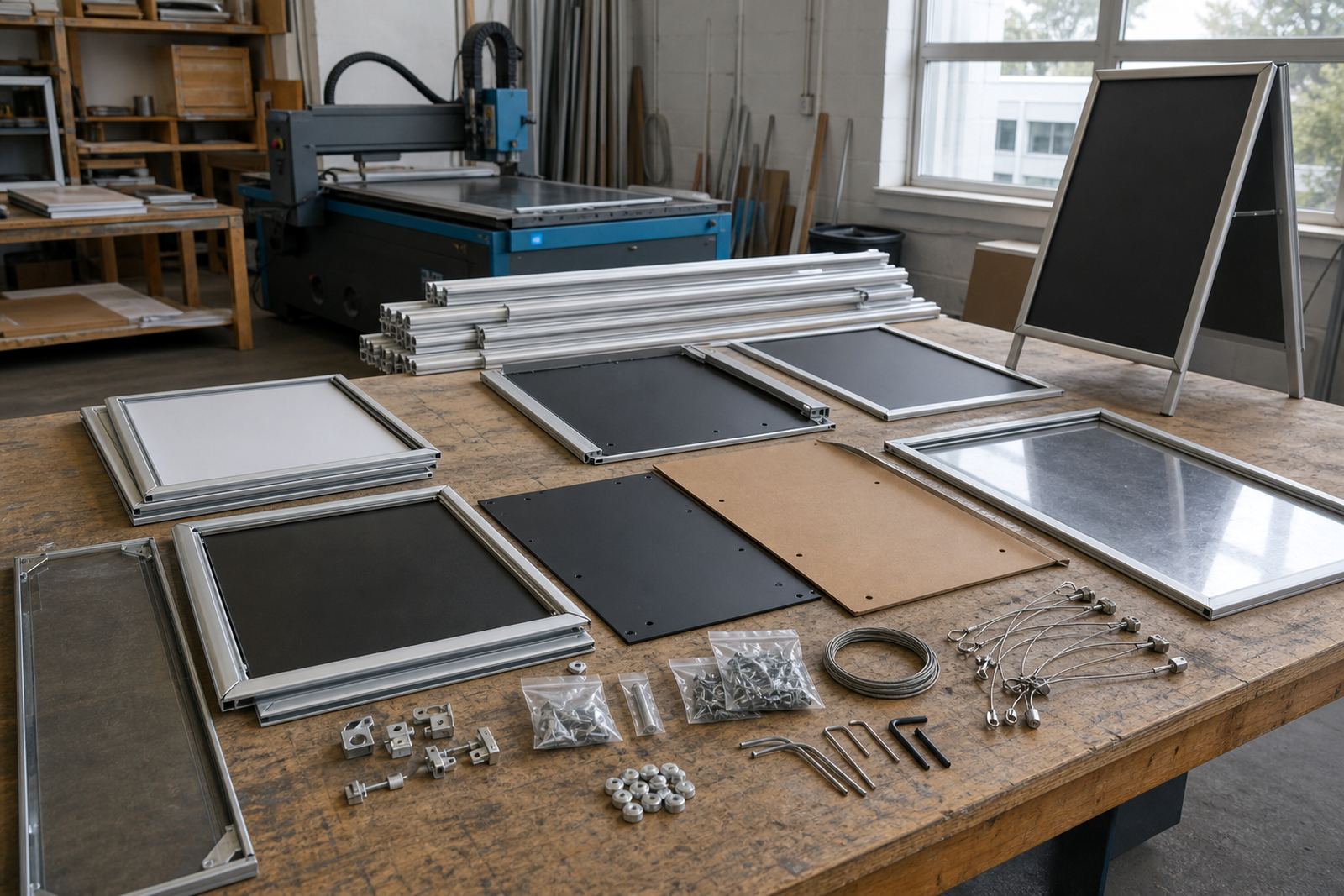
The fixing points must be sound and aligned, especially where the frame holds a heavier insert or a double-sided board. A suspension kit should be matched to the board size and weight, not chosen by eye. In a humid coastal area, hardware and clips need to stay neat and free of surface rust, so the finish matters as much as the print.
- Confirm the ceiling or beam can take the load.
- Keep the frame level from every viewing angle.
- Check the drop height against head clearance.
- Choose fittings that suit the local indoor conditions.
A-frame stands for pavements, entries and queue control
A-frame menu stands are useful where the offer needs to move with the footpath, entrance or waiting area. They suit chalkboard panels, printed inserts and quick specials outside a cafe or takeaway counter. The frame can be shifted inboard at night or when the weather turns, which is practical in places where wind or passing traffic can affect loose displays.
For outdoor use, the board should sit stable on even paving and not wobble when customers walk past. A-frame menus also work well for short run printing when the specials change often. If the insert size changes, the opening and panel depth should still hold the print flat, without curling at the edges.
- Place the stand where it is visible but not in the way.
- Use a heavier base or stable hinge for exposed spots.
- Keep the message short enough for quick reading.
- Store the stand in a dry spot after service where possible.
Print sizes, inserts and the frame that fits them
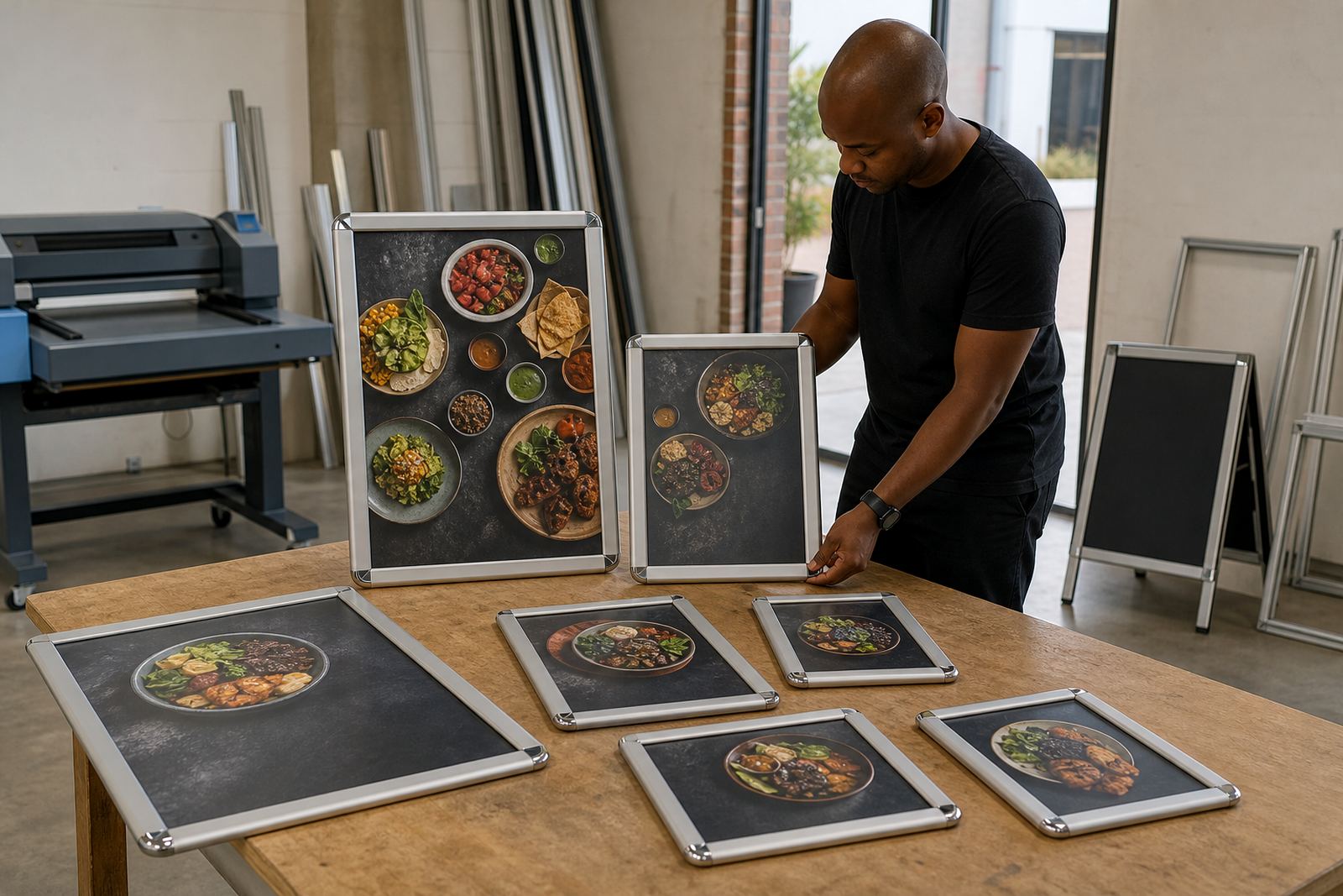
A4 and A3 are the most common menu sizes for wall and counter displays. A4 suits compact lists, breakfast specials and payment points. A3 gives more room for set menus, combo boards and larger price lists. Where a menu needs several sections, the layout should be checked before print so the type, spacing and image blocks do not feel cramped.
Menu typesetting, resizing and proofing help keep the same items readable across different frames. If one board carries a poster insert and another uses a laminated menu print, both should still match the tone and the line spacing. Colour matching matters too, especially where a brand uses a fixed red, black or warm neutral across several boards.
- Match the insert to the visible frame size, not the outside edge.
- Allow a small border for snap closure.
- Check whether the board is portrait or landscape.
- Keep recurring items in the same position across all menus.
A practical fitting sequence for steady service
A good fitting sequence starts with the location, then the size, then the fixing method. First decide whether the menu should live on a wall, window or stand. Next confirm the board size, print size and how often the menu changes. After that, look at the surface, the height and the angle at which people will read it.
For shops in Paarden Eiland, Milnerton or Bellville, the final check is usually the simplest one, standing at customer height and reading the board without leaning in. If the layout still reads cleanly from that spot, the mounting choice is usually sound. Courier packaging also matters for out of town delivery, because a bent corner can spoil a neat installation before it reaches the site.
- Pick the mounting point before artwork is finalised.
- Confirm the board opens, closes and clears the wall.
- Check the route for courier handling if the frame travels.
- Keep spare inserts folded flat in the same pack.