Where glare starts to get in the way
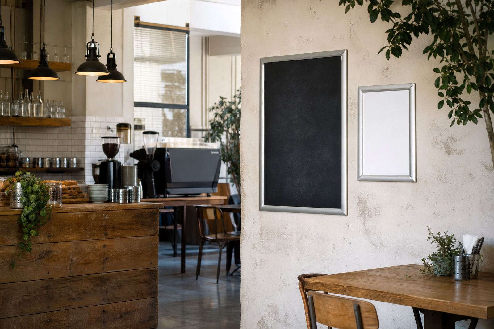
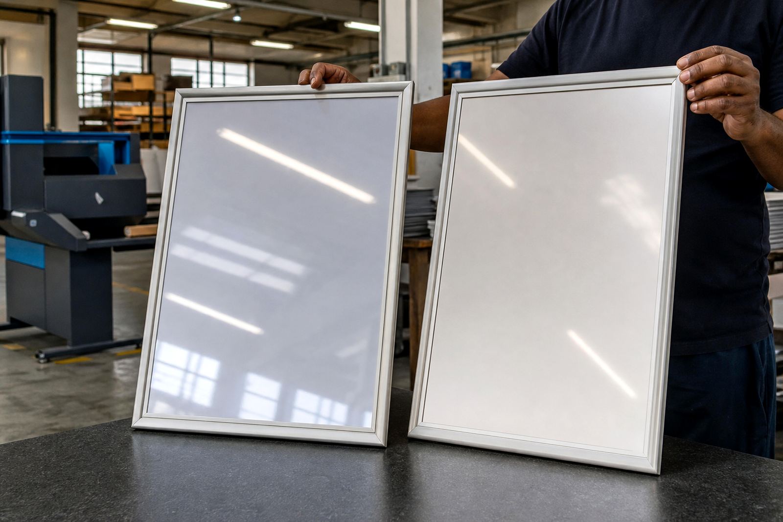
Glare shows up when overhead fittings, daylight or a shop front window bounces off the menu surface. In a bright Cape Town café, or near a doorway in Durban, the wrong cover can turn a clean layout into a sheet of reflections that is hard to read from standing height.
Anti-glare covers soften that reflection. They do not make a menu dull, they reduce the sharp shine that catches the eye before the text does. That matters most where customers read from an angle, wait in a queue, or lean across a counter while deciding on a meal.
Signs an anti-glare cover is worth specifying
Not every menu frame needs it. A board tucked into a shaded dining room may work well with a standard clear cover. The trouble starts where light changes through the day, or where the same menu has to read cleanly from several positions.
- Window mounted menus facing strong daylight
- Wall frames set under bright ceiling fittings
- Takeaway counters with glass, chrome or tile nearby
- Outdoor or semi-covered seating with shifting sun
- Menus that need to stay readable from queue height
If customers keep tilting their heads to read a board, the finish is probably doing the wrong job. In that case anti-glare is not a nice extra, it solves a real viewing problem.
A4, A3 and the way size changes the glare problem
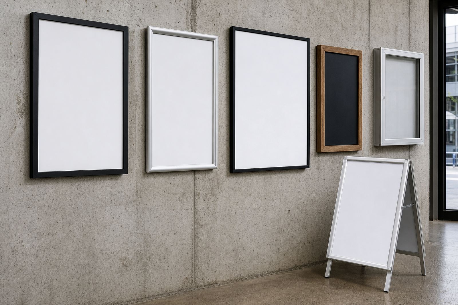
Smaller A4 menus are easier to read at close range, but they also sit nearer to the eye so surface shine can stand out more clearly. A3 frames are used where a fuller food list needs space, yet bigger panels can collect broader reflections from lights above or glass beside them.
For wall menu boards, the viewing angle often matters more than the size alone. An A4 board mounted high may need a different finish from an A3 insert placed at eye level. In practice, the best choice depends on where people stand, how far back they read, and how much direct light the frame catches during service.
How anti-glare covers behave in busy service areas
In takeaway counters and cafés with regular handling, the cover has to do two jobs. It must protect the printed insert and still keep the text readable after repeated cleaning. Anti-glare surfaces usually soften fingerprints and light scatter at the same time, which helps when the menu is changed often or handled during rush periods.
For laminated menu prints, the cover can sit over the laminate without making the page feel heavy. For poster insert printing, it helps when the insert is replaced often and the staff need the layout to stay legible under mixed lighting. If the board is used near a service hatch or window, this finish usually earns its place quickly.
A quick check before you decide on the finish
Use a short on-site check before specifying the cover. Stand where the customer stands, not where the board was fitted. Then look at the menu under the actual light that falls across it at opening time, at midday and later in the day.
- Can the top line be read without leaning in?
- Do bright spots land on prices or item names?
- Does daylight from the window change the reading angle?
- Will the board be cleaned often with a cloth or spray?
- Is the frame used for short run printing, updates or inserts?
If two or more answers feel doubtful, anti-glare usually makes sense. If the board sits in soft light and the menu is short, a standard clear cover may be enough.
Printing, inserts and the cover that sits over them
Anti-glare covers work best when the print underneath is planned properly. Menu typesetting needs enough line spacing, strong contrast and sensible font sizes so the surface finish does not blunt the message. A clean layout helps more than a crowded one, especially in A3 frames where too much text can fight the reading flow.
For menu resizing, it helps to keep the important items near the upper half of the page and leave margin space around prices. Colour matching matters too, because pale text or weak contrast can disappear faster when viewed through a matte surface. If the menu is being updated often, the cover should support the print rather than competing with it.
Matching the finish to the frame, mounting and room layout
Wall frames, window mounted boards and A-frame menu stands each handle light differently. A wall board under a ceiling strip light may need anti-glare to calm reflections. A window mounted frame facing the street can benefit from it even more, because daylight shifts through the day and the customer sees the board at an angle.
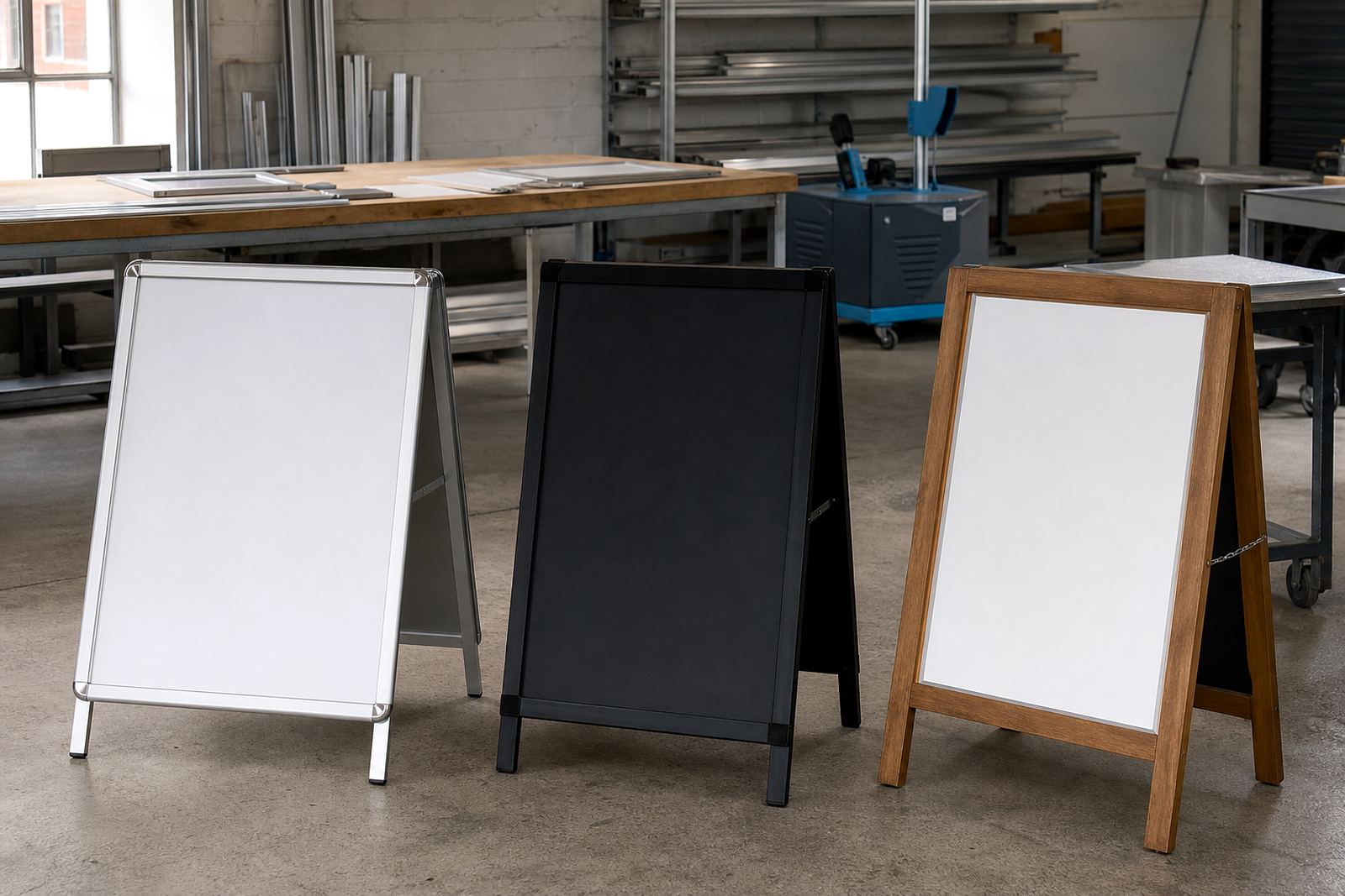
A-frame stands used near entrances often catch light from the side, so the finish helps the menu stay readable as people walk up to the counter. For chalkboards, the decision is different, because the writing style and board surface play a bigger role than a printed insert. The frame, the room and the light all need to be considered together.
A simple specification note for your next menu order
If you are ordering new frames or replacing inserts, write the light conditions into the brief. Note whether the menu sits in direct sun, under bright fittings, near glass, or on a front counter with a lot of reflection. That helps the finish, print size and mounting method line up properly.
A useful brief might include the frame size, whether it is A4 or A3, where it will be mounted, and whether the menu will be changed often. Add whether you need wall mounting, window mounting, an A-frame stand or poster insert printing. With those details in place, the anti-glare choice is easier to judge and the menu reads better where it matters.