Where the eye lands first indoors and at the glass
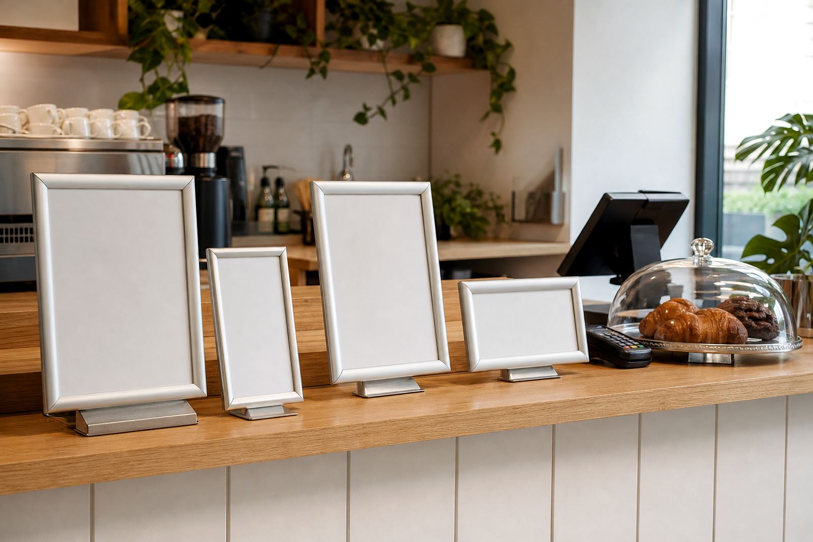
Inside a restaurant or cafe, guests usually stand closer to the menu and have more time to read it. A wall menu board above the counter can carry more detail, because the viewing distance is short and the light is often more controlled.
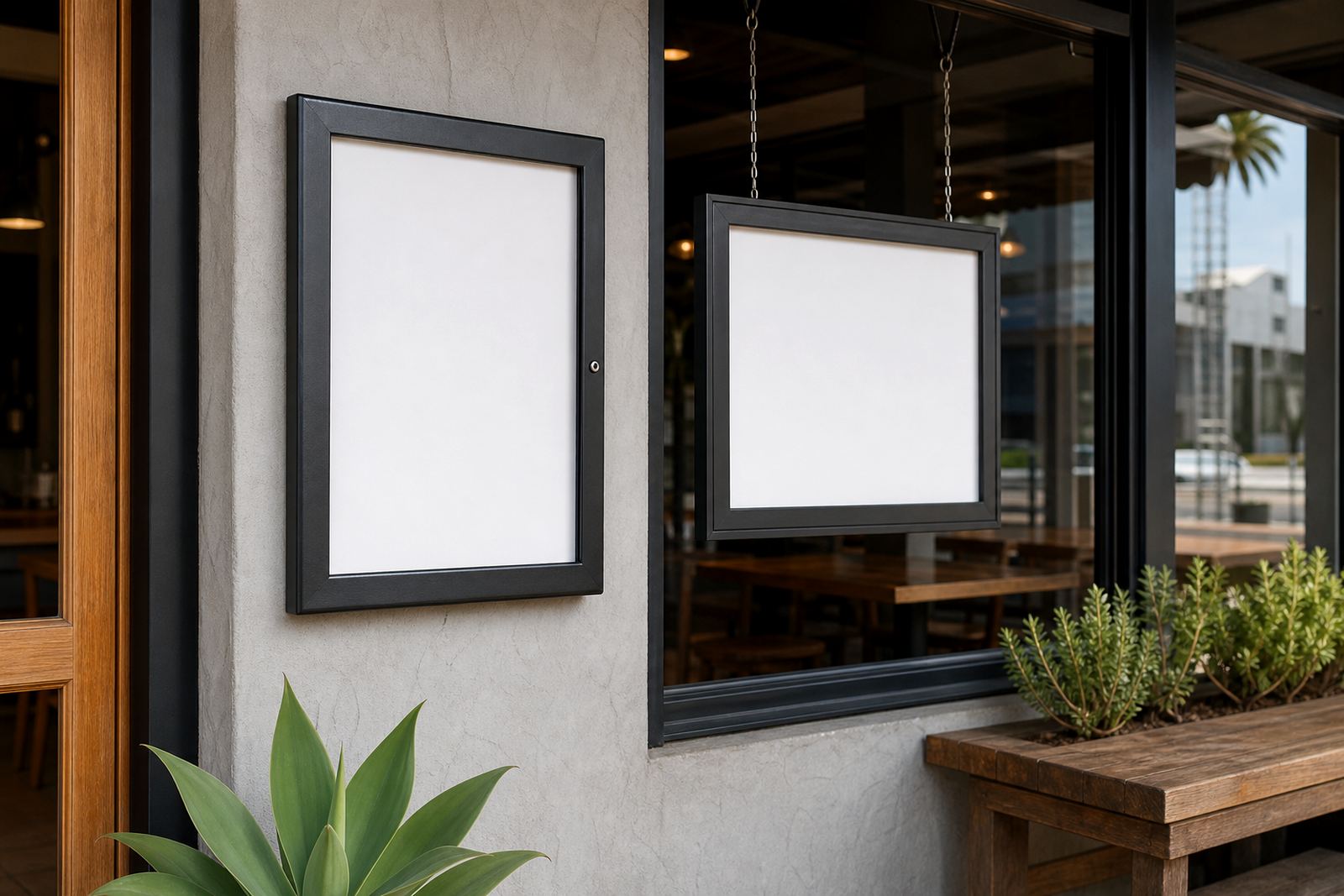
A window display works harder from the street. People may glance at it while walking past, driving slowly or waiting outside, so the layout has to be simpler. Large headings, fewer lines and strong contrast help the offer read through glass and across a pavement.
Sizing the insert for a wall frame or shopfront panel
A4 works well for shorter menus, daily specials and side items. A3 gives more breathing room for breakfast sets, lunch boards and layered pricing where the reader needs a clear path from top to bottom.
For a window display, bigger type usually matters more than packing in extra items. If the menu sits behind glass, check that the print size still reads when daylight is bright and cars are moving past the frontage.
- A4: tighter menus, specials, and quick swaps.
- A3: fuller menus with more spacing between lines.
- Larger window copy: fewer items, stronger headings, clearer prices.
Glare, reflection and the problem with shiny surfaces
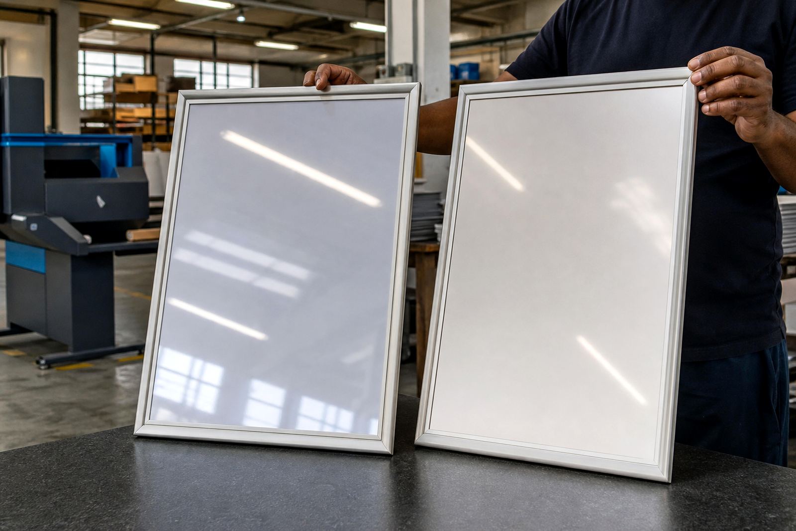
Indoor frames can use standard covers when the light stays even. Near a front window though, direct sun can wash out text and create reflections that make reading difficult. Anti-glare covers reduce that effect and keep the surface easier to read from different angles.
Where the menu faces east or west, sunlight shifts during the day and the glass can flare badly at certain times. In Cape Town and Durban that matters quite a lot, especially on shopfronts with full glass panels. A matte finish often helps more than a glossy insert.
Mounting choices that suit the room or the street
Wall mounting suits interior menu boards, waiting areas and counter-facing displays. It keeps the menu at eye level and frees the floor from stands that can get knocked over in a busy service area.
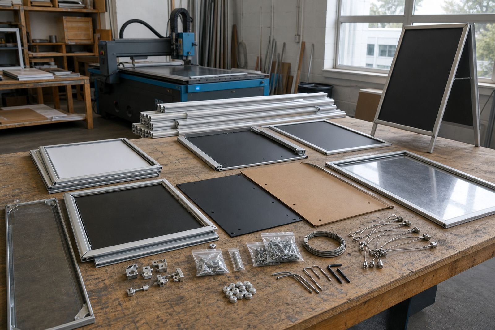
Window mounting works better when the menu must be seen from outside, or when the same board needs to speak to both people passing the shop and people standing at the till. Aluminium snap frames are light enough for wall use and neat enough for a window line, while A-frame menu stands are useful where the board must move between the doorway, pavement and counter.
- Wall frames: stable, tidy and easy to position above service points.
- Window panels: best for visible promotions and street-facing offers.
- A-frame stands: useful for entrances, specials and temporary placement.
Printing choices for indoor menus and glass-facing menus
Indoor menus can carry fuller descriptions, allergen notes and extra detail on combos or upgrades. That extra information is easier to read when customers are already inside and standing close to the board.
Window menus usually need stronger contrast, fewer fonts and a layout that survives sunlight and reflections. Laminated menu prints help with handling and cleaning, while poster insert printing suits quick menu changes. Menu proofing is worth doing before print, because a small spacing issue becomes more obvious once the sheet is inside a frame.
- Use laminated prints where menus are handled often.
- Use poster inserts when pricing changes regularly.
- Check colour matching if brand colours matter on the frontage.
A working checklist before you place the board
Before final sizing, measure the viewing distance from the customer point. A menu read from the counter needs different line spacing from one seen through a shopfront window. If the board is for outside viewing, stand back across the pavement and test whether the heading still carries clearly.
Also check the mounting surface. Glass, brick and painted walls each need a different approach, and the frame should sit level so the insert does not look crooked. In humid coastal areas, a clean aluminium profile holds up neatly and keeps the frame looking sharp, even when the air carries salt.
- Measure the viewing distance from both inside and outside.
- Check sun direction and reflection at peak trading times.
- Confirm the frame size before typesetting the menu.
- Choose a cover that suits cleaning and glare control.
- Decide whether the menu must be fixed, removable or moved often.
When one menu needs to work in both places
Some counters need a menu that serves the room and the street at once. In that case, use a cleaner layout, larger type and a frame size that can carry the essentials without crowding the page. A3 often gives enough room for both a strong heading and readable prices.
For multi-branch groups or stores across Cape Town, Stellenbosch, Johannesburg, Durban and Gqeberha, the same format can be resized for different sites while keeping the wording and layout consistent. Courier packaging then matters, because a frame sent to Milnerton or Bellville must arrive ready for fitting, with the insert protected from bends and moisture.