Start With the line of sight, not the frame
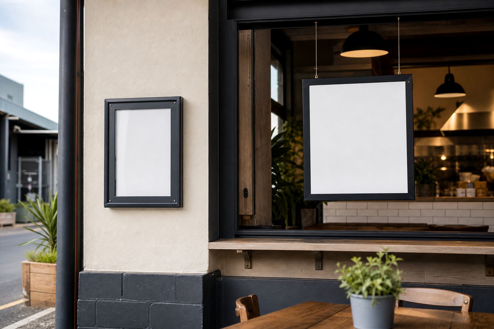
Before picking between a wall mount and a window-facing display, stand where the customer stands. If they enter from the pavement, the first readable surface may be the glass frontage. If they queue inside, the wall above the till or service counter may carry more weight. A menu that sits in the wrong place can be neat and still miss the moment when people are deciding what to order.
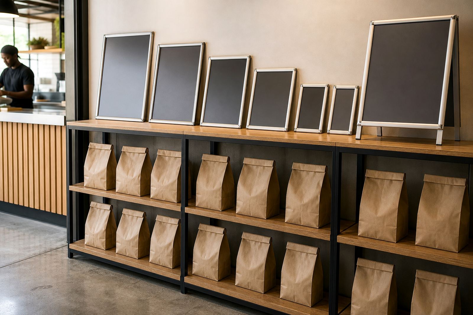
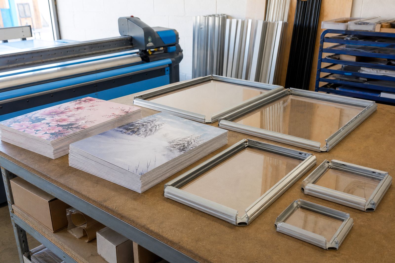
Snap menu frames suit both positions because the inserts change without tools, and the aluminium profile keeps the edge tidy. A4 frames work well for narrow specials and short lists, while A3 gives more room for categories, combo boards or a fuller drinks list. The cover sheet matters too, especially in bright Cape Town window light where glare can wash out small text.
- Use wall mounting when customers pause at the counter or order from inside.
- Use window mounting when passers-by need to see specials before entering.
- Choose A4 for shorter notices, A3 for fuller menu groupings.
- Ask whether the display needs portrait or landscape layout from the start.
When a wall board carries the weight of the order
Wall-mounted menu boards suit interiors where the counter face stays busy and the menu needs to sit above eye level. This works well in cafés, bars and takeaway counters with a narrow service zone, because the board stays clear of hands, bags and passing trays. It also helps where window space is limited by frosted film, pillars or a street-facing layout that gets strong afternoon light.
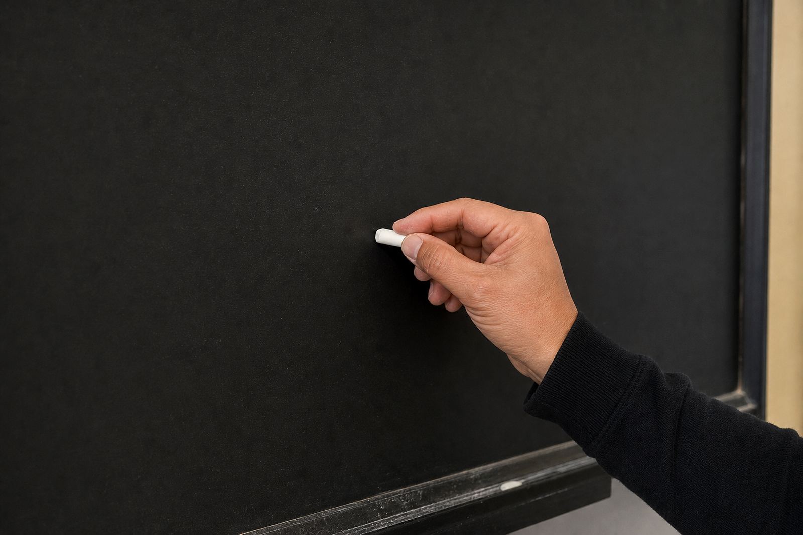
For wall use, the mount has to be secure and level, and the menu content should be spaced so people can read it from a short distance. A chalkboard style board can work for daily specials, but printed inserts are better when the menu changes often and the wording must stay sharp. Menu proofing matters here, because a wall board usually sits in the same spot long enough for customers to notice every spelling slip and price change.
- Good for fixed service points and indoor ordering lines.
- Useful where lighting is controlled and the wall stays visible all day.
- Works with poster insert printing for frequent menu changes.
- Best when the menu layout needs a clear top to bottom read.
Window-facing displays do the heavy lifting outside
Window-facing displays are useful when the first sale happens before anyone steps through the door. A clean A4 or A3 snap frame on glass can carry breakfast menus, lunch specials or takeaway offers where pedestrians and drivers notice them first. In suburbs like Milnerton, Bellville and Paarl, where cars slow near entrances, a strong window display can make the menu visible from the pavement or parking area.
The trick is to keep the glass readable in changing light. Anti-glare covers help in direct sun, and colour matching keeps printed inserts consistent from one batch to the next. Where the frontage takes moisture or sea air, as it often does around Paarden Eiland and the harbour side of Cape Town, the frame finish and insert protection need a little more attention so the display stays neat and presentable.
- Useful for front-of-house visibility before customers enter.
- Works well for short specials and high-turnover items.
- Anti-glare covers help when sunlight hits the glass directly.
- Window mounting can suit portrait menus or wide specials boards.
A-frame stands for foot traffic that keeps moving
A-frame menu stands sit in their own category. They are not fixed to a wall or a pane, which makes them useful for pavement edges, forecourts and entrances where customers scan quickly while walking past. A-frame stands work best when the message is short: daily special, meal deal, coffee offer or a simple call to enter. Too much text turns a good board into clutter.
In Cape Town, a stand can help on windy streets or at entrances where wall space is already taken by signage, railings or window decals. The frame should feel steady under normal foot traffic and be easy to reposition when the layout changes. If the menu changes often, laminated menu prints or short run printing keep the inserts practical, while courier packaging protects extra sets sent to branches in Johannesburg, Durban or Gqeberha.
- Best for entrances, pavement points and passing traffic.
- Keep the copy short and readable from a few steps away.
- Choose laminated inserts when the board is handled often.
- Use print-ready templates so every branch keeps the same layout.
How to match size, print and finish to the space
Size decisions are easier when the menu has been measured against the actual wall or window. A4 suits a compact drinks list, table specials or smaller service counters. A3 gives more room for sections, prices and a cleaner reading path. If the menu needs to sit behind glass, the insert should be trimmed with enough edge room so the text does not crowd the snap profile.
Menu typesetting and menu resizing matter more than people expect. A design that looks tidy on a screen can run too long once prices, item names and dietary notes are added. Printing on the wrong size wastes space or forces the customer to lean in. In busy shops, that small strain can be enough to slow the queue.
- A4 suits concise menus and narrow wall spaces.
- A3 suits larger categories and clearer spacing.
- Portrait layouts work well for step-by-step reading.
- Landscape layouts can suit specials with fewer, wider lines.
A Paarden Eiland example: street view, indoor queue, one menu story
In Paarden Eiland, a takeaway counter may need both a window display and an indoor wall board. The glass front can carry the offer that pulls people in from the road, while the wall near the till can hold the fuller ordering list. That split keeps the message short where it needs to be seen fast, and detailed where customers have stopped moving.
For that kind of setup, the display set often includes one A3 snap frame for the main menu, one A4 frame for specials and a window-facing insert for passing traffic. If the board is changed often, short run printing, laminated menu prints and courier packaging make the system easier to keep in step across branches. It is a practical layout for restaurants, cafés and takeaway counters that need the same menu to read well in Cape Town, Stellenbosch or Durban without changing the core structure.
The cleanest result usually comes from the simplest rule: let the customer see the short version first, then the fuller version once they stop. That keeps the ordering path clear and the front of house less crowded, which matters when the counter is busy and the light shifts through the day.