Start with the words that matter most
A chalkboard gets crowded fast if every item is given the same weight. Put the dish name first, keep the price close to it and leave the garnish details for a second line if they are needed. A customer standing near the door should spot the special without having to lean in or stop in the doorway.
In a cafe or takeaway counter, the board often sits above head height or near a window where glare can play tricks on the eye. That makes spacing more important than decoration. A short line of text with generous gaps reads better than a packed board with fancy loops and cramped letters. If a board needs to carry breakfast, lunch and dessert notes in one day, the layout must stay calm while the wording changes.
- Keep the dish name on one line where possible.
- Leave a blank strip between sections or meal times.
- Use the price in a size that matches the distance from the customer.
- Trim down long descriptions that do not help the sale.
Letterforms that hold up in a real service rush
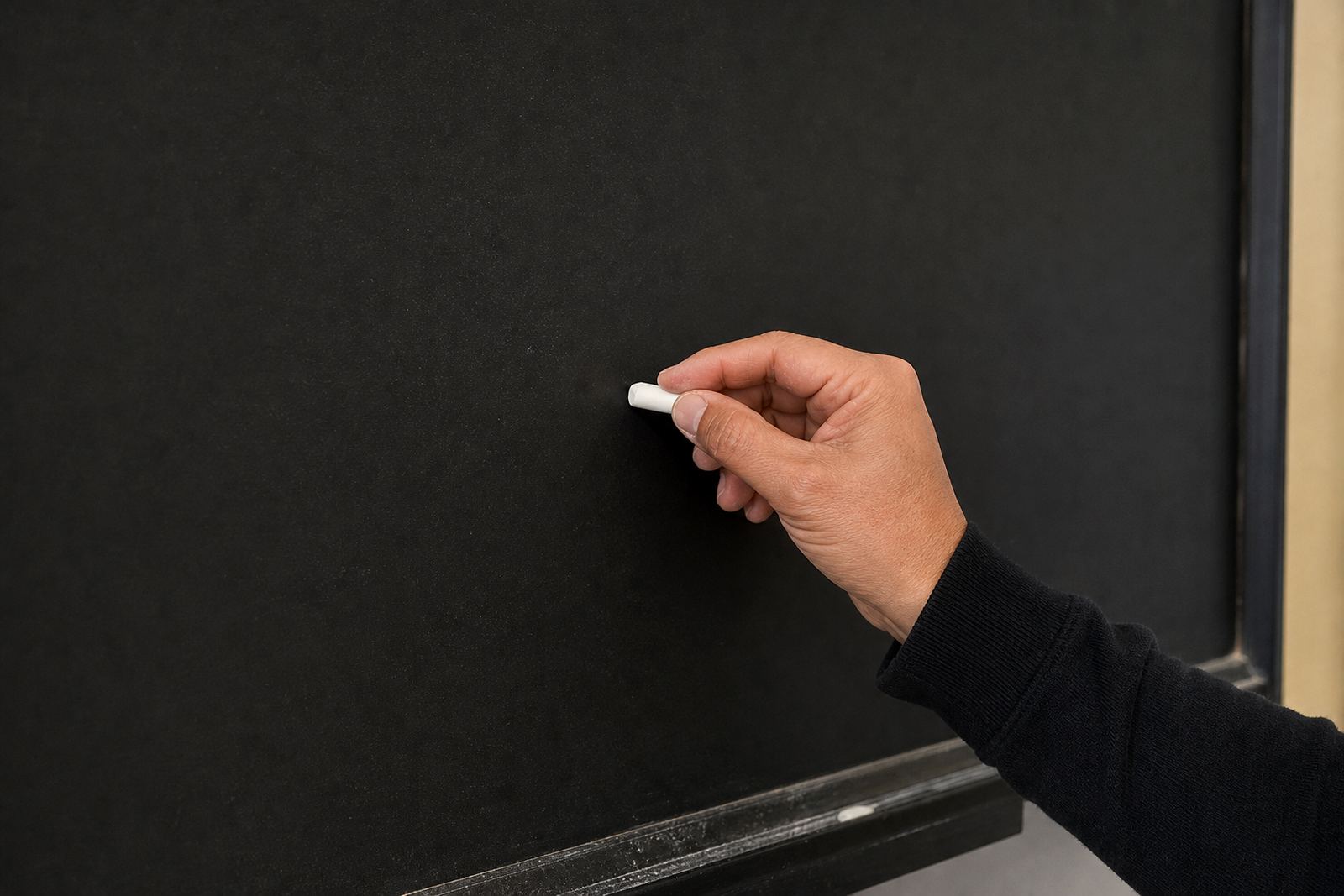
Readable chalk writing is usually plain writing. Upright letters, even spacing and consistent stroke width carry better than stretched cursive. The board does not need decorative flourishes on every word. It needs rhythm, and it needs the same height for letters that sit beside one another.
When a team rewrites specials several times a day, speed can tempt the writer to skip structure. That is where a simple house style helps. Decide on how tall capitals should be, how far apart words sit and whether prices are aligned on the right or placed directly after the item. A steady pattern is easier to read from a queue, from a window or across a narrow dining room.
- Use capital letters only where they help, such as dish names.
- Keep the baseline straight, even if the board is large.
- Match the same letter style across all specials on one board.
- Leave enough space for an extra line if the special changes.
Colour contrast on blackboards and framed inserts
Chalk works best when the contrast is strong enough for daylight, indoor lighting and window reflections. White chalk on a dark surface is the usual choice, but a touch of yellow or pale blue can help separate headings from prices or labels. Too many colours blur the message and make the board look busy from a distance.
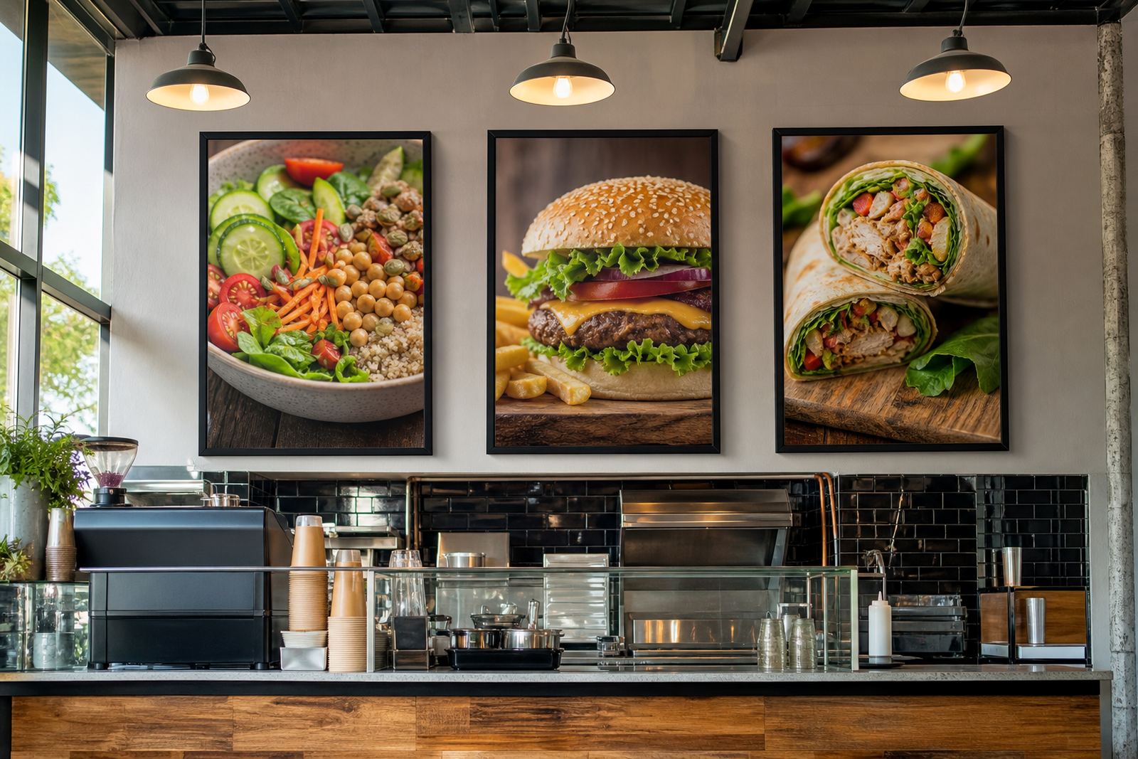
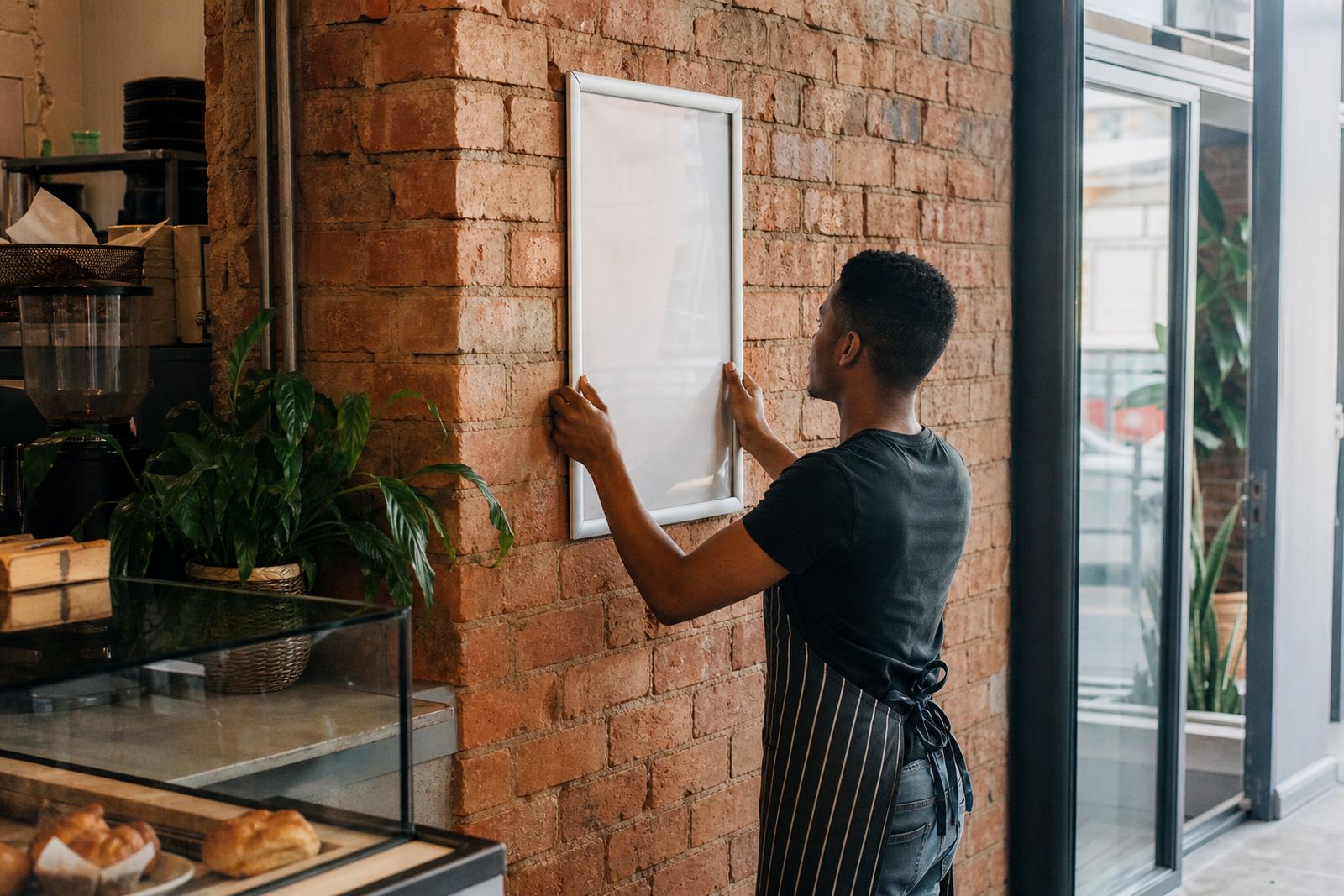
Where snap frames are used with menu inserts, the same rule applies. A clean A4 or A3 layout with dark type on a light sheet can sit behind an anti glare cover and still remain legible across the counter. For wall mounted boards and window displays, simple contrast matters more than fancy type. If the board is near the street in Cape Town or along a windy walkway in Milnerton, the wording must survive bright light and a quick glance.
- Choose one main writing colour for the body of the special.
- Use a second colour only for headings or price highlights.
- Test the board from the far side of the room before service starts.
- Keep contrast high where sunlight hits glass or polished tile.
Sizing specials for A4, A3 and A-frame boards
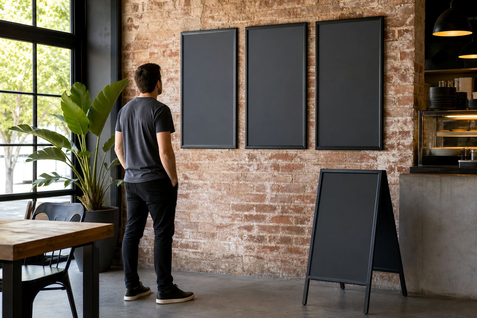
The size of the board changes the way the message is written. An A4 insert suits short specials, price notes and a compact breakfast list. A3 gives more room for daily menu changes, larger headings and a little breathing space around each item. A-frame menu stands are useful when the board needs to sit outside a cafe entrance or near a takeaway queue, because the angle helps passers-by see the writing before they reach the door.
On an A-frame, long copy often disappears into the distance. That is why the wording should be shorter than the staff may first want it to be. A board that can be read from several metres away usually says more with fewer words. If the menu changes through the day, use separate panels or inserts so the writing stays neat instead of being crossed out and rewritten in a hurry.
- A4 suits short daily specials and quick price changes.
- A3 suits fuller lists with a stronger visual presence.
- A-frame boards work well for pavement traffic and entrance points.
- Short wording improves legibility from a moving queue or parked car.
A local counter example from Paarden Eiland to Pretoria Street
A busy takeaway counter in Paarden Eiland may need a special board that changes before lunch and again later in the day. One practical method is to keep the handwriting styles fixed, then swap only the item names and prices. That keeps the board calm while the menu itself stays flexible. A laminated print can carry the permanent items, while a chalk section handles the daily specials that move with stock and trading patterns.
For a shop serving walk-in customers and drivers at the curb, visibility matters just as much as content. A board at eye level near the till can hold detailed notes, while a larger wall mounted frame near the entrance can carry the headline items. On a windy Cape Town corner, the safer setup is usually a secured frame or stand rather than a loose sign. The board should sit where the staff can update it without fuss, and where the lettering still reads clean from a few paces away.
- Use permanent inserts for core items and chalk for daily changes.
- Keep one board near the entrance and one near the counter if needed.
- Mount signs securely where coastal wind or traffic can interfere.
- Place the most profitable special where eyes land first.
Board care, clean edges and regular resets
Chalkboard clarity is not only about the writing. A dusty edge, smeared cloth marks or a board that has not been cleaned properly can make even neat lettering look tired. Wipe the surface fully before rewriting, then step back and check the message as if you were a first-time visitor. Smudges near the price are often the first thing customers notice.
If the board uses snap frames, keep the inserts trimmed square and the corners clean. A poster insert that sits slightly crooked can spoil a tidy menu, especially where customers look straight at the wall from a queue. For laminated menu prints, the finish should be even, with no bubbles or uneven cuts around the edge. Small details matter because they decide whether the board looks planned or patched together.
- Clean the surface before each major rewrite.
- Remove old chalk dust from corners and frame edges.
- Check that inserts sit square inside the frame.
- Replace worn specials before they start to look faded.