How far the eye sits from the menu
A guest standing at a till counter reads differently from someone seated at a cafe wall board or waiting near a takeaway hatch. A menu viewed from one to two metres can hold tighter spacing and smaller headings, while a board seen across a room needs larger type and clearer section breaks. The frame size must match that reading distance, not only the available wall space.
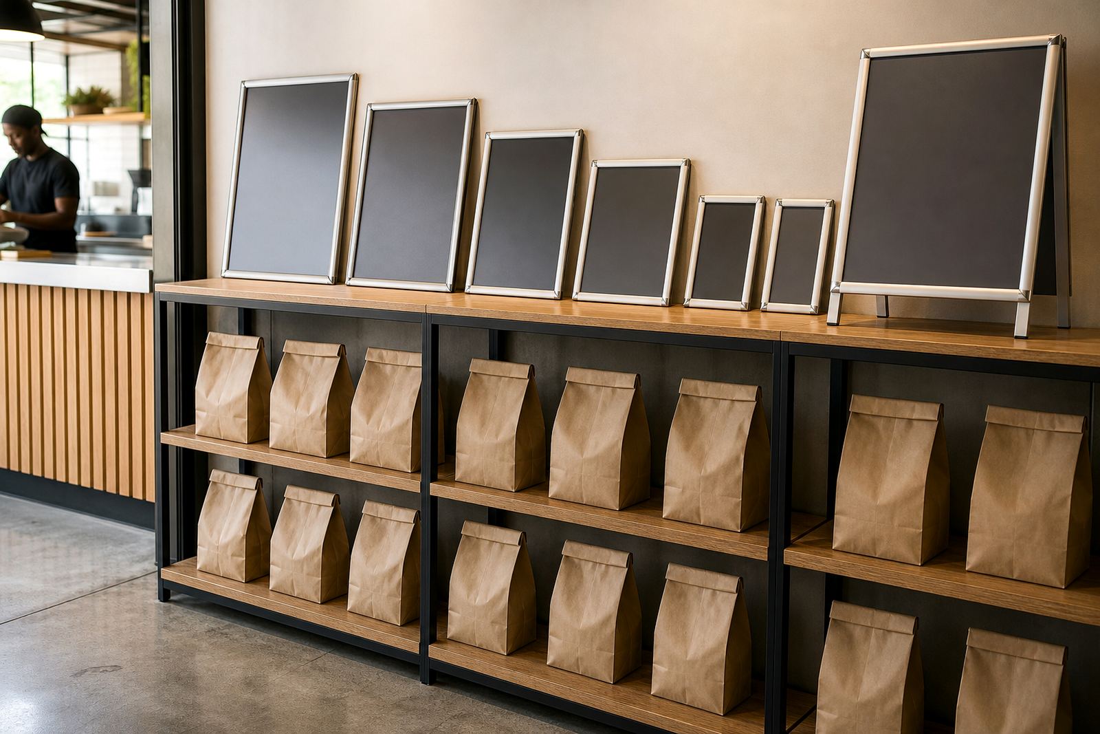
For front counters, A4 often works for compact specials, side lists and short add-ons. A3 gives more breathing room for breakfast, lunch or coffee sections where prices, modifiers and item names need space to breathe. When the reading point moves further away, the page should lose clutter before it loses information.
Where A4 helps and where A3 earns its place
A4 suits close viewing and smaller lists. It is handy for a narrow counter wall, a window panel, or a short set of daily specials that changes often. A3 is better when the menu has more categories or when customers need to scan from a few steps back without leaning in.
- A4 works well for single-category inserts, dessert boards and quick add-on items.
- A3 suits fuller menus with breakfast, mains, drinks and desserts on one sheet.
- Large boards help in busy stores where people queue and read at an angle.
- Smaller boards reduce wall clutter in tight shopfronts or narrow passageways.
The right answer is not always the bigger sheet. A crowded A3 can read worse than a well planned A4, especially if the layout tries to hold too many line items and too many price points.
Density belongs in the layout, not only the size
Reading distance changes how much information a guest can process at a glance. A menu that sits close to the customer can carry more detail, but it still needs enough white space to separate groups and prices. The closer the menu, the more likely a person will read line by line. The further away it hangs, the more the eye wants short blocks and bold headings.
That is why menu resizing is not a straight reduction job. Text may need to open up, image blocks may need to disappear, and item names may need shorter phrasing. On a printed insert, a few millimetres can change the whole reading flow. In a window mounted board near bright Cape Town glare, lower density also helps the content stay legible during the midday rush.
Mounting height changes what customers can actually read
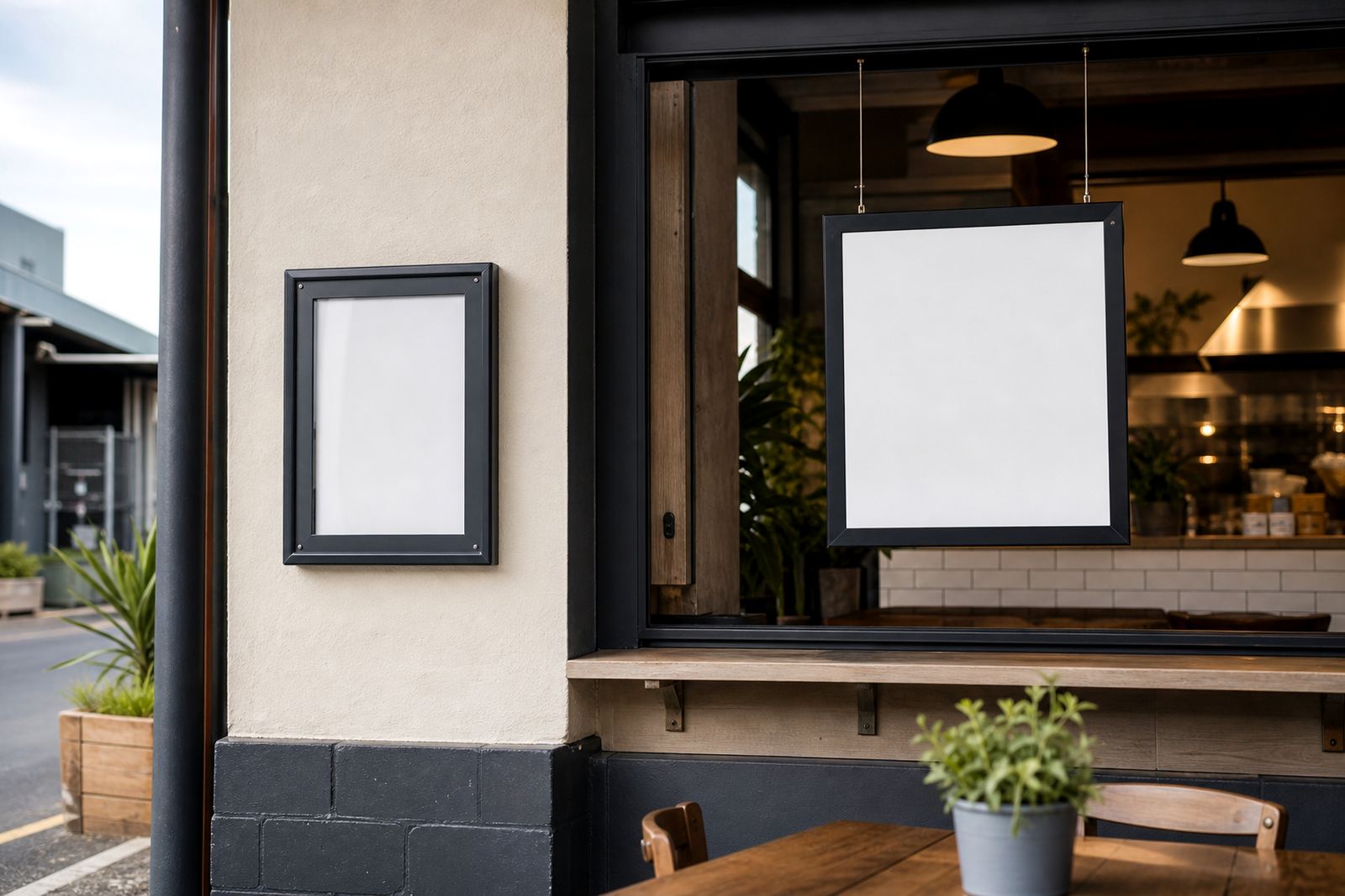
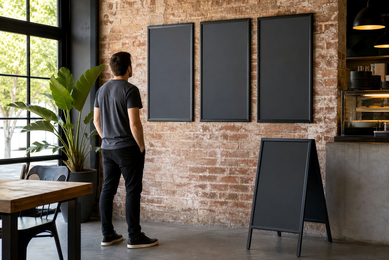
A frame that sits too high makes people tilt their heads back, while one fixed too low can disappear behind queue traffic or the counter edge. Wall mounting should put the main heading in the natural eye line, not above it. For window fittings, the best height often depends on whether passers-by are reading from outside or guests are reading from inside the shop.
At a takeaway counter in Paarden Eiland, we often see the same mistake: the menu is sized for the wall, but not for the queue. Guests in line read on the move, so the layout needs larger section headings and enough contrast for a quick scan. A-frame stands can help when the menu must work from both directions, especially near entrances or pavement service points.
The frame type should match the viewing angle
Snap frames work well because the insert can be swapped without tools, and the anti-glare cover helps reduce reflections from shop lights and daylight. Aluminium profiles give a neat edge and keep the board straight, which matters when the customer is trying to read prices from a distance. A frame that flexes or bows can make the page look untidy before anyone even starts reading it.
- Wall mounted snap frames suit fixed menus and rotating specials.
- Window mounted boards suit street-facing cafes and service counters.
- A-frame stands suit entrances, walkways and busy queue points.
- Chalkboards suit short handwritten specials where the list changes often.
If the display sits in strong light, the cover finish matters as much as the print. If the menu faces a shaded interior, the main issue may be size and contrast rather than reflection. Each setting asks for a different mix of frame, print finish and mounting position.
A local example from Cape Town traffic and coastal light
A cafe in Milnerton with a bright street front faces different reading conditions from a dining room in Stellenbosch. In Milnerton, the board may need stronger contrast, a larger heading and a position that works for people walking past in motion. In Stellenbosch, guests may stand longer at the counter, which gives the menu a little more reading time but still demands a clean layout.
That difference becomes clear near the coast, where daylight reflections and humidity can affect how a printed insert feels and looks inside a frame. Laminated menu prints can help a board stay neat in a busy service area, while short run printing is useful when a seasonal list changes before the next weekend. Courier packaging also matters when boards travel to Johannesburg, Durban or Gqeberha and need to arrive flat and ready for use.
A practical way to decide before you print
Start with the place where the customer stands, then measure the distance to the board. After that, work backwards from the reading distance to the sheet size, then the amount of text, then the frame. If the menu needs to be read at a glance, keep the language short and the blocks clear. If it is meant for slower reading near the counter, there is more room for detail.
Our contact form is useful when you need help with A4 menu templates, A3 menu templates, menu resizing, menu typesetting, menu proofing, laminated menu prints, poster insert printing, print finishing or courier packaging. The same applies to wall boards, window mounted frames and A-frame stands where the final position changes how the page should read.