Where a pickup notice earns its keep
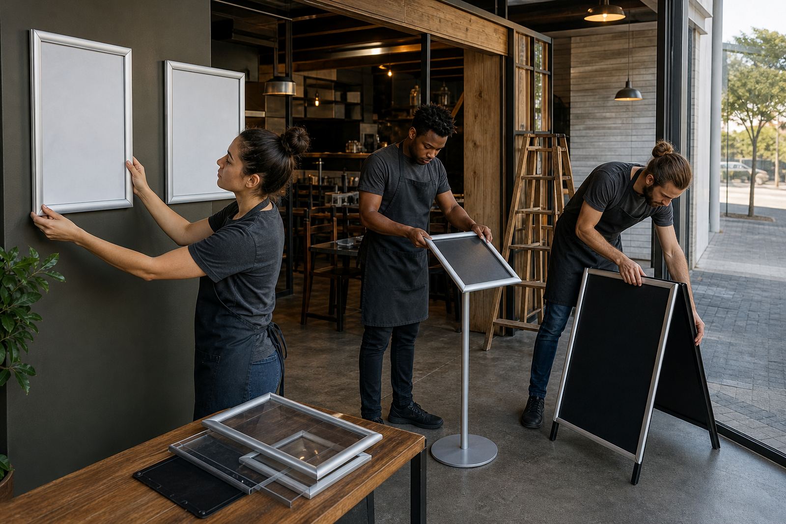
A collection point notice works best where staff hand over sealed meals, drinks or parcels in a tight space. At a takeaway counter in Paarden Eiland, a simple A4 frame at eye level can point walk-ins to the right hatch, while a second board near the till can mark prepaid orders or collection only.
For busy fronts, the message needs to be short and direct. A customer should read it while standing in the queue, not after they have already leaned over the counter and asked twice. Clear wording, large type and a clean border help the notice do its job without crowding the area.
- A4 suits tight counter zones and smaller notice points.
- A3 gives more space for headings and a few extra lines.
- Wall mounting keeps the area neat when counter space is limited.
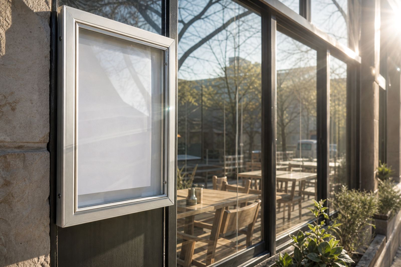
- Window mounting works well for pickup signs facing the street.
Frame styles that handle daily handling
Snap frames suit collection notices because the cover opens and closes without tools, so printed inserts can be changed when trade shifts. Aluminium profiles keep the frame straight, and an anti-glare cover helps when sunlight hits a front window or a bright shop light lands across the print.
For a site with a lot of foot traffic, choose a frame that can handle repeated changes without the corners looking tired. If the notice needs to move between a counter wall and an entrance window, a lighter profile is easier to position and still looks smart enough for a customer-facing area.
- Aluminium snap profiles keep the edges firm.
- Anti-glare covers reduce reflections on glossy prints.
- Portrait or landscape orientation depends on the wording.
- Window and wall mounting suit different front-of-house layouts.
A-frame stands for courtyards and curbside handover
An A-frame stand earns its place where customers collect from a forecourt, courtyard or shared parking area. It can be placed near the entrance, beside the handover point or at the edge of a walkway, so people know where to stand without blocking the flow of staff moving meals out.
In Stellenbosch, where lunch trade can spill between narrow pavements and busy entrances, an A-frame can guide takeaway customers before they reach the door. The sign face should stay simple: collection only, order number points, or a short instruction about where to wait. Too much wording makes the frame look crowded and slows the reading.
Print sizes that work with short messages
Collection notices usually work best when the wording is stripped back to the basics. A4 and A3 menu templates can be resized for notices, but the content must still be set for fast reading. A single heading, one instruction and a line for order collection is often enough.
Print finishing matters as much as the layout. Lamination helps on notices that stay inside a busy counter zone, while poster insert printing is handy where the message changes for lunch trade, functions or weekend trading. Colour matching keeps logos, headings and arrows consistent across frames, boards and stand inserts.
- Short lines read better than long paragraphs.
- Large type suits queue points and handover counters.
- Laminated prints hold up better in humid coastal air.
- Poster inserts make menu and notice updates easier.
Keeping the counter area readable
A collection point notice should support the staff, not add clutter. If there are labels for paid, pending and collected orders, each one needs a clear place and the same type style. Mixed sizes and mixed wording make the front counter harder to read, especially when a lunch rush is moving through quickly.
Short run printing helps when a pickup message changes for a promotion or a temporary trading shift. Menu resizing and menu proofing are useful when the same notice needs to sit beside a wall menu, a window sticker and a tabletop label. The result is cleaner when the wording, spacing and print size are checked as one set.
Courier packaging for notices sent beyond Cape Town
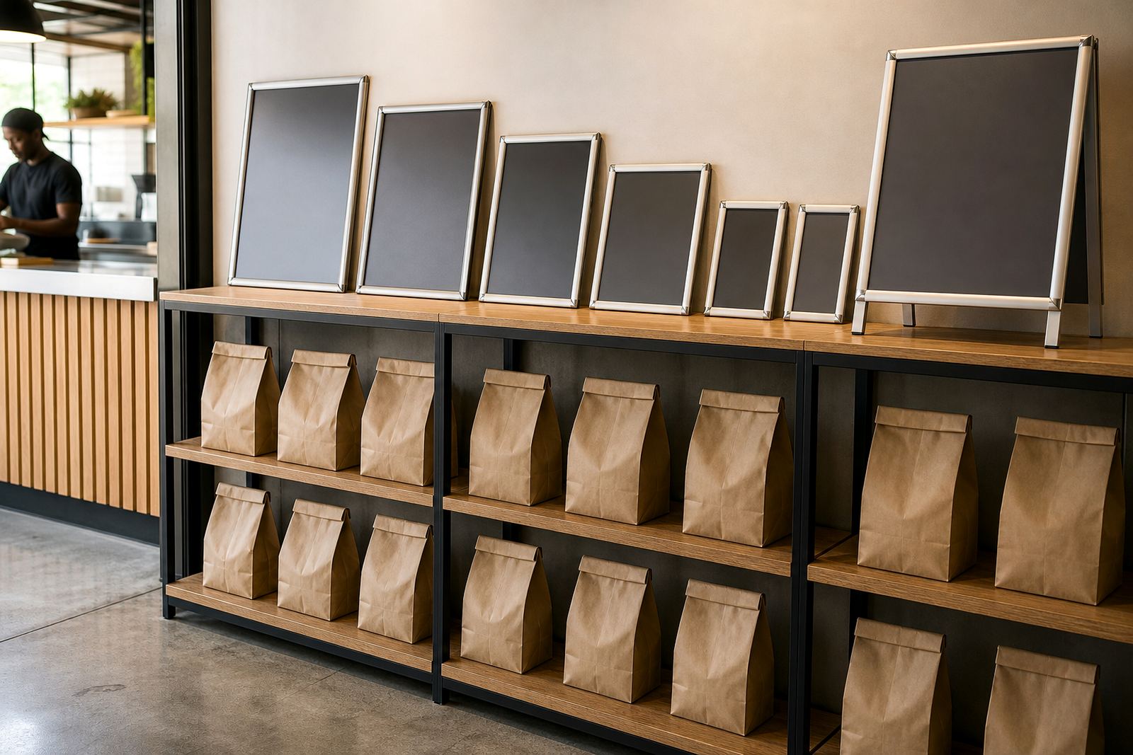
Collection point notices often travel to more than one branch, so the packaging has to protect the corners and keep the prints flat. Courier packaging matters on routes to Johannesburg, Durban and Gqeberha, where framed inserts and loose boards need to arrive ready for installation or handover.
For a multi-branch food group with outlets in Cape Town, Bellville and Milnerton, one print style can be repeated across sites with slight wording changes for each pickup counter. That keeps the front of house tidy without forcing every branch to invent its own signs.
- Pack frames so corners do not shift in transit.
- Keep inserts flat to protect the print face.
- Label each branch set clearly before delivery.
- Group wall boards and A-frame inserts together for sorting.
A practical local use case
A small cafe in Paarden Eiland that serves takeaway lunches may use one A3 snap frame beside the till and one A-frame stand near the pavement edge. The wall frame can say orders collected here, while the stand directs arriving customers toward the right side of the entrance. That split keeps the queue moving and saves staff from repeating the same instruction all day.
When the same cafe adds early breakfast trade, the notice can be updated with a fresh insert before opening. That is where clean typesetting and a good insert size matter, because the sign has to stay legible at shoulder height and still look tidy next to the menu boards.