When sunlight turns a menu into a mirror
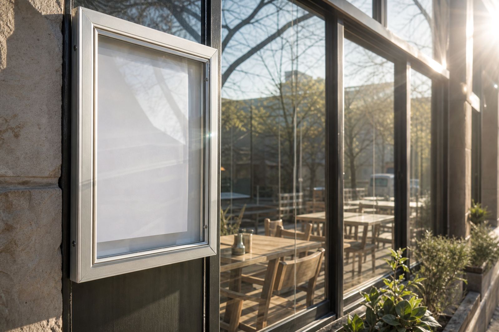
Window glare is usually the first problem people notice, but it is not the only one. Direct sun, reflected light from glass and polished floors, and a bright street outside can all strip contrast from a menu board. What looked clear at the counter can become hard to read from two metres away, especially where customers are moving, ordering and paying in one quick stop.
In Cape Town, a shopfront that faces the afternoon sun can have very different reading conditions to a shaded site in Bellville or a busy takeaway counter in Milnerton. The answer is rarely to print darker and hope for the best. It is better to treat the whole display as one unit, with the frame, cover, print size and position all working together.
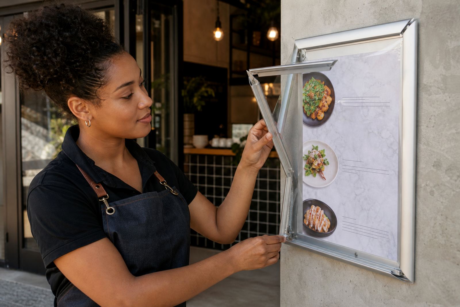
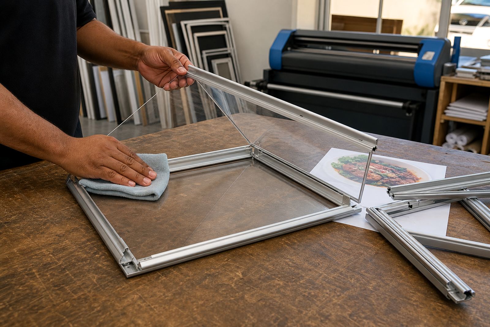
Snap menu frames are useful here because the front cover can be changed without tools, but the frame still needs the right finish. A glare reducing cover softens reflection, while a clean aluminium profile keeps the edge neat and holds the print flat. When the print sits flat, light does not scatter as badly across the surface.
Choose the right viewing angle before the size
A4 and A3 menu inserts behave differently near glass. A small A4 insert may work well for short specials, but if the board sits too close to the window or too high above eye level, people will catch more reflection than text. A larger A3 board can help where the order list is longer, yet the extra size only helps if the mounting angle is sensible.
For wall or window mounting, the viewing angle matters as much as the paper. If a frame is mounted flat against a pane that catches morning sun, the display can flash with white glare. A slight offset, or a position a little deeper into the shop, often improves legibility more than changing the font alone.
- Keep key text at eye level where customers pause.
- Avoid placing pricing lines where the strongest reflection falls.
- Use one board for daily items and a second board for specials if the list is crowded.
- Test the display from outside the shop and from the queue point, not only from behind the counter.
Anti-glare covers do the quiet work
An anti-glare cover is not a decorative extra. It cuts the sharp reflection that bounces off clear plastic and makes a menu appear faded from certain angles. In a café with large frontage, that small change can make headings easier to read when the sun shifts across the glass.
For takeaway counters, the cover also protects laminated menu prints from finger marks and dust. If the site is near the sea, as in parts of Cape Town and Gqeberha, salt in the air can collect on exposed surfaces faster than people expect. A covered snap frame keeps the insert cleaner for longer, and the board itself looks tidier on the wall or window.
Where window displays carry full menus, poster insert printing can help with bigger sections such as meal deals, platters or drink lists. A clear cover over a well-sized print is usually easier to read than a crowded sheet with too much text packed into one panel.
Board layout, chalkboard use and short menu changes
Some counters need quick changes through the day, and that is where a mix of snap frames and chalkboards can work well. A chalkboard is useful for daily specials, but it performs best when the writing is neat, the spacing is generous and the board is not placed where bright daylight washes out the chalk. If the room is very bright, a printed board often gives sharper contrast for the main menu.
Short run printing is worth using when the menu changes often but the core items stay the same. Instead of crowding one board with every new item, separate the stable menu from the daily add-ons. That way the display stays easier to scan, and the staff do not need to rewrite the entire board for a small change.
- Use bold headings for meals, drinks and add-ons.
- Keep price alignment consistent across the insert.
- Leave enough white space around specials so the eye can rest.
- Match chalkboard handwriting to the rest of the counter display, not the other way round.
Menus near glass need practical print choices
When a board sits near a bright window, print finishing matters. Laminated menu prints resist handling and can be wiped clean, while colour matching keeps brand tones closer to the rest of the interior. If the reds, greys or dark blues on the menu are too weak, glare will flatten them further.
Menu resizing and menu typesetting are often overlooked. A layout that works on A3 may need adjustment when reduced to A4, because small text can break apart once reflections hit the page. Wider spacing, stronger contrast and fewer tiny details usually help more than dense text blocks. For restaurants and cafes in Stellenbosch or Durban, where light changes during the day, the menu should stay readable from breakfast through evening service.
Print finishing also matters at the edges. A neat trim and a straight insert help the frame close properly, which keeps dust out and stops the print from curling. A good fitting insert looks cleaner under glass and stands up better in busy service areas.
A Paarden Eiland example with a window and a queue
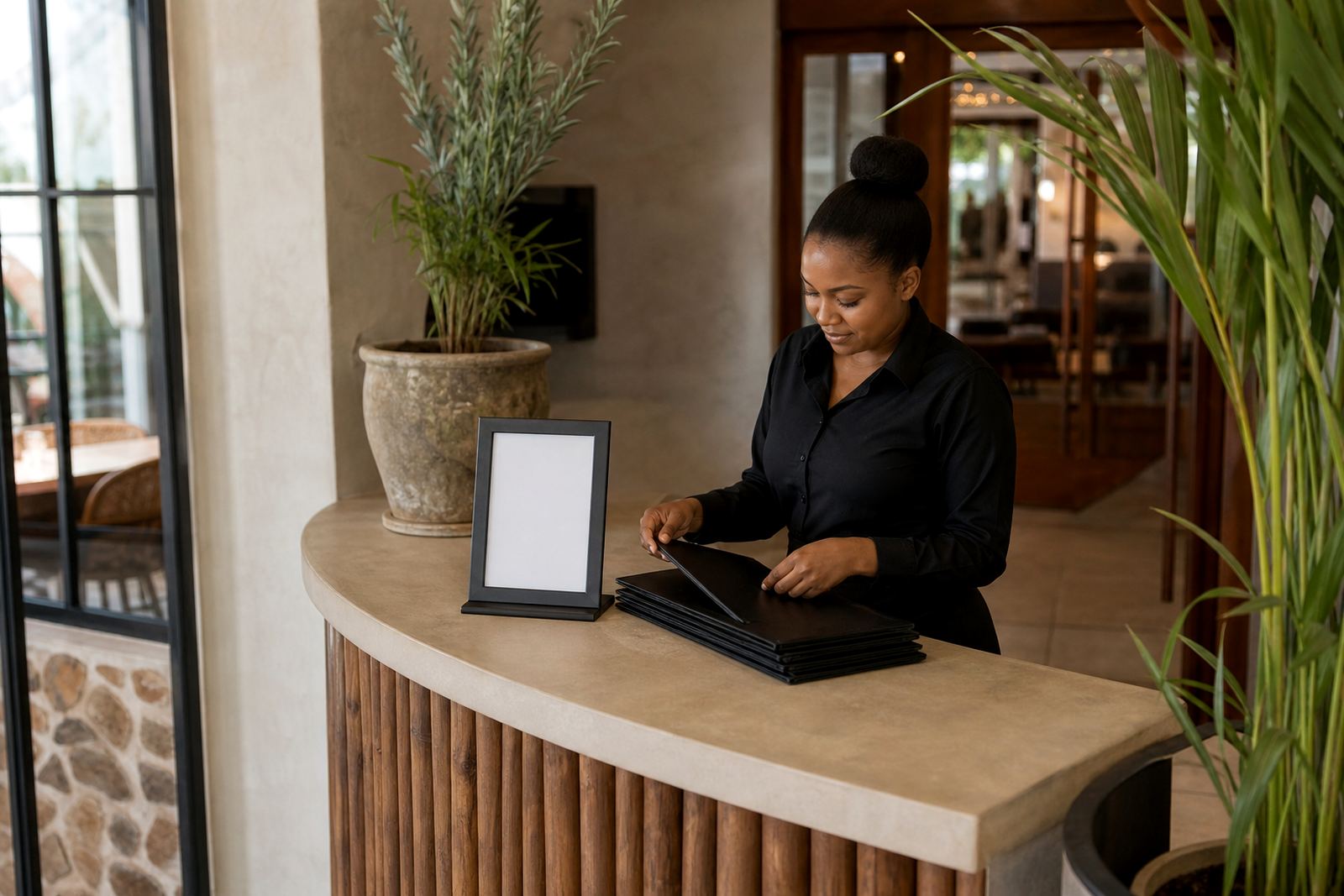
A busy café in Paarden Eiland may have a bright street-facing window, a queue at the counter and a lunch list that changes by the hour. In that setting, one wall-mounted snap frame can carry the main menu, while a second A-frame stand near the entrance can hold the daily special or a breakfast insert. The front window can then stay less crowded, which reduces visual noise and makes the main pricing easier to read.
The same job often benefits from a print set that is planned in advance: A4 templates for short lists, A3 templates for the main items, and courier packaging for replacement inserts sent to branch sites. For a group working across Cape Town, Johannesburg and Gqeberha, that kind of organisation keeps the display consistent even when the menu changes from one site to the next.
In strong daylight, the best result is usually not one dramatic fix. It is a mix of the right frame, a sensible mounting point, a cleaner layout and an insert size that suits the amount of information. That combination keeps the board readable when customers are looking quickly and the sun is moving across the glass.
What to send when the glare keeps winning
If a window display is still hard to read, the useful details are usually simple: the size of the opening, where the sun lands during the day, whether the board is on a wall or in a window, and whether the menu changes daily or weekly. From there, our contact form can be used to send the room details and the current menu copy, so the frame, print size and finishing can be matched to the site.
That approach works well for restaurants, cafés and takeaway counters that need cleaner reading near glass. It also helps with branch rollouts where one site sits in shade and another catches strong afternoon light. The board should suit the room first, then the menu second, and the print should stay legible without fighting the reflections.
- Use A4 for shorter notices and compact specials.
- Use A3 where the main menu needs more breathing room.
- Choose anti-glare covers for bright windows and street-facing entrances.
- Keep the first read simple, then let the details follow underneath.