Start with the menu surface, not the décor
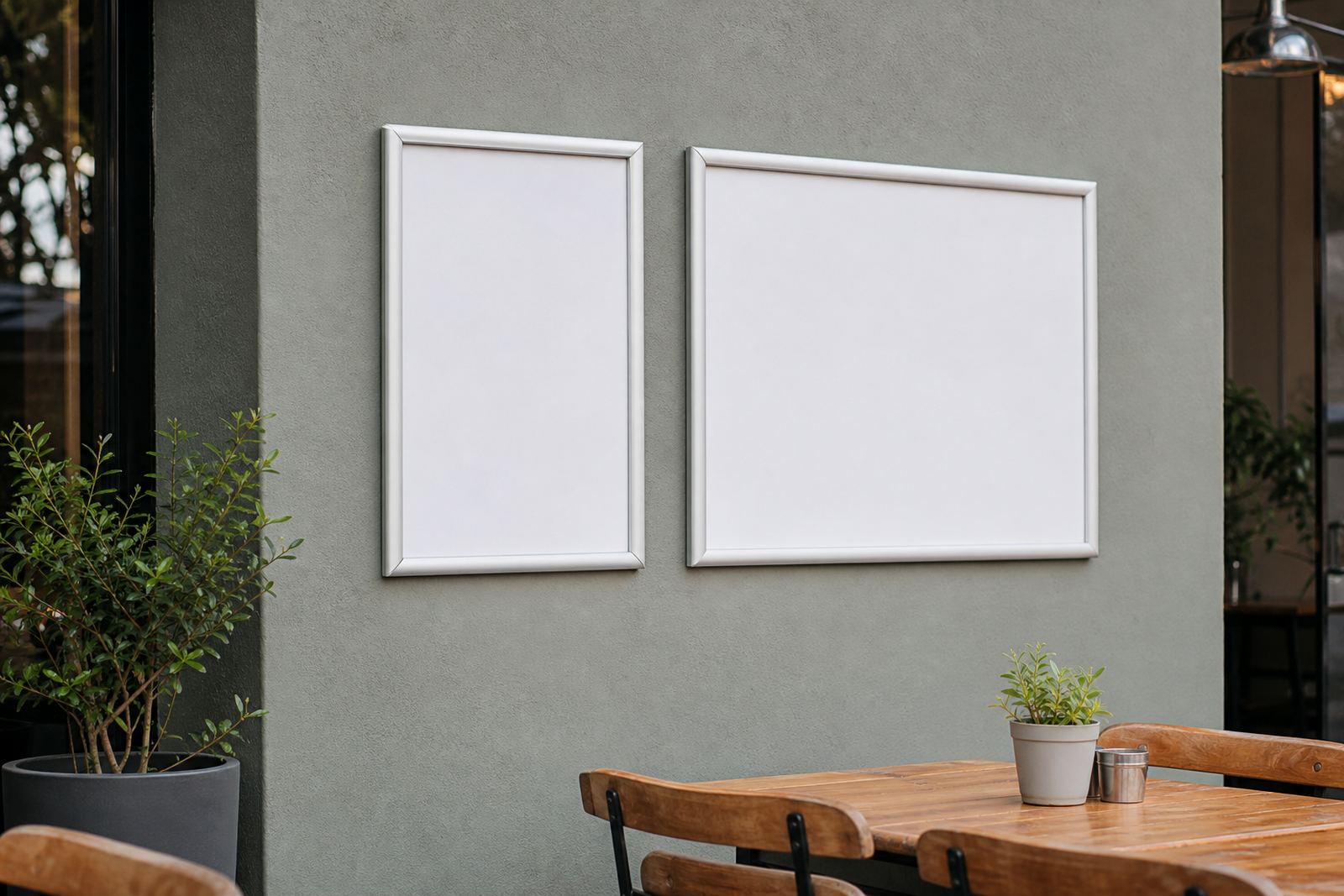
Before a chair is moved into place, decide where the guest will actually read the offer. An A4 snap frame suits tight walls, coffee counters and notice points, while an A3 frame gives more breathing room for brunch lists, set meals or a bigger specials panel. In a narrow takeaway shop in Milnerton, that choice can save the staff from cramming too much text into one corner and then reprinting it a week later.
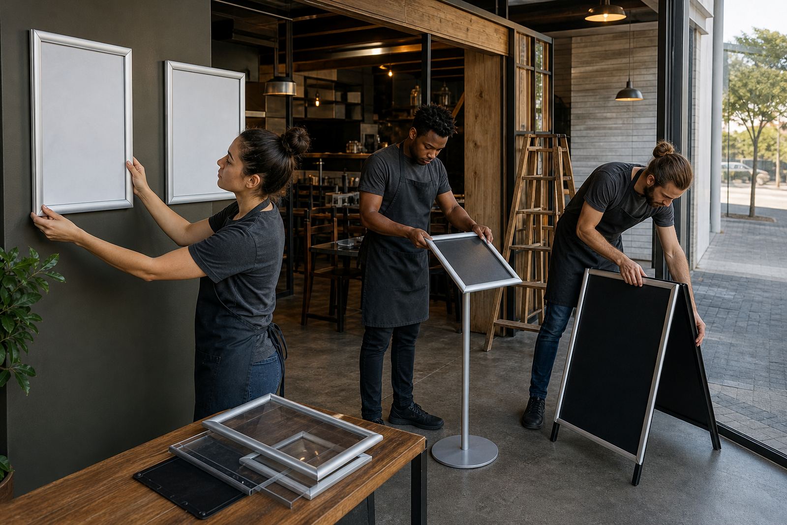
Look at the route from the door to the till. If customers pause at the counter, place the price board at eye level and keep the type size generous. If the venue has a window facing the street, a double-sided insert board or window-mounted snap frame can catch passing trade without adding clutter inside. Aluminium profiles hold shape well, and anti-glare covers help on bright Cape Town mornings.
Build a set that can change with the day
Launch week usually brings small corrections. A breakfast menu may need a lighter set of items, lunch might need a shorter list, and specials can change before the evening rush. That is where snap menu frames earn their keep, because the insert lifts out in seconds and the board stays on the wall or stand.
- Use one master layout for the core menu
- Keep a separate specials board for daily changes
- Set aside space for pricing updates and sold-out lines
- Order spare prints for the first trading weeks
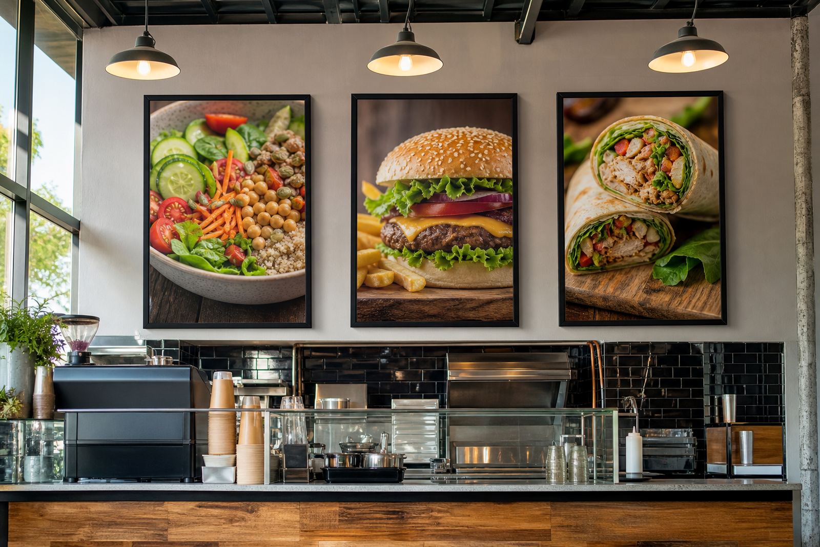
For a cafe in Stellenbosch, a simple pair of wall frames can carry the main menu while a chalkboard handles the day’s pies, soups and cold drinks. The board mix should match the pace of the kitchen. If the offer changes often, keep the changing part on a format that can be replaced without tools or a full reprint.
Print sizes that do not fight the frame
Menus look tidy when the artwork is prepared for the frame size from the start. A4 works for shorter lists, counter notices and compact specials. A3 gives more room for item groups, icons and a cleaner layout where the text needs to breathe. When the print is too small for the frame, the board looks empty and the menu feels unfinished. Too much copy in a small frame makes the customer work too hard.
Menu resizing and typesetting matter during launch because the first artwork is often pulled from a supplier list, a chef’s draft or a handwritten sheet. That needs careful proofing before the print run starts. Colour matching also matters when the venue has a set look already, as one odd shade on a board can throw off the room. Small corrections at the start save a lot of mess on opening night.
What to send in the launch pack
When the opening team prepares the menu pack, keep the file and the content in one tidy group. That gives the production side something workable, whether the job is a single wall frame or a batch of boards across the venue. If the launch is in Durban where humidity can be rough on paper edges, laminated menu prints and neat finishing help the sheets last through busy shifts and damp air.
- Final menu text with item names and prices
- Preferred frame sizes, such as A4 or A3
- Any specials board wording for opening week
- Colour notes for logos, headers and section blocks
- Courier address details for sites outside Cape Town
Short run printing helps when a launch still has a few moving parts. You may need ten inserts for one counter and a smaller stack for a tasting bar or patio area. Courier packaging keeps those boards flat and protected on the way to Johannesburg, Gqeberha or Paarl, so the first set arrives ready to place rather than needing repairs at the door.
A-frame stands for the pavement and the path in
An A-frame menu stand suits places that want foot traffic to slow down before the door. It works well for breakfast boards, lunch specials and takeaway offers near the pavement or parking bay. On a busy road in Bellville, the stand can sit where it is visible but still easy to bring in after trading hours.
Choose a stand that can take repeated handling and still sit level on uneven paving. A chalkboard panel is useful where the offer changes daily, while a printed insert board suits a fixed launch list with one or two seasonal swaps. If the front of house team expects wind, rain or constant handling, the frame should close firmly and the board should be easy to wipe down after a spill.
A local opening example with fewer moving parts
Picture a small eatery opening in Paarden Eiland with breakfast, toasted sandwiches and a short lunch board. The counter needs one A3 menu frame, the wall needs one smaller specials board, and the street-facing side needs an A-frame stand with a clear offer. That setup covers the first week without forcing the team to rework the whole display each morning.
In that kind of launch, the practical path is plain. Keep the core menu fixed, let the specials board carry the daily changes, and hold a few spare laminated inserts for corrections. If a supplier note changes or a price needs a small fix, the frame system makes that easier to handle before the lunch crowd builds. It keeps the opening day calm, which matters more than a glossy finish no one can read.
The last check before doors open
The final pass is not about decoration, it is about legibility. Stand at the counter, step back from the wall and read the board from the guest side. If the item names are cramped, if the prices vanish in bright light or if the menu board looks crowded, make the change before service starts. A clean launch display helps staff answer fewer repeated questions and lets the order flow stay steady.
SnapperFrame Menus works with menu templates, resizing, proofing, print finishing and courier packaging for venues across Cape Town, Stellenbosch, Johannesburg, Durban and Gqeberha. That mix covers the first prints and the next round of edits when the menu settles into daily trade. A launch board should feel ready on day one, not like something that still needs sorting after the first rush.