Start with the wall, not the paper size
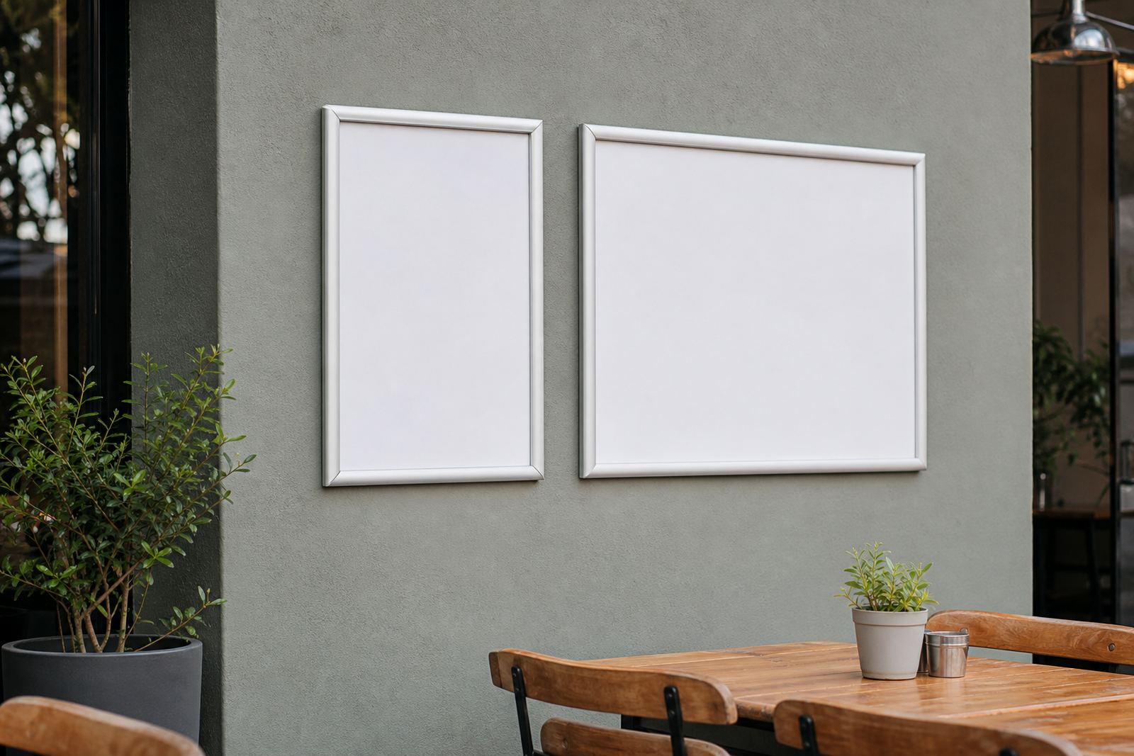
A menu frame should suit the wall first, then the content inside it. In a tight counter area, a portrait frame can sit neatly beside a service hatch or beside a till point without taking over the wall. A landscape frame gives broader spacing and often feels calmer on long feature walls or above a service counter where people stand and read from left to right.
In Cape Town cafes with narrow interior walls, portrait layouts usually make better use of vertical space. In restaurants with long blank walls, landscape frames often balance the room better and leave enough air around the menu. The frame should not fight the room, because the eye notices that before it notices the specials.
- Portrait suits tall wall gaps and shorter item lists.
- Landscape suits wider walls and grouped menu sections.
- Measure the reading height before settling on a size.
- Check where lights and reflections hit the cover.
When portrait helps the menu read faster
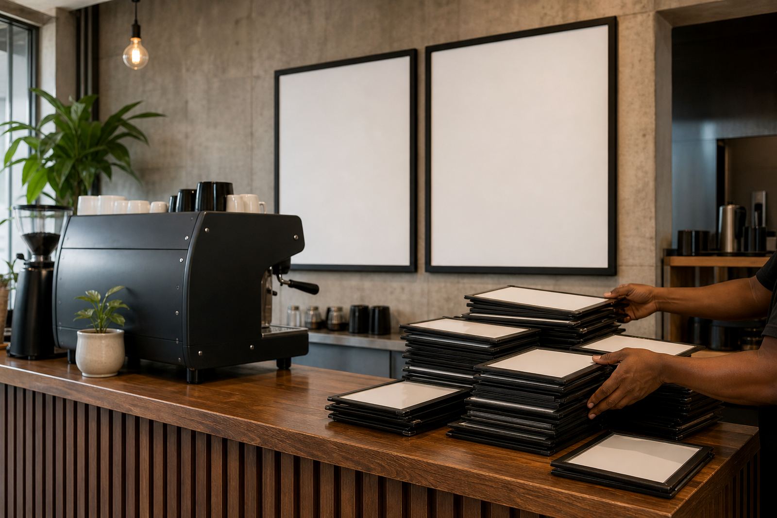
Portrait works well when a menu is built in clear tiers. Breakfast, light meals, mains, drinks and desserts can sit in a top to bottom flow that feels natural to customers reading at standing height. It is also useful when the menu board carries fewer items but needs stronger vertical presence, such as a wall board beside a coffee station.
A4 portrait snap frames are common for compact specials, while A3 portrait frames give more breathing room for pricing and item descriptions. When the menu changes often, portrait can make each section easier to swap without reshuffling the whole page. That matters in takeaway counters where staff need the board to stay readable during busy lunch periods.
- Good for menus with separate sections and short descriptions.
- Works neatly for specials boards and wall notices.
- Helps keep pricing columns aligned from top to bottom.
- Useful where the available wall height is greater than width.
Landscape when the menu needs room to breathe
Landscape is the cleaner choice when items sit in rows or when a menu has several columns. It gives more lateral space for category headings, pricing and small notes such as gluten free or extra sides. A wider frame also suits window mounting, where people glance in from outside and need a quick read without leaning in.
For bars, cafes and casual dining spaces, landscape often carries a more open feel. It can hold one long menu board or a set of evenly spaced panels across a service wall. In a Durban takeaway, for example, a landscape A3 insert can keep meal options visible above the counter while the cover cuts glare from daylight.
- Useful for multi-column menus and longer item names.
- Better for wide service walls and window displays.
- Gives more space for icons, prices and brief notes.
- Often suits drinks lists and combo menus very well.
Reading distance changes the right format
Customers do not read a menu frame from the same spot every time. Some stand close at the till, others wait near the doorway, and some scan the wall from across the room. Portrait frames tend to guide the eye downward, which helps when the reader is close to the board. Landscape frames often work better at a short distance because the eye can scan across each line without losing its place.
Anti-glare covers matter here as much as orientation. A clear cover with less reflection helps both portrait and landscape menus, especially near windows or under bright lights. If the room has strong afternoon sun, the angle of the frame matters too. A frame that looks neat in the morning can become hard to read by late afternoon if it sits in the wrong spot.
A4, A3 and the shape of the message
The page size should match the amount of information, not just the frame style. A4 portrait is practical for short specials, wine lists or coffee boards with limited text. A3 portrait gives more space for structured menu sections without needing to shrink the type too much. A4 landscape can suit compact lists with three or four columns, while A3 landscape gives room for layered menu structures and larger visual spacing.
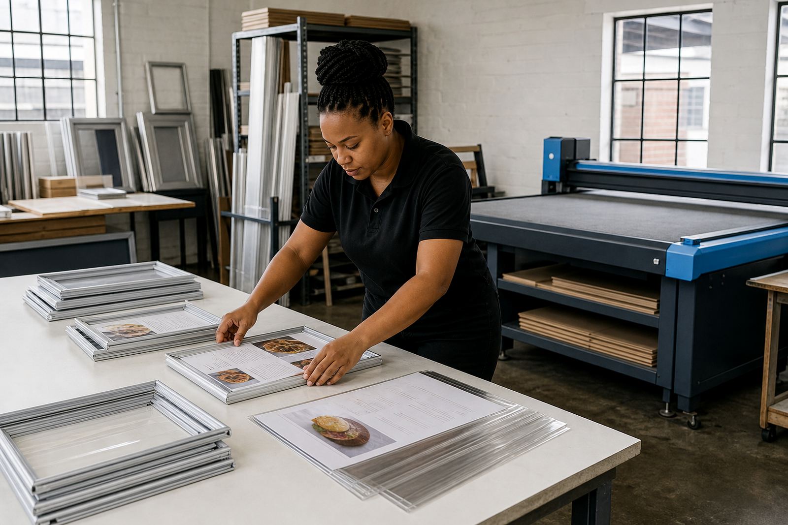
Snap frames with aluminium profiles are useful because inserts can be changed without tools. That keeps the shape decision practical instead of decorative. If a menu is updated often, the frame has to work with printing, cutting and alignment as a single process. A tidy insert in the wrong orientation still looks awkward, so the template should be planned before printing starts.
- A4 works well for compact specials and notices.
- A3 suits fuller menus and wider spacing.
- Landscape gives more room across the page.
- Portrait gives more room down the page.
How A-frames and chalkboards shift the decision
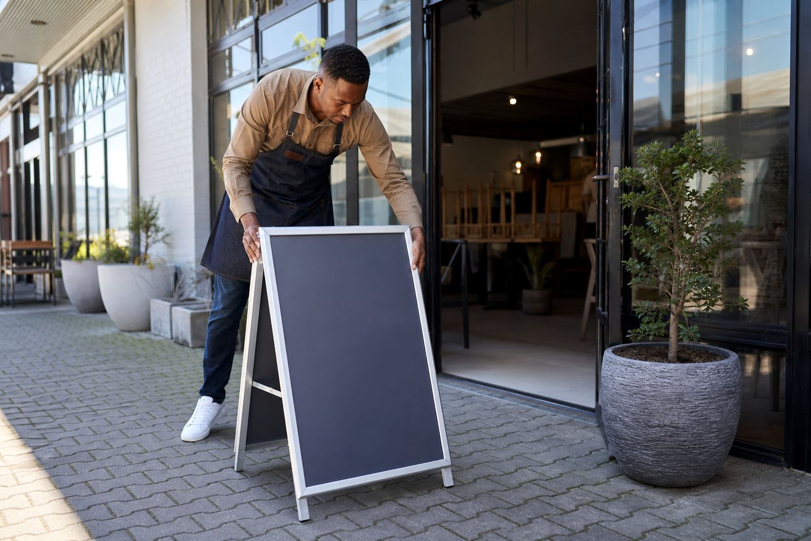
A-frame menu stands change the conversation because they sit in circulation space rather than on a wall. On a pavement edge or at an entrance, landscape often feels easier to read from a passing angle. Portrait can still work when the sign needs to show one main offer, a short list or a directional message. The frame should not wobble in wind or crowd traffic, especially in exposed spots near the coast.
Chalkboards play by slightly different rules. They suit hand lettering and quick changes, but the same layout logic still applies. A tall chalkboard can divide specials neatly, while a wider board gives more freedom for featured dishes and price bands. In Milnerton or Gqeberha, where coastal air can affect finishes, the frame and board material need to hold up without looking tired too soon.
A Paarden Eiland example that keeps it practical
A small takeaway in Paarden Eiland may need one wall board for hot meals, one counter insert for drinks and one A-frame outside for daily specials. The wall board could work best in landscape if the items are grouped into columns. The counter insert may suit portrait if the list is shorter and the space beside the till is narrow. That mix gives staff a cleaner layout, and customers can find the right board without confusion.
For a Cape Town menu that is printed, inserted and updated often, the frame shape should support the working rhythm of the shop. Menu resizing, proofing and colour matching all become easier when the orientation is chosen early. Courier packaging also matters when frames and inserts are travelling to Stellenbosch, Johannesburg or Durban, because the board has to arrive ready to mount or display.
Portrait and landscape are not opposites. They are two tools for different wall sizes, different reading distances and different kinds of menu structure. When the frame, print size and mounting point line up properly, the menu looks orderly and the service counter feels easier to work with.