Too many lines, not enough reading room
A menu board has a fixed field of view, so the copy has to earn its place. When every item is treated as equal, the board starts looking busy and customers skim past the details that matter. Fewer words do not make a menu thin, they make it readable.
In restaurants, cafes and takeaway counters, people are often standing, ordering, moving off to pay or waiting for a collection slip. That means the board needs quick visual entry points. Strong headings, short item names and enough blank space around each group keep the eye moving in a sensible order.
- Group breakfast, mains, snacks and drinks into clear blocks.
- Keep item names short and direct where possible.
- Leave space between categories so the board can breathe.
- Use one style of punctuation and stick with it.
How spacing changes the way a board reads
Spacing is not empty space for the sake of it. It guides the eye from one choice to the next and stops the board from feeling crowded. In an A4 or A3 snap frame, tight margins can make a menu look cramped even when the wording is sensible. Good spacing gives each line a proper turn.
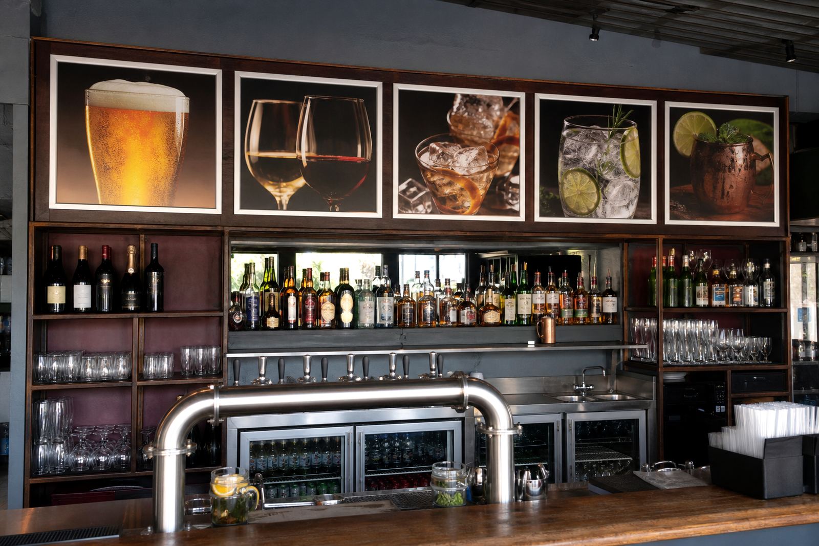
Margins, line spacing and section breaks matter even more on wall-mounted boards near counters where customers are making a quick decision. If the text sits too close together, price points blur into item names and the whole board becomes hard work. A cleaner layout helps the menu stand up to daily use, fingerprint marks and changing specials.
- Use wider line spacing for dense lists.
- Keep price columns aligned so numbers are easy to scan.
- Let the heading size do some of the organising.
- Avoid stacking too many specials in one block.
For boards that are updated often, laminated menu prints and poster insert printing help keep the finish tidy. The print fits neatly behind the anti-glare cover and the page change does not disturb the rest of the layout.
Headings that tell people where to look
Headings that tell people where to look
Good headings do more than name a section. They set the pace for the whole board. A customer should be able to find salads, grills, drinks or lunch boxes without reading every line from top to bottom. That is where a clear hierarchy matters.
Headings need contrast in size and weight, while the body copy should stay plain and practical. If the heading is weak, the menu loses structure. If the heading is too decorative, it fights the item list. The best boards use simple hierarchy and leave the food to do the talking.
A useful test is to stand back from the board and glance for three seconds. If the categories are obvious, the structure is working. If the whole page feels like one long paragraph, the board needs tightening.
A Cape Town takeaway counter example
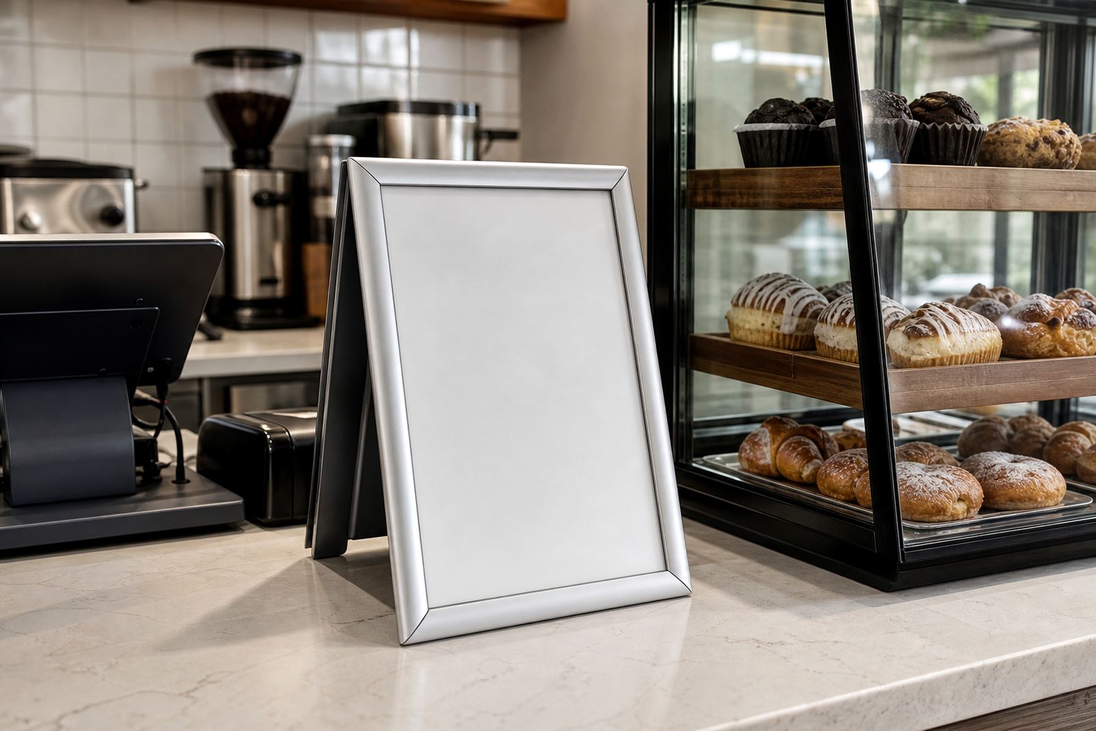
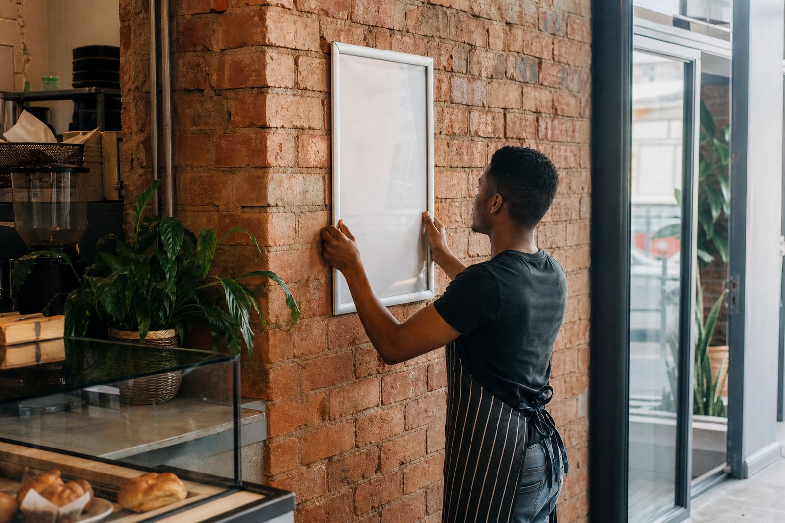
In Paarden Eiland, a takeaway counter serving office lunch traffic might need a wall board behind the till and an A-frame stand at the entrance. The front board can carry the full set of categories while the stand picks out the short list that draws people in. That split keeps the message clean and stops the entrance board from becoming overloaded.
A practical setup often uses A4 or A3 snap frames with aluminium profiles and anti-glare covers, plus a chalkboard for daily specials where handwritten notes need to stay brief. If the same menu has to work in Milnerton, Bellville and a small shopfront in Stellenbosch, the layout should stay legible from a short distance and still look tidy in window mounting or wall mounting.
- Use the wall board for the main menu structure.
- Keep the A-frame for specials, combos or one strong offer.
- Shorten long item names before shrinking the type size.
- Reserve large text for headings and high turnover items.
Print decisions that keep the board calm
Print decisions that keep the board calm
Clutter is not only a writing problem, it is also a print problem. If the text is resized without checking line breaks, the layout can start to fold in awkward places. Menu resizing, menu typesetting and proofing help make sure each panel fits the frame properly and nothing feels squeezed.
Colour matching matters too. High contrast is useful, but too many colours on one board can make the eye wander. A clean colour plan with one or two strong tones is usually enough for menu boards in busy service spaces. Print finishing should support the layout, not compete with it.
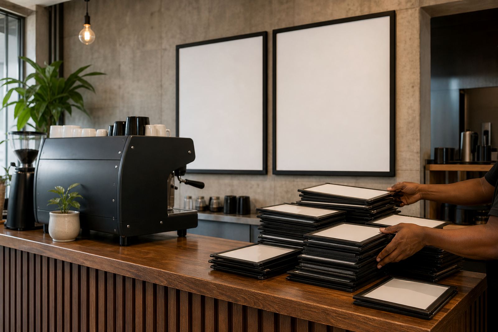
For a Durban cafe or a Gqeberha takeaway counter, courier packaging also matters because the printed panels need to arrive flat and ready for fitment. When the board is packed well, the frame opens neatly and the menu goes in without creases or bent corners.
What to trim before the next reprint
Menus improve when they are edited with discipline. Long descriptions, repeated words and near-duplicate items all take up space without adding much value. Short run printing makes it easier to test a cleaner version before committing to a full change across all branch boards.
When the menu is trimmed properly, staff can guide customers more confidently and the board stays easier to update. The goal is not to strip out personality. It is to make sure the wording works inside the frame, on the wall and at the counter without forcing the reader to hunt for the important bit.
- Cut repeated flavour notes that appear in several lines.
- Move long product descriptions to a smaller insert, if needed.
- Keep prices aligned and visible.
- Use the same naming style across branches in Cape Town, Johannesburg and Durban.
A menu that reads cleanly usually sells more smoothly because the customer does less work. On a busy Friday in a Stellenbosch cafe or a lunch rush in Bellville, that matters more than fancy wording ever will.