Start with the order flow at the counter
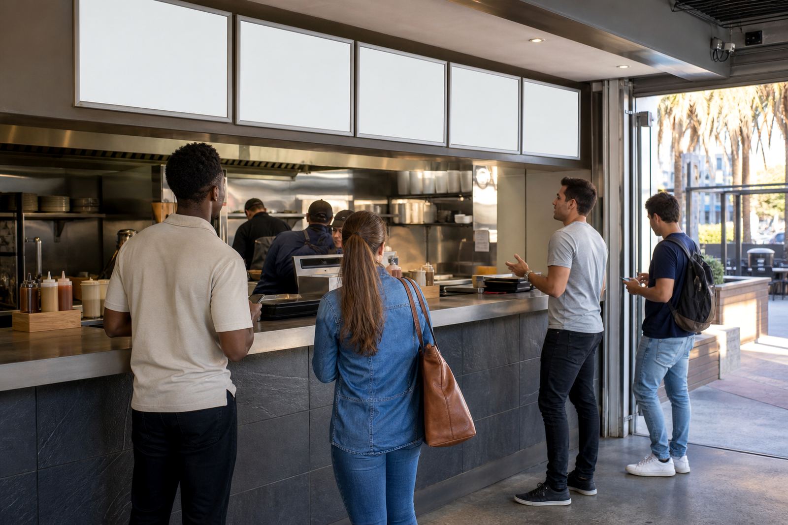
In a busy bar, the menu is read standing up, often with a queue behind the customer and a barman trying to keep pace. That makes the first job of the layout very practical: separate the menu into blocks that match how people order. Cocktails sit well at eye level near the top, beer and cider can take the middle, and wine or by the glass pours can live in a calmer section lower down.
A single long list forces the eye to hunt. A zoned layout gives each category breathing room, and that matters when the room is loud and the lighting is not perfect. In Paarden Eiland we see this work well for bars serving a quick weekday lunch crowd and a later evening trade, where the same board has to read cleanly in both settings.
- Lead with the busiest category for that venue.
- Keep similar drinks together, not scattered across the board.
- Leave white space around headings so the eye can rest.
Cocktails need space, not clutter
Cocktails usually carry longer names, ingredients and sometimes a short flavour note. That means the cocktails section should not be squeezed between two smaller groups. A proper block gives room for line breaks, price alignment and enough contrast for easy reading from a few metres away.
For A3 menu boards, this zone can work as a featured panel with a narrow ingredient line under each drink. On A4 inserts, tighter typesetting helps, but the same rule holds: keep the names bold and the notes lighter. If a venue runs seasonal cocktails, a snap frame makes those swaps simple without reprinting the whole board.
- Use one heading for classic cocktails and one for seasonal specials if needed.
- Keep garnish notes short, not crowded.
- Avoid mixing cocktail names with beer promos on the same line.
Beer and cider belong in a clean run
Beer is usually scanned faster than cocktails, so this section should feel straight and easy. Guests often look for lager, ale, stout, draught or bottled options in a predictable pattern. When beer is grouped cleanly, the menu feels calmer and the order moves faster at the till.
For a wall board or window-mounted frame, use the same logic as a shelf label system. Each beer type gets a clear line, then the pricing sits to the right or below in a fixed position. That kind of repetition helps in noisy venues where a customer may only glance once before ordering.
- Group draught, bottled and non-alcoholic beer separately.
- Keep pack sizes or volumes aligned across the zone.
- Do not place beer specials beside wine tasting notes.
Wine is easier when it has its own calm block
Wine lists read better when they are not fighting for attention with mixed drinks or snack items. Even a short wine zone should show whites, reds and sparkling options in a settled structure. If the venue offers house wine by the glass, that can sit at the top of the block before the bottle list begins.
In a Cape Town bar with a narrow front window, a laminated insert behind an anti-glare cover can protect the layout from strong sunlight and sea air. The point is not decoration, it is legibility. A neat wine zone gives the guest confidence, especially when the room is full and the menu has to work quickly.
- Separate by glass and by bottle before listing the varieties.
- Keep vineyard or origin details brief.
- Use one font size for wine names and a smaller one for notes.
Specials should look temporary without feeling improvised
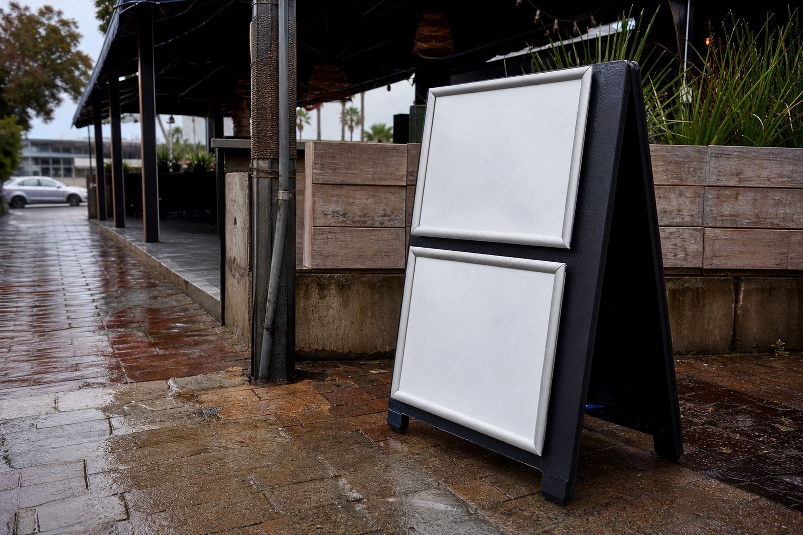
Daily or weekly specials need their own display zone, because they change more often than the core menu. A small panel at the top corner of a snap frame, or a separate A-frame stand near the entrance, can handle that role well. The trick is to make the specials feel current while still matching the rest of the board.
For takeaway counters in Stellenbosch or Milnerton, specials often shift with stock and foot traffic. That is where menu resizing and proofing matter, especially if the same artwork must work in both A4 and A3 formats. A special should stand out, but it should never look like it was squeezed in at the last moment.
- Keep specials shorter than core menu items.
- Use one accent colour only, not several.
- Place time-sensitive items in a separate zone, not mixed into the main list.
Materials and frames that help the zones hold shape
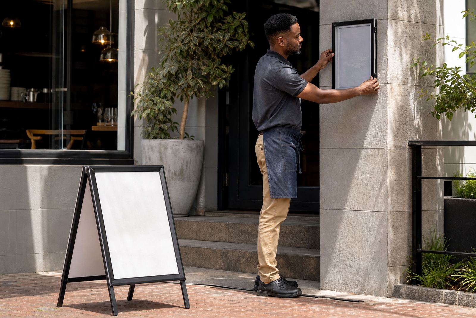
The display hardware does a lot of quiet work. Aluminium snap frames keep the edges neat, while anti-glare covers help under bright lights and window exposure. Wall mounting suits fixed interiors, window mounting helps street-facing bars, and an A-frame stand gives flexibility for entrances, patios or queue points.
For a bar that updates drinks often, courier-ready inserts and print finishing keep the pages tidy during transport. A chalkboard can also work for specials, but it needs disciplined handwriting and enough spacing to match the printed zones nearby. When the materials are consistent, the menu reads as one system instead of a mix of unrelated pieces.
A Cape Town example with a busy Friday trade
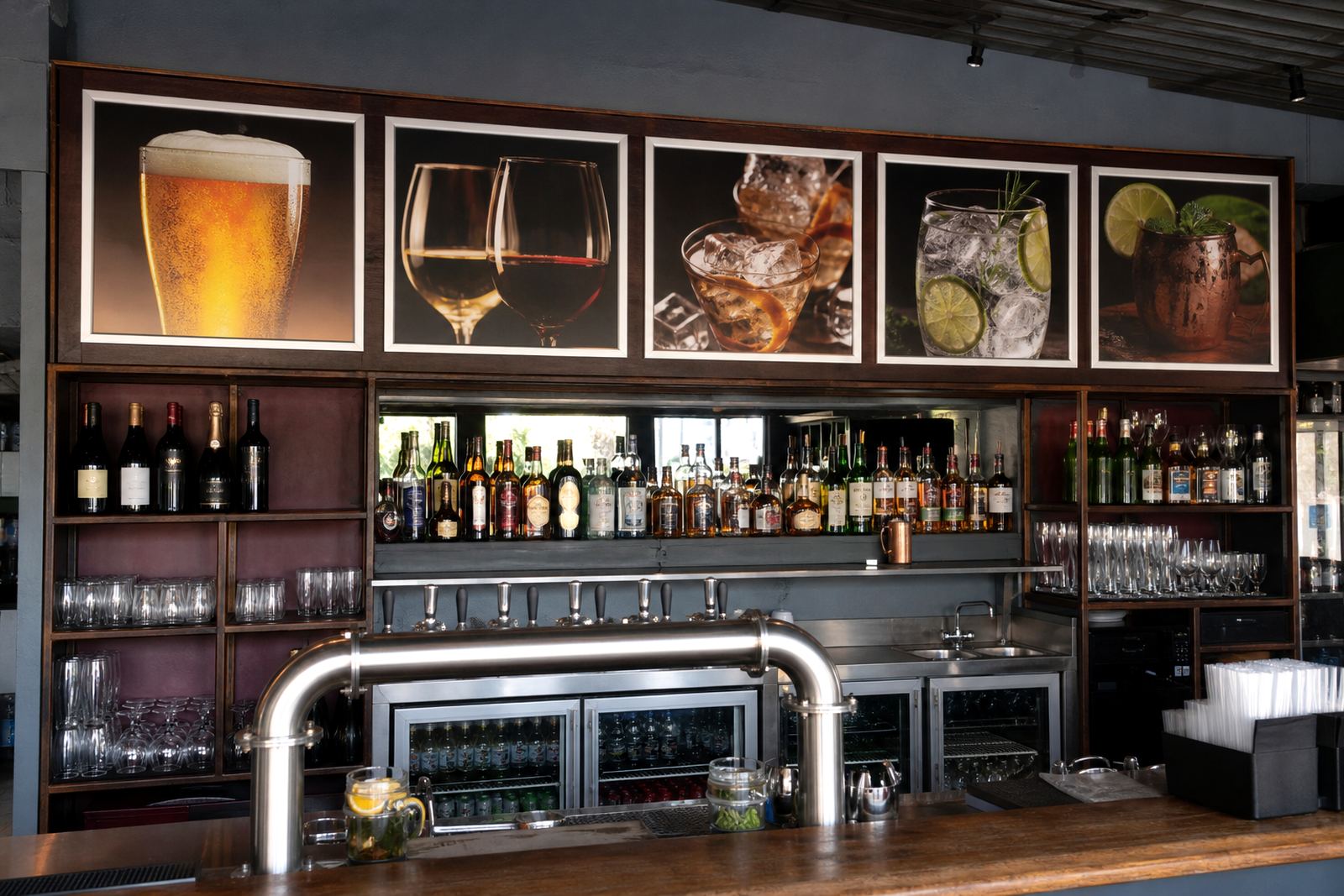
A bar in Paarden Eiland serving after-work guests and weekend visitors might use a wall frame behind the counter for the main drinks list, then place an A-frame near the entrance for rotating specials. Cocktails would sit at the top of the wall board, beer in the middle, wine lower down, and a small specials panel could highlight a house pour or seasonal mix. That layout keeps the queue moving without making the board feel crowded.
Because the venue may need fresh inserts for events, menu updates and short run printing help the board stay current without redoing the whole display. The same structure also travels well to branches or sister sites in Bellville, Paarl or Durban, where the drink list may be similar but the specials are not.