Put the right offer where the eye lands first
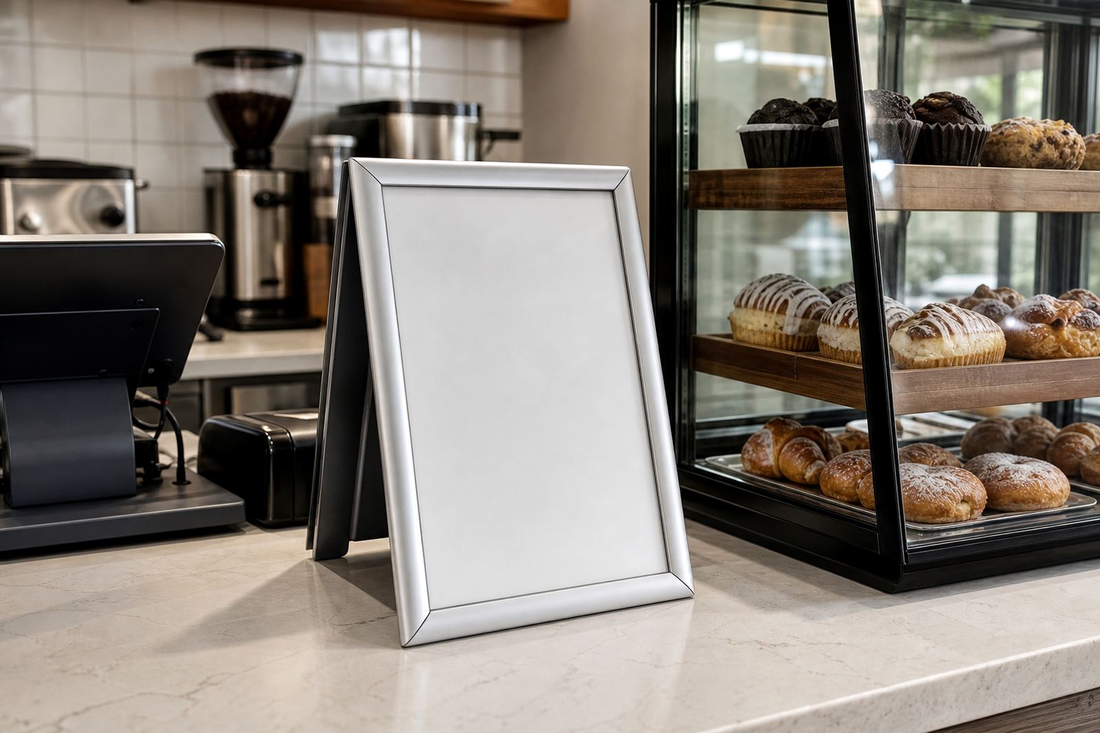
A countertop frame works best when it carries the decision people are already trying to make. At the till that may be a coffee add-on, a pastry special or a lunch combo. Near a collection counter, it might be the sauces, extra toppings or a reminder to check the order number before stepping aside. The point is not to list everything. It is to place the next useful choice in front of the customer without making the counter feel cramped.
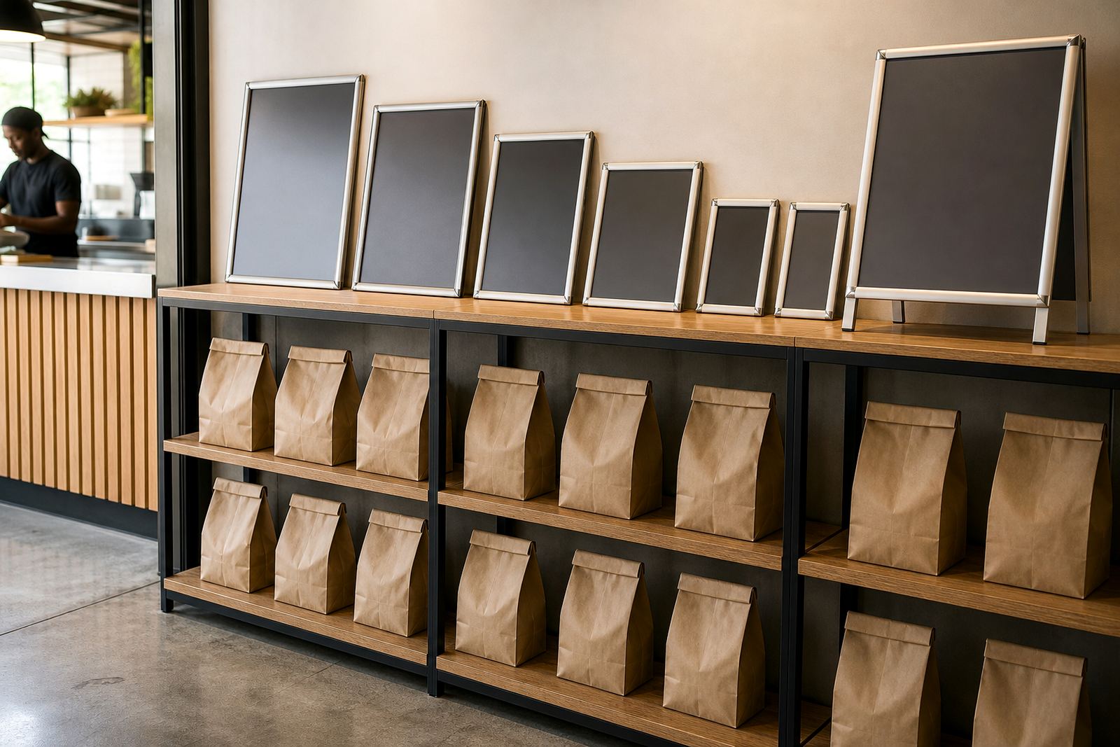
Small formats suit these spots because they keep the visual load light. An A4 snap frame is often enough for one special or a short menu list, while A3 gives more room when the copy must include a few options and pricing lines. Aluminium profiles hold the print neatly, and anti-glare covers help in bright shopfronts where daylight hits the counter from the side.
- Use one frame for one job: specials, add-ons or collection notes.
- Keep the text large enough to read from queue height.
- Leave enough clear counter space for card machines, trays and packing.
Choose a frame height that suits the queue
A frame that sits too low disappears behind cups, bags and hands. One that stands too high can block sightlines across the counter and make the staff area feel boxed in. The best position is usually just above the clutter line, where a customer can glance down while waiting and still keep the flow moving. On a pastry case, a slim stand placed at one end often works better than a board in the middle of the glass.
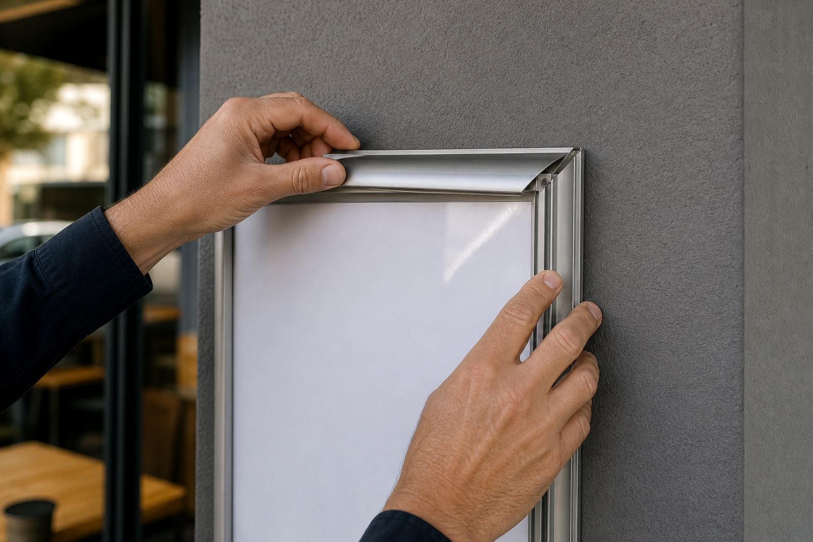
If the counter is narrow, a wall mounted frame just behind it can carry the same message without taking up service space. For window-facing counters, a double sided or front-facing layout can keep the message visible from outside and from the queue. In Cape Town coastal air, window and wall fittings should be checked for salt exposure and regular wipe-downs, because fingerprints and moisture show quickly on bright displays.
- A4 suits a single message or compact price list.
- A3 suits multi-item specials or a fuller breakfast board.
- A-frame stands work well where the counter is shared with pickups.
Match the frame to the kind of message
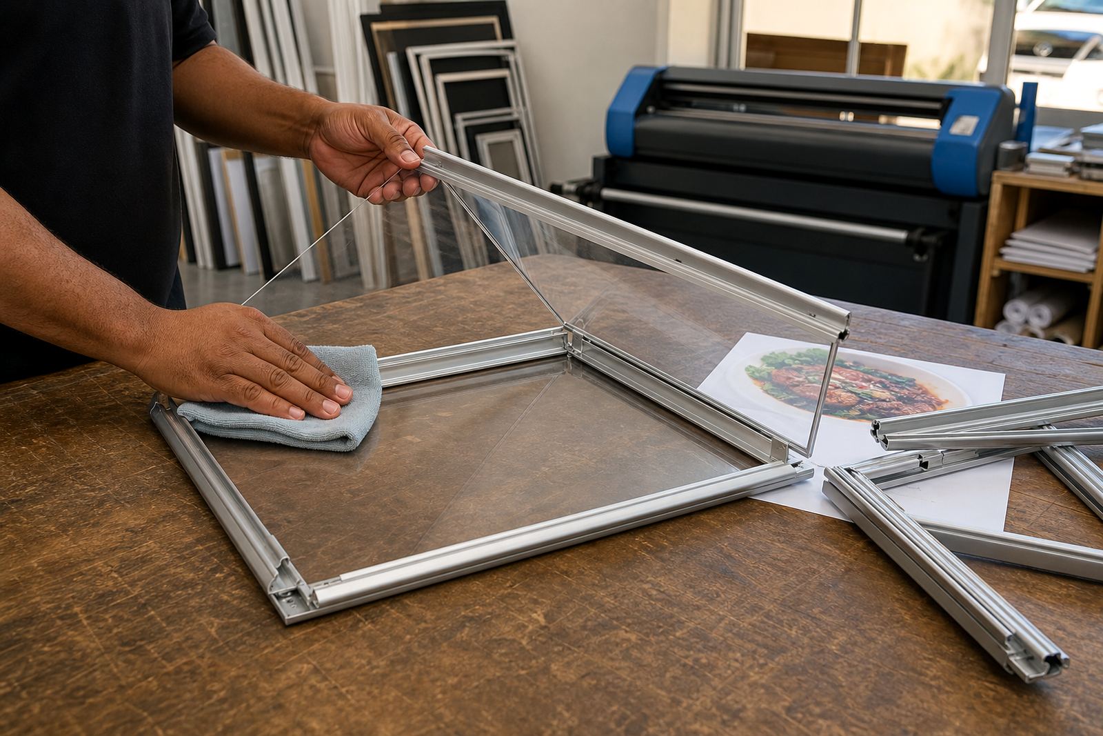
Not every counter message belongs in the same display. A chalkboard style board suits daily specials and quick changes, especially in cafés where the line-up shifts with breakfast, lunch and baked goods. A snap frame suits printed menus, labels and repeated price lists that need a clean edge. If the offer changes often, use a printed insert that can be swapped without fuss. If the message stays fixed, a laminated print or poster insert gives a neat finish that stands up to wiping.
Menu printing size matters more than many people expect. A cramped layout looks rushed, even when the food is good. Larger type, simple spacing and a clear heading help the customer read while balancing a tray or tapping a card. Menu typesetting should keep the wording tight, not crowded, and proofing is worth doing before the print run starts because a small typo on a counter board gets noticed fast.
- Printed inserts suit prices, combos and fixed notices.
- Chalkboard surfaces suit specials that change through the week.
- Laminated sheets suit counters that need frequent wiping.
Use the counter to guide choice, not to flood it
Countertops are not billboards. They work best when they answer one question at a time. If the customer is ordering coffee, the board should support that order with a pastry pairing or a size upgrade. If the counter is a collection point, the board should help people collect cleanly with order numbers, pickup names or a short note about where to wait. Too many messages in one place slow people down and make staff repeat themselves.
Think about the route a customer takes from entrance to payment to pickup. A frame near the till can carry the last prompt before payment. Another near the pastry case can push a sweet item without shouting. In takeaway counters, a small board close to the collection shelf can reduce confusion when several orders are ready at once. The board does not need to be loud. It needs to be readable and placed where the hand and eye naturally pause.
- Keep one main offer per display face.
- Separate pricing from instructions where possible.
- Use short line breaks so the eye moves easily.
A practical fit for Cape Town counters and busy pickup points
A local example helps. In a Paarden Eiland café with a narrow till ledge, an A4 snap frame can sit beside the card machine with a single breakfast special. A second frame on the pastry case can carry the day’s baked items. In a Durban takeaway counter with more humidity and constant foot traffic, a laminated insert inside an aluminium snap frame holds up well to wiping and the corners stay tidy. Johannesburg venues often need a stronger visual cue at the pickup point because the counter may sit deeper inside the shop and the queue forms faster than staff can point.
For shops serving Stellenbosch or Paarl commuters, the best display is often the one that changes quickly without tools. A menu update may only need a new print, a clean insert and fresh pricing. When the board is planned well from the start, the same frame can handle seasonal items, lunch plates and counter notices without crowding the service area. That keeps the front of house neat, and it also helps the team work through a rush with less pointing and less re-explaining.
What to send when the layout needs sorting
For a countertop display brief, the useful details are plain. Share the menu items, the board size you want, where it will sit and whether the display needs wall mounting, window mounting or a stand on the counter. If the print must match an existing shop style, send the colours and any wording that must stay unchanged. If the board will face strong daylight or repeated wiping, mention that too so the finish can be set up for the site.
our contact form is the place to send those details to the SnapperFrame Menus team in Paarden Eiland. The team works with A4 Menu Templates, A3 Menu Templates, menu resizing, short run printing, laminated menu prints and courier packaging for Cape Town, Milnerton, Bellville, Stellenbosch, Johannesburg, Durban, Gqeberha and nearby areas. That makes it easier to match the frame to the counter instead of forcing the counter to suit the frame.