Where the pavement gives you the first glance
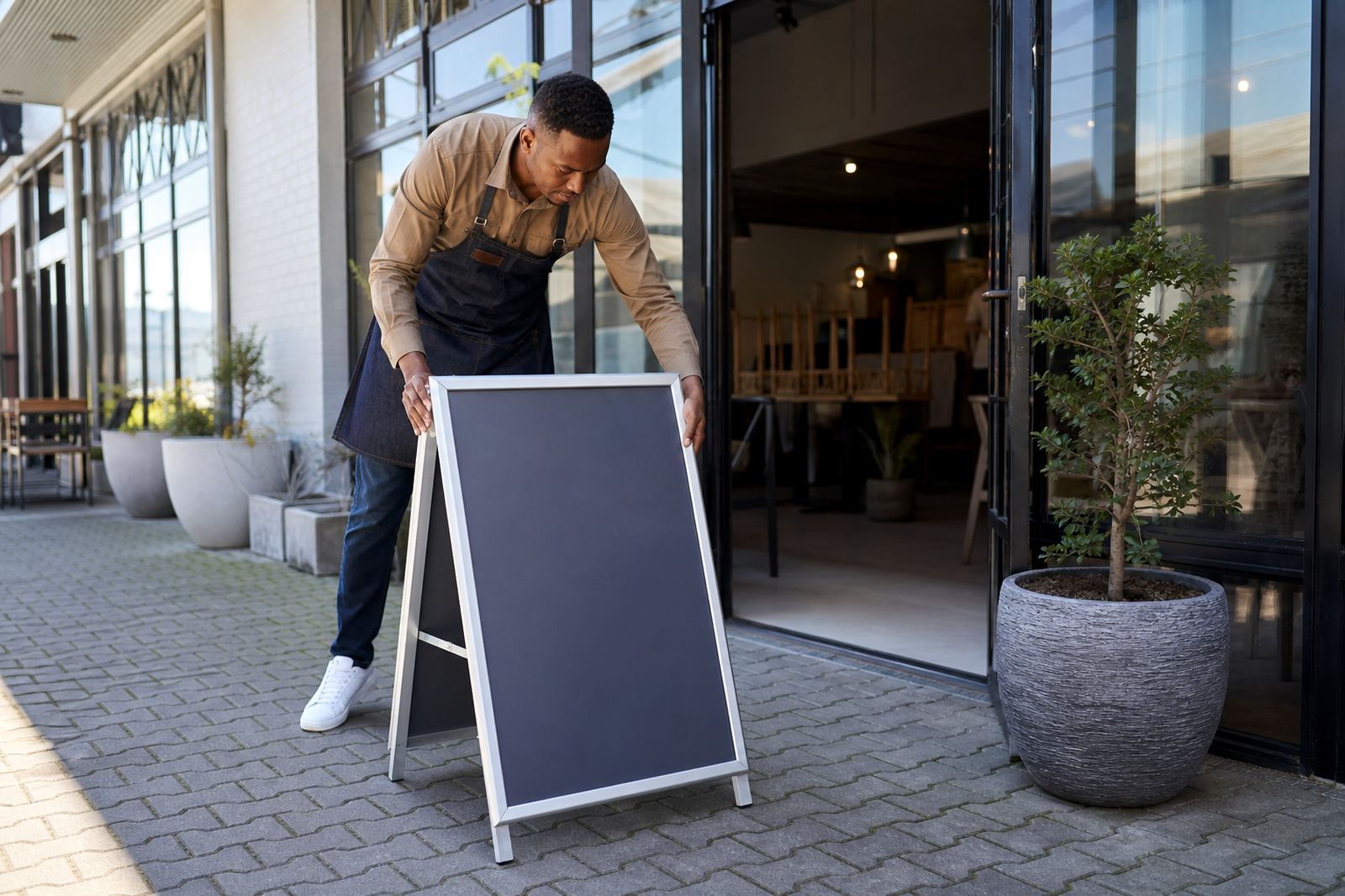
An A-frame earns its place outside the door, near a forecourt, at a mall entrance or on a busy sidewalk where foot traffic already exists. In Cape Town, a board placed too far back can vanish behind parked cars, street poles or a queue at the till, so the stand needs a clear line of sight from both directions.
For cafés in Milnerton or Bellville, the best position is often just inside the boundary line, where the board is visible without blocking access. In Paarden Eiland, where many stops are quick and practical, a message on the pavement has to be short, bold and readable from a few metres away.
- Place the board where walkers naturally slow down.
- Keep the message facing the main flow of foot traffic.
- Avoid dark corners, cluttered entrances and wind tunnels.
- Leave enough space for people to pass without brushing the stand.
What belongs on an A-frame, and what does not
An A-frame is not the place for a full menu list. It works better for one breakfast special, a lunch combo, a daily soup, or a clear takeaway deal with one or two price points. Too much copy turns it into a wall of text and people glance past it.
Menus that change through the week need simple formatting. A3 boards give more breathing room, while A4 suits tighter pavement spots and smaller shopfronts. A chalkboard face can suit handwritten specials, but a printed insert keeps the lettering clean when a café wants a sharper finish or needs the same message at several branches.
- Use large lettering for the main offer.
- Keep the price easy to spot at walking distance.
- Limit each panel to a small number of items.
- Reserve fine detail for the counter menu inside.
Frames, covers and the weather that tests them
South African weather asks practical questions. Wind off the Atlantic, sea air near the coast, and summer dust can all work against a lightweight stand. A good A-frame uses aluminium profiles, firm hinges and anti-glare covers so the menu stays legible when the sun hits it at an angle. That matters in places like Stellenbosch and Gqeberha, where bright light can wash out glossy prints.
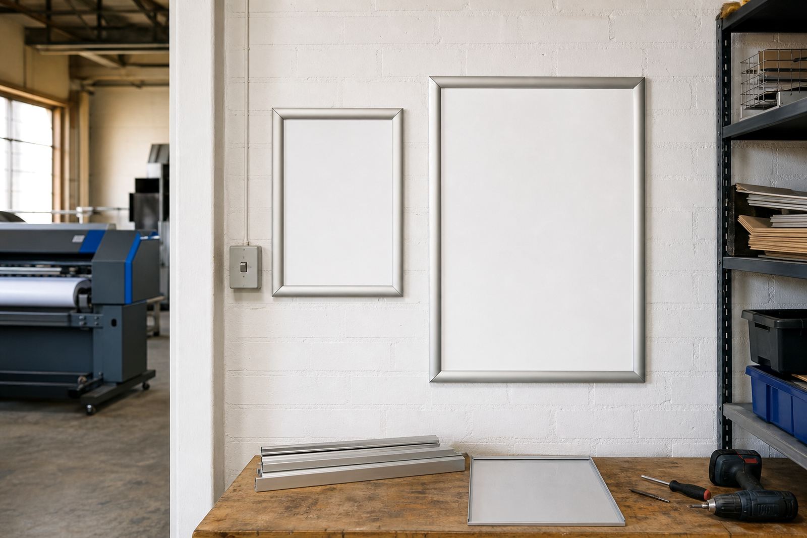
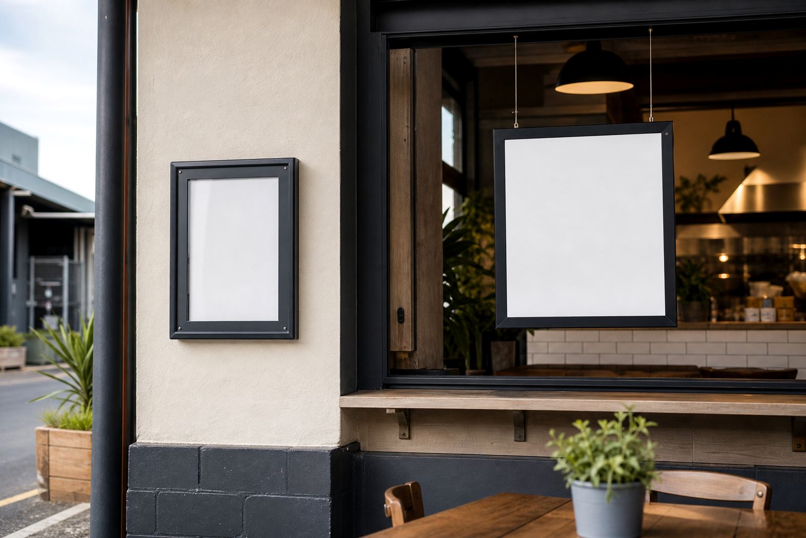
Window-mounted boards and wall menu frames also have a role, especially when the stand sits beside a door rather than out on the pavement. Some sites use both, one board for passing trade and another on the wall for people already at the entrance. The point is to keep the message where a customer naturally looks first, not buried in the interior.
How short-run changes stay manageable
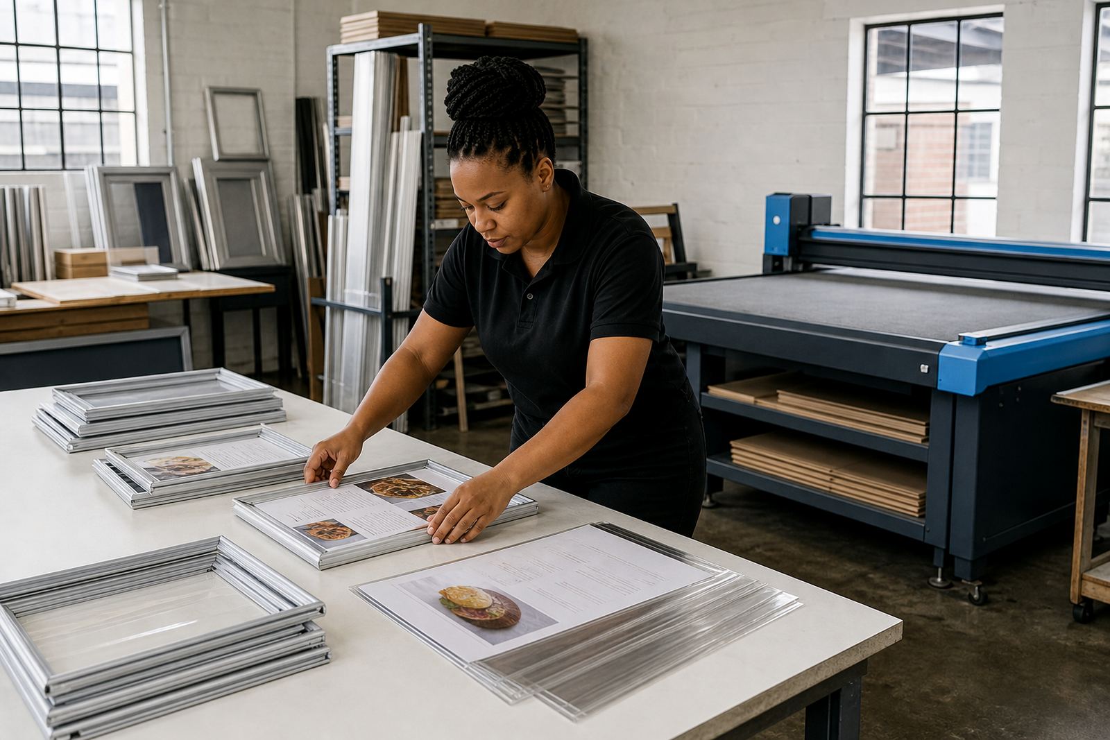
Specials change often in food service. A lunch board may need a new burger, a smaller breakfast board may need a new price, and a weekend offer can disappear by Monday. That is where snap menu frames help, because the insert lifts out without tools and the new print goes in cleanly.
For multi-site operators, short-run printing and menu resizing keep the format consistent across different branches. A3 in one shop, A4 in another, the message can still match. Print-ready templates also help when the same layout has to travel from a café in Durban to a takeaway counter in Paarl without the artwork shifting out of proportion.
- Use one master layout for all branches.
- Keep item names and prices in fixed positions.
- Match the board size to the available wall or pavement space.
- Proof the artwork before the print run starts.
Reading the board from three metres away
A-frame copy has a job to do fast. Most people read it while moving, so the typeface, spacing and contrast matter more than decorative extras. Dark text on a light background usually works best in bright outdoor conditions, while coloured blocks can help separate breakfast, lunch and drinks offers.
Menu typesetting is worth doing carefully, because uneven spacing or cramped prices make the stand look tired. For a takeaway counter, that can be the difference between a passer-by and a person who keeps walking. The best boards carry one main message per side, with enough white space for the eye to land without effort.
A simple Cape Town example from the pavement edge
On a weekday near Paarden Eiland, a café that serves breakfast and lunch may have a mixed crowd of workshop staff, office visitors and people picking up parcels. An A-frame placed near the entrance can show a breakfast wrap, a lunch special and a cold drink deal without interrupting the counter flow. If the pavement is narrow, a slimmer stand or wall board might work better than a broad sign.
The same idea travels well. A takeaway counter in Bellville may want a board that changes before the midday rush, while a bar in Durban may use an outdoor frame to show a happy hour note before evening trade. In each case, the board has to suit the street, the step-in point and the size of the menu change.
Getting prints, inserts and packaging to the site
SnapperFrame Menus works from Paarden Eiland in Cape Town with A4 menu templates, A3 menu templates, menu resizing, menu proofing, laminated menu prints, poster insert printing and courier packaging for outlets across South Africa. The same team can prepare wall boards, window-mounted frames and A-frame stands for a single site or a group of branches.
Courier delivery reaches Cape Town, Stellenbosch, Johannesburg, Durban and Gqeberha, with regular work also going into Milnerton, Bellville and Paarl. For operators who want a cleaner, quicker menu change, our contact form is the route for new briefs, print updates and board sizing. Marius Mlambo leads the team, with Anele Zondo on production, Bianca Ebrahim on sales, Thabo Kajee on installations, Liam Mkhabela on print coordination and Zanele Wessels handling customer support.