The size choice starts with the wall, not the menu
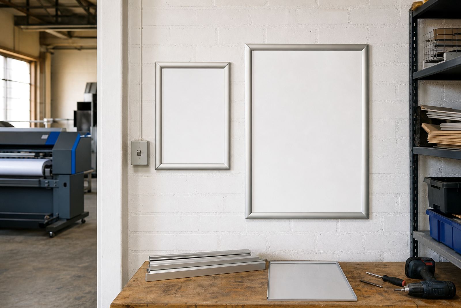
A4 and A3 are both common snap frame sizes, yet they solve different space problems. A4 is tidier where the menu sits close to the customer, while A3 gives more room for sections, specials and clearer spacing when people are standing a little further away.
In a narrow Cape Town takeaway counter, an A4 frame can keep the service area clean and still show the daily list clearly. In a larger cafe entrance or bar wall, A3 often reads better because the lettering can stay generous without crowding the page.
When the board is going into a window, on a tiled wall, or beside a till point, the available width matters as much as the menu content. A frame that looks balanced on paper can feel cramped once it is mounted and the lighting hits the cover.
Where A4 earns its place
A4 menu frames suit shorter menus, tight counters and places where the offering changes often. They are also easier to place in pairs or rows, which helps when drinks, breakfast, lunch and takeaway specials each need their own spot.
For a small sandwich bar in Milnerton or a compact coffee counter in Bellville, A4 can be the cleaner option. It keeps the message focused, and staff can swap inserts quickly when the menu shifts for the day.
- Good for short menus with fewer sections
- Useful where wall space is limited
- Works well for specials, add-ons and counter notices
- Easy to group into a neat grid above a till or prep line
A4 also helps when you want more than one frame in a small area. Three or four frames can sit in order without making the wall feel overloaded, which is useful in older shopfronts with limited frontage.
Where A3 holds the better line
A3 gives more breathing room. It suits menus that carry breakfast choices, grills, beverages and extras without forcing the text into a tight block. The larger face also helps when customers are standing back, such as at a bar wall or a queue point near the door.
In Durban, where humidity can be part of the daily routine, the cover and aluminium profile still matter, but the bigger format often makes the message easier to read through a busy front of house. It can also suit laminated prints that need a little more space around the edges.
A3 is often the better fit for one strong menu board rather than several smaller ones. If the business wants fewer visual breaks on the wall, this size gives more room for headings, prices and a simple layout that does not feel rushed.
- Better for fuller menus with more items
- Useful where customers read from a few metres away
- Works well for wall displays and window facing boards
- Helps when print needs clearer spacing and stronger hierarchy
Snap frame details that change the result
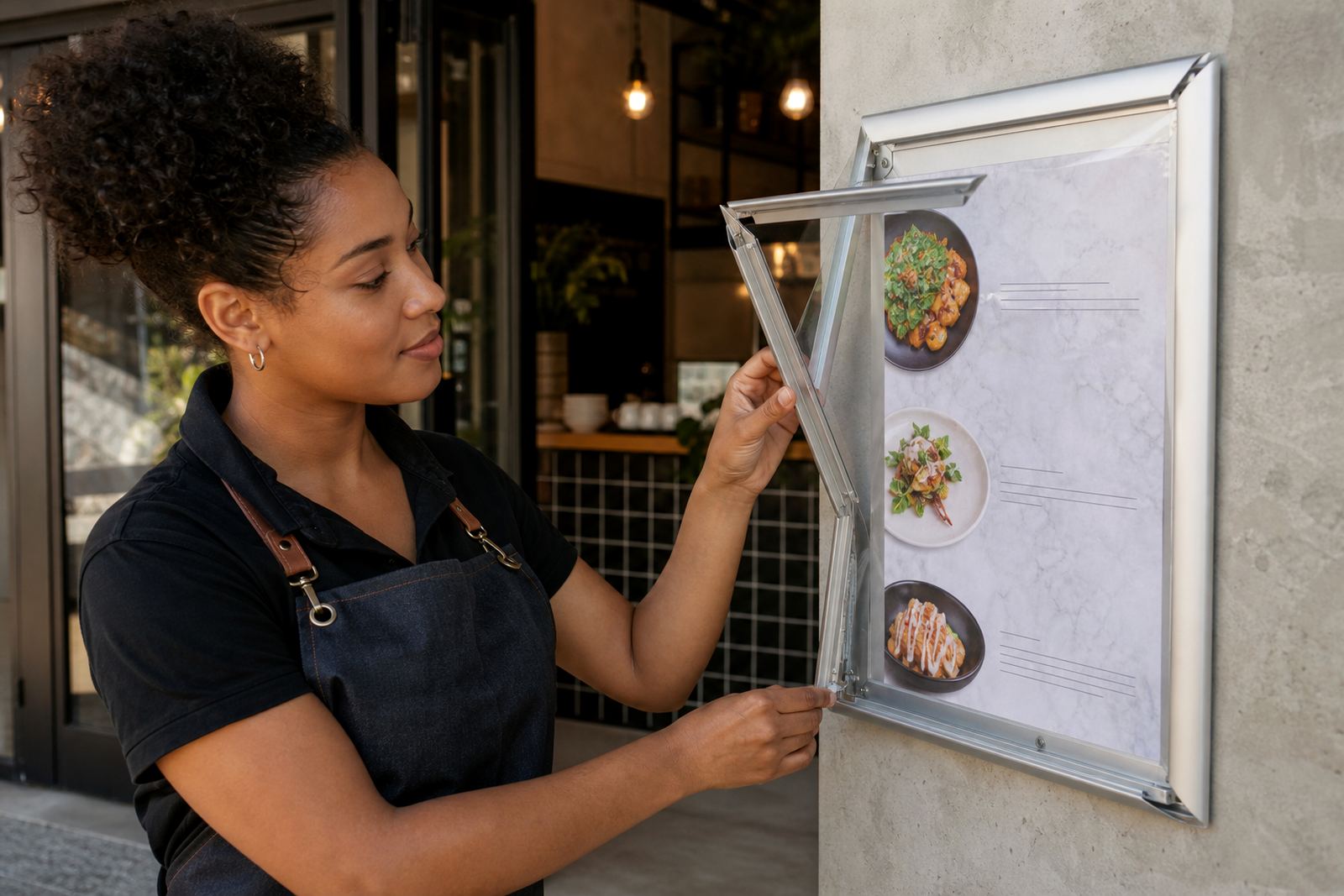
The frame size is only part of the job. Aluminium profiles, anti-glare covers and the way the insert sits inside the frame all affect how the menu looks once it is on the wall. A good snap frame should open cleanly, hold the print flat and close without fighting the edges.
Wall and window mounting each bring their own checks. A window facing board needs cleaner contrast because sunlight can wash out weak artwork. A wall mounted board may need a steadier reading height, especially where customers stand in a queue and scan the menu in a hurry.
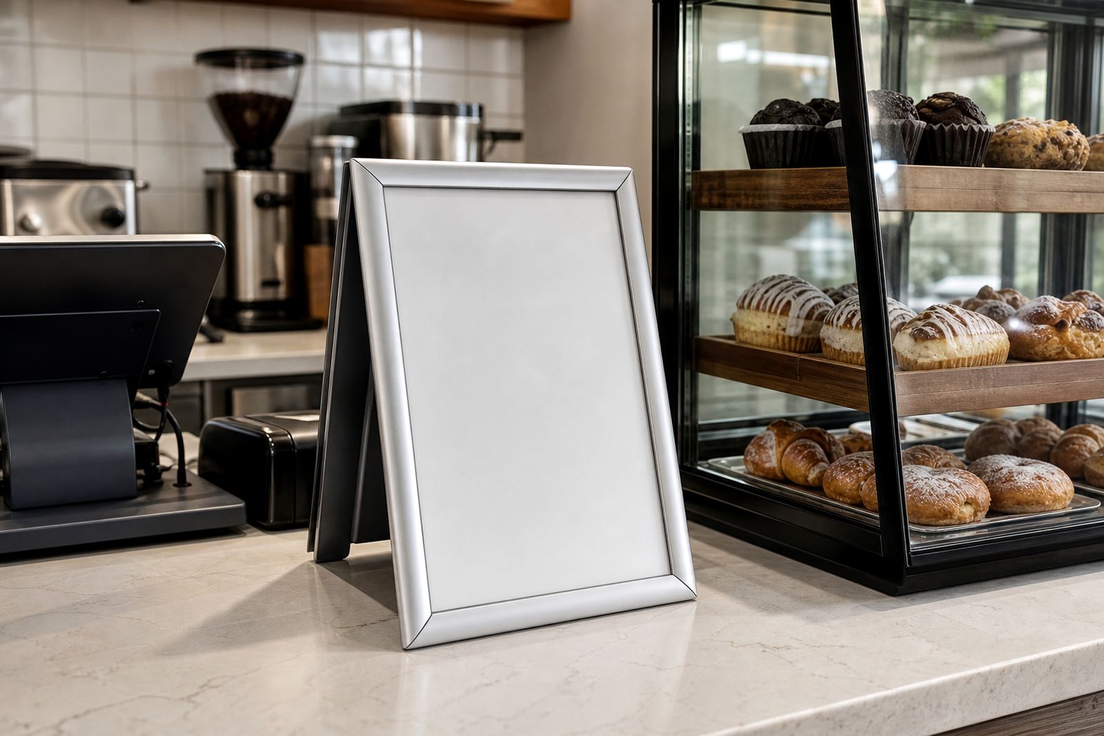
For takeaway counters, the frame must carry the message without feeling bulky. A slim profile often works better there, while the anti-glare cover can help reduce reflections from strip lighting and front windows.
Menus that change often need a different size choice
If the menu changes every week, the format needs to stay practical. A4 is often easier for short run printing, menu updates and menu resizing when specials are added or removed. A3 suits bigger boards when the business wants a more permanent main menu with only a few changes.
Some operators in Stellenbosch prefer one larger A3 board for the main offer and one or two A4 frames for rotating specials. That mix keeps the front counter tidy while still giving room for seasonal dishes, breakfast add-ons or drinks lists.
For printed inserts, the size should match the amount of copy and the type of imagery used. A page packed with text can look cramped in A4, while a page with generous spacing may feel lost if it is pushed into a smaller frame.
- A4 suits frequent updates and shorter lists
- A3 suits fuller menus and stronger visual spacing
- Mixed sizes can separate main items from specials
- Proofing helps avoid awkward line breaks and clipping
A local example from a busy Cape Town front counter
A takeaway counter in Paarden Eiland may need a board that reads fast, stays neat and can be changed without tools. If the menu is mostly burgers, toasties and a few daily specials, A4 can do the job well, especially where the board sits close to customers waiting to pay.
If that same business adds breakfast items, family meals and drinks across a fuller list, A3 often gives the layout more room. The larger page size makes it easier to balance prices, headings and spacing, and it can reduce the need for tiny text that no one wants to study at the counter.
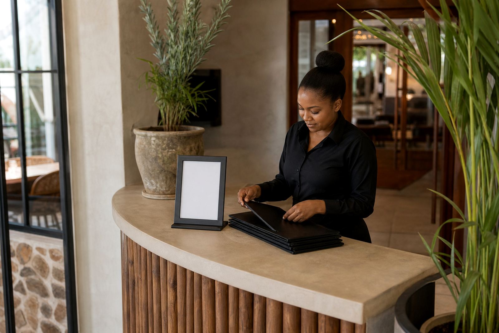
For businesses that need a mix of wall boards, window boards and A-frame menu stands, the choice is not always one size only. A cleaner answer is often a combination that suits the room, the print, and the way people move through the space.
What to send through for a proper menu fit
When ordering A4 or A3 menu frames, the useful details are usually straightforward: the menu size, where the board will sit, whether it is wall mounted or freestanding, and how often the print will change. If there is a current artwork file or a rough menu list, that helps the layout stay neat from the start.
Our team in Paarden Eiland handles A4 menu templates, A3 menu templates, menu typesetting, menu proofing, print finishing, laminated menu prints, poster insert printing and courier packaging for delivery across South Africa. That includes Cape Town, Stellenbosch, Johannesburg, Durban and Gqeberha, with local support for Milnerton, Bellville and Paarl too.
For businesses that want the menu framed, printed and packed together, the size choice is usually the first decision. After that, the artwork, insert finish and mounting method can be set to suit the counter and the room.