When the ink stops carrying the meal
Menus that sit behind clear covers or inside snap frames take a fair amount of handling. On a busy counter, people slide inserts in and out, wipe them down and lift them for checks. That routine is normal, but it also means the print eventually starts to lose its edge. Colours fade first in sunlight near a window, then black text starts looking grey, and small prices become harder to read from standing height.
If a menu needs a second look for the wrong reason, it is already working less well than it should. Guests should be able to glance at an A4 or A3 insert and read the offer without leaning in. Once the print looks washed out, the menu is no longer doing its job clearly.
Price changes that make the old sheet unsafe to use
Reprinting is not only about appearance. A menu insert that carries old prices can create awkward service moments and billing corrections. That matters in a cafe with breakfast boards, a bar with seasonal specials, or a takeaway counter that updates meal deals when food costs move.
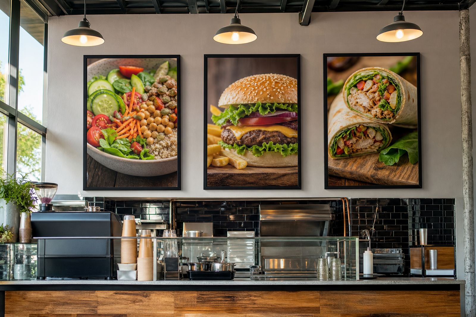
A wall menu board or A-frame stand is only useful when the content matches the till. If the printed sheet and the live price list do not match, staff spend time explaining differences and customers lose confidence in the board. In practice, price changes are one of the strongest signs that a new print run is needed.
- Items that no longer match the till slip into service quickly.
- Special offers become confusing when the old insert stays in place.
- Staff waste time correcting customers at the counter.
- Older inserts can keep showing meal sizes or add-ons that no longer apply.
Wear marks, spills and rough handling tell their own story
Some menus do not fail through fading, they fail through use. Edges curl after repeated insert changes, corners collect moisture and laminated sheets can pick up fine scratches. In a coastal area like Cape Town, humidity can make paper inserts buckle a little faster, especially where windows, kitchens and washing-up areas all sit close together.
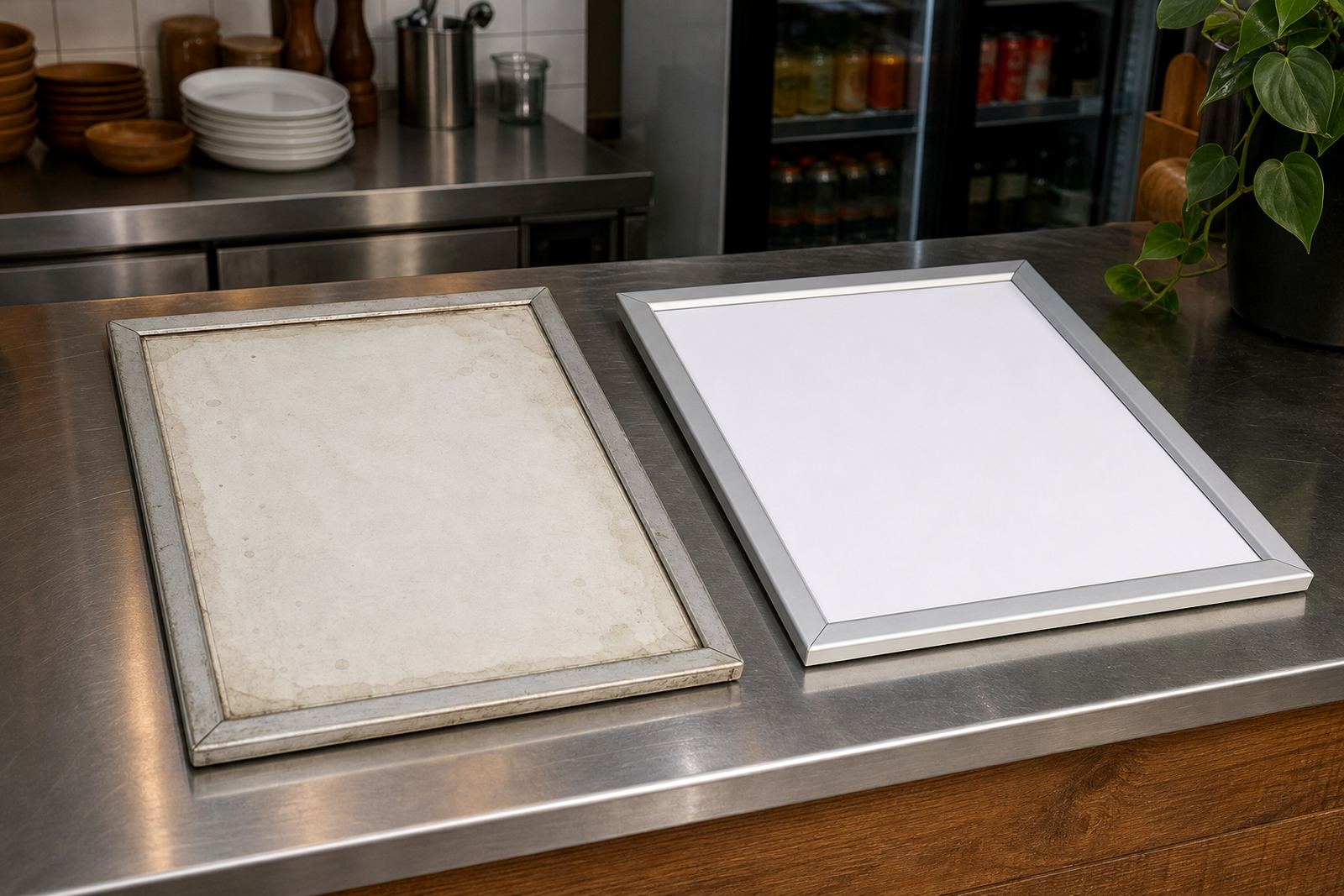
Once a menu has scuffed corners, stained patches or creases across the same fold line, it starts looking neglected even if the wording is still correct. A clean reprint is often cheaper in practical terms than keeping a damaged sheet in circulation. The frame may still be fine, but the insert no longer presents the food properly.
Format drift when the menu no longer fits the frame
Another sign is a mismatch between the artwork and the hardware. A menu that was first printed for one layout may later be trimmed, enlarged or forced into a different frame size. That is where headings crop awkwardly, dish names land too close to the edge, or a narrow strip of white space appears where none was planned.
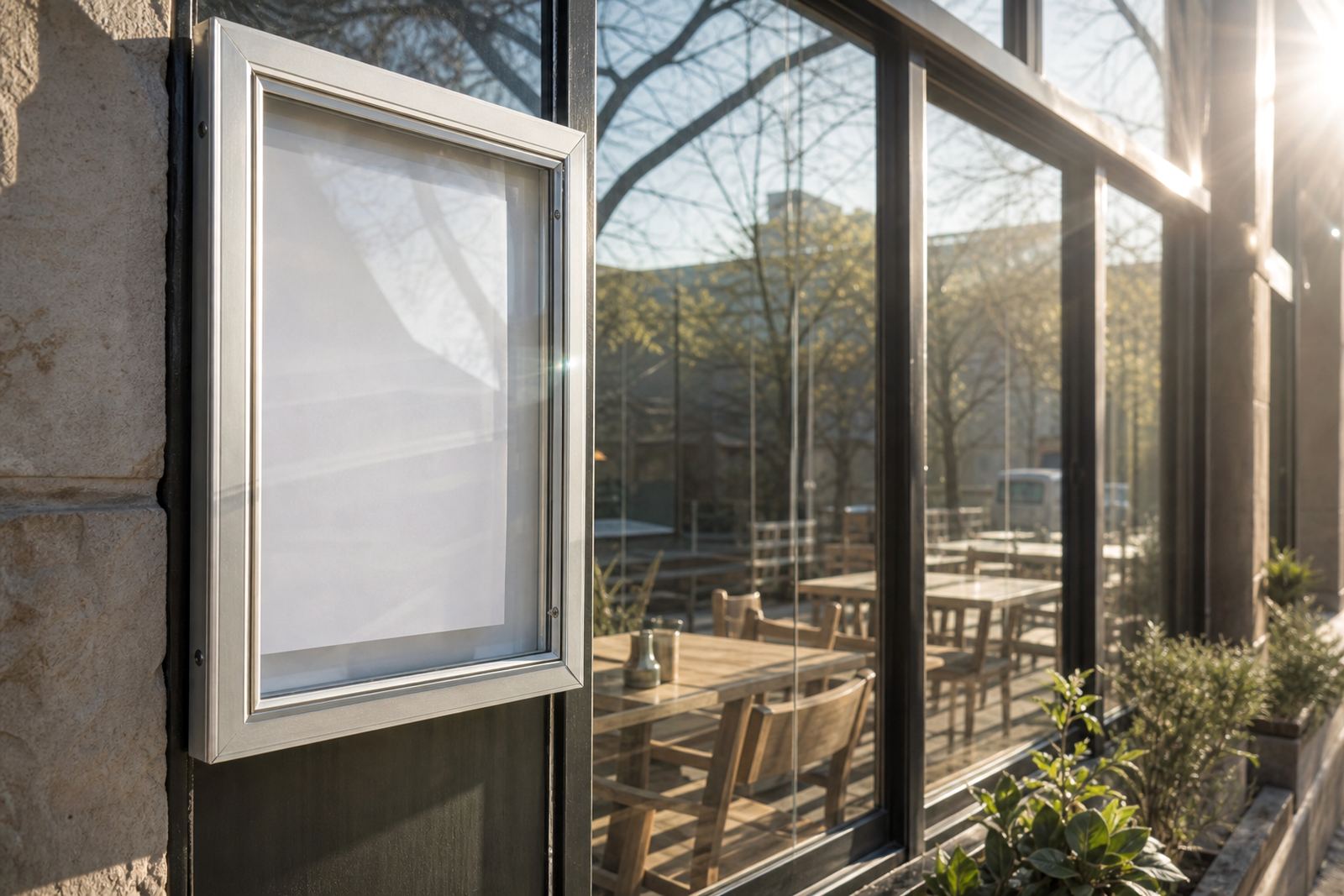
For snap menu frames, that mismatch becomes obvious very quickly. A4 and A3 inserts need clean margins so the aluminium profile holds the sheet properly and the anti-glare cover sits flat. If the print has been resized too many times, the layout can start looking patched together rather than intentional.
- Text sits too close to the snap frame edge.
- Images blur after repeated resizing.
- Line spacing changes from one reprint to the next.
- Window-mounted inserts catch light badly when the proportions are off.
A local case from a Cape Town takeaway counter
A takeaway counter in Milnerton may run the same menu board for months, but a few small changes can force a reprint sooner than expected. One combo meal is removed, a breakfast item gets renamed and the coffee list changes in price. The board still hangs neatly on the wall, yet the insert no longer reflects the actual offer.
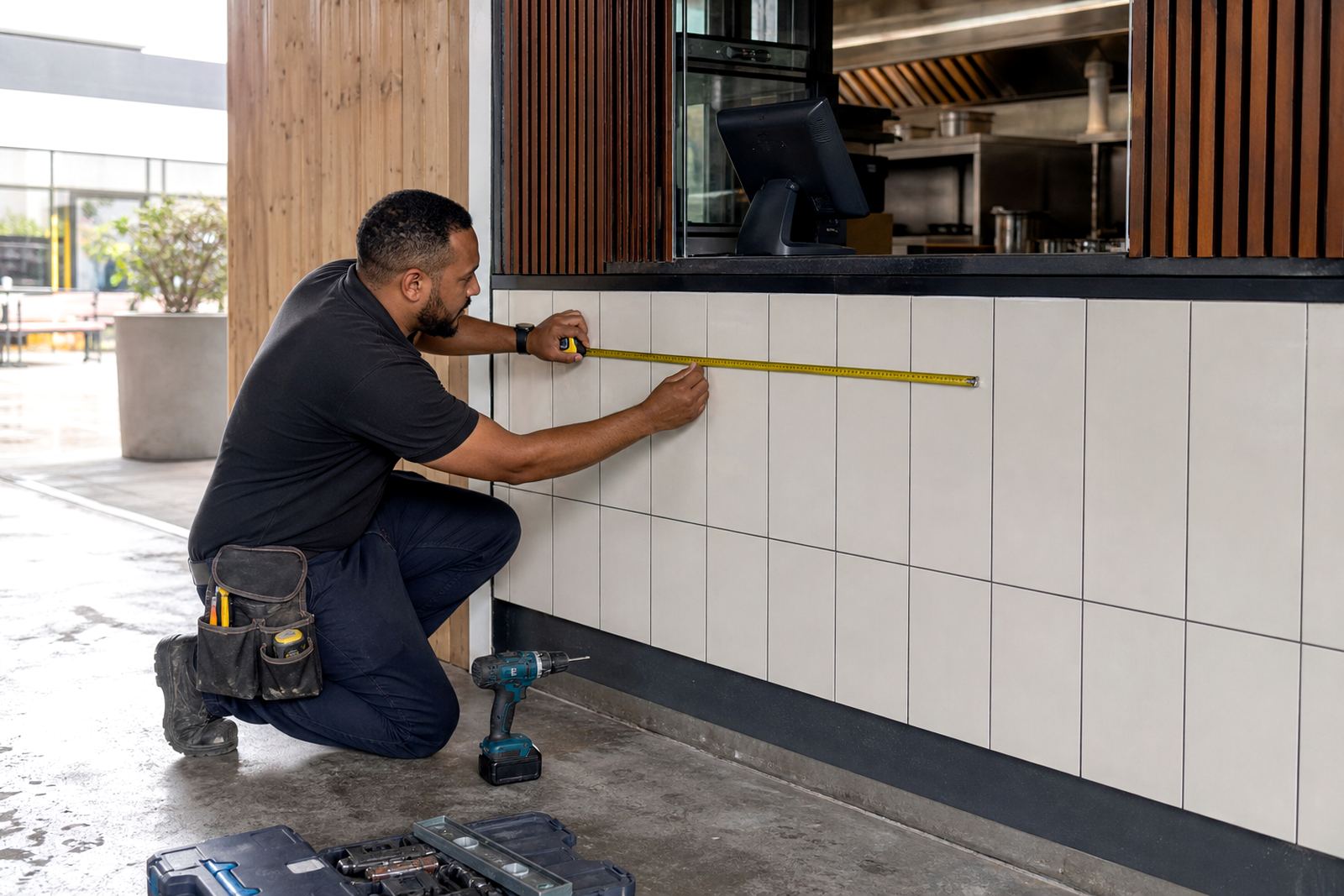
That is the kind of job where menu edits matter more than a full restyle. A fresh reprint keeps the same frame, same mounting position and same visual order, while bringing the wording in line with what is being sold. For a counter serving walk-ins all day, accuracy matters more than squeezing extra weeks out of a tired sheet.
What to watch before the next print run
There is no need to wait until a menu looks broken. A few signs tell you the reprint point is close, especially where inserts are handled often or exposed to light. Staff usually notice these first, because they stand closest to the board every day.
- Prices have changed more than once on the same sheet.
- Colours look dull under indoor lighting or near a window.
- Laminate edges are lifting or showing small bubbles.
- The menu has marks from wipes, spills or fingermarks.
- New items no longer fit the existing layout.
- The board still works, but the insert looks tired beside it.
For restaurants, cafes and bars, the best time to reprint is often before the menu starts causing avoidable questions. That keeps the printed side of the business tidy and makes the frame, stand or board earn its keep for longer.