When the menu changes with the weather, the frame should keep up
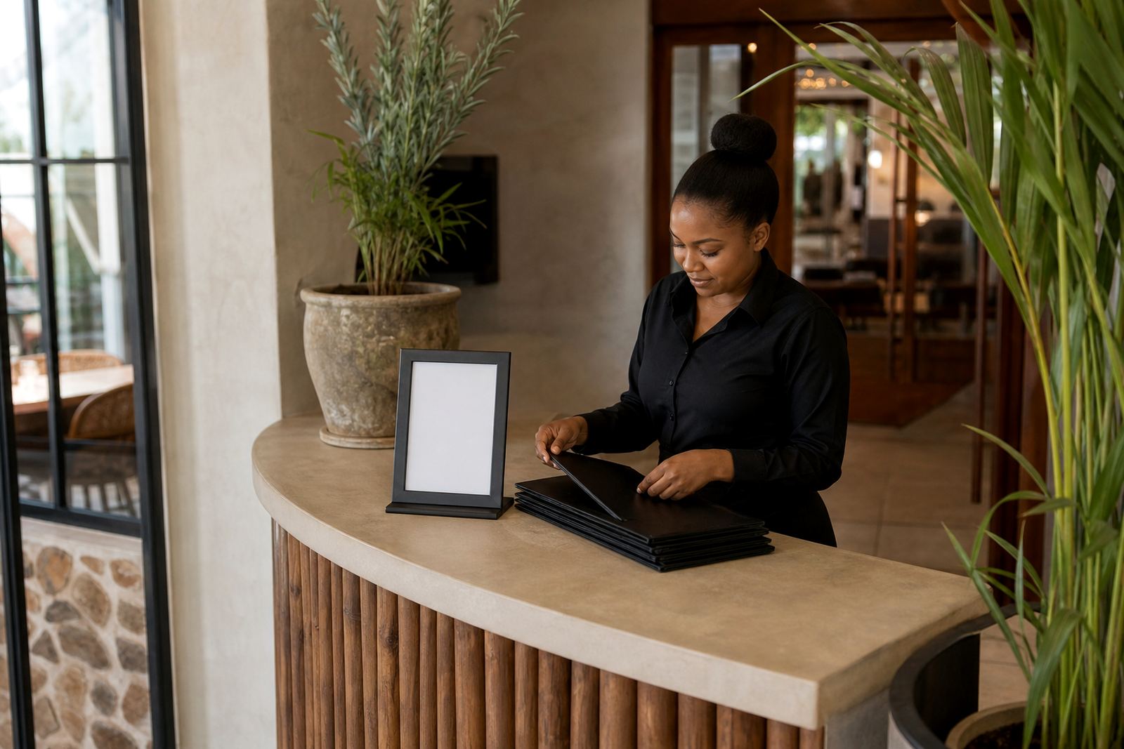
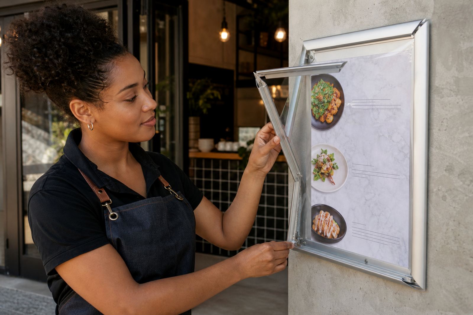
Seasonal menu work is not only about adding pumpkin soup in winter or iced coffee in summer. It is also about keeping the printed insert neat, readable and aligned to the board after each update. In busy service areas, the hardware needs to let staff swap pages without opening screws, hunting for tools or smudging fresh print.
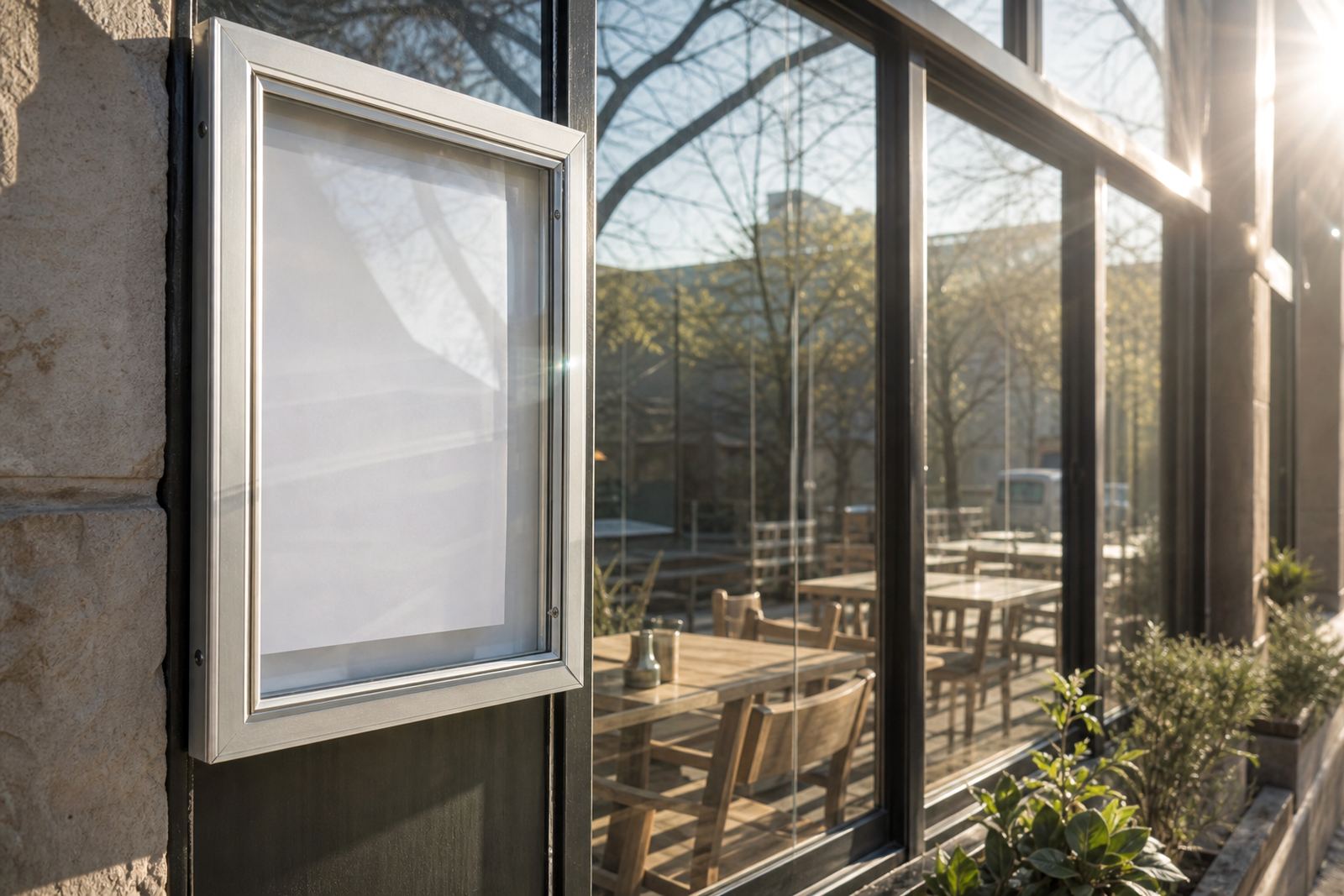
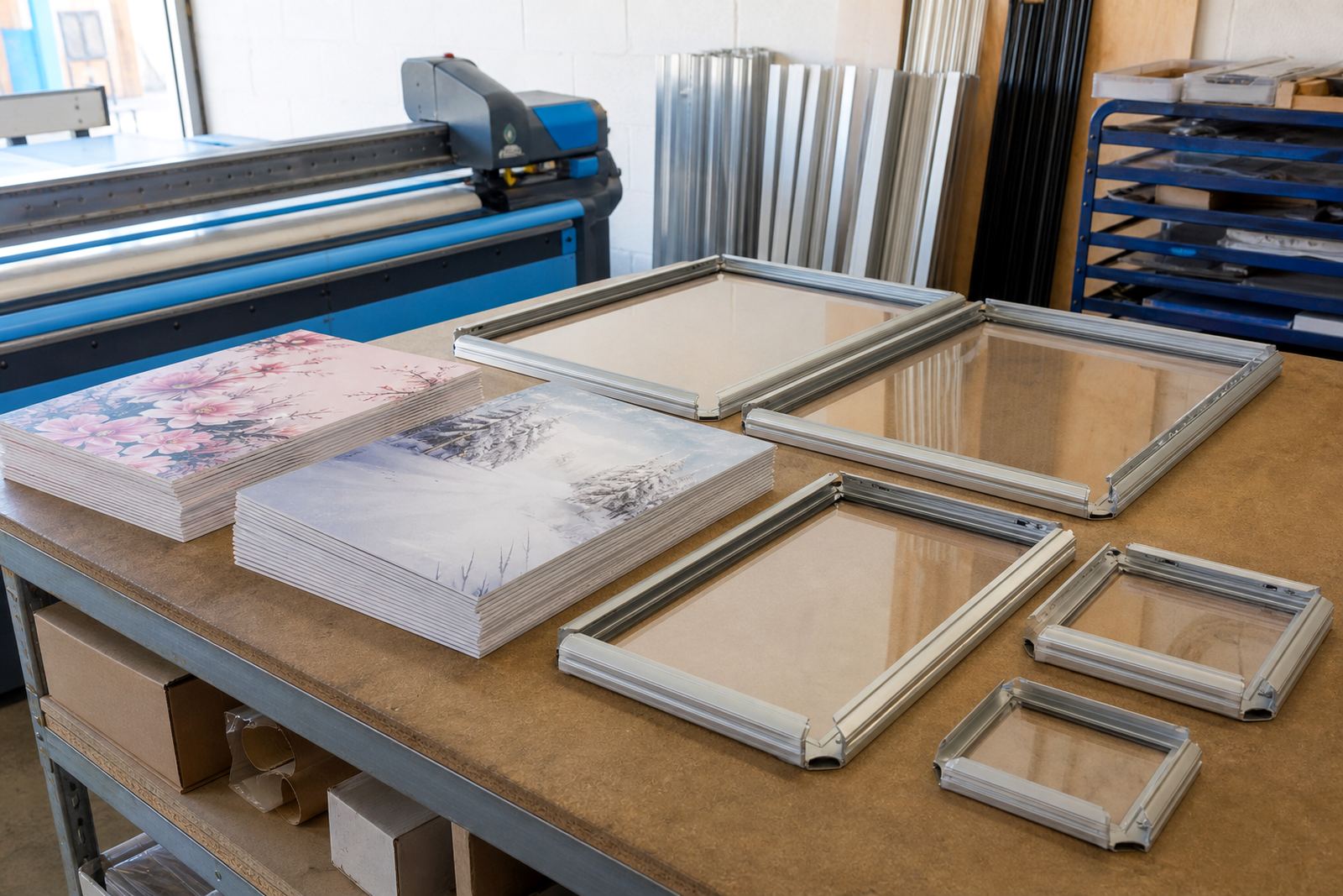
Snap menu frames handle that job well. A4 and A3 snap frames use aluminium profiles that open at the edge, so the poster or insert can be replaced in seconds. Anti-glare covers help under bright counter lighting and near shopfront windows where reflection can make small text hard to read. For restaurants, cafés and takeaway counters, that matters more than a decorative flourish.
- A4 works for short specials, drinks add-ons and lunch boards
- A3 suits wider menu sections, bigger prices and window-facing displays
- Anti-glare covers reduce shine from indoor lights and street light
- Wall and window mounting keep inserts fixed in one clear position
Build one board for regular dishes, then swap the seasonals
Seasonal updates work best when the core menu stays stable and the changing items sit in a separate area. A wall menu board or snap frame can carry the main offer, while a smaller insert highlights soups, desserts, breakfast specials or weekend drinks. That way the kitchen does not need to rework the whole board every time a new item lands on the pass.
For cafés in Stellenbosch or coastal spots in Cape Town, humidity can also matter. Laminated menu prints hold shape better when they are handled often, and clean edges help the insert slide into the frame without curling. If the specials list changes weekly, short run printing keeps the stock lean and the boards looking fresh without over ordering.
- Keep the fixed items on the main board
- Use a smaller insert for seasonal dishes and promotions
- Laminated prints last better where hands are damp or salty air is common
- Separate tasting notes from price lines so updates stay tidy
A-frame stands suit pavement traffic and window spillover
A-frame menu stands are useful where the first read happens outside the door. A passerby on a street in Milnerton, Bellville or the Cape Town city fringe can pick up the day’s offer before stepping inside. They also help when the inside board is busy with table numbers, specials cards and service notes.
For seasonal promotions, the stand should be easy to reposition and simple to refresh. Many operators use poster insert printing for the main seasonal message, then place a second insert on the back for different trading hours or a smaller list of drinks. If the stand sits near a doorway, weight and stability matter, especially on windy days in open precincts.
- Use the front panel for the strongest seasonal message
- Place a shorter message on the reverse side if needed
- Choose a board size that can be read from a few steps away
- Check that the stand closes securely after the insert is changed
Menus that change often need clean proofing before printing
A seasonal menu can drift out of shape fast if the wording and prices are not checked before print. One extra ingredient, a price shift or a spelling slip is enough to make the insert look careless. Menu typesetting and proofing help keep the final page aligned, with prices lined up and dish names set in a clean hierarchy.
In practice, that means separating the headings, item descriptions and price columns before print finishing starts. If a drinks board changes three times over a month, the file should stay easy to update without rebuilding the whole layout. Colour matching matters too, especially where a brand uses a warm tone for winter items or a brighter palette for summer specials.
- Confirm item names before the layout is locked
- Keep price placement consistent across all seasonal inserts
- Use the same type sizes so the board does not look patched together
- Match print colour to the rest of the venue signage
A local example from a Cape Town counter with tight service windows
A takeaway counter in Paarden Eiland might run a lunch board, a drinks insert and a weekend special sheet on different schedules. The staff need to swap one part at opening, then change another after the lunch rush. A snap frame system makes that possible without tools, and a courier pack can send the finished inserts to branches in Durban, Johannesburg or Gqeberha when the same seasonal offer needs to appear in more than one city.
For that kind of operation, the practical move is to keep a master board in A3 and smaller A4 inserts for price changes or add-ons. The board stays on the wall, while the seasonal sheet moves in and out with the menu cycle. It is a simple setup, but it saves time at the counter and keeps the printed offer looking deliberate instead of improvised.
- A3 for the main seasonal board
- A4 for add-ons, desserts and side dishes
- Courier packaging for multi-branch rollouts
- Window mounting for visible street-facing specials
Keep the seasonal offer readable after the food is plated
The best seasonal menu insert does not shout over the food. It gives the reader enough space to scan the items, spot the price and understand the offer without standing too close to the board. That is where print size, finishing and board format work together. A chalkboard look can suit a casual café, while a printed insert feels cleaner for a bar or takeaway counter with frequent changes.
Before a seasonal change goes live, it helps to think through who will handle the swap, where the board hangs and how often the insert will change over the month. With the right frame or stand, the seasonal piece becomes part of the service rhythm rather than an extra task hanging over the shift.