Where the eye lands in a busy queue
People in a queue rarely read every line with care. They scan for the nearest price, the most familiar item and any quick cue that tells them what to do next. If the menu sits too high, too low or tucked behind a person at the till, the order point starts to feel crowded and uncertain.
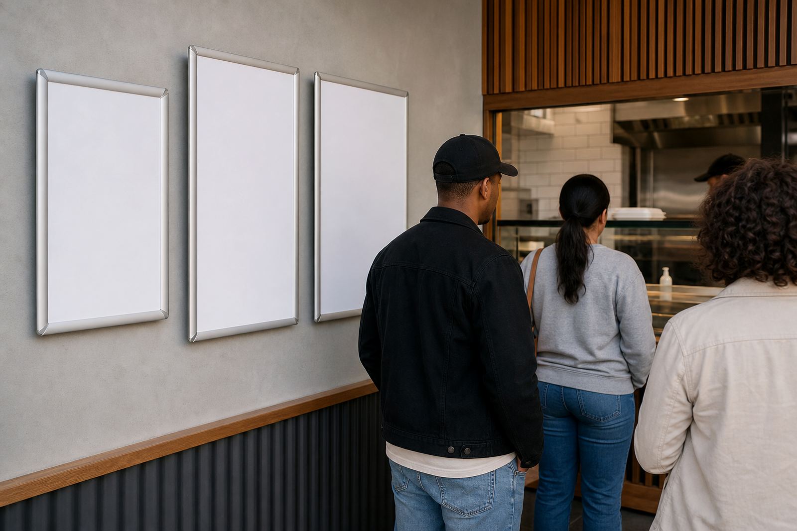
Menu placement works best when the first board catches the eye before the customer reaches the front of the line. A4 and A3 snap frames can sit at eye level on a wall, window or service partition. For larger lists, a row of framed panels does a better job than one dense board, especially where specials change often.
- Place the first decision item within a short glance from the back of the queue
- Keep best sellers and combo meals on the clearest panel
- Use larger type for item names than for detail lines
- Avoid forcing people to turn fully toward the till before they know what to order
Frames that keep menus readable through the day
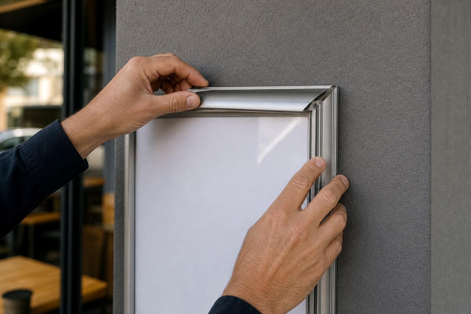
Snap frames suit places where menus need quick updates. The aluminium profile opens at the front, so a printed insert can be swapped without removing the whole frame. That matters when breakfast rolls into lunch, or when a takeaway counter changes soup, bake or drink specials before the afternoon rush.
Anti-glare covers help under bright indoor lights and near windows. In Cape Town and Durban, where sunlight can hit the front counter hard, that finish reduces the shine that makes a menu harder to read. A clean cover also protects print from fingerprints, steam and the damp air that builds near coffee machines and serving hatches.
- A4 frames suit short lists, notices and add-on items
- A3 frames give more room for grouped meal boards
- Window mounting works well where the queue faces glass
- Wall mounting keeps the line clear where floor space is tight
A-frame stands for the last stretch before ordering
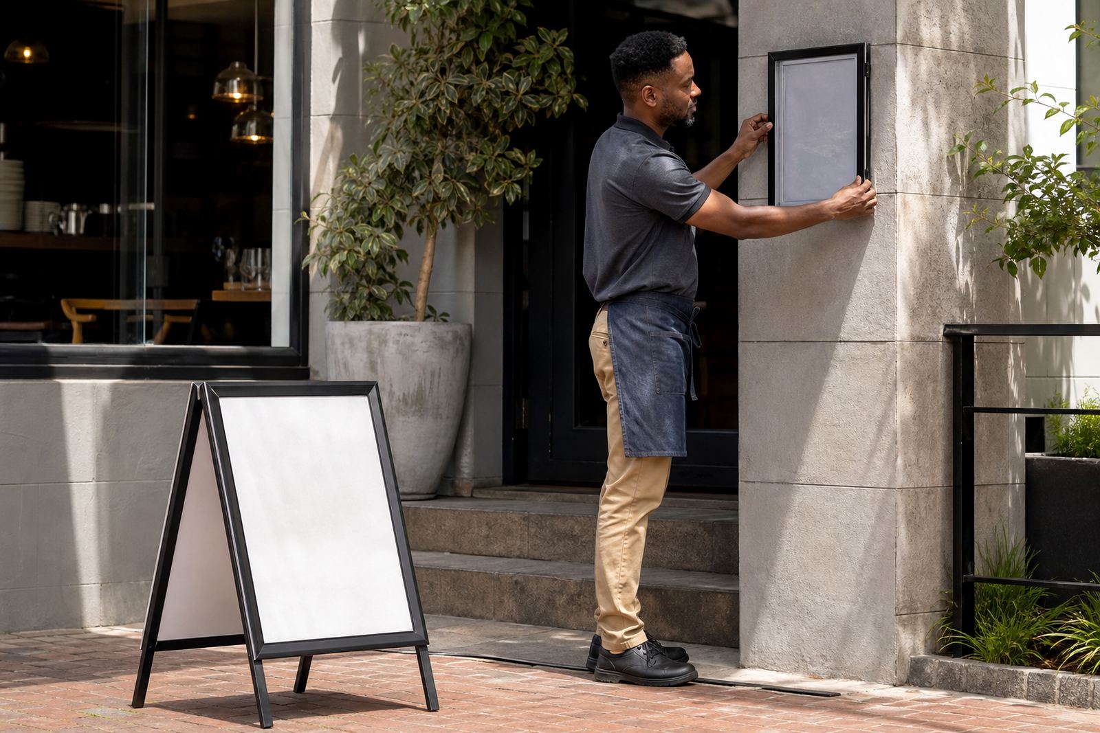
An A-frame menu stand works well at the front edge of the queue, where people slow down and scan one last time. It gives you a low, stable display point that can sit outside or near the entrance, then be moved for cleaning or closing. For cafés with pavement seating or restaurants with a narrow entry, this format can be the easiest thing to see before a customer joins the line.
On a windy day in coastal areas, weight and balance matter. A sturdy stand with a good hinge line stays upright better than a lightweight sign that shifts every time the door opens. Where the pavement is shared or narrow, the stand must also leave enough walking space for people passing through.
- Use the stand for daily specials and short menu highlights
- Keep text big enough to read from a few steps away
- Reserve the lower half for pricing or quick add-ons
- Move it where the queue naturally slows, not where staff must keep pointing
Menu size choices that reduce hesitation
Good menu design is not about cramming more on the board. It is about spacing choices in a way that lets the eye move quickly from item to item. A4 menu templates suit compact boards and short service lists. A3 menu templates give more breathing room for sections, prices and a few supporting lines.
For queue line visibility, the goal is to cut the number of steps a customer needs to make a choice. If every item competes for attention, the queue slows. When the layout groups similar meals together, the customer can pick a path faster, and staff do not need to repeat the same list at the till.
- Use one board for mains, another for drinks or extras
- Leave enough white space between sections
- Print sizes should suit viewing distance, not just paper size
- Keep specials in a separate frame if they change often
A local counter in Paarden Eiland
A takeaway counter in Paarden Eiland may serve office staff at lunch, tradespeople on the move and visitors who want a quick meal before heading out. In that setting, menu placement has to work at a glance. A wall board near the entrance, a smaller insert beside the till and one A-frame outside can guide the line without adding noise.
Picture a lunch queue where the first board shows burgers, the second shows wraps and the stand outside carries the daily soup. Customers can choose before they reach the counter, which cuts the awkward pause at the front. That makes the handover feel steadier, and the line behind them does not bunch up so easily.
SnapperFrame Menus supplies printed inserts, laminated menu prints, menu resizing, menu proofing, colour matching and courier packaging for sites in Cape Town, Stellenbosch, Johannesburg, Durban, Gqeberha, Milnerton, Bellville and Paarl. The point is not decoration for its own sake, it is making the order point easier to read when the room is busy.
What to keep visible from the back of the line
Queue line visibility improves when the first read is the right read. A customer should know where to stand, what the main choices are and whether the board they are seeing is current. If the board looks old, crowded or hidden behind hanging décor, the whole line feels less certain.
Small details help more than people expect. A clear heading, a consistent type size and a clean print finish all carry weight. In humid coastal weather, laminated prints and proper finishing also help the board stay presentable longer, especially where hands, splashback and kitchen steam are part of the day.
- Keep the newest menu board closest to the point of decision
- Replace faded inserts before they start looking tired
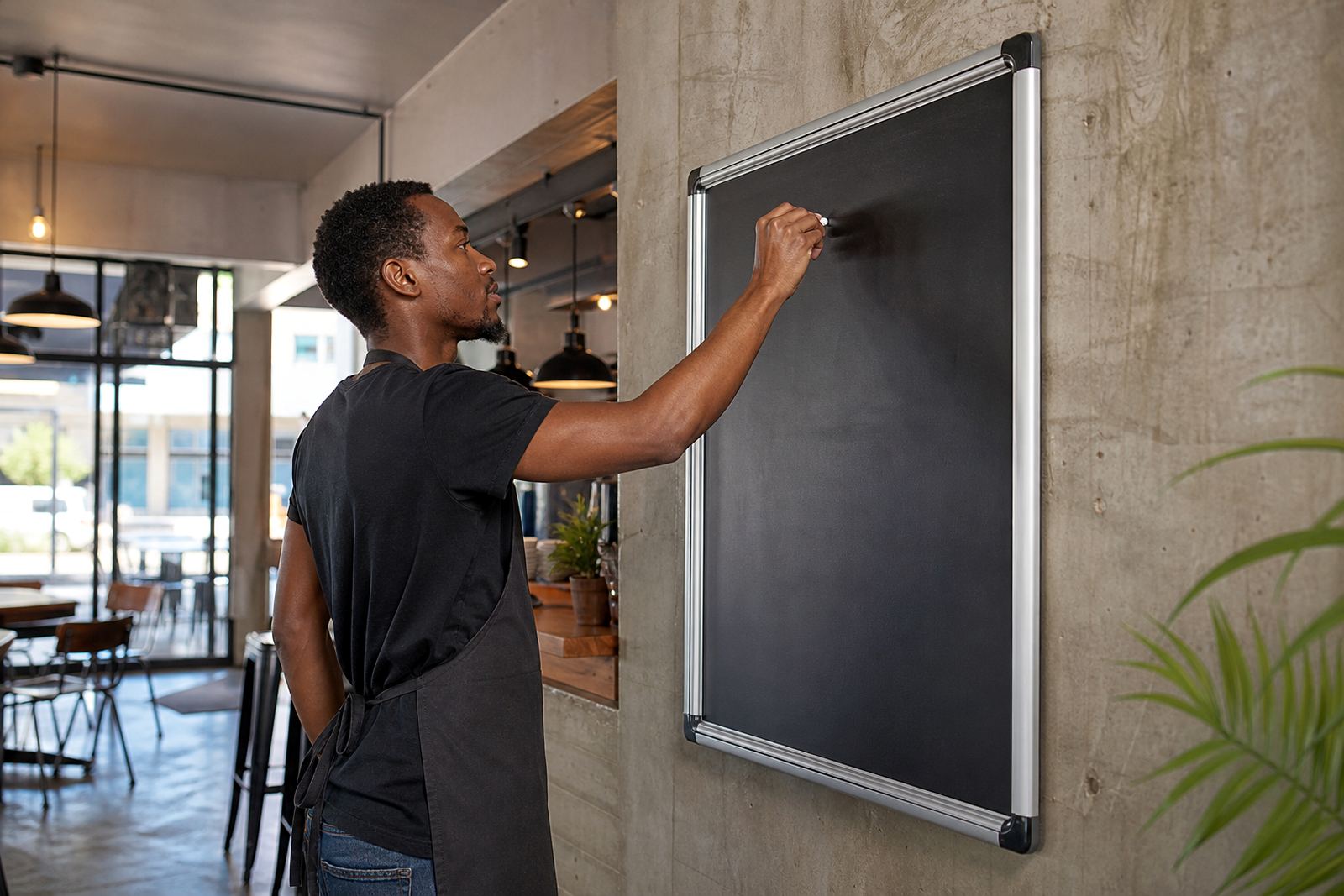
- Use chalkboards only where hand lettering stays neat and legible
- Match the frame style to the counter, not the other way around