When the frame should step forward, and when it should fade out
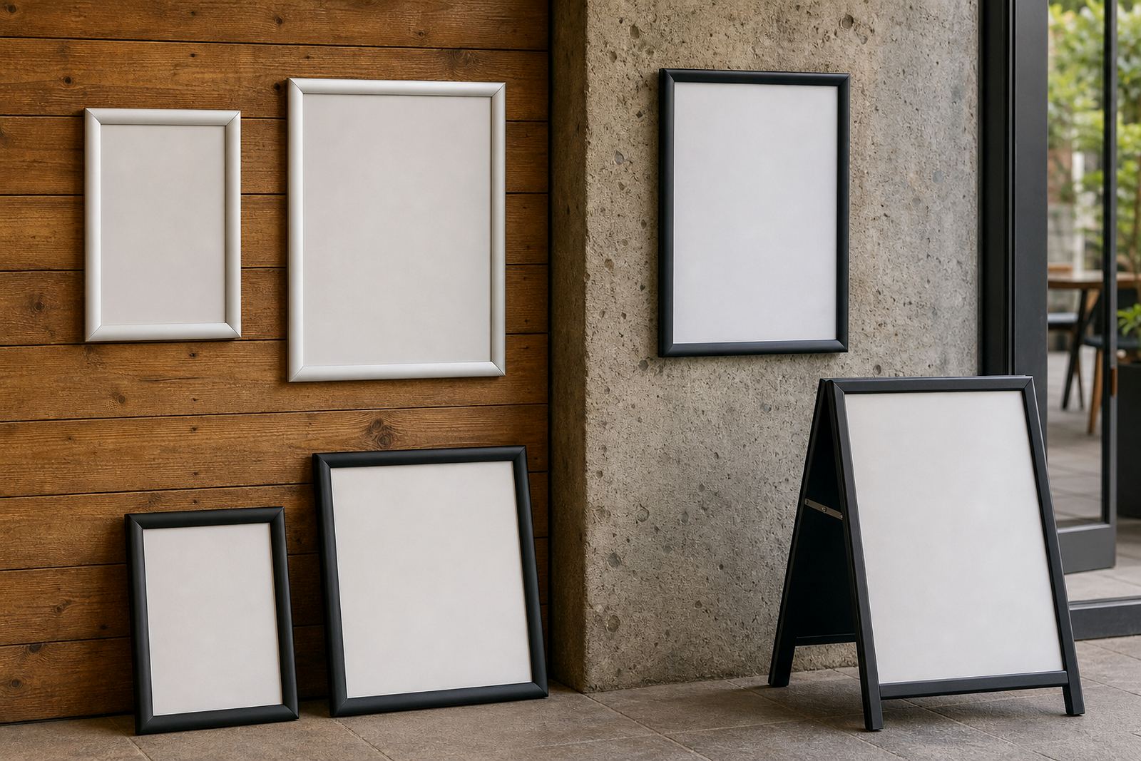
A menu frame is not only there to hold artwork. It sits at eye level, near counters, doors and walkways, so the finish needs to work with the room instead of fighting it. Silver frame profiles carry a clean, neutral look that suits lighter interiors, brushed steel fittings and spaces with lots of natural light. Black frames feel firmer and more defined, which can help a menu board stand out against a painted wall or a busy backdrop.
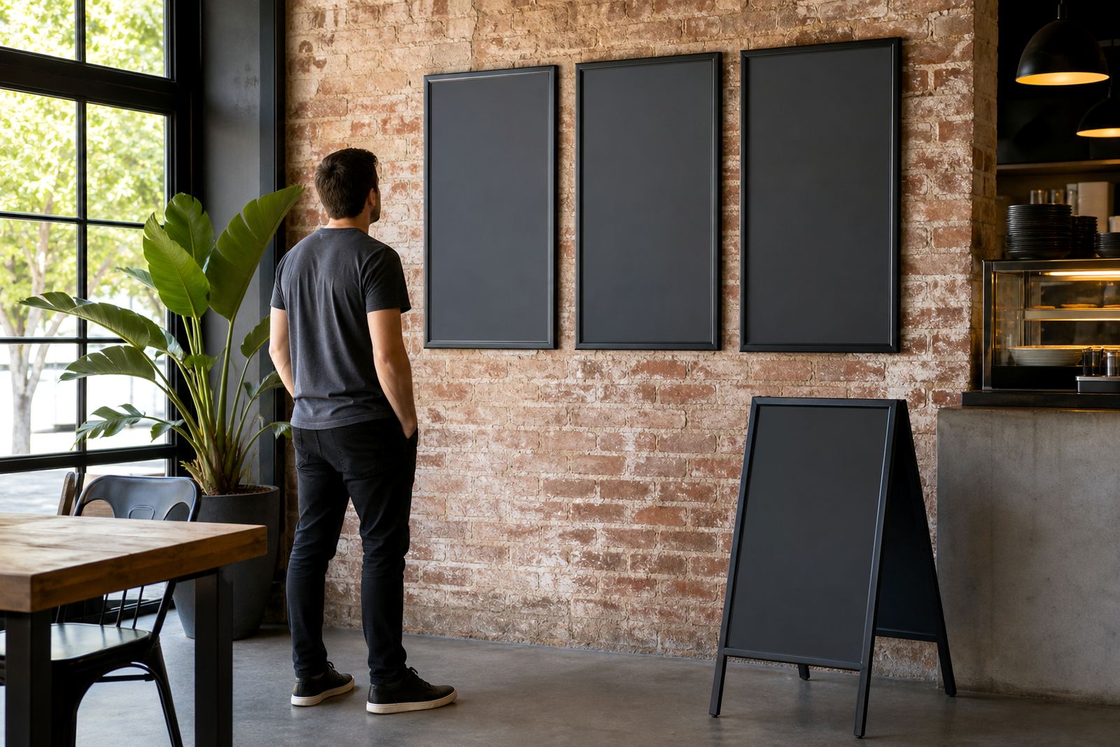
In a Cape Town café with white walls, timber counters and pale flooring, a silver A3 snap frame can keep the menu looking open and neat. In a cocktail bar with dark paint, pendant lighting and framed prints, black gives the menu a tighter edge. The best result is usually the frame that lets the text stay readable without drawing too much attention to the hardware.
- Silver works well with stainless counters, glass, pale tiles and light wood.
- Black suits dark feature walls, moody interiors and narrow display zones.
- Either finish can look right if the mounting and print size are matched properly.
What the room is already saying before the menu goes up
Interior colour is only part of the decision. A frame has to sit beside floors, skirting, shelving, counter fronts and signage that may already set a clear tone. If the room has grey concrete, black steel and warm timber, a black frame can hold its own without looking heavy. If the room already has dark walls and dark furniture, silver can lift the menu board a little and stop the whole wall from feeling flat.
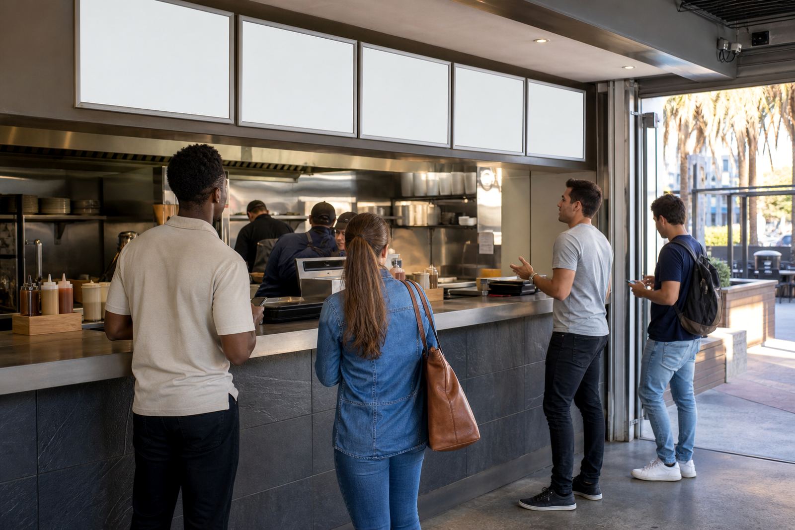
Coastal humidity also plays a part in finish choice, especially near open doors, windows and kitchen passes. Aluminium profiles handle that sort of environment well, and the finish should still look tidy after regular cleaning. For a takeaway counter in Milnerton or Gqeberha, the frame often sits close to busy traffic, so the colour has to work with scuffs, reflections and fingerprints too. A finish that looks good in a showroom can feel different once it is mounted above a point of sale.
- Look at wall colour in daylight and under warm evening lighting.
- Check whether nearby fittings are silver, black or mixed metal.
- Think about how often the frame will be touched during service.
A4, A3 and the shape of the wall space
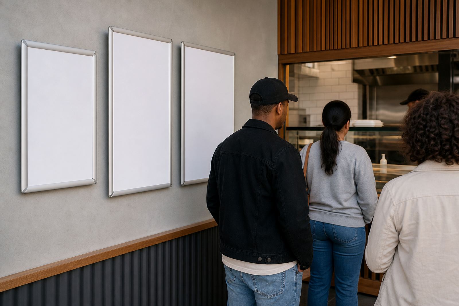
Frame finish should always sit alongside size. An A4 menu frame in black can look crisp and compact at a till point, while an A3 frame in silver can read more softly on a larger wall. Where there is a long strip of wall beside a service hatch, two or three frames in the same finish often look better than mixing colours without reason. A single frame near the counter is one thing, a row of boards along a passage is another.
Menu boards used for breakfast, lunch and specials often work best when the printed insert is sized neatly inside the snap frame with room for clear margins. If the menu needs quick swapping, the profile should open cleanly and close without rubbing the print. That matters for laminated menu prints, poster insert printing and menu updates, because a frame that looks good but fights the paper soon becomes annoying.
- A4 suits compact menus, specials and drink lists.
- A3 gives more room for item grouping, pricing and branding.
- Frame colour should support the print, not overpower it.
Wall, window and A-frame placement change the finish choice
Where the frame lives can change which finish feels right. A wall-mounted board beside a painted feature wall may need black to anchor it. A window-mounted menu near bright daylight can benefit from silver, especially where reflections need to be kept under control. A-frame menu stands placed at entrances, pavement edges or foyer points often pick up more public attention, so a neutral finish helps the printed menu stay central.
Anti-glare covers matter in these spots too. They soften reflections from street light, shop lighting and passing glare, which is useful in glass-fronted premises and entrances with strong afternoon sun. In Paarden Eiland, where many food counters face bright openings and hard interior light, the cover can be just as important as the frame shade. If the frame is going into a window display, black can look sharper from the street while silver can feel lighter from inside the room.
- Wall mounting works well where the board should stay fixed and neat.
- Window mounting suits specials visible from the street or frontage.
- A-frame stands need a finish that still looks tidy from both sides.
A local fit note from the Cape Town side
A small restaurant in Stellenbosch may need a different finish from a busy counter in Bellville. A wine bar with muted walls and brass details can carry black frames well, while a family café with pale tiles and light shelving may lean toward silver. The right answer is not only about taste, it is about what the room already has and how often the menu changes during service.
For larger venues, mixed finishes can work if they are used with a clear pattern. For example, wall menus near the host stand might stay black, while silver frames hold drinks lists near the bar. That gives the room a steady visual rhythm without making every surface look identical. Our team in Paarden Eiland often sees that the better choice is the one that makes the print easier to read and the counter area less cluttered.
When a menu layout is still being adjusted, menu typesetting and proofing help keep the text spacing honest before printing. That is where finish and format meet, because a clean frame cannot rescue a cramped layout.
A short check before a frame finish is approved
Before a frame finish is chosen, it helps to check the room in the same light it will be used in. Morning light, evening light and indoor lighting can all change how silver or black reads against the wall. A black frame can disappear too much on a dark wall, while silver can catch too much glare on a bright one. The decision gets easier when the print, wall colour and mounting point are looked at together.
- Confirm the wall colour, floor tone and nearby fittings.
- Measure the available space for A4 or A3 inserts.
- Decide whether the frame needs anti-glare covers or window mounting.
- Keep the finish consistent across matching menu points where possible.
Courier delivery across South Africa means the same finish can be used in Cape Town, Durban, Johannesburg, Gqeberha and smaller towns too. What changes is the room it lands in, and that is where the final choice matters most.
Where the finish meets the print, not just the wall
A good snap frame finish is quiet work. It frames the menu without stealing attention from the food list, specials or pricing. Silver is often the safe middle ground, but black has its place where the interior needs a stronger edge. Either can work cleanly when the size, cover and mounting are matched to the space. The point is to make the menu easy to read and the room feel settled, not crowded.
For restaurants, cafes and takeaway counters, that usually means choosing the finish after the layout is settled, not before. Once the print size, insert style and mounting position are known, the frame colour becomes a practical call rather than a guess. That is where the result usually starts to look right.