The door frame does more than hold a menu
An entrance display has one job before anything else: make the offer readable before the customer reaches the counter. At a glance, it should show the menu name, the right pricing structure and a clean route into the ordering point. If the board is cramped or too low, people slow down. If it is too large for the wall, the door starts to feel crowded.
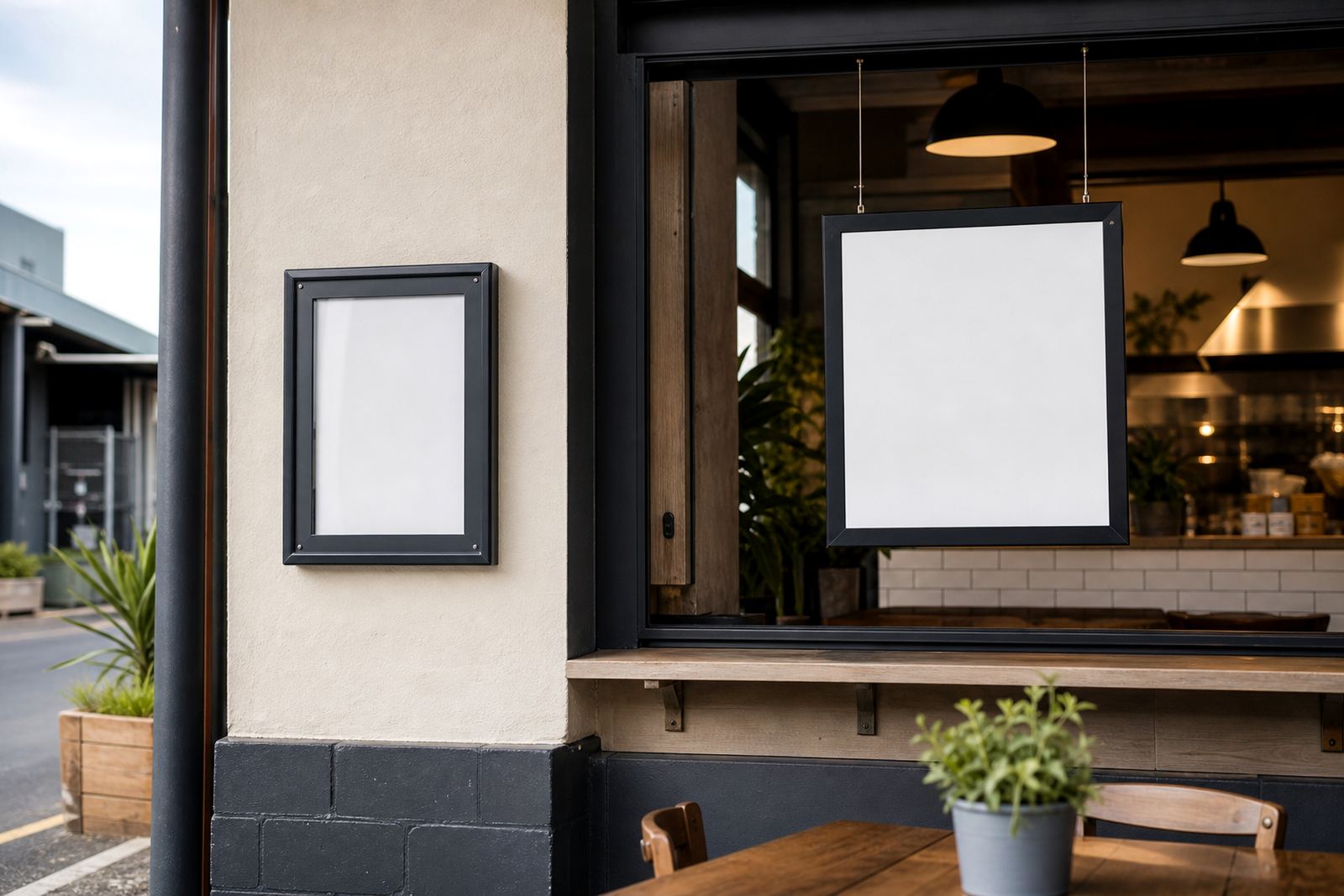
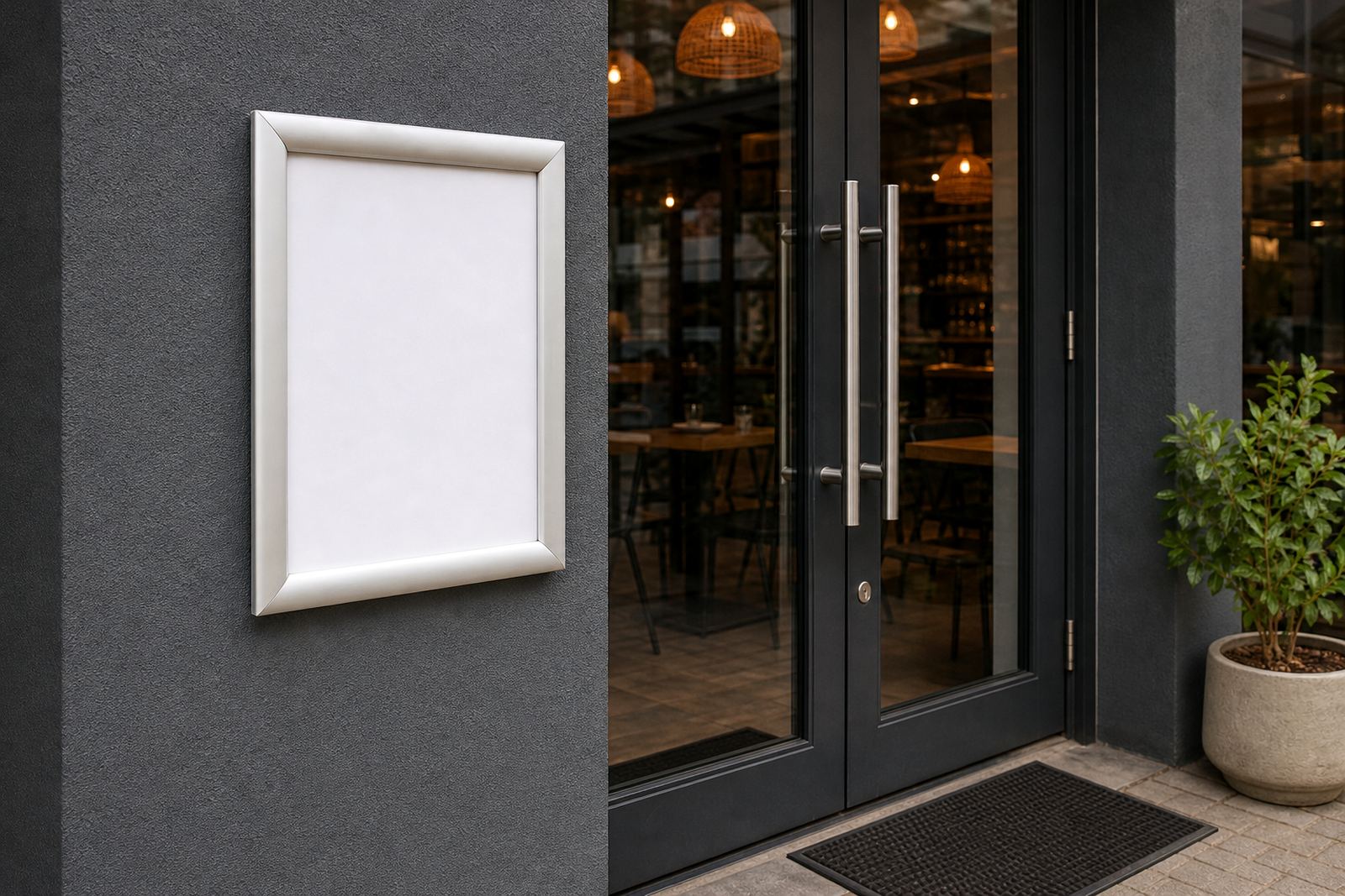
In Paarden Eiland we often see the same pattern in restaurants, cafés and takeaway counters. The first board is not only for decoration, it sets the pace for the queue. A neat snap frame or wall board gives a printed insert a crisp edge, while anti-glare cover sheets help with bright shopfront glass and Cape Town daylight bouncing off tiled floors.
- A4 frames suit short lists, combo deals and notices near the till.
- A3 frames suit fuller menus with sections for drinks, mains and extras.
- Window mounting works well where the entrance faces foot traffic.
- Wall mounting keeps the counter area clear and easier to clean.
Reading speed starts with the size of the print
Many entry points fail because the menu is printed at the wrong scale for the viewing distance. A guest standing at the door needs larger type than someone reading a table tent. That is where menu resizing and typesetting matter. The line spacing, item grouping and font weight all affect how fast someone can find breakfast, lunch or a takeaway special.
A3 inserts help when the menu carries a wider range of items, while A4 works better for short, high-turnover selections. For entrances with a narrow sightline, a single large headline and a few clear categories can be more effective than a full page crowded with text. Our print-ready templates are set up for common snap frame sizes, so the finished insert lands neatly into the frame without trimming drama.
- Keep the opening line short and legible from the queue.
- Place price points beside the item, not far below it.
- Use bold section names for breakfast, grill, coffee or specials.
- Leave enough white space so the eye can travel cleanly.
Aluminium profiles and anti-glare covers earn their keep
Snap frames work because the front opens and closes with a simple lift, so menu inserts can be changed without tools. That suits an entrance display where items move in and out through the week. Aluminium profiles hold their shape well and give the frame a neat finish, while anti-glare covers protect the print and reduce reflections from glass doors and strong lighting.
At coastal sites, especially along the Atlantic side or near Durban humidity, a tidy frame finish helps the display stay presentable. A wall board used near a service hatch can also take a chalkboard surface for daily specials, though the main menu still benefits from a printed insert when the core offer must stay consistent. In busier stores, short run printing and laminated menu prints keep the front-of-house piece looking sharper for longer.
The practical value is simple: less fiddling at the entrance, fewer loose sheets and a cleaner reading surface for the guest standing there with a queue behind them.
A-frame stands suit the edge of the pavement
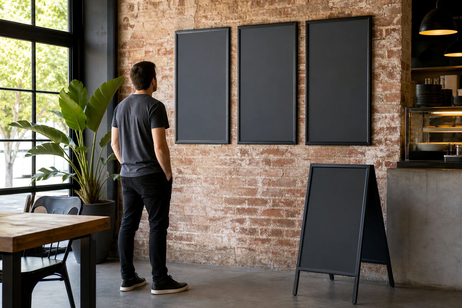
Not every entry point is a wall or a window. Some sites need the menu to reach the pavement first. An A-frame stand works well where pedestrians approach from the street, especially for cafés and lunch counters with steady foot traffic. It can be moved for cleaning, brought in after trading hours and set closer to the path when the weather allows.
For these stands, the layout needs to be direct. The most useful boards lead with the product category, then the entry items people order most often. A breakfast list can be split into hot drinks, light meals and fuller plates. A takeaway counter may need only a small specials insert beside the main menu if the core list already covers the regular items.
- Use a weather-safe print finish where the stand sits near the pavement.
- Choose wording that can be read in one quick glance.
- Keep the display stable on uneven paving or shopfront tiles.
- Check that the stand does not block the entrance route.
Menu updates work best when the board is built for change
Restaurants and cafés rarely keep the same front page for long. Prices shift, items run out, weekday specials change and seasonal drinks move in. A snap menu frame handles that pattern well because the insert can be updated without replacing the whole unit. Menu updates are easier when the original size is correct and the wording has been laid out for future edits from the start.
That is why proofing matters. A heading that looks fine on screen can sit too close to the edge once printed. A narrow line of text can lose its balance when stretched across A3. Colour matching matters too, especially where a brand uses strong reds, dark greens or a pale background that must stay clean under shop lighting.
In Cape Town, a takeaway counter in Bellville may need one set of prices on the wall and a second insert by the till for quick add-ons. In Johannesburg or Gqeberha, the same menu can travel through courier packaging without bending if the board is packed correctly and the insert is protected.
A practical entrance layout for Cape Town foot traffic
Paarden Eiland has its own rhythm. Some doors open straight onto the street, others sit inside a shared retail strip where people are deciding while they walk. In those spaces, the entry point display has to do the work of a brief introduction. It should tell the guest what type of food is on offer, where to stand, and what the most common order looks like.
A local café with a narrow frontage may use one A3 wall menu at eye level, then a smaller A4 insert for specials beside the counter. A larger takeaway store could use two matching frames, one for the core menu and another for drinks or add-ons. The point is not to fill every wall, but to place the right information where the eye lands first.
Our team handles the mix of menu printing sizes, finishing and courier delivery across South Africa. That includes Cape Town, Stellenbosch, Milnerton, Paarl, Durban and Gqeberha, with entry displays built to suit the way customers move through the door rather than forcing them to stop and search.