Text arranged for service, not for clutter
Good menu typesetting starts with the way the eye moves. We set titles, item names, descriptions and prices so a busy customer can scan the page without stopping at every line. On a breakfast board that may mean tighter groups and a clear price column. On a dinner list it may mean wider spacing, stronger section breaks and shorter description lines.
We work with menus that have grown over time, where one page picked up extra items, a few specials and a last-minute note or two. The layout gets those layers under control. Headings sit in the right place, type sizes stay consistent and the finished page feels deliberate instead of crowded.
What we set up in the artwork
Menu typesetting covers the practical details that affect reading speed and print quality. We prepare the structure, check line breaks, and make sure the page still works when it is printed in a frame or inserted behind a clear cover. If your board needs to live in a window, on a wall or on an A-frame stand, the spacing has to hold up in daylight and from a short viewing distance.
- Section headings, item names and descriptions aligned with a clear visual order
- Price columns set to stay neat across repeated items
- Line spacing adjusted for dense text and smaller formats
- Typography prepared for A4 and A3 menu frames, boards and inserts
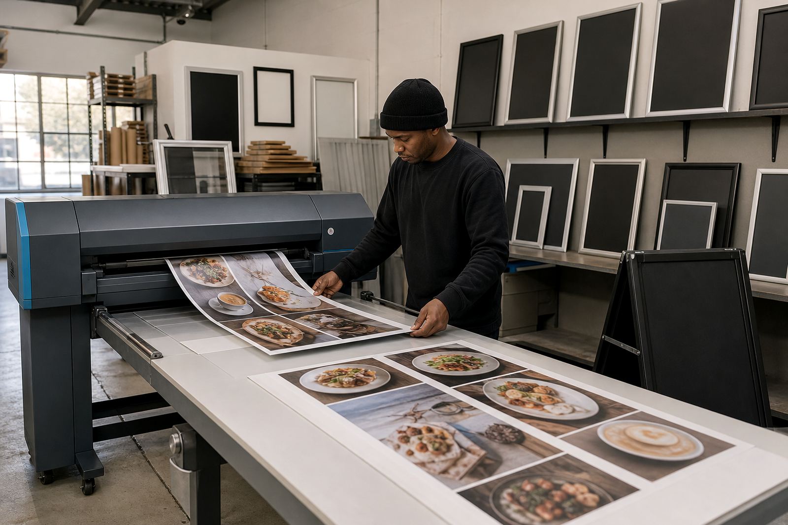
- Print-ready pages arranged for short runs, laminated prints or poster inserts
- Text flow checked for wall mounting, window mounting and A-frame viewing angles
The steps we follow on a menu job
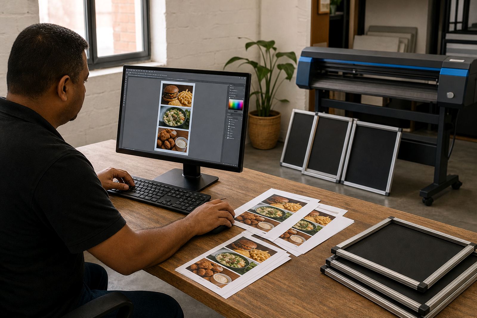
We usually begin with the text you want on the page and the format it needs to fit. If the menu is changing an old list, we clean up the structure first, then sort out heading levels, spacing and repeated wording. Where the copy has to fit into a fixed frame size, we keep the layout honest to the final print dimensions so there are no surprises at the counter.
After the first layout is set, we check spacing, page balance and the way prices sit against the items. A menu with too many line breaks can feel jumpy. One with too little breathing room looks cramped and hard to read. We tune those details until the page works as a working menu rather than a block of text.
- Collect the menu text and the intended frame or board size
- Set the headings, item groups and descriptions into a clear order
- Adjust spacing, font sizes and price alignment
- Review the proof for layout balance and print fit
- Prepare the final file for printing, inserts or courier packaging
A4, A3 and larger pages need different handling
An A4 menu used behind a snap frame carries different pressure from an A3 board on a wall. Smaller pages need tighter control over line lengths and whitespace, while larger boards can give the eye more room but still need structure. We size the text to the page, not the other way round, so the finished layout suits the frame and the customer flow around it.
For counters and takeaway points, the menu often needs to read quickly from standing height. For a dining room wall, the page may carry more detail and still stay legible. We also handle menu resizing where existing artwork must be adapted to a new frame size without losing the balance of the original layout.
Turnaround, printing and courier handling
Once the layout is signed off, the file moves into the print stage or is prepared for a print partner if the menu is being inserted into a frame or board on site. We can set menus for short run printing, laminated menu prints and poster inserts, with courier packaging arranged for delivery across South Africa. That includes Cape Town, Stellenbosch, Johannesburg, Durban and Gqeberha, plus local deliveries around Milnerton, Bellville and Paarl.
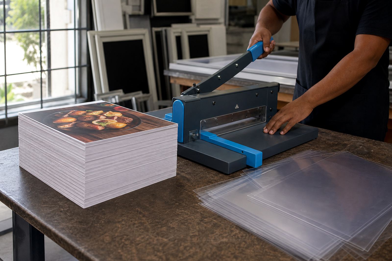
The practical side matters here too. If a menu is heading into a snap frame, the bleed, trim and insert size need to match the frame opening. If it is for an A-frame stand, the viewing distance and board angle affect the font choice. We keep those details tied to the final use, not just the artwork file.
- Print-ready files prepared for A4 and A3 inserts
- Artwork checked for trim, bleed and safe margins
- Laminated or unlaminated output depending on the board setup
- Courier packaging for folded, flat or framed items
Pricing built around the amount of work
Menu typesetting is priced around the amount of layout work, the number of pages, the level of editing and whether the menu needs resizing or proofing. A simple text update on one page is not the same as rebuilding a long drinks list with sections, modifiers and pricing changes. We also factor in whether the job must fit a standard frame size, a custom board or a mix of formats for different branches.
When a menu changes often, we keep the structure tidy so future updates are less messy. That saves time on later revisions and helps the menu stay consistent across branches in Cape Town, Johannesburg or Durban. The final quote follows the scope of the pages, the artwork state and the finishing needed for print or display.
- Single-page menus and multi-page price lists
- Text corrections, reflow and layout cleaning
- Menu proofing before print release
- Resizing for A4, A3 and insert formats
Aftercare for menus that keep changing
Menus shift when items move off the list, specials become permanent or pricing needs a full reset. After the first typeset version is complete, we can help with updates, colour matching for repeated pages and finishing adjustments when a new print run is needed. The aim is to keep the menu readable each time the board changes, without losing the structure that made it work.
For teams using snap frames or wall boards, that means the next update can follow the same logic as the first one. The spacing stays familiar, the hierarchy stays clear and the menu keeps its shape even when the text changes. On a busy counter in Paarden Eiland or a cafe in Stellenbosch, that consistency matters more than decorative flourishes.
Clients reach us through our contact form when they need a menu set out properly for print, frame inserts or a fresh board layout. We then work from the text, the size and the finish that the menu needs.
Key facts
| Formats | A4 menu templates, A3 menu templates and resized inserts |
|---|---|
| Output | Print-ready artwork for framed, laminated or inserted menus |
| Typography | Hierarchy for headings, items, descriptions and price columns |
| Mounting fit | Wall, window and A-frame display layouts |
| Print finishing | Laminated menu prints, poster inserts and cut-to-size pages |
| Coverage | Paarden Eiland, Cape Town and nationwide courier delivery |