How the colour check starts on a real menu run
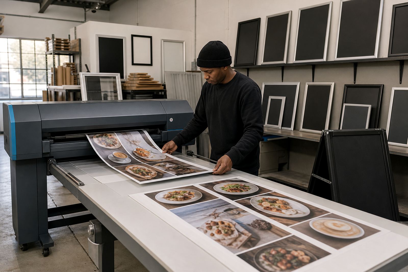
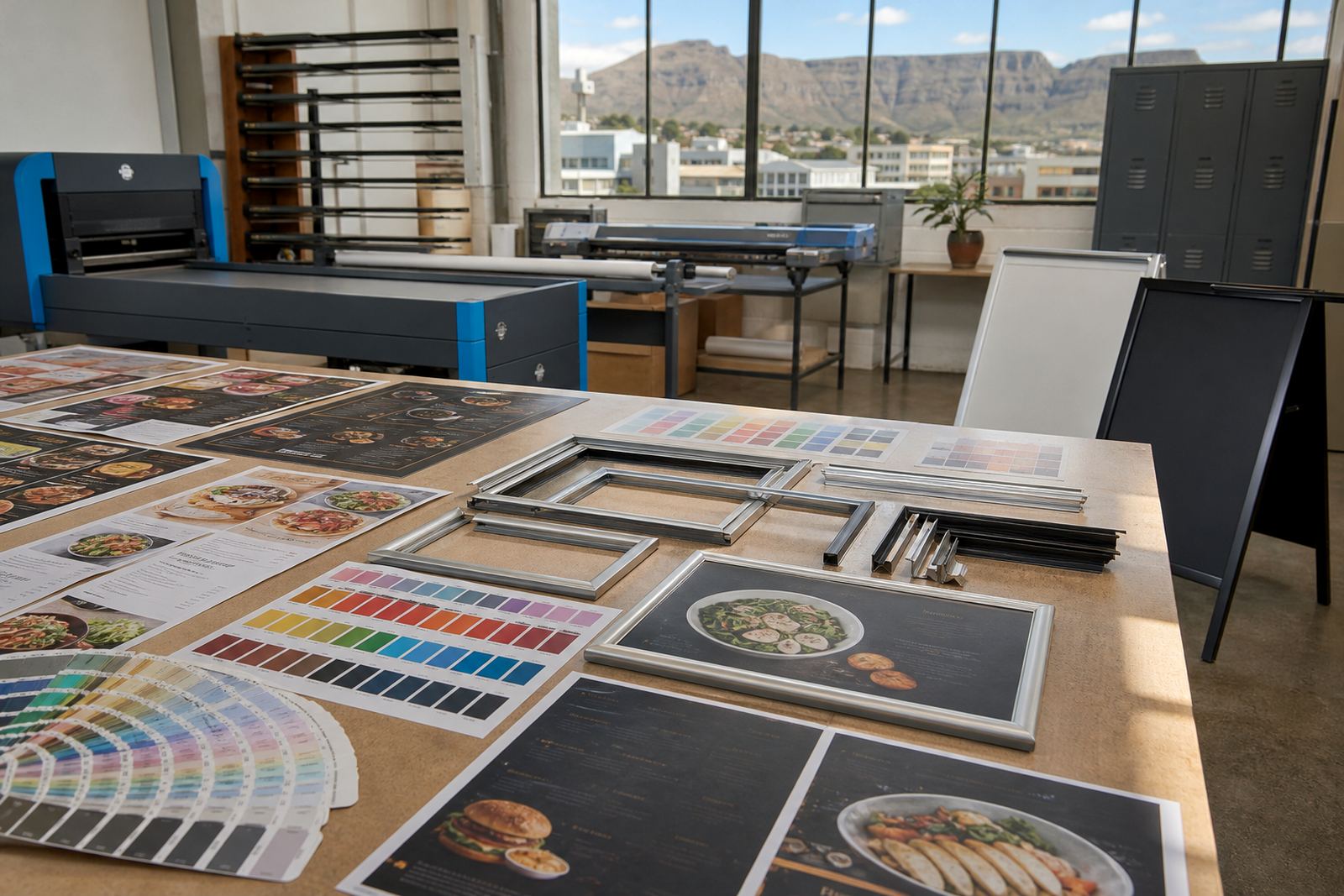
We begin with the artwork that is already in play, whether that is a laminated menu print, a poster insert or a board panel used in a snap frame. The first pass looks at the current file, the previous print and the way the menu is used under counter lights, daylight near the window, or in a shaded dining room. Small shifts in cyan, magenta, yellow and black can change flesh tones, coffee browns and deep reds more than most people expect.
The work is practical. We compare printed samples against the approved look, then adjust for the stock, coating and viewing angle. A4 menu inserts need a different touch from A3 wall boards, and an A-frame on a pavement outside Cape Town picks up light in a very different way to a board under a canopy in Durban.
- Artwork checks against the last approved print
- Adjustments for paper, laminate or insert stock
- Attention to warm neutrals, reds and dark brand shades
- Matching for indoor boards and outside-facing stands
What the colour matching service covers
This service covers practical correction for repeat menu work, not just a single file tweak. We can balance menus that have drifted from run to run, tidy up logo tones, and keep the same tone across matching inserts for a wall frame, counter board and A-frame stand. If the menu needs to be resized or re-typeset at the same time, we keep the colour treatment aligned with the new layout so the finished sheet still feels like one set.
For takeaway counters and busy café specials, consistency matters because the same menu may be printed in more than one size. A3 for the wall, A4 for the counter, and a smaller insert for a narrow frame can all sit together if the colour is handled with care.
- Menu file correction for repeated print runs
- Logo and text colour adjustment
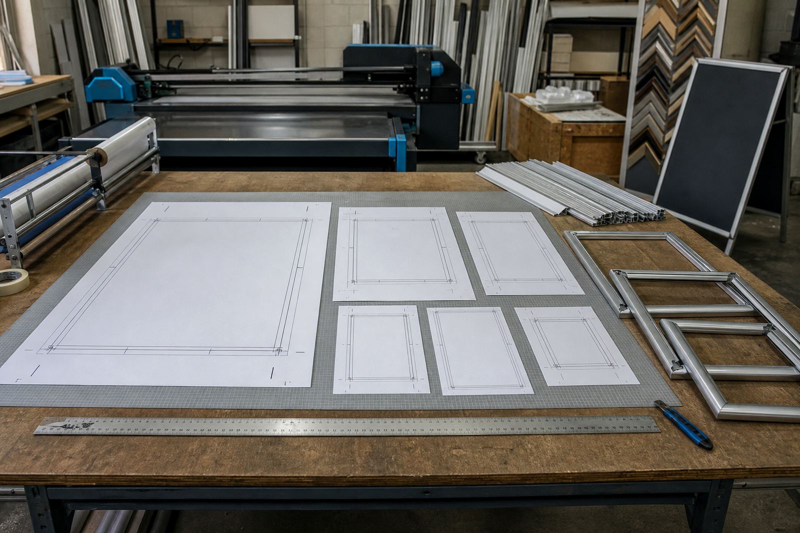
- Matching across A4, A3 and poster inserts
- Support for laminated menus and snap frame displays
The file work behind a steady print result
Colour matching is part art and part production control. We look at how the file is built, whether the blacks are rich or flat, and whether the greys lean too blue or too brown. If an image looks strong on screen but weak in print, we tune it for the press output and the chosen finish. That often includes a careful shift in saturation and contrast, plus a clean check on small type so it does not blur when the menu is trimmed.
For restaurants and cafés in humid coastal areas, paper and coatings can behave a little differently too. Window-mounted frames near glass can catch reflections, so a matte or anti-glare cover may need the colour to be nudged slightly darker or more even to hold its read.
- Press-aware colour correction
- Greyscale balance and black density checks
- Readability checks for small menu text
- Finish-aware adjustments for gloss or matte covers
Turnaround, proofing and approval steps
The process is kept clear. You send the current artwork or a previous print sample, we assess the colour drift, and then a proof is prepared for review before any print run is released. Where the menu is part of a larger update, such as new prices or seasonal items, the colour work is folded into the proofing stage so there is one set of changes to sign off.
For short runs, the colour correction is usually handled alongside the print prep and finishing notes. For larger batches, or where inserts must match across several branches, the approval stage matters more because small variation becomes obvious across multiple walls, windows and stands.
- Review of current menu files or sample prints
- Proof preparation with corrected colour values
- Approval before short run printing or insert production
- Packaging notes if the job is couriered nationwide
Pricing logic for colour matching work
Pricing depends on how much correction the file needs, how many menu variants are involved, and whether the job is tied to resizing, typesetting or proofing. A single A4 insert with minor correction costs less work than a full menu set with different boards, window frames and takeaway counter panels. If the artwork is badly out of balance, the time rises because the file needs more careful correction and another round of checks.
We keep the pricing approach tied to the actual production effort. That means a neat file with a small drift will not be treated like a full rebuild, and a long menu with image-heavy pages is priced differently from a plain specials board.
- Minor correction for clean, near-ready artwork
- Higher effort for multi-page menu sets
- Separate pricing for matching, resizing and proofing
- Packaging and courier costs handled on the job line
Aftercare for repeat prints and branch rollouts
Once a colour standard is set, we keep a record of the corrected file state so later menu updates can stay close to the same look. That helps when a restaurant adds a new breakfast insert, changes one section of a bar list, or rolls the same board out to several branches in Cape Town, Stellenbosch, Johannesburg, Durban or Gqeberha. The aim is a repeat print that does not look like a different menu altogether.
If the next batch needs new prices, a changed dish list or a different board size, the colour treatment can be carried forward with the update. That keeps the frame display orderly and avoids the awkward patchwork look that happens when each reprint is handled on its own.
- File notes kept for later menu updates
- Colour carry-over across branch sets
- Support for revised prices and seasonal panels
- Useful for wall boards, window frames and A-frames
Key facts
| Service type | Practical colour adjustment for menu prints and display boards |
|---|---|
| Common sizes | A4, A3 and custom resized inserts |
| Display formats | Snap frames, wall menu boards, window frames and A-frame stands |
| Print finishes | Matte, gloss, laminated and anti-glare cover options |
| Process | File check, colour correction, proofing and print prep |
| Coverage | Nationwide courier delivery from Paarden Eiland, Cape Town |