A darker edge that suits busy service areas
This finish is made for menu displays that need a stronger outline against pale walls, tiles, timber counters and glass. The darker frame helps the printed insert hold attention, especially where the room has a mix of daylight, downlights and reflected light from front windows. In busy front-of-house spaces the darker edge hides light scuffs and finger marks better than pale finishes and it keeps printed menus looking crisp even under mixed lighting.
The frame itself uses an aluminium profile with a black outer face and snap-open sides, so staff can change inserts without tools. The opening action is simple, but the frame still needs to be mounted squarely so the cover sits flat and the corners close properly. If the board is going near a public walkway, the fixing points should be checked for the wall material and the daily handling the unit will take.
For restaurants, cafes and takeaway counters, the black finish works best where the menu changes often and the display has to stay tidy between specials, drinks lists and breakfast or lunch sets. It gives a calm, finished look without pulling focus away from the printed artwork.
Sizes, profiles and display options that match the menu
Black frame finish units are commonly supplied in A4 and A3 sizes, with portrait or landscape orientation depending on the menu layout. A4 suits shorter lists, service notices and drink sheets. A3 gives more room for food categories, combo meals or a fuller board that needs breathing space. If a wall board will carry several inserts side by side, it helps to keep the same frame size across the line for a cleaner run along the counter or service wall.
Profile depth matters as much as size. A slimmer profile gives a neater look for modern interiors, while a deeper frame can suit thicker inserts, laminated menu prints or boards that need a slightly more substantial edge. Anti-glare cover sheets are often fitted over the artwork to reduce reflection on bright days and to keep the print readable near glass doors or windows.
- A4 black snap frame for single menus, specials or notice boards
- A3 black snap frame for larger menu boards and fuller layouts
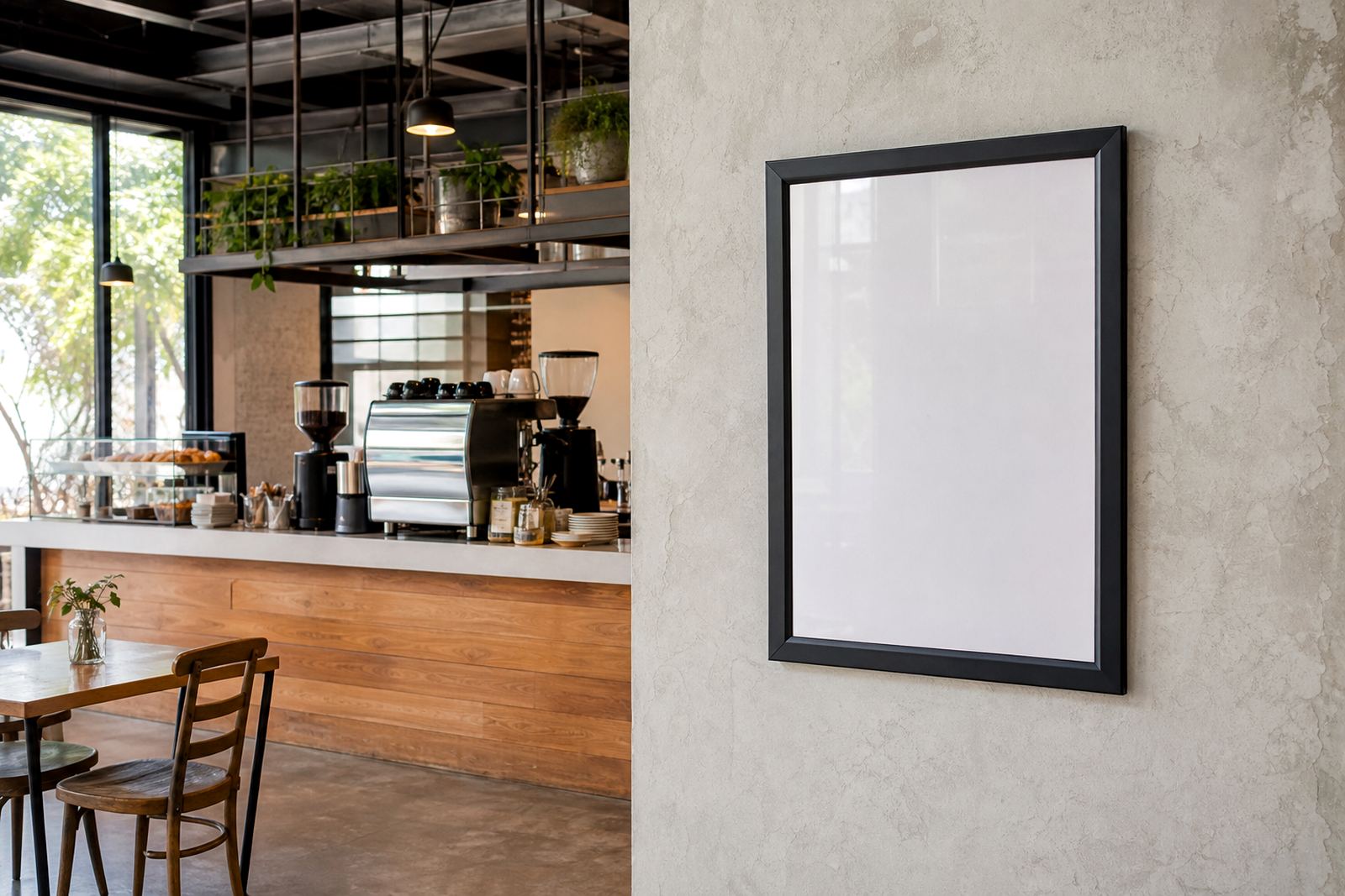
- Wall mount format for fixed menus behind counters or in seating areas
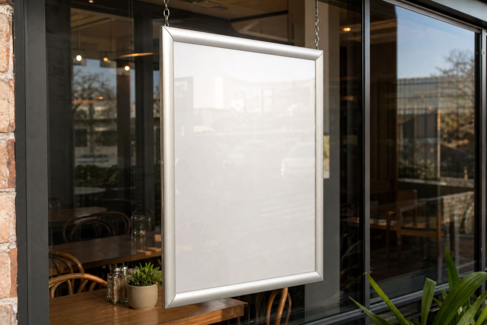
- Window mount option where the display must face the street
- A-frame stand format for pavement-facing or entrance displays
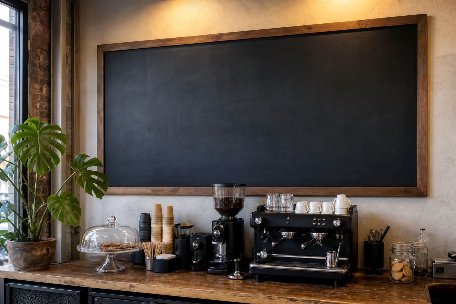
- Chalkboard-style insert panel for handwritten specials and daily offers
Where the black frame finish works best
This finish suits contemporary dining rooms, coffee counters, bars and takeaway points where the display needs to feel deliberate rather than temporary. It also works well in spaces with dark timber, exposed brick, matte tile or steel trim, because the frame ties in naturally with those finishes. In a lighter room, the black edge gives the menu stronger definition and stops the board from disappearing into the wall colour.
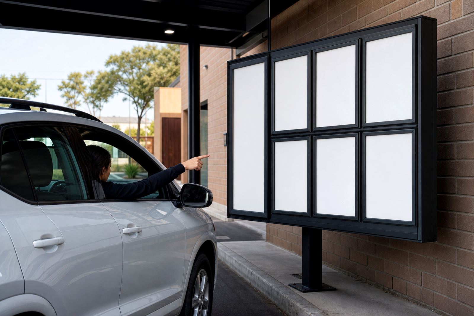
For shopfronts and pavement-facing displays, the darker frame can help the menu read clearly from a distance, specially where the window area is busy with stickers, opening hours or service notices. On A-frame menu stands, the finish gives the board a stable visual base and makes the insert look more anchored when it is placed outside the door. In Cape Town coastal air, and in other humid areas like Durban, a proper aluminium frame with fitted covers is a practical choice because it holds its shape better than soft signage styles that can curl or bow.
Where several boards are used together, the black finish can also help separate sections such as breakfast, lunch, drinks and dessert. The result is less visual noise at the point of sale and easier reading for customers standing in line.
Fitting details for wall, window and stand-mounted use
Mounting depends on the surface and on how often the board will be changed. Wall-fitted frames need level placement, proper spacing and fixings that suit plasterboard, masonry or timber. For shop windows, the board may be mounted to face in or out, depending on whether the main audience is inside the room or on the pavement. A-frame stands need balanced hinges and enough weight in the base so they do not shift on slick floors or in coastal wind.
If the menu will be updated often, it is worth leaving enough hand clearance around the frame so staff can open the edges without scraping the wall or knocking nearby fittings. The cover should close cleanly around the print, and the insert size must match the frame exactly or the edges may lift. A neat fit also matters for laminated menu prints, poster inserts and short run changes where the artwork needs to sit flat without waves.
- Check whether the frame will hang portrait or landscape
- Confirm the wall material and fixing point before fitting
- Confirm if the display faces customers inside or outside
- Allow space for staff to open and close the snap edges
- Match the insert size to the visible frame opening
Care that keeps the finish looking clean
Cleaning is straightforward, but the black surface shows dust more clearly than a pale one, so a quick wipe with a soft dry cloth keeps it looking smart. For heavier marks, use a damp cloth and mild cleaner, then dry the surface so no streaks settle on the edge. Avoid harsh scouring pads because they can dull the finish and leave shiny patches where the coating has been rubbed down.
The anti-glare cover should be cleaned with a soft cloth rather than rough paper, and it helps to lift fingerprints before they harden under heat from shop windows. When inserts are changed, the inner edge of the frame should be checked for grit or paper dust, because small particles can stop the snap sides closing flush. On boards used near a counter, a quick weekly check keeps the corners aligned and the insert seated properly.
If the display is used in a takeaway or café that handles steam, grease or frequent hand contact, the frame will need a bit more care than one in a quiet office lobby. That extra attention keeps the finish sharp and stops the board from looking tired before the menu itself changes.
What to confirm before the order leaves for print
Ordering goes more smoothly when the details are locked in from the start. The frame colour, size, orientation and mounting method all need to match the menu artwork and the location where it will hang or stand. If the board is part of a larger menu set, the same black finish can be used across all pieces so the frontage stays consistent from the first panel to the last.
For printed inserts, it helps to confirm the artwork dimensions, bleed allowance and whether the final file is for A4, A3 or a custom size. If the menu will be proofed before production, the text should be checked for dish names, prices, spelling and spacing, especially where a dark frame makes the printed area look more compact. The print finish also matters, because glossy and matte stock behave differently under light.
- Frame size and orientation: A4 or A3, portrait or landscape
- Mounting type: wall, window or A-frame stand
- Insert type: menu print, laminated sheet or poster insert
- Finish preference: standard black edge or black with anti-glare cover
- Artwork size and bleed: confirm the exact print dimensions
- Quantity and delivery town: Cape Town, Stellenbosch, Johannesburg, Durban or Gqeberha
SnapperFrame Menus handles menu boards, sizing, print finishing and courier packaging from Paarden Eiland in Cape Town, with delivery across South Africa. Clients also use our contact form when they need menu resizing, menu proofing, laminated menu prints or short runs that fit a changing service board.
Key facts
| Finish | Black aluminium profile with snap-open edge |
|---|---|
| Common sizes | A4 and A3 |
| Display formats | Portrait or landscape |
| Cover option | Anti-glare clear sheet |
| Mounting | Wall, window or A-frame stand |
| Use areas | Restaurants, cafes, bars and takeaway counters |